Orthodontic Patient Portal & Intake Website Template
The Align Healing Space Orthodontist Patient Portal Landing Page Template is a single-column, content-first page built for orthodontic practices. It opens with a three-step intake form, flows into a polaroid-style testimonial mosaic, and serves ungated educational resources before any email gate appears. The Forest Trust color system and warm typographic pairing create a calm, professional atmosphere that earns patient trust at every scroll depth.
by Rocket studio
Quick summary
The Align template is a healing-space patient portal landing page designed for orthodontic practices. It guides every visitor through a gentle three-step form, builds confidence through real patient stories, and delivers practical resources before asking for contact details. The result is a page that feels supportive and purposeful from the first visit onward.
Who this template is for
This template is built for orthodontic practices that want a digital front door that feels as considered as the care they provide. It works equally well for established offices and newer practices ready to present treatment options with clarity and warmth.
- Orthodontists serving anxious teenagers whose parents are researching braces or clear aligners for the first time
- Young professionals exploring orthodontic treatment now that their insurance covers Phase II care
- Adults in their forties who have lived with crowded teeth for decades and are finally ready to begin
What problem this template solves
Most orthodontic websites push visitors straight to a generic contact form. That approach fails the patient who does not yet know what treatment is right for them, and it fails the practice that needs to qualify inquiries efficiently. This page solves both problems at once.
- Visitors feel overwhelmed when they cannot find clear, simple guidance about their treatment options on the first visit
- Practices lose inquiries because patient forms are buried, paperwork feels clinical, and there is no resource to resolve early questions before an appointment
- New and returning patients need different paths, and a one-size-fits-all layout cannot serve both well without a structured intake flow
What you get with this template
The template ships as a complete, single-column landing page built around three core content zones. Every section has a defined job, and the layout keeps the visitor moving forward without confusion.
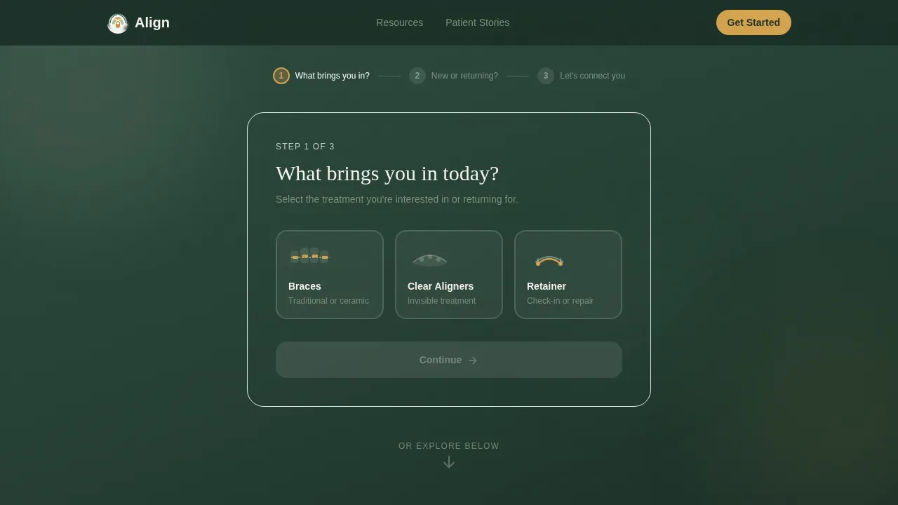
- A three-step animated intake form that qualifies visitors by treatment interest, patient status, and contact details, with an amber progress bar tracking each step
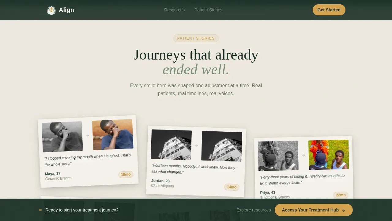
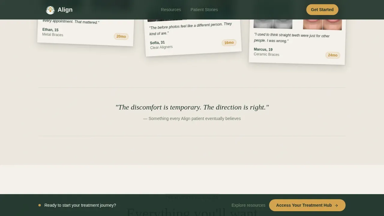
- A scrollable testimonial mosaic of polaroid-style patient cards, each showing a before-and-after smile, patient name and age, treatment duration, and a single authentic quote
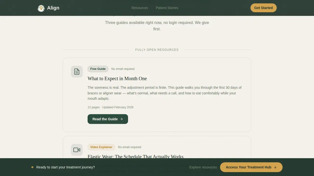
- Three fully ungated educational resource blocks covering what to expect in month one, elastic wear schedules, and a brushing-with-braces guide, followed by gated download prompts requiring only an email address
Feature list
This section describes the core built-in components that give the template its function and character.
Three-Step Animated Intake Form
The hero section opens with a guided form that moves like turning a page in a journal. Step one presents three illustrated tile choices: braces, clear aligners, or retainer check-in. Step two asks whether the visitor is a new or returning patient. Step three collects a name and preferred contact method. A thin amber progress bar stretches across the top of the form, making each step feel like forward motion rather than a hurdle.
Testimonial Mosaic with Parallax Scroll
Patient stories appear as a living wall of polaroid-style cards staggered at gentle angles. As the visitor scrolls, cards drift into view with subtle parallax movement. Each card carries a before-and-after image of a patient's smile, a first name and age, the number of months in treatment, and a single sentence in the patient's own voice. This format builds credibility without a carousel and keeps the scroll engine running naturally.
Ungated Resource Hub
Three educational resource blocks sit between testimonial clusters, each framed in birch white with lichen-gray borders. The blocks contain a downloadable guide on what to expect when treatment begins, a video explainer on elastic wear schedules, and an interactive brushing-with-braces reference. All three are fully readable before any gate appears, which signals to the visitor that this portal exists to help rather than to harvest contact details.
Gated Resource Downloads
After the ungated content, amber "Download This Guide" buttons unlock additional resources in exchange for an email address. The gate is light and contextual: it appears only after the visitor has already received value, making the request feel fair. Each button sits naturally within its resource block rather than interrupting the page flow.
Persistent "Access Your Treatment Hub" Bar
After the visitor crosses the first scroll depth threshold, a fixed bottom bar appears with the primary call to action. The bar stays visible as the visitor continues reading, creating a low-pressure but always-present path back to the form. It disappears on pages where it would overlap the form itself.
Forest Trust Color and Typography System
The page uses a four-color system built around deep evergreen, soft birch white, lichen gray, and warm amber. Fraunces handles all headings with organic serif warmth, while DM Sans keeps body copy and form fields clean and legible. The combination feels clinical enough to trust and organic enough to exhale.
Page sections overview
| Section | Purpose |
|---|---|
| Hero intake form | Qualify visitors by treatment need in three animated steps |
| Amber progress bar | Show form completion depth and reduce abandonment |
| Testimonial mosaic | Build trust through real patient stories and smile results |
| Ungated resource blocks | Deliver immediate value before any email gate appears |
| Gated download prompts | Collect email addresses after trust has been established |
| Persistent call to action bar | Keep the primary action visible throughout the scroll |
| Footer arc split | Display logo, tagline, and navigation links in a clean layout |
Design & branding system
The visual identity follows a Healing Space theme that pairs clinical structure with organic calm. Every color and type choice serves a specific emotional job on the page.
- The Forest Trust palette uses deep evergreen (#2D4A3E) as the primary background tone, soft birch white (#F5F1EB) for resource frames and breathing space, lichen gray (#A8B5A2) as a secondary tone for borders and captions, and warm amber (#D4A24E) reserved strictly for buttons, progress indicators, and active form states
- Fraunces sets headings with a warmth that feels personal rather than institutional, while DM Sans keeps all body copy and user interface elements clean and easy to scan
- Generous whitespace around every section creates breathing room, prevents the page from feeling crowded, and allows each content block to register fully before the next one arrives
Mobile & speed optimization
The template is built mobile-first, which reflects how most patients reach an orthodontic office today: on a phone, often between school and home or during a lunch break at work.
- The single-column flow stacks cleanly on every screen size without layout compromise, keeping the form, testimonials, and resource blocks fully functional on small displays
- Client-side components handle form state, scroll-triggered parallax, and the persistent bar, while static sections use server-rendered markup to keep the initial page load light
- Touch targets on the illustrated intake tiles are sized for thumb interaction, and the amber progress bar remains visible at the top of the viewport throughout the form steps
How this template helps you convert
The page earns the click by giving first. Every structural decision is designed to move a hesitant visitor toward becoming a scheduled patient without pressure tactics.
- The three-step form qualifies visitors immediately, routing braces candidates, clear aligner inquiries, and retainer check-ins down the correct path before the doctor's office even receives the request. This reduces back-and-forth and respects the patient's time.
- The ungated resource hub builds enough trust that the gated download prompt feels like a natural next step rather than a barrier. Visitors who complete the resource flow are already engaged, making them more likely to schedule appointments and complete their intake forms.
- The persistent bottom bar keeps the primary call to action available without interrupting the reading experience, so a visitor who needs more time to decide can still convert at the exact moment they feel ready.
Other information about this template
This section covers additional context that helps practices get the most from this template and understand how it fits into a broader digital presence.
- The align healing space orthodontist patient portal landing page template is categorized under Health and Medical and is designed specifically for the orthodontist patient portal niche, making it a focused starting point rather than a generic medical layout
- The American Association of Orthodontists recommends an orthodontic screening at age 7, and the template's illustrated tile system can serve children, teenagers, and adults equally without requiring separate pages for each audience
- Treatment times for orthodontics generally range from 18 to 30 months, and the testimonial cards are structured to surface treatment duration prominently so visitors can set realistic expectations before they even schedule a consultation
- Metal braces remain the best choice for complex rotations, ceramic braces offer the same control with less visual impact, and clear aligners provide flexibility for removal during meals; the intake form's tile selection is designed to reflect these distinct treatment options clearly from the very first interaction
- Many adults seek orthodontic treatment, and the template's calm, professional tone avoids the anxiety-inducing clinical aesthetic that often causes adults to delay the first visit for years
- The resource blocks can cover practical topics such as managing soreness after an adjustment, what to avoid eating, how alcohol-based mouthwash can affect appliance materials, brushing tips for upper and lower teeth with braces, and what to do in an emergency if a bracket breaks
- Practices can resolve common pre-appointment questions through the resource section, reducing repetitive calls to the office and freeing the care team to focus on in-person visits
- The page's clean, minimalist layout with ample whitespace helps to create a sense of breathing room that prevents overwhelming the user, which is particularly valuable for patients who already associate dental visits with discomfort or anxiety
- Patient portals that provide access to important documents and forms improve patient convenience and reduce paperwork at the desk, and this template's gated download system supports that workflow by collecting contact details alongside resource delivery
- Practices looking to promote their services across websites and social media will find the page structure easy to link to from any campaign, since the persistent call to action and ungated resources serve visitors arriving with varying levels of prior knowledge
Theme
Healing Space
Creative direction
Testimonial Mosaic
Color system
Forest Trust
Style
Single Column Flow
Direction
Content/Resource
Page Sections
Three-step Animated Intake Form
Polaroid-style Testimonial Mosaic
Ungated Educational Resource Hub
Gated Download Prompts
Persistent Treatment Hub Call to Action Bar
Forest Trust Visual Identity System
Related questions
Who is the Align template designed for?
Can I customize the intake form steps and resource content?
Does the template support both new and returning patients?
How does the page reduce anxiety for first-time visitors?
What does a visitor see after submitting the intake form?



