Provider Directory Landing page Template
A single-column landing page built for cosmetic dentist directories. It guides high-intent visitors from a confident headline and zip code search through a problem-aware narrative, a credential verification walkthrough, a live-searchable provider grid, and a step-by-step lead capture form. Every design choice reinforces clinical trust before asking for a single detail.
by Rocket studio
Quick summary
This landing page template is built for cosmetic dentist provider directories. It follows a Problem to Solution scroll arc, opening with a bold centered headline and zip code search bar, then walking visitors through real patient anxieties, a transparent verification process, a searchable provider grid, and a procedure-match lead capture form. The design system is clean, minimal, and clinically precise.
Who this template is for
This template is built for operators running a curated cosmetic dentistry directory. It suits founders, healthcare marketers, and patient-matching platforms targeting high-intent dental consumers in the United States.
- Directory founders who list verified cosmetic dentists by specialty, city, and patient review score
- Healthcare lead generation teams converting anxious searchers into matched patient appointments
- Patient-matching platforms serving brides-to-be, busy executives, and parents researching teen orthodontic options
What problem this template solves
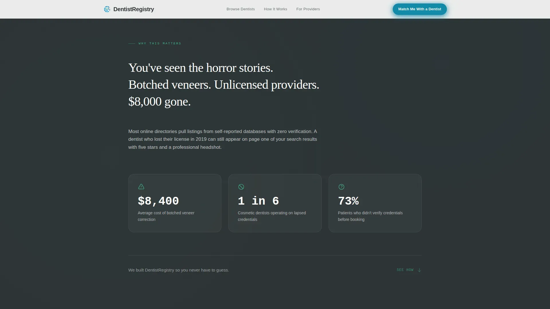
Patients searching for cosmetic dental care carry real anxiety. They have read about botched veneers, unlicensed providers, and thousands of dollars wasted. A generic directory page does nothing to address that fear. This template is built to name those anxieties out loud and immediately resolve them with a verified, structured path to a trusted provider.
- No visible trust signals means visitors leave before they ever search for a dentist
- Unguided browsing without a lead capture funnel wastes high-intent traffic
- A poor mobile experience loses the commuter who searches on a phone mid-day
What you get with this template
You get a complete single-column landing page with every section pre-structured for a cosmetic dentist directory. The layout handles both passive browsers and active lead submissions within the same scroll flow.
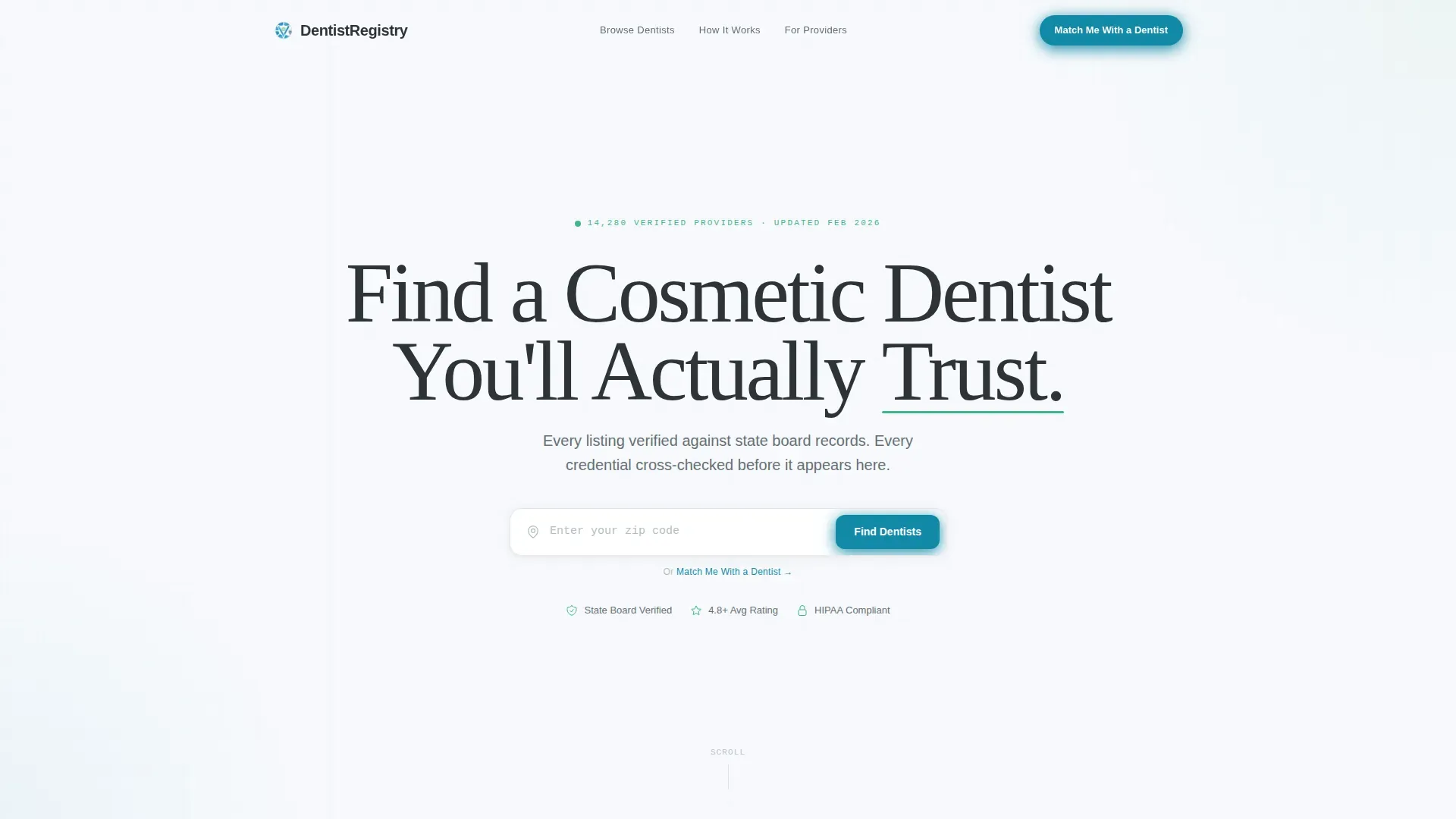
- A hero section with giant centered headline, mint-underlined trust word, and zip code search bar
- A live-searchable provider grid with headshot cards, star ratings, specialties, and distance display
- A multi-step lead capture form collecting zip code, procedure interest, insurance carrier, and email
Feature list
This template ships with six purpose-built sections, each designed to move a skeptical visitor closer to a booking.
Giant Headline Hero with Zip Code Search
The header opens on a stark glacial white viewport. A single oversized slate charcoal headline reads across the full width with a thin mint underline beneath the trust word. A search bar directly below accepts a zip code. The emptiness of the layout is intentional. It signals that this directory earns trust through verification, not visual noise.
Problem Arc Anxiety Section
A dedicated scroll segment names the real fears out loud. Botched veneers, unlicensed providers, and large out-of-pocket losses are stated plainly with supporting context. This section raises the cost of a wrong choice before the template pivots into the directory's solution. The contrast between the fear copy and the clean visual system makes the resolution feel earned.
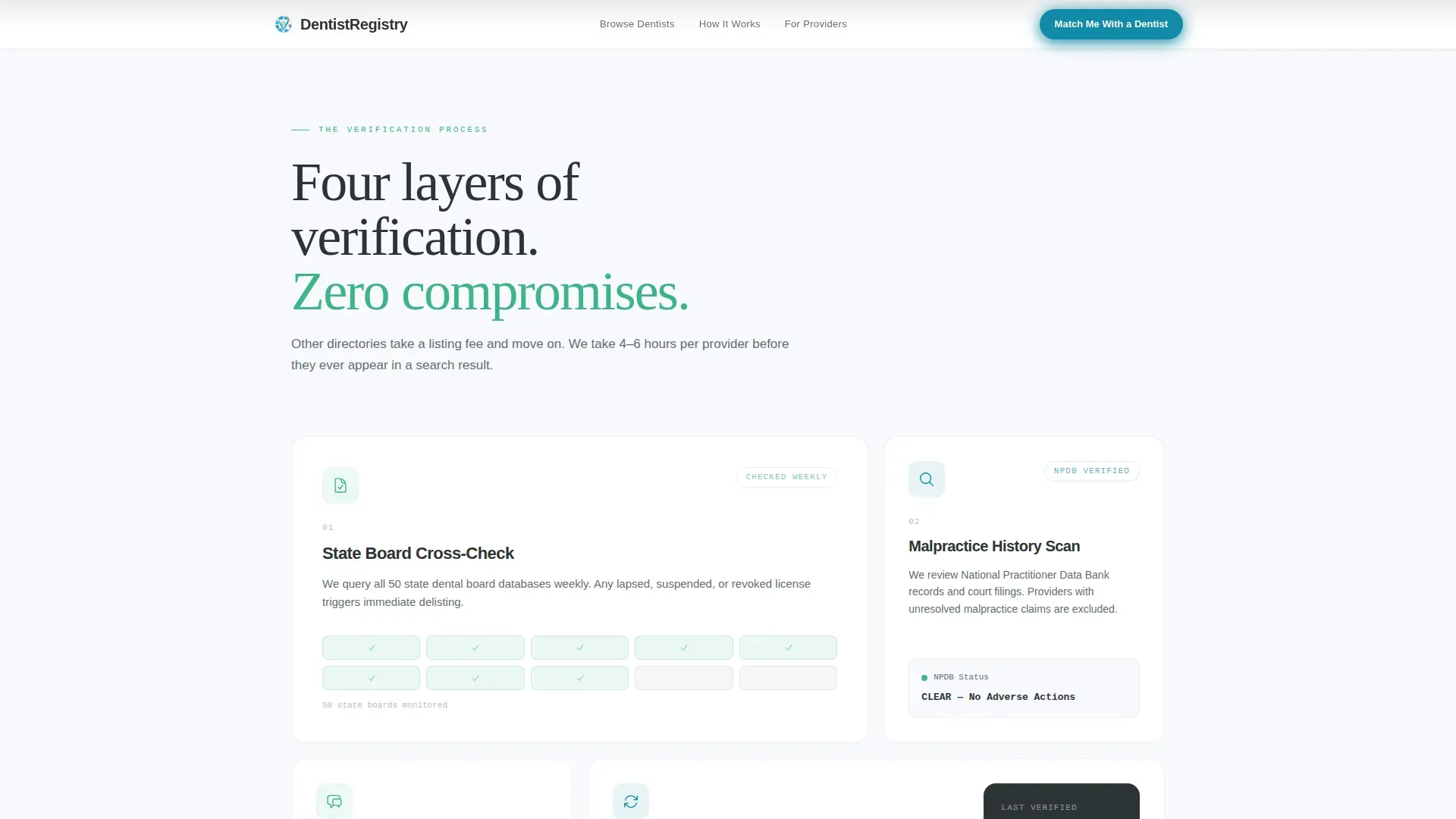
Credential Verification Walkthrough
A step-by-step asymmetric bento layout explains how every listed provider is cross-checked against state board records. Each step is displayed as a distinct block so visitors can follow the verification logic at a glance. Mint icons signal trust status at each stage. This section answers the "how do I know this is real?" question before visitors even reach the provider grid.
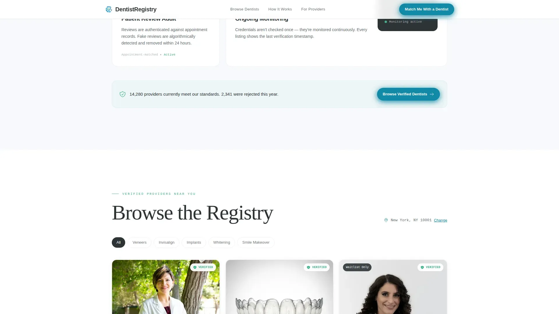
Live-Searchable Provider Grid
The provider grid is filterable by specialty, city, and patient review score. Each card shows a headshot, star rating, listed specialties, and calculated distance from the visitor's zip code. Every card includes a "Request This Dentist's Availability" button that opens a modal collecting name, phone number, and preferred appointment window. The grid supports scroll-reveal stagger animation on card entry.
Procedure-Match Lead Capture Form
The primary lead form follows a sequential funnel. Visitors enter zip code first, then select a procedure from a dropdown covering veneers, whitening, implants, Invisalign, and full smile makeovers. They then choose an insurance carrier and enter their email. This staged approach lowers friction by asking for low-commitment details before personal contact information.
Sticky Mobile Call to Action Bar
On mobile viewports, a sticky bottom bar keeps the primary call to action visible throughout the entire scroll. The bar uses the cerulean accent color and stays anchored as the user moves through the anxiety section, verification walkthrough, and provider grid. This ensures the lead path is never more than one tap away.
Page sections overview
| Section | Purpose |
|---|---|
| Hero Headline Search | Opens with bold headline and zip code search bar to capture immediate intent |
| Problem Arc Block | Names patient anxieties about botched procedures and unlicensed providers explicitly |
| Verification Process Steps | Walks through state board credential cross-check logic step by step |
| Provider Card Grid | Displays searchable, filterable dentist listings with ratings and specialties |
| Lead Capture Form | Collects zip code, procedure interest, insurance carrier, and email in sequence |
| Single-Row Footer | Closes with minimal linear footer row |
Design & branding system
The visual identity follows a Corporate Precision theme built on the Alpine Fresh color system. The palette is described in the brief as feeling like a freshly unwrapped dental instrument: cool, sterile, and reassuringly modern. Every color has a single assigned role.
- Glacial white (#F7F9FC) dominates all backgrounds; clinical mint (#3EB489) marks trust badges and verification icons; slate charcoal (#2D3436) carries all body text
- Cerulean (#1289A7) is reserved for buttons, interactive highlights, and the sticky mobile call to action bar
- Typography pairs DM Sans for headlines with IBM Plex Mono for data fields and credential display text
Mobile & speed optimization
This template is built mobile-first. The brief explicitly targets users who search on a phone mid-commute or while already sitting in a waiting room. Every interactive element is sized and positioned for thumb reach.
- The sticky cerulean bottom bar keeps the primary call to action visible on all scroll positions on mobile
- Scroll-reveal animations and staggered card entry are set to medium intensity so motion stays smooth without interrupting the browsing flow
- Static layout sections use server-rendered components while the search bar, filter tabs, and availability request modals use client-side interactivity
How this template helps you convert
The entire scroll arc is engineered to convert a cautious visitor into a submitted lead or a booked availability request. Fear is named early, resolved visually, and followed by a frictionless capture path.
- The Problem to Solution Arc raises the emotional stakes of choosing the wrong dentist before showing how this directory solves it, making the lead form feel like relief rather than friction
- The multi-step lead form reduces drop-off by asking for zip code first, the least personal detail, before requesting email, the highest-commitment field
- Every provider card carries its own "Request This Dentist's Availability" button, creating a secondary conversion path for visitors who prefer to browse before committing to the main form
Other information about this template
This template is built for the United States market. All localization defaults follow US conventions including zip codes, USD pricing references, state board terminology, and MM/DD/YYYY date formatting. Credential timestamps shown on provider cards use US state board language.
- The template style is Single Column Flow, which keeps the entire narrative linear and avoids the decision paralysis of a multi-column layout
- The creative direction is a Problem to Solution Arc, meaning each scroll segment builds on the last and the lead form arrives at the point of highest emotional readiness
- The header concept is Giant Headline Centered, a deliberate choice to let the typography carry full authority without supporting imagery
Theme
Corporate Precision
Creative direction
Problem→Solution Arc
Color system
Alpine Fresh
Style
Single Column Flow
Direction
Lead Generation
Page Sections
Giant Headline Hero with Zip Code Search
Problem Arc Anxiety Section
Credential Verification Walkthrough
Live-searchable Provider Grid
Multi-step Lead Capture Form
Sticky Mobile Call to Action Bar
Related questions
What types of cosmetic dental procedures does the directory support?
Can visitors browse the directory without submitting the lead form?
How does the template show visitors that listed dentists are verified?
Is this template suited for mobile users?
What does the lead capture form collect from visitors?



