Pediatric Dentist Directory Landing Page Template
Smile is a pediatric dentist provider directory landing page built for anxious parents who need to find a gentle, trustworthy dentist for their child. The zigzag layout walks visitors through four calm steps, from zip code search to booking a first visit, using a soft Arctic White palette and a scheduling modal that keeps commitment feeling light.
by Rocket studio
Quick summary
Smile is a single-page pediatric dentist directory designed around one goal: helping worried parents find the right dentist and book a first visit with as little stress as possible. The alternating layout, calming color system, and step-by-step scroll guide a parent from midnight panic to a confirmed appointment in four clear, unhurried sections.
Who this template is for
This template is made for anyone building a parent-facing pediatric dental directory. It fits teams that want to lead with trust and emotion rather than a raw list of clinic names.
- Parents of young children, especially those facing a first dental visit or an anxious child
- Healthcare directory founders matching families with child-friendly dental providers
- Caregivers navigating special-needs dental care who need clear, filtered results
What problem this template solves
Most dental directory pages feel clinical and cold. They treat a parent searching at midnight the same way they treat a business buyer comparing vendors. Smile is built differently.
- Parents feel overwhelmed and emotionally charged when searching for a pediatric dentist
- Standard directories offer no reassurance, no filters for sedation or accessibility, and no parent context
- First-time dental visits shape a child's relationship with dental care for life, so the stakes feel personal
What you get with this template
The template delivers a full single-page directory experience, from hero search bar to sticky booking bar. Every section has a specific role in moving a hesitant parent toward action.
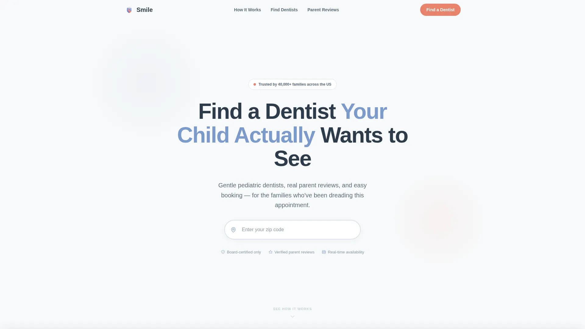
- A giant centered hero headline with a zip code search bar and soft whitespace
- Four numbered step sections in an alternating zigzag layout, each with its own background color
- A lightweight booking modal and a "Save This Dentist" email flow for parents who are not ready yet
Feature list
This template ships with purpose-built components tied directly to the pediatric dentistry use case. Each one addresses a specific moment in the parent journey.
Zip Code Search Bar
The hero section opens with a single-line search bar carrying a location pin icon and "Enter your zip code" placeholder text. It floats on a field of arctic white with a faint cloud-gray shadow, keeping the first interaction calm and simple.
Zigzag Provider Cards
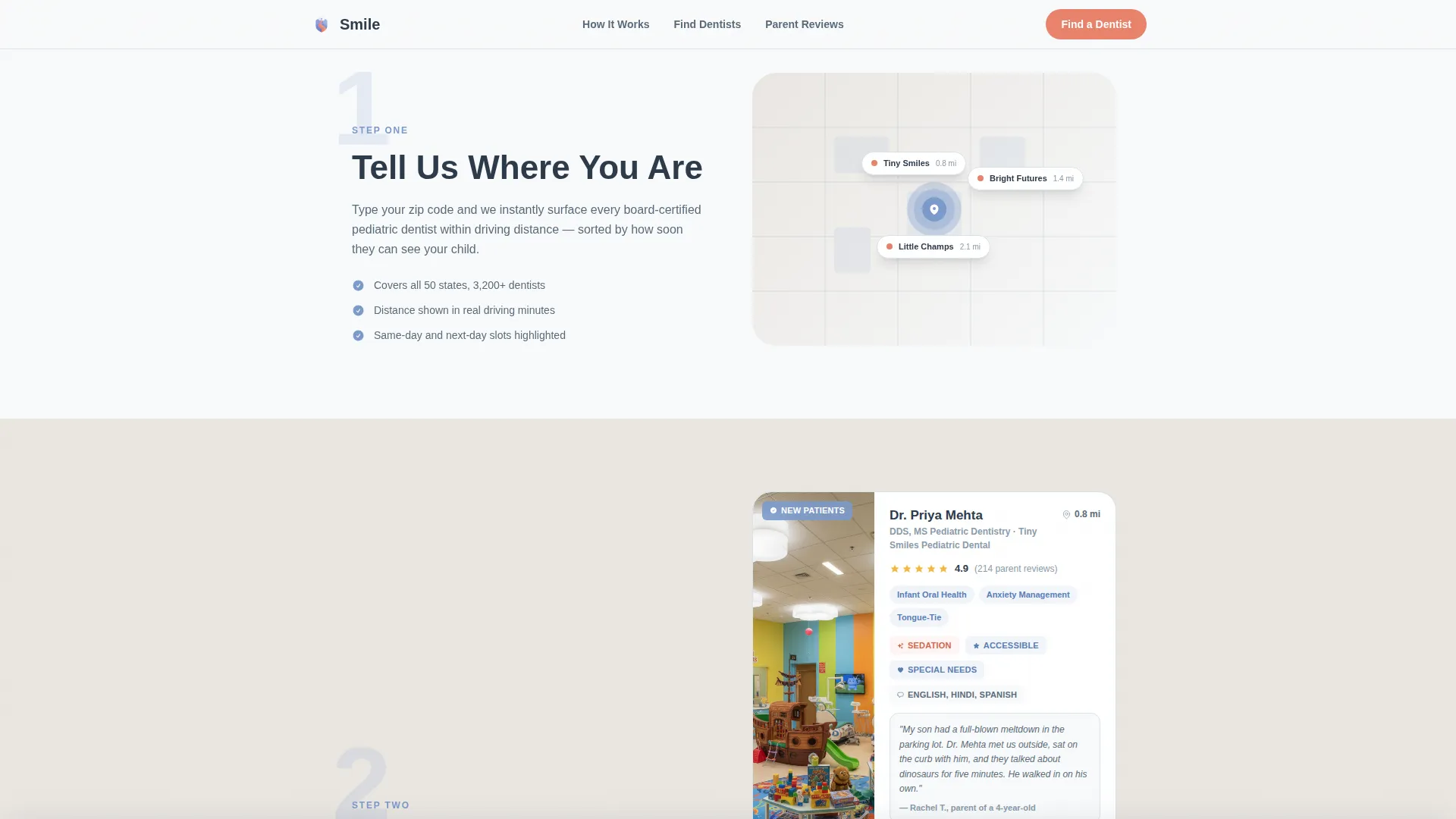
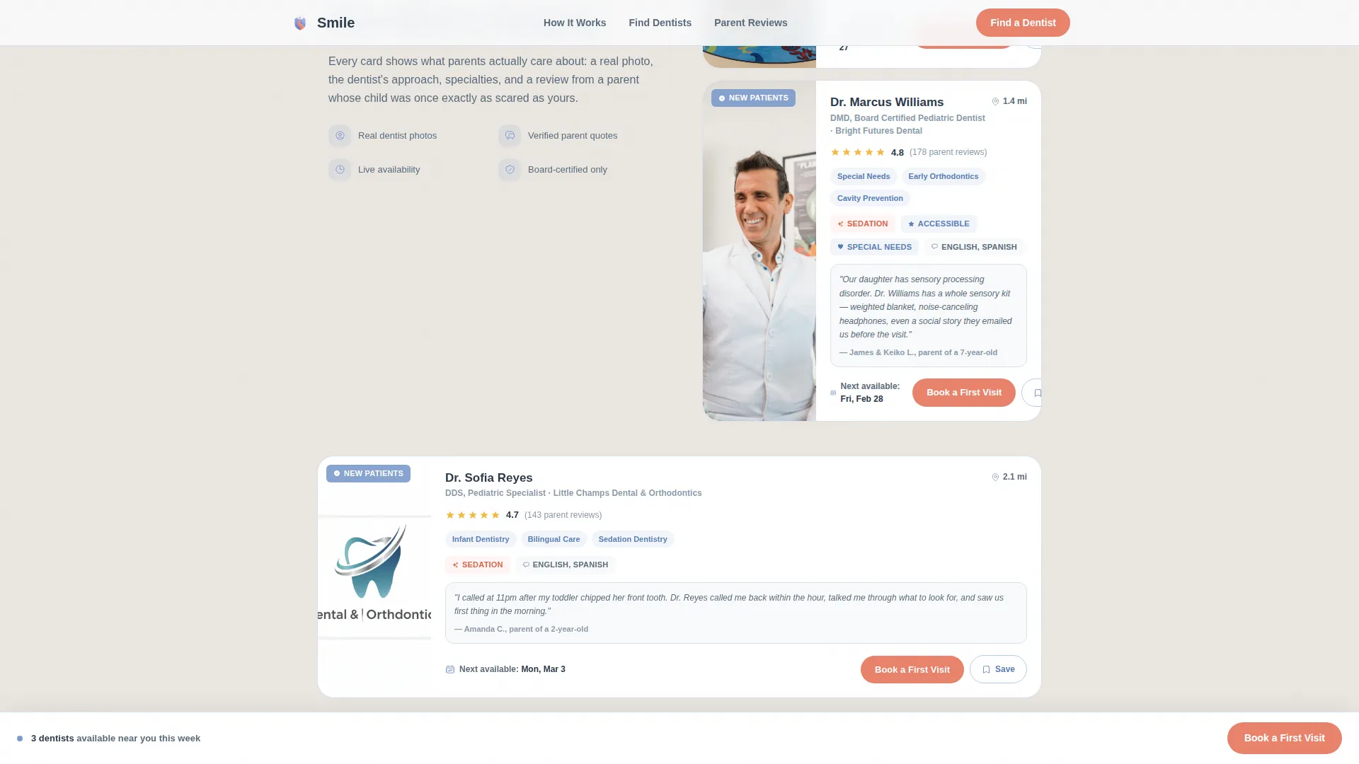
Step two displays provider cards in an alternating left-right layout. Each card includes a dentist photo, listed specialties, and a snippet from a real parent review, giving parents enough context to feel a connection before clicking.
Advanced Filter Panel
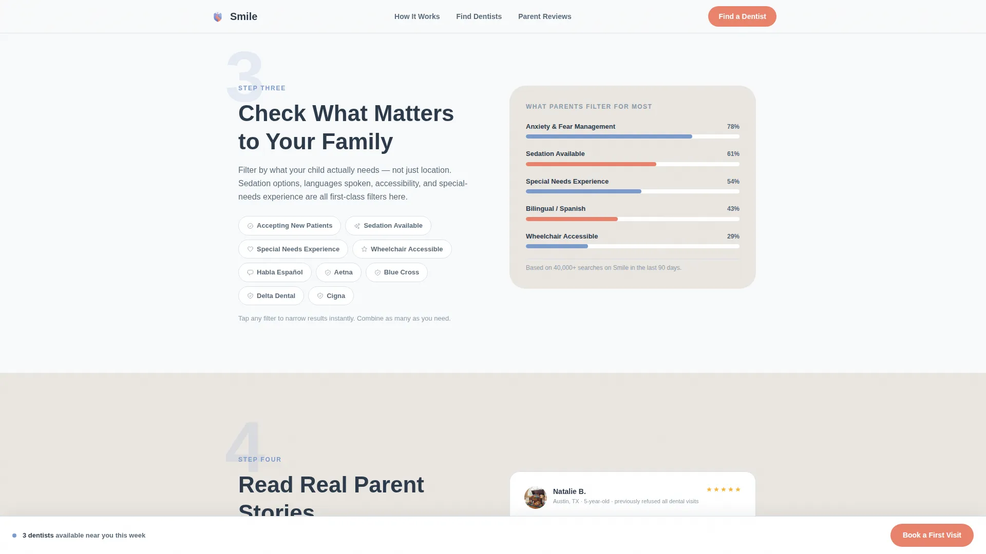
Step three surfaces filters for insurance compatibility, accessibility badges, sedation options, and languages spoken. Parents can narrow results to what actually matters for their child without guessing.
Booking Scheduling Modal
Each provider card carries a "Book a First Visit" button in soft coral. Tapping it opens a modal asking for the child's first name, age via dropdown, a preferred date range via calendar picker, and an optional insurance provider field.
Save Dentist Email Flow
A secondary path labeled "Not Sure Yet? Save This Dentist" lets hesitant parents bookmark a profile with a single email field. It removes the pressure of committing on the first visit to the page.
Sticky Booking Bar
After a visitor scrolls past the search results section, a sticky bottom bar carrying the "Book a First Visit" call to action stays visible. It ensures the conversion path is always within reach without interrupting the reading flow.
Page sections overview
| Section | Purpose |
|---|---|
| Hero Search Bar | Entry point with headline and zip code input |
| Step 1: Location Entry | Animated map with zip code prompt |
| Step 2: Provider Cards | Zigzag cards with photos and reviews |
| Step 3: Filter Panel | Insurance, sedation, and accessibility filters |
| Step 4: Parent Stories | Testimonials with child-age context |
| Sticky Booking Bar | Persistent call-to-action after scroll |
| Footer | Minimal horizontal flow navigation |
Design & branding system
The visual identity follows a Healing Space theme built on an Arctic White color system. Every color choice has a deliberate job: clinical trust, emotional warmth, or clear interaction signal.
- Backgrounds alternate between clinical snow (#F8FAFB) and warm cloud (#EAE6E1) across sections, creating a gentle visual rhythm
- Calming periwinkle (#7B9ACC) anchors section headings, oversized step numerals, and iconography throughout the page
- Soft coral (#E8836B) appears exclusively on buttons and trust signals, making every interactive element feel like a gentle nudge
Mobile & speed optimization
This template is built mobile-first, because the parents it serves are most often searching on a phone, late at night, under stress. The layout responds cleanly to small screens.
- The zigzag alternating layout collapses into a single-column stack on mobile without losing the step-by-step reading rhythm
- Server Components handle static sections for a fast initial load, while Client Components power the booking modal, filter chips, and save flow
- Soft animations including fade-ins, staggered card reveals, a gentle map pulse, and scroll-linked number reveals are tuned to feel calm rather than distracting
How this template helps you convert
The conversion strategy in this template is built around reducing emotional friction before asking for anything. Parents need to trust before they tap.
- Social proof arrives early: star ratings, review counts, parent testimonials with child-age context, and trust badges all appear before the booking prompt, lowering the emotional cost of commitment.
- The booking modal keeps its ask small: only a child's first name, age, preferred date range, and an optional insurance field, so the form never feels like a survey.
- The sticky booking bar and the "Save This Dentist" path serve two different parent mindsets at once, capturing both the ready-to-book visitor and the one who needs more time.
Other information about this template
This template is a strong starting point for any pediatric dental directory project that wants to lead with empathy and clarity. A few additional details worth noting:
- Typography uses Plus Jakarta Sans, a rounded and weighted sans-serif that feels approachable while still reading as professional and credible
- The footer follows a minimal horizontal flow pattern, keeping the exit experience as clean as the entry
- The step-by-step creative direction means each section number is revealed with a scroll-linked animation, reinforcing the sense of guided progress
- The template supports English-language content, United States zip codes, United States date format, and pricing in US dollars
Theme
Healing Space
Creative direction
Step-by-Step Guide
Color system
Arctic White
Style
Zigzag/Alternating
Direction
Booking/Scheduling
Page Sections
Zip Code Search Bar
Zigzag Provider Cards
Advanced Filter Panel
Booking Scheduling Modal
Save Dentist Email Flow
Sticky Booking Bar
Related questions
Who is this landing page template designed for?
Can I customize the filters in the Check What Matters section?
What does the booking modal collect from parents?
Does the template include a way to save a provider without booking?
What color system and typography does this template use?



