Veneer Services Landing page Template
A hub and spoke landing page built for cosmetic dentists who want to turn website visitors into booked veneer consultations. The page guides prospective patients through every phase of the smile journey, from digital mockup to polished results, using clinical photography, before and after grids, video testimonials, and a trust-first flow that ends with a single, low-friction call to action click.
by Rocket studio
Quick summary
This landing page template is built for cosmetic dental practices focused on porcelain veneer patient acquisition. It takes visitors through a structured five-phase journey, consultation, treatment, recovery, results, and reviews, using anchored navigation, scroll-triggered reveals, and a sticky call to action bar. The design feels clinical, calm, and confident before a single word is read.
Who this template is for
This template suits cosmetic dentists and smile-focused practices that want a patient acquisition page with emotional depth and clinical credibility. It works best for practices whose primary service is porcelain veneers or smile makeovers.
- Cosmetic dentists targeting adults who have avoided smiling for years
- Practices serving brides, executives, and patients finally ready to act
- Dental teams that want to show the full patient journey before asking for a booking
What problem this template solves
Most dental websites ask for a booking before they've earned one. Prospective veneer patients are anxious, skeptical, and often embarrassed. They need to understand the process, see real outcomes, and feel calm before they consider clicking a button.
- Visitors leave early because they don't understand what the veneer process involves
- Before and after results feel untrustworthy without clinical context
- Generic contact forms interrupt the decision-making moment before trust is built
What you get with this template
You get a fully structured, single-page patient journey with six distinct hub sections, each mapped to one phase of the cosmetic dental experience. Every section escalates emotional proof and clinical confidence in sequence.
- A towering serif hero with ghosted patient imagery and a five-link anchor navigation bar
- Five scroll-anchored hub sections covering consultation through reviews, each with its own visual treatment
- A sticky "See If You're a Candidate" call to action bar and a post-results eligibility quiz flow
Feature list
This template is built around a small set of purposeful, high-impact components that work together to move a hesitant visitor toward action.
Stacked Type Hero with Anchor Navigation
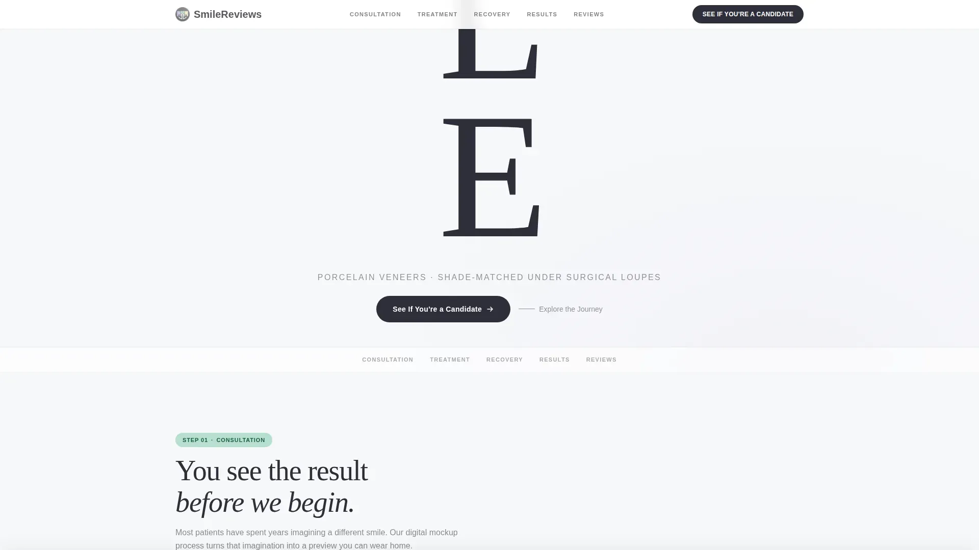
The hero displays the word SMILE in an ultra-light towering serif, one letter per line, filling the viewport vertically. A faint ghosted patient photo sits behind the letterforms at low opacity. A thin anchor navigation bar pins to the top on scroll, linking directly to Consultation, Treatment, Recovery, Results, and Reviews.
Before and After Swipe Grid
The Results section features a full-width grid of patient transformation images. Visitors drag a slider to reveal the before state against the after state. The interaction is built for desktop-first use and scales cleanly on smaller screens.
Scroll-Triggered Section Reveals
Each hub section animates into view as the visitor scrolls using GSAP ScrollTrigger. Cards, images, and text blocks enter the frame progressively, giving the page a sense of paced, deliberate storytelling rather than a wall of content.
Day-by-Day Recovery Timeline
The Recovery section presents a horizontal-scroll timeline that sets realistic expectations for the post-treatment period. It is non-numbered and designed to feel reassuring rather than clinical, helping patients understand what to expect day by day.
Sticky Call to Action Bar
Once a visitor scrolls past the Treatment hub, a sticky bottom bar activates with the primary call to action: "See If You're a Candidate." The bar persists as the visitor continues reading, making the next step visible without interrupting the content flow.
Video Testimonials and Google Ratings
The Reviews section closes the page with video testimonial blocks and starred Google rating displays. Patient quote cards sit on warm enamel backgrounds, grounding the social proof in real voices before the final call to action appears.
Page sections overview
| Section | Purpose |
|---|---|
| Hero Type Tower | Set tone, introduce anchor navigation |
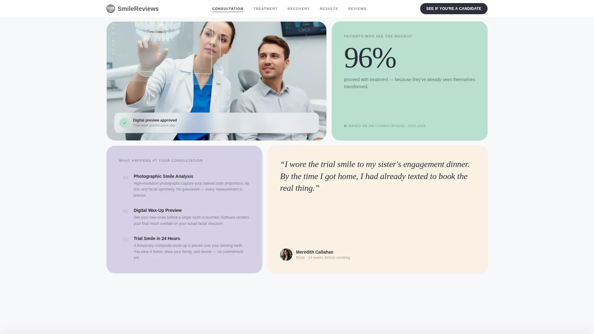
| Consultation Hub | Show digital smile mockup process |
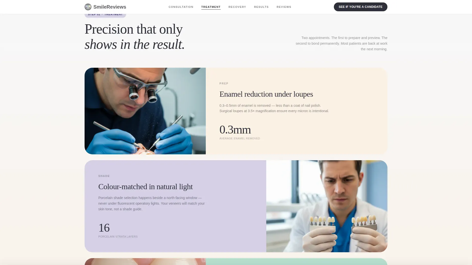
| Treatment Hub | Walk through veneer prep and bonding |
| Recovery Timeline | Set day-by-day patient expectations |
| Results Grid | Display before and after transformations |
| Reviews Hub | Deliver video testimonials and ratings |
Design & branding system
The visual identity follows a Medical Clarity theme. Every color and type choice signals hygiene, precision, and calm, the same feeling a well-lit treatment room gives a patient before they sit down.
- Color palette: clinical white (#F7F8FA), sterilized lilac (#D5D0E5), breath-mint green (#B8DFD0), warm enamel (#FAF0E4) for patient story cards, and charcoal (#2E2E38) for all body text
- Typography: Fraunces ultra-light serif for the hero display and DM Sans for all body copy, creating a clear contrast between emotional and informational text
- No stock imagery or lab coats, the hero relies entirely on confident typography with ghosted patient photography behind the letterforms
Mobile & speed optimization
The template is designed desktop-first to match the Zoom executive persona at the core of the target audience. It is fully responsive and adapts cleanly to smaller viewports.
- Interactive components such as the before and after slider and the sticky call to action bar are built as client-side elements, keeping static sections lean
- The horizontal recovery timeline and anchor navigation scroll spy are touch-friendly and function correctly on mobile devices
How this template helps you convert
The page is structured so that trust and desire build gradually before any commitment is requested. The call to action does not appear until the visitor has moved through four sections of proof.
- The anchor navigation and sequential hub structure guide visitors through consultation, treatment, recovery, and results before the primary call to action activates, reducing drop-off from uncertainty.
- Clicking "See If You're a Candidate" routes to a short three-question eligibility quiz covering dental health, desired outcome, and preferred timeline, followed by a booking calendar, removing form friction from the landing page itself.
Other information about this template
This template is a strong fit for practices that want a content-rich patient acquisition page without a traditional inquiry form on the page. The eligibility quiz flow keeps the commitment threshold low while still qualifying leads before the calendar appears.
- The footer uses a horizontal layout pattern suited to minimal branding elements and quick links
- Patient quote cards use the warm enamel (#FAF0E4) background to visually separate social proof from clinical content sections
- The template is localized for English (US) audiences with United States date formats and USD pricing context in mind
- Parallax ghost images in the hero are set at roughly fifteen percent opacity, keeping the focus on typography while still evoking real patient outcomes

Theme
Medical Clarity
Creative direction
Step-by-Step Guide
Color system
Soft Mist
Style
Hub & Spoke (Anchor Nav)
Direction
Click-Through
Page Sections
Stacked Type Hero with Anchor Nav
Before and After Swipe Grid
Scroll-triggered Section Reveals
Horizontal Recovery Timeline
Sticky Candidate Call to Action Bar
Video Testimonials and Rated Reviews
Related questions
Does this template include a contact form on the page?
Can this template be adapted for cosmetic dental services beyond veneers?
How does the before and after swipe slider work?
When does the sticky call to action bar become visible?
What kind of social proof does this template support?



