Iceland Travel Booking Website Template
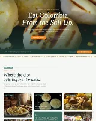
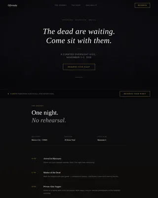
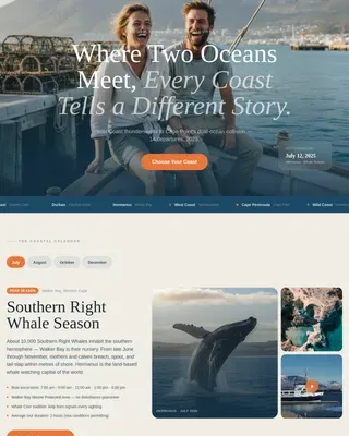
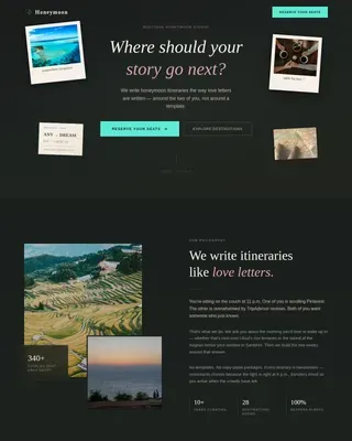
Smjr is an immersive culinary landing page built for Iceland food and travel experiences. It uses a masonry grid organized by season, a panoramic hero image, and a direct booking flow with inline payment. The Neo-Retro Ocean Calm palette and moment-driven card design make the page feel less like a brochure and more like a well-loved cookbook.
by Rocket studio
Quick summary
Smjr is a single-page culinary tour template built for Iceland food experiences. It leads with forty-plus masonry cards organized by season, each showing one dish, one place, and one moment. A booking rail pinned to the right edge lets visitors reserve a seat or buy a gift voucher once the food has already sold them.
Who this template is for
This template is built for operators who sell high-end culinary travel in Iceland. It suits small-group tour companies, chef-led experience brands, and independent food travel hosts who want to present their offering with visual depth and sell directly from the page.
- Food tour operators running seasonal Iceland departures
- Chef-led tasting and foraging experience hosts
- Independent culinary travel designers selling small-group trips
What problem this template solves
Most tour pages lead with logistics. Guests see prices and itinerary tables before they feel anything. Smjr flips that order. It earns trust through atmosphere and storytelling first, then presents the booking option after the visitor is already invested.
- Visitors leave tour pages before connecting emotionally with the experience
- Price-first layouts create sticker shock before value is established
- Generic grid layouts cannot convey the texture of a place-specific culinary journey
What you get with this template
You get a fully structured single-page layout with every visual section and interactive component already in place. The template is ready to receive your images, copy, pricing, and departure dates without rebuilding the layout from scratch.
- A panoramic Neo-Retro hero section with animated seasonal departure ribbon
- A masonry grid of moment-driven cards organized by Iceland's summer and winter seasons
- An inline booking form with departure selector, guest stepper, dietary field, and card payment integration via Stripe
- A gift voucher path labeled "Give the Island" for non-traveling buyers
Feature list
A short overview of what drives this template's visual and functional performance.
Panoramic Seasonal Hero
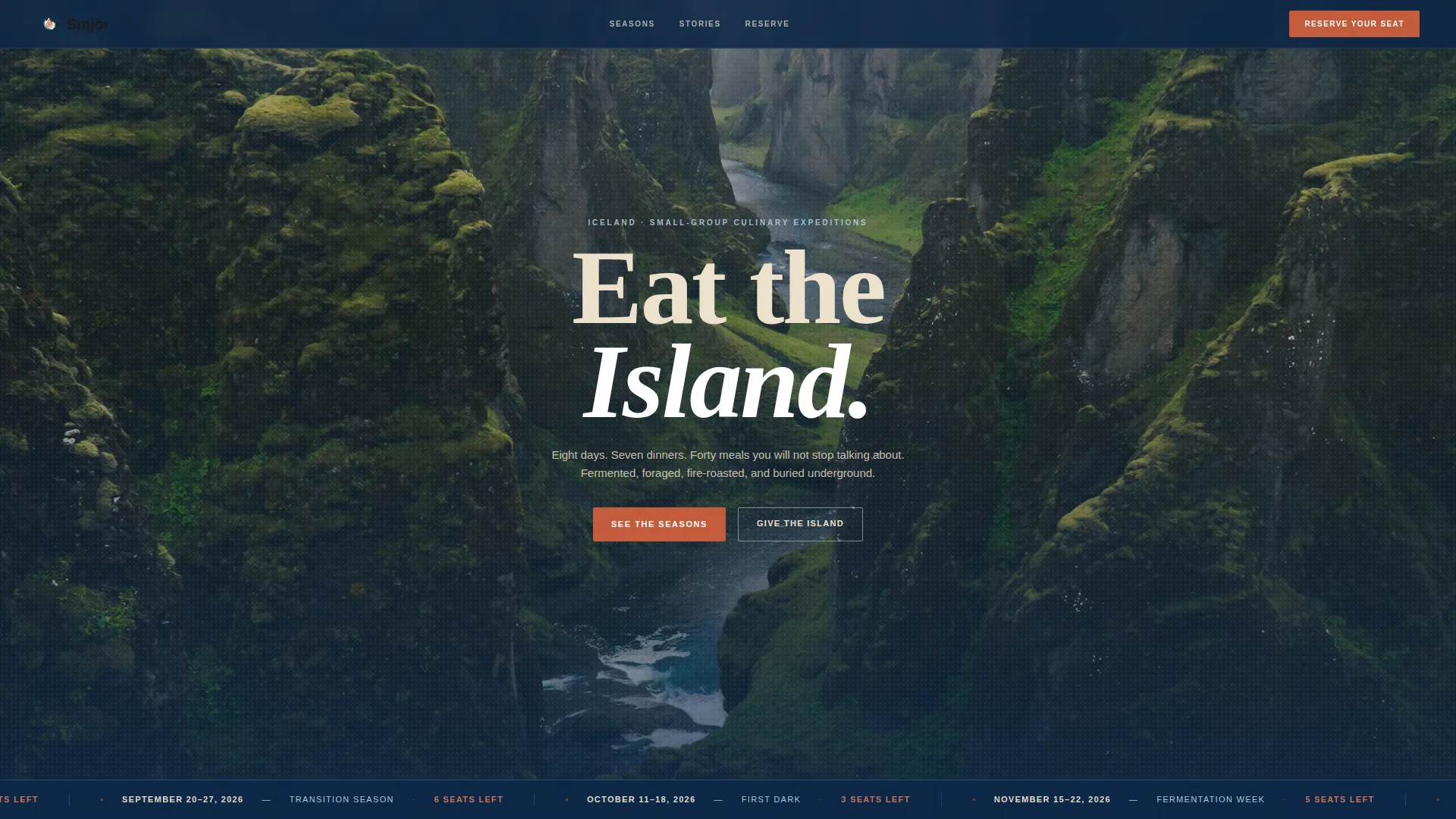
The header stretches edge to edge with a single unbroken horizon shot. A condensed serif headline reads "Eat the Island" across the sky. A thin animated ribbon below the fold scrolls seasonal departure dates like a flight departures board, setting the tone before the visitor reads a word.
Masonry Moment Grid
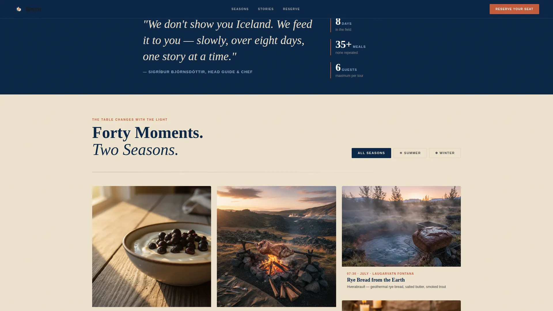
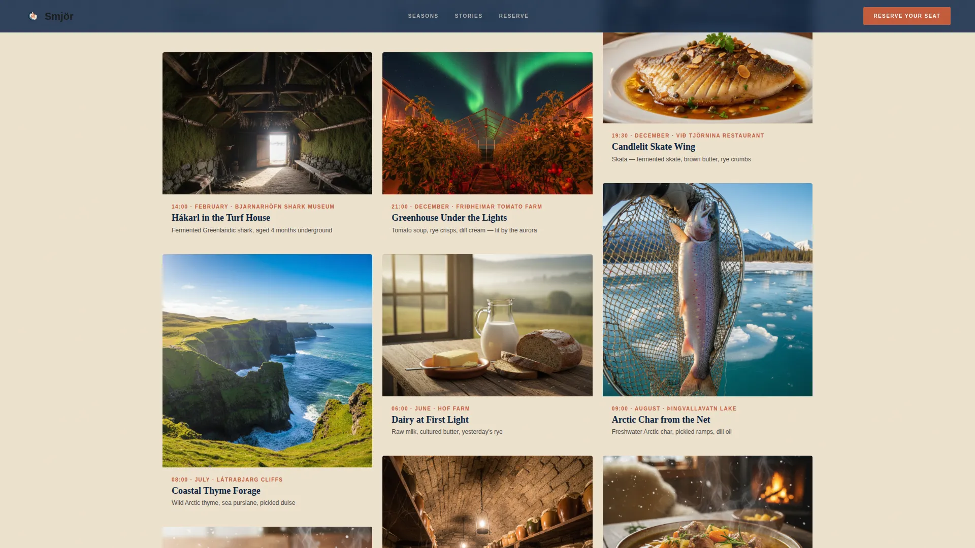
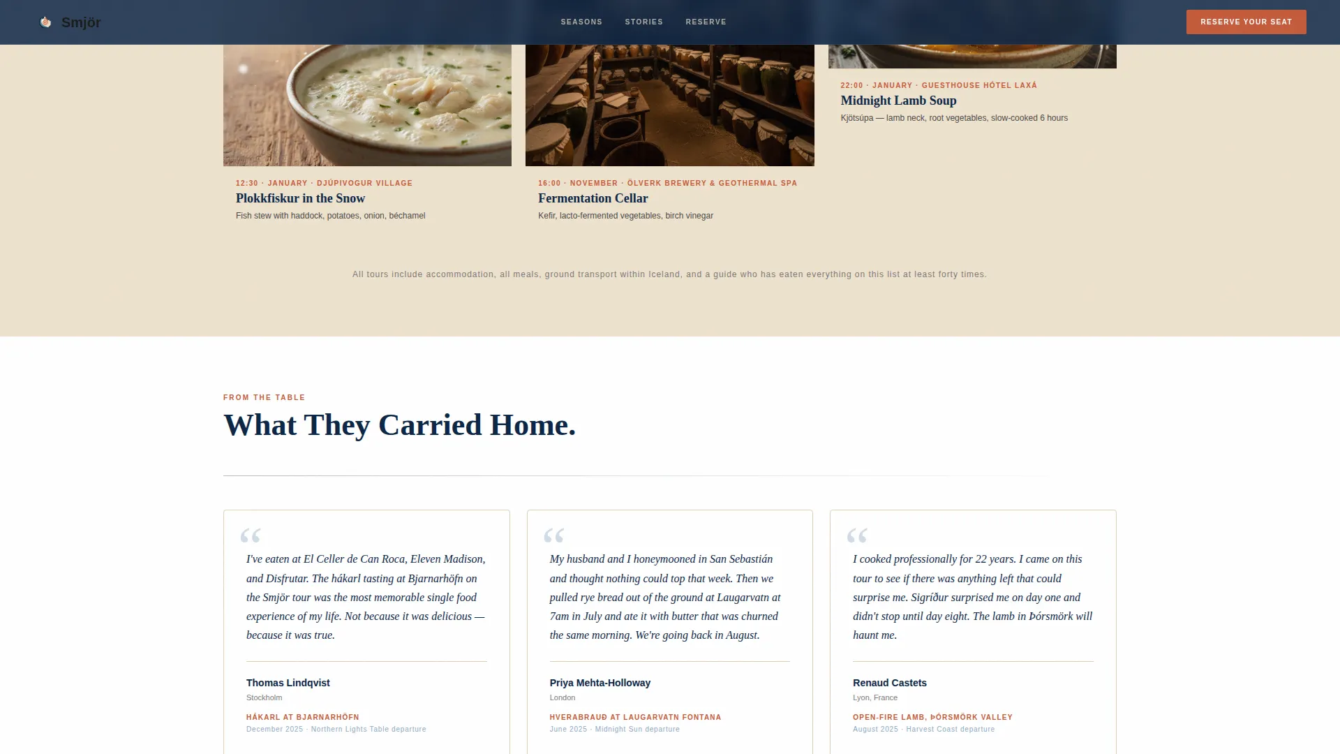
The page body is a masonry grid that organizes the tour by Iceland's extreme seasons rather than by itinerary day. Each card captures one dish, one location, and one time of day. Hovering a card reveals a short backstory in a cream-colored overlay, so the story arrives only when the visitor asks for it.
Inline Direct Booking Rail
A booking rail is pinned to the right edge of the page. Each seasonal departure card shows its price directly, with no click-to-reveal step. Clicking "Reserve Your Seat" opens a slim inline form with a pre-selected departure date, a guest count stepper from one to six, a free-text dietary field, and a card payment field.
Gift Voucher Path
A secondary conversion path labeled "Give the Island" lets buyers purchase a gift voucher without booking a departure for themselves. This expands the addressable audience to include friends, family members, and corporate gifters browsing on behalf of a traveler.
Neo-Retro Ocean Calm Visual System
The color palette draws from deep North Atlantic navy, glacial meltwater blue, smoked cream, and a hot geothermal accent. Typography uses a condensed serif that references 1960s Icelandic tourism print. Every color has a structural role: navy anchors the header and footer, meltwater blue marks section dividers, smoked cream warms the card backgrounds, and geothermal orange fires only on buttons, price tags, and hover states.
Hover-Reveal Card Storytelling
Each masonry card carries a hidden backstory that appears as a cream overlay on hover. This keeps the visual grid clean while rewarding curious visitors with context. The reveal mechanic turns passive scrolling into active discovery, which keeps attention on the page longer before the booking prompt appears.
Page sections overview
| Section | Purpose |
|---|---|
| Panoramic Hero Header | Sets atmosphere with full-width landscape image and headline |
| Animated Departure Ribbon | Scrolls seasonal tour dates in a departures-board style |
| Summer Season Cards | Shows midnight-sun dairy, foraging, and open-fire feast moments |
| Winter Season Cards | Shows fermentation cellars, snow-village dishes, and greenhouse chef's table |
| Pinned Booking Rail | Persistent right-edge booking form with price and guest controls |
| Gift Voucher Section | Secondary path for buyers purchasing on behalf of a traveler |
Design & branding system
The template uses an Ocean Calm palette built from four mineral tones that reference 1960s Icelandic print design. The result feels muted and dramatic without ever becoming cold or clinical.
- Deep North Atlantic navy (#0B2545) anchors the header and footer for structural weight
- Glacial meltwater blue (#8DA9C4) washes section dividers with a quiet northern light
- Smoked cream (#EEE2CE) gives masonry card backgrounds a parchment warmth
- Hot geothermal accent (#C45B3A) fires on buttons, price tags, and hover states only
Mobile & speed optimization
The masonry layout and large hero image are designed with responsive reflow in mind. Cards stack cleanly on smaller screens so the seasonal moment structure remains readable without horizontal scrolling.
- The masonry grid reflows into a single-column stack on narrow viewports
- The pinned booking rail collapses into a fixed bottom bar on mobile for easy thumb access
How this template helps you convert
The page is structured to build desire before presenting a price. Every layout decision delays the ask until the visitor has already formed an emotional connection with the experience.
- The masonry grid puts forty-plus food moments in front of the visitor before the booking rail becomes prominent, letting appetite do the persuasion work.
- Prices appear directly on each departure card with no extra clicks required, so when a visitor is ready to act, the path from interest to payment is as short as possible.
Other information about this template
This template is built for the Iceland food and culinary tour market and pairs naturally with direct-sales tour brands that rely on visual storytelling rather than travel agency listings.
- The template style is Masonry/Pinterest, suited to experience-rich offerings with many visual moments to share
- The creative direction is Seasonal/Moment, meaning the grid narrative follows Iceland's extreme light calendar rather than a linear itinerary
- The landing page direction is Direct Sales, with no external checkout redirect
- The header concept is Panoramic/Wide, optimized for full-bleed landscape photography
- The theme is Neo-Retro, combining condensed serif typography with a mineral color system inspired by vintage Icelandic print
Theme
Neo-Retro
Creative direction
Seasonal/Moment
Color system
Ocean Calm
Style
Masonry/Pinterest
Direction
Direct Sales
Page Sections
Panoramic Neo-retro Hero Section
Seasonal Masonry Moment Grid
Inline Direct Booking Rail
Gift Voucher Conversion Path
Ocean Calm Color System
Related questions
Can I change the departure dates shown in the animated ribbon?
Does the booking form support group sizes larger than six guests?
Can I use this template for a culinary tour outside Iceland?
Is the gift voucher path a separate page?