Geometric Resistance Bands Gallery Landing Page Template
Snap is a gallery-plus-detail landing page template built for resistance band and workout gear dropshipping stores. It uses moment-driven storytelling, a draggable Before/After hero slider, shoppable life-moment gallery grids, animated progress rings, and a slide-in product detail panel to move visitors from inspiration directly to checkout with a single coral "Grab Your Set" call to action.
by Rocket studio
Quick summary
Snap is a single-page, gallery-plus-detail landing page template designed for resistance band and workout gear dropshipping stores. It pairs a draggable Before/After hero slider with three shoppable moment galleries, animated progress rings, and a right-side product detail panel. Every section of the canvas funnels toward one direct-to-checkout call to action, removing friction between discovery and purchase.
Who this template is for
This template is built for store owners who sell resistance bands, workout accessories, and home fitness gear through a dropshipping model. It works especially well when your customers are real people living real lives, not competitive athletes training in fully equipped facilities.
- Dropshipping store owners selling resistance bands, grip-handle sets, ankle straps, and bundled workout kits to apartment-dwelling buyers.
- Fitness brand founders targeting remote workers, new parents rebuilding strength, and ex-gym members who prefer training at home.
- Independent sellers who want a visually rich, story-led product page without hiring a custom development team or creative agency.
What problem this template solves
Most fitness product pages show a band on a white background and list a weight rating. That approach asks the visitor to do all the imaginative work. Snap does the opposite. It places the product inside specific life moments the target buyer already recognizes, then makes those moments shoppable.
- Visitors scroll past standard product listings without connecting emotionally, leading to high bounce rates and low conversion on standard fitness store pages.
- Buyers want to picture the product working in their actual space, their apartment living room, their hotel room, their early morning before the kids are awake, not in a studio photography set.
- Standard checkout flows with cart pages and intermediate steps add unnecessary friction between product interest and purchase intent.
What you get with this template
Snap delivers a complete, production-ready landing page canvas built around five structured sections. Each section is designed to carry a specific role in the buyer's journey, from first emotional hook to final purchase tap.
- A draggable Before/After hero slider with a typewriter headline, a coral drag handle, and geometric pattern accents built into the background wall of the right-side image.
- Three shoppable moment galleries, each themed around a specific life scenario, with clickable product cards that open a right-side detail panel featuring weight specs, stretch percentage data, and a looping six-second use clip.
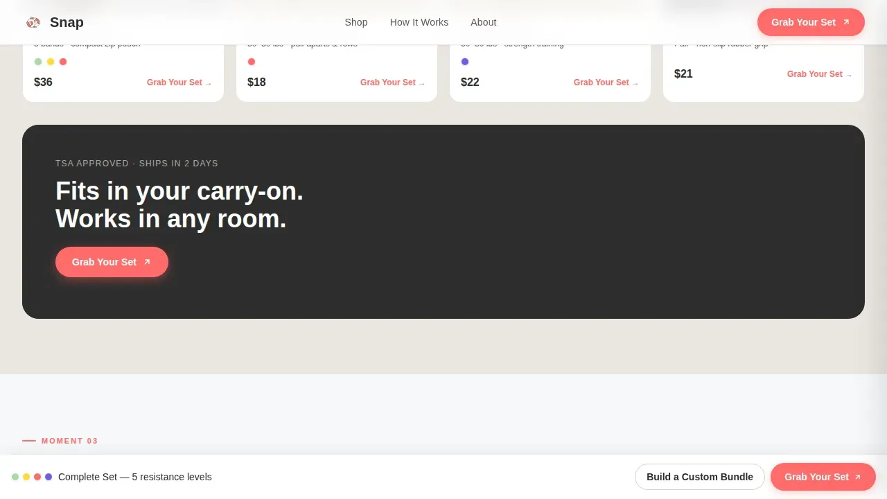
- A sticky bottom bar that appears after the first scroll, offering a secondary "Build a Custom Bundle" prompt for visitors who want to mix resistance levels before going to checkout.
Feature list
This section walks through the core interactive and visual capabilities built into the Snap template. Each feature is drawn directly from the template brief and represents a real, designed component you can use on day one.
Draggable Before/After Hero Slider
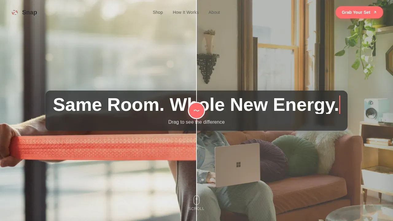
The hero section splits the viewport down the center. The left side of the canvas shows a person at rest, slouched on a couch in afternoon light. The right side reveals the same person mid-exercise, a coral resistance band stretched across the chest, geometric shapes patterned into the background wall. A circular coral drag handle with a band-snap icon sits at the split point. As the visitor drags the handle to center, a typewriter animation types the headline: "Same Room. Whole New Energy." This opening moment sets the transformation tone without a single line of product description.
Shoppable Moment Gallery Grids
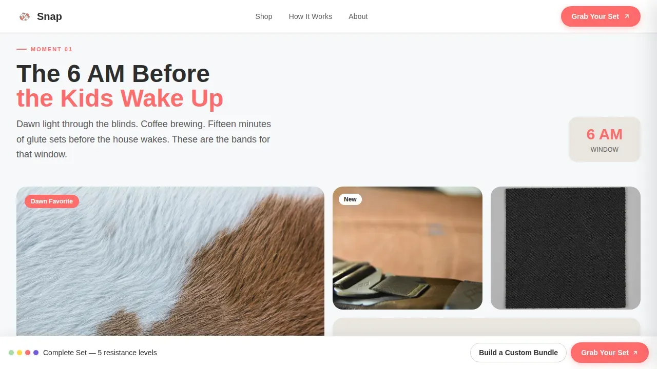
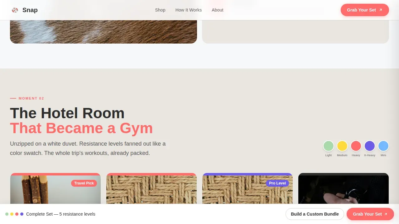
Three distinct gallery sections follow the hero, each framed around a specific life moment. The first gallery, "The 6 AM Before the Kids Wake Up," displays a grid of mini-loop glute band exercises photographed in dawn light. The second, "The Hotel Room That Became a Gym," shows travel pouches unzipped on a white duvet with resistance levels fanned out like a color swatch. The third, "The January That Actually Stuck," reveals a Week 1 through Week 12 progression layout with geometric progress rings. Every card in every gallery is shoppable.
Scroll-Triggered Progress Ring Animation
The Week 1 through Week 12 progression gallery features geometric progress rings that animate as they enter the viewport. The rings use an Intersection Observer trigger, meaning the animation fires at the moment each ring becomes visible during scroll. This creates a sense of forward motion and achievement that mirrors the buyer's own fitness journey. The visual process of watching rings fill is designed to build confidence and emotional investment before the purchase tap.
Right-Side Product Detail Panel
Clicking any product card in any of the three moment galleries opens a detail panel that slides in from the right side of the screen. The panel displays weight specifications, stretch percentage data, and a looping six-second use clip for the selected product. This keeps the visitor on the same canvas rather than navigating away, and it places the "Grab Your Set" coral call-to-action button directly inside the panel so the purchase path stays one tap long.
Direct-to-Checkout Call to Action Flow
Every moment gallery card and every product detail panel connects to a single coral "Grab Your Set" button. Tapping it passes the selected bundle configuration directly to the checkout page. There is no cart page and no intermediate review step. The sticky bottom bar, which appears after the first scroll, adds a secondary "Build a Custom Bundle" prompt for visitors who want to compare resistance levels before committing. Both paths skip unnecessary friction.
Sticky Bottom Conversion Bar
After the visitor scrolls past the hero section for the first time, a sticky bar appears at the bottom of the screen. It carries the secondary "Build a Custom Bundle" call to action. This bar stays visible throughout the rest of the scroll journey, giving every visitor a persistent low-commitment entry point into the bundle builder without interrupting their experience of the moment galleries above.
Page sections overview
| Section | Purpose |
|---|---|
| Before/After Hero Slider | Hooks visitors with a draggable split view and typewriter headline |
| Dawn Light Gallery | Shoppable grid featuring early-morning band workout scenarios |
| Hotel Room Gallery | Shoppable color-swatch layout featuring travel resistance band sets |
| Progress Ring Gallery | Week 1 through 12 progression display with animated geometric rings |
| Product Detail Panel | Right-slide panel showing specs, stretch data, and a looping use clip |
| Sticky Bundle Bar | Persistent bottom bar offering a custom bundle builder after first scroll |
| Footer Pattern | Horizontal flow footer layout completing the page structure |
Design & branding system
The visual identity of Snap follows a Playful Geometric theme built on a Cloud Canvas color system. The overall feeling is Scandinavian apartment meets dropped gumball energy: airy and light at the large scale of the page, with concentrated coral accents landing like vivid punctuation against a soft neutral field. The palette and typography work together to create a canvas that feels premium without feeling cold.
- Colors: soft cloud white (#F7F8FA) as the dominant background, warm putty gray (#D6CFC7) for card surfaces and section dividers, cheerful coral (#FF6B6B) on all calls to action and resistance-level indicators, and deep charcoal (#2D2D2D) for body text.
- Typography: Plus Jakarta Sans for all headings, paired with DM Sans for body text, creating a clean and readable typographic line throughout the page.
- Geometric decorative patterns are woven into background surfaces and wall accents, adding visual texture without cluttering the product photography or interfering with the shoppable image grid layout.
Mobile & speed optimization
Snap is designed with a mobile-first build priority. The audience, apartment dwellers browsing Instagram-adjacent content on their phones, demands that every interaction feel native and responsive at the small-screen scale. The template structures its animations and interactive elements to perform smoothly without relying on heavy third-party libraries.
- All animations, including the typewriter headline, the draggable slider, the scroll-triggered progress rings, and the sliding detail panel, are built using CSS scroll-behavior and the Intersection Observer API rather than heavy JavaScript animation libraries.
- The sticky bottom bar, the shoppable gallery cards, and the right-side detail panel are all designed to work cleanly on touch screens, with tap targets sized appropriately for mobile use.
How this template helps you convert
Snap is built around a single conversion principle: let visitors see themselves inside a specific moment first, then place the exact product from that moment one tap away. This removes the cognitive gap between product interest and purchase decision.
- The Before/After slider creates an immediate personal transformation hook at the top of the canvas, showing the same space before and after a resistance band session, so the visitor's first glance at the page is already emotionally anchored.
- Each shoppable moment gallery deepens that connection by placing products inside real life scenarios, dawn workouts, hotel-room sessions, month-long progress journeys, so every product image carries context and desire before the detail panel even opens.
- The direct-to-checkout call-to-action flow, with no cart page and no intermediate step, captures purchase intent at its peak and passes the selected bundle configuration immediately to checkout, reducing drop-off at the most critical point in the process.
Other information about this template
Snap sits at the intersection of fitness retail and visual storytelling. It draws heavily on a creative process rooted in showing human moments rather than isolated product objects. The design approach mirrors the way the contemporary art world uses large scale compositions and carefully chosen color fields to guide the eye and create emotional resonance before intellectual analysis begins.
In the same way that an artist builds a canvas open to multiple readings by layering geometric patterns and bold color shapes, this template builds a product page that reveals its offer gradually. The visitor does not see a price tag at the top. They see a life moment. Then another. Then another. By the time the product detail panel opens, the desire is already formed.
The template's creative process borrows from traditions in exhibition design and gallery curation. Like a well-arranged gallery display, each section of the page is a distinct room. The visitor moves through them in sequence, and each room adds new context. The dawn light gallery functions like an opening exhibition room: intimate, specific, and immediately relatable. The hotel room gallery shifts the mood, broadening the identity of the customer from home-dweller to traveler. The progress ring gallery closes the emotional arc by showing transformation over time, a before-and-after narrative stretched across twelve weeks rather than split across a single slider.
The visual language of Snap shares qualities with the broader world of geometric abstract work. Shapes, lines, and color fields carry meaning without needing text labels. A coral circle is a call to action. A putty-gray card surface is a resting moment between product reveals. A charcoal text block grounds the playfulness with weight and clarity. The whole thing operates like a carefully choreographed visual sequence: each element doing its part, nothing decorative for its own sake.
From a content-architecture perspective, the template is well suited to store owners who already have strong product photography and want to organize it into a narrative rather than a grid. If your photographs show real people in real spaces, rather than studio-lit objects on white paper backgrounds, Snap will amplify that authenticity and translate it into purchase intent.
This template can also support expansion into seasonal campaigns. The moment-gallery structure is designed to be swapped and refreshed. A winter launch might feature "The Living Room That Replaced the Gym in January." A summer version might show "The Back Porch at 7 AM." Each new moment is a new canvas open to a new emotional story, while the underlying page structure and checkout path remain constant.
The design system's use of geometric patterns as background texture rather than foreground decoration keeps the photography dominant. In the art world, there is a long tradition of framing figurative content within geometric structures to direct attention and add depth. Snap applies the same logic to product photography: the geometric wall pattern in the hero slider's right panel adds visual richness without competing with the figure performing the exercise.
The template's color system deserves additional context because it does significant work in the creative process. Cloud white as a background functions like the white paper of a sketchbook: neutral, open, and ready to receive color. The coral accent behaves like a colored pencil mark on that white surface: immediate, deliberate, and impossible to ignore. The putty gray is the mid-tone that gives the whole composition breathing room. This three-value palette, light, mid, dark, maps cleanly to the visual hierarchy: background, surface, and text.
For store owners new to moment-based storytelling, Snap also works as a framework for thinking about content. The three moment galleries are prompts as much as they are sections. They ask: what are the three most specific, most believable moments in which your customer reaches for your product? Answer that honestly, fill the gallery cards with photographs that reflect that reality, and the page does the rest of the emotional work.
The sticky bottom bar is worth highlighting as a separate conversion tool. It is not a popup. It does not interrupt. It appears quietly after the first scroll and stays in place, offering the bundle builder option to visitors who are comparison-shopping resistance levels. For buyers who are earlier in the decision process, this bar functions as a low-pressure next step rather than a forced commitment. It acknowledges that some visitors are researchers first and buyers second, and it gives them a path that serves their preferences without abandoning them.
The Snap template is part of a broader project of building fitness retail pages that treat the customer as a full human being with a specific schedule, a specific space, and a specific relationship to movement rather than as a generic buyer in a generic market. That specificity is what separates a high-converting product page from a product catalog. The canvas is not a container for product data. It is a space where the visitor can briefly inhabit a version of their life that already includes your product, and then choose to make that version real.
The template's footer follows a horizontal flow layout pattern that completes the page without adding visual noise. It keeps the final impression clean and consistent with the airy Scandinavian aesthetic that runs through every section above it.
For dropshippers specifically, Snap addresses one of the central challenges of the category: building trust and desire for products the customer cannot touch before buying. Photographs, motion clips, stretch percentage data, and resistance-level color coding all work together as tactile substitutes. The looping six-second use clip inside the product detail panel is particularly valuable here because it shows the band in motion, which communicates stretch, resistance, and physical quality in a way that static images alone cannot.
- The template is English-language, US-dollar priced, and uses the US date format throughout, making it immediately ready for the North American dropshipping market.
- The Playful Geometric theme draws visual inspiration from the contemporary art world's tradition of using color, form, and geometric patterns to create compositions that communicate before they explain, an approach that works exceptionally well for impulse-adjacent fitness purchases.
- The three moment-gallery structure reflects a curatorial philosophy rooted in exhibition design: each gallery is a distinct thematic room, and the visitor moves through them as they would move through a well-paced art exhibition, building context, desire, and identity with every step.
- Pablo Picasso's well-documented influence on the art world introduced the idea that geometric fragmentation of a figure could reveal more emotional truth than a realistic portrait; Snap applies a version of this logic by fragmenting the customer's life into specific moments rather than presenting a single generic lifestyle image, with the before/after slider functioning as its own form of figurative transformation akin to the way large scale paintings use contrast and division to create tension and resolution.
- The colored pencils analogy extends through the design system: each coral accent, each putty-gray surface, each charcoal text block is a deliberate mark on a cloud-white canvas, building a composition that feels hand-crafted even at the large scale of a full-viewport landing page, and the result is a collection of visual moments that display beauty through restraint rather than decoration.
Theme
Playful Geometric
Creative direction
Seasonal/Moment
Color system
Cloud Canvas
Style
Gallery + Detail
Direction
Click-Through
Page Sections
Draggable Before/after Hero Slider
Shoppable Moment Gallery Grids
Scroll-triggered Progress Ring Animation
Right-side Sliding Product Detail Panel
Direct-to-checkout Call to Action
Sticky Bottom Conversion Bar
Related questions
Can I swap out the three moment-gallery themes for my own scenarios?
Does the detail panel work for multiple product variants?
Is there a cart page between the gallery and checkout?
Do I need to configure the sticky bottom bar separately?
Who is this template best suited for?



