Addiction Recovery Patient Education Landing Page
Sober is a comparison table landing page built for addiction and recovery patient education. It walks patients, families, and case managers through treatment options using animated stats, scroll-triggered comparison tables, and warm second-person copy. The design feels clinical enough to trust and human enough to stay with, guiding every visitor toward a personalized treatment-readiness assessment.
by Rocket studio
Quick summary
Sober is a single-page patient education template built around transparent side-by-side comparison tables. It opens with three animated recovery statistics, then walks visitors through inpatient versus outpatient care, medication-assisted treatment options, and recovery pathway comparisons. Every section is designed to reduce anxiety and build trust before a single click is asked.
Who this template is for
This template is built for organizations that educate people about addiction and recovery. It speaks directly to the people sitting with the hardest questions at the hardest hours.
- Health platforms and recovery centers publishing patient-facing treatment guides
- Family advocates and case managers who need a clear, trustworthy resource to share
- Digital health teams building compassionate, information-first patient education tools
What problem this template solves
People seeking addiction treatment are overwhelmed, often skeptical of medical systems, and searching at odd hours on a phone. They need clear, honest information before they can take a next step. Most resources are either too clinical to feel safe or too vague to be useful.
- Scattered information forces visitors to jump between sources, losing trust and momentum
- Clinical language creates distance exactly when warmth and clarity matter most
- No single page honestly lays out treatment costs, timelines, and tradeoff comparisons side by side
What you get with this template
You get a fully structured comparison table landing page with five distinct content sections, scroll-triggered animations, and a clear click-through path to a treatment-readiness assessment. Every design and copy decision prioritizes the visitor's emotional state as much as their information need.
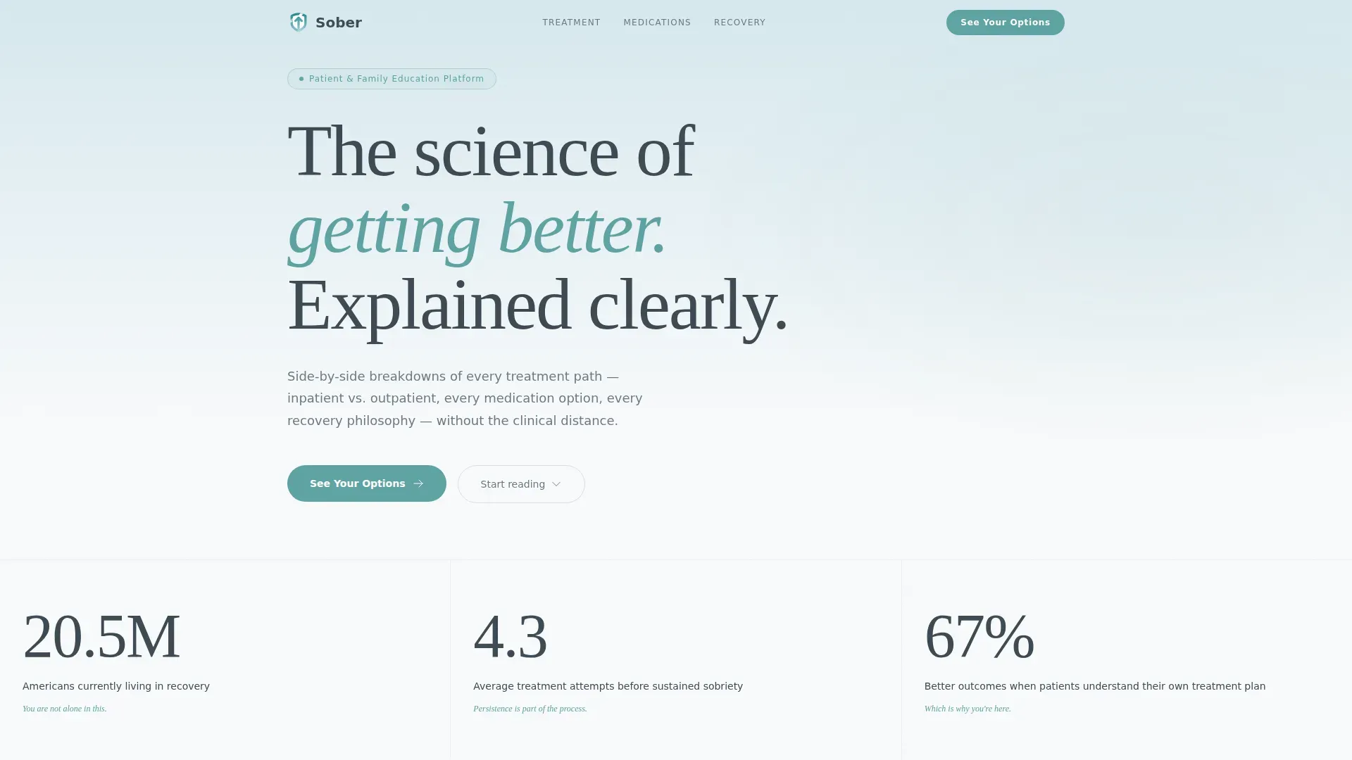
- Animated hero stats section with three softly counted recovery figures
- Four scroll-triggered comparison tables covering treatment pathways and medication options
- Context-aware call-to-action placements after each major table section
Feature list
This template is built around a small number of carefully considered components, each earning its place on the page.
Animated Statistics Header
Three large counters rise into view on page load: 20.5 million Americans currently living in recovery, an average of 4.3 treatment attempts before sustained sobriety, and a 67 percent improvement in outcomes when patients understand their own treatment plan. Each figure arrives with gentle easing, half a second apart, giving the visitor space to absorb each truth before the next one lands.
Scroll-Triggered Comparison Tables
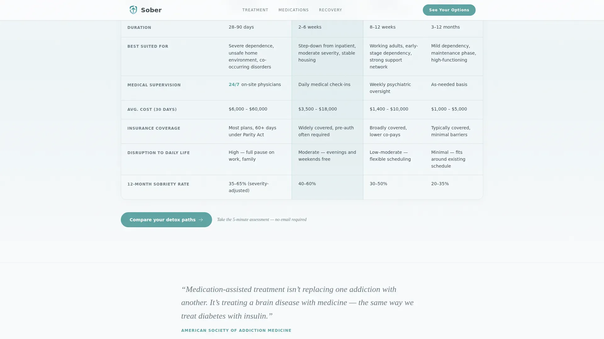
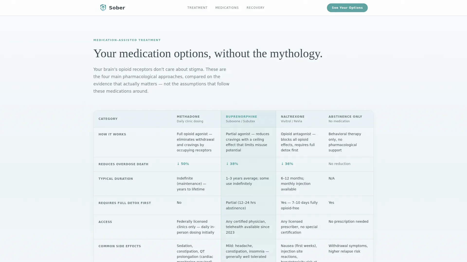
Four side-by-side comparison tables reveal row by row as the visitor scrolls. Tables cover inpatient versus outpatient care, four medication-assisted treatment options compared across efficacy, side effects, and duration, and three recovery pathways including twelve-step, SMART Recovery, and harm reduction approaches.
Context-Aware Call-to-Action Blocks
The primary call-to-action button, labeled "See Your Options," appears first below the header stats and then resurfaces after each comparison table with unique microcopy. Phrases like "Compare your detox paths," "Find your fit," and "You've read enough, let's make it personal" match the visitor's scroll position and emotional context.
Second-Person Explainer Paragraphs
Between each comparison table, short single-paragraph explainers address the visitor directly using "your brain," "your timeline," and "your choice." This keeps the page feeling like a guided conversation rather than a clinical reference document.
Soft Gradient Fade-In Animations
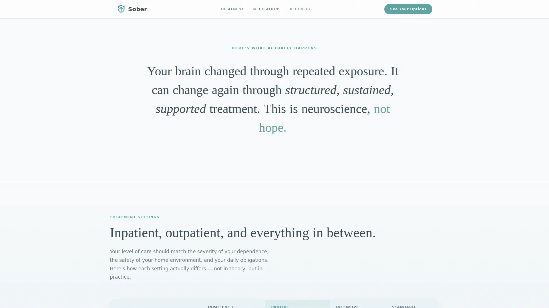
Table rows and explainer text fade in left to right on scroll, as though a curtain is being drawn open. Transitions are smooth and unhurried, reinforcing the page's tone of calm clarity rather than urgency.
Linear Single-Row Footer
The footer uses a minimal linear single-row pattern that keeps the close of the page clean and uncluttered, consistent with the overall design principle of carrying the eye rather than directing it.
Page sections overview
| Section | Purpose |
|---|---|
| Hero Stats | Display three animated recovery statistics and anchor the first call-to-action button |
| Inpatient versus. Outpatient | First comparison table revealing treatment setting tradeoffs row by row on scroll |
| MAT Options | Four-option medication-assisted treatment comparison across efficacy, side effects, and duration |
| Recovery Pathways | Side-by-side comparison of twelve-step, SMART Recovery, and harm reduction approaches |
| Hard Questions + Final Call to Action | Cost and duration transparency section paired with the final assessment call-to-action |
| Linear Footer | Single-row footer closing the page with minimal visual weight |
Design & branding system
The visual identity uses an Arctic White color system that feels like morning light through a window after a first good night of sleep. Gradients drift vertically from pale glacier blue into open snowfield white, never sharp, carrying the eye downward without urgency.
- Color palette: snowfield white (#F8FAFB) background, glacier blue (#D6E8EE) accent, soft graphite (#3D4A53) for body text, and muted teal (#5EA3A3) for buttons and progress indicators
- Typography: Fraunces serif for headlines, DM Sans for body text, creating a pairing that reads as both considered and approachable
- Comparison table borders use a single-pixel graphite rule, while selected or highlighted columns receive a faint teal wash
Mobile & speed optimization
The template is built mobile-first because the primary user is most likely on a phone in the middle of the night. Every layout decision starts at the smallest screen and expands outward.
- Table components are built with server-side rendering in mind, keeping JavaScript minimal and page load light
- Scroll-triggered animations use medium-weight easing that works smoothly on mobile without feeling sluggish
- Counter animations, row reveals, and gradient transitions are tuned to feel natural on touch-scroll devices
How this template helps you convert
This template earns its click-through by proving the platform understands the visitor before asking anything in return. There are no forms, no email capture fields, and no friction on this page.
- The animated statistics create an immediate sense of informed, trustworthy authority, lowering the visitor's guard within the first few seconds of arriving
- Each comparison table removes a specific layer of uncertainty, so by the time the visitor reaches the final call-to-action, they feel genuinely ready to take a personalized next step
- Context-aware microcopy on each call-to-action button matches the visitor's position in the page, making every prompt feel timely and earned rather than generic
Other information about this template
This template is categorized under Health and Medical, with a specific focus on addiction and recovery care patient education. It is designed for the United States market and uses English language copy throughout with no currency symbols or date references.
- The template style is Comparison Table, built within a Soft Gradient theme using the Arctic White color system
- Creative direction follows a Transparent Process approach, turning the scroll into a progressive act of demystification
- The header concept is Stats and Metrics, leading with data rather than faces or photography to respect visitor anonymity
- Page direction is Click-Through, moving visitors toward a free personalized treatment-readiness assessment on the next page
- Social proof is data-driven, using recovery statistics rather than personal testimonials to protect the anonymity of people in recovery
Theme
Soft Gradient
Creative direction
Transparent Process
Color system
Arctic White
Style
Comparison Table
Direction
Click-Through
Page Sections
Animated Recovery Statistics Header
Scroll-triggered Comparison Tables
Context-aware Call-to-action Buttons
Second-person Explainer Copy
Soft Gradient Fade-in Animations
Minimal Linear Footer
Related questions
Who is this landing page template designed to help?
Does this page collect any information from visitors?
Can I update the comparison table content for my own programs?
What makes this template different from a standard health information page?
Is this template suitable for mobile users?



