Addiction & Recovery Telehealth Landing Page Template
Sober is a hub and spoke landing page template built for addiction and recovery telehealth services. It features a multi-step pre-qualification form as the hero, a fixed anchor navigation rail, and five structured spoke sections. The layout guides visitors from self-assessment to a matched scheduling calendar, all within a clean, clinical Arctic White design system.
by Rocket studio
Quick summary
Sober is a single-page telehealth template designed to convert first-time visitors into scheduled addiction counseling appointments. It opens with a multi-step form that pre-qualifies each visitor by substance type, insurance, and time zone. Five anchor-navigated spoke sections walk visitors through a structured audit before presenting a matched provider calendar.
Who this template is for
This template serves telehealth practices that connect clients to licensed addiction counselors quickly and discreetly. It is built for both direct-to-consumer and business-to-business (EAP, or Employee Assistance Program) acquisition flows.
- Functioning professionals who need treatment that fits between work commitments without disclosure
- Spouses or family members searching late at night after a crisis moment
- HR directors or benefits coordinators building EAP referral pipelines for their organizations
What problem this template solves
Most addiction treatment pages lead with emotional imagery and long intake forms that feel overwhelming. Visitors who are ambivalent or cautious abandon them quickly. This template removes that friction by reframing the entire experience as a structured, diagnostic process.
- Removes the shame-barrier of traditional intake forms by presenting each step as a self-assessment checklist
- Eliminates scheduling confusion by surfacing a pre-filtered provider calendar matched to the visitor's inputs
- Supports the secondary conversion path of sending a private, expiring plan link to a loved one without requiring a direct ask for help
What you get with this template
You get a fully structured hub and spoke landing page ready to adapt for any addiction and recovery telehealth practice. Every section is designed to build trust incrementally rather than ask for commitment upfront.
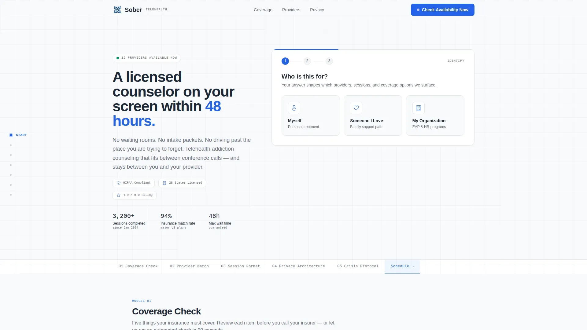
- A multi-step hero form with toggle-switch checklist steps and three audience-selection entry points
- Five scrollable spoke sections each closing with a repeated primary call to action
- A fixed left-rail anchor navigation that tracks scroll depth and lets visitors jump to any section instantly
Feature list
This template packages clinical structure and conversion-focused interaction into one coherent layout. Each feature below is built into the template as described in the source brief.
Multi-Step Pre-Qualification Form
The hero section is entirely a multi-step form. Step one presents three audience buttons: Myself, Someone I Love, and My Organization. Step two surfaces three to five checklist items styled as toggle switches, covering frequency of use, substance type, and prior treatment history. The form feels diagnostic rather than administrative.
Fixed Anchor Navigation Rail
A fixed left-rail navigation lists five spoke sections: Coverage Check, Provider Match, Session Format, Privacy Architecture, and Crisis Protocol. A pinned "Check Availability Now" button sits inside the nav at all times. Visitors can jump to any section without losing their scroll position.
Checklist and Audit Spoke Sections
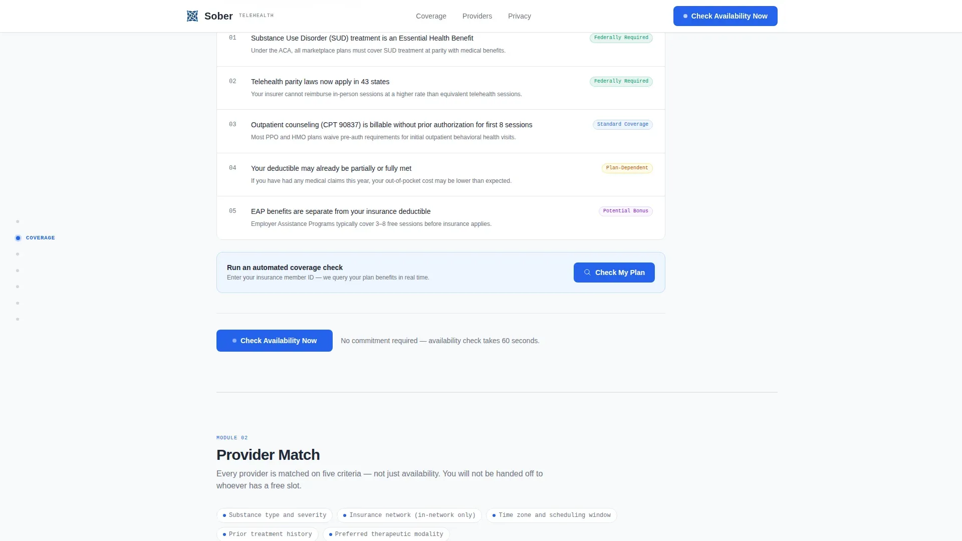
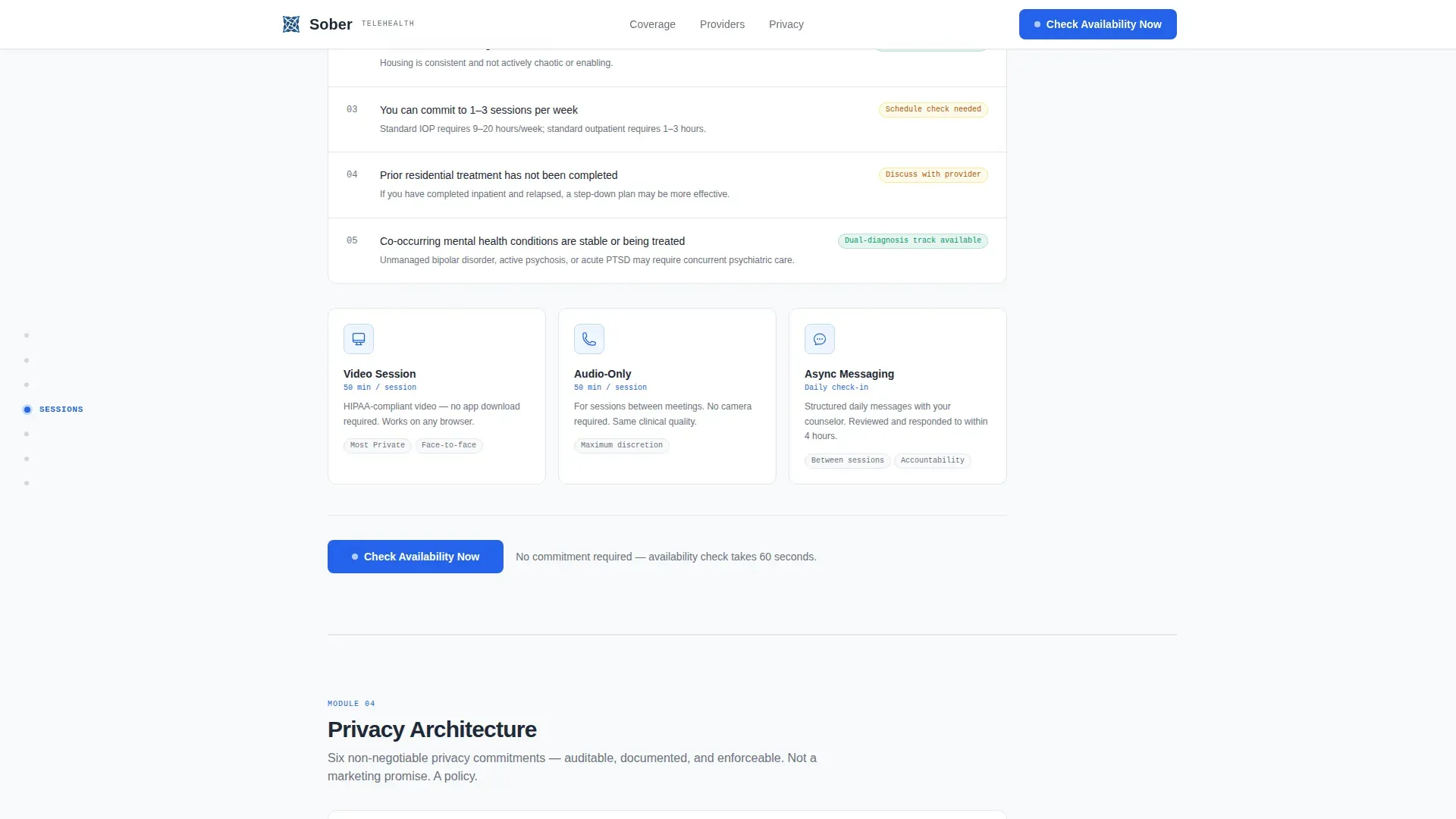
Each of the five hub spoke sections opens with a bold yes/no or numbered checklist. Examples include "Three things your insurance must cover" and "Five signs outpatient is enough." This rhythm lets visitors self-assess before any commitment is requested.
Matched Provider Scheduling Calendar
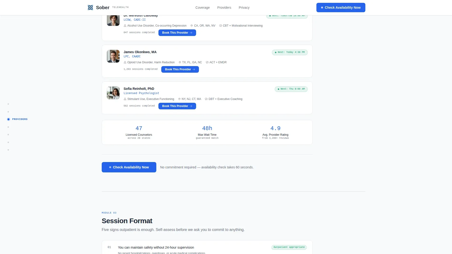
The scheduling module at the bottom of the page shows only providers matched to the visitor's substance type, insurance, and time zone inputs captured earlier. This reduces decision fatigue and increases booking confidence.
Private Plan Sharing Link
A secondary conversion path generates a private, expiring link the visitor can text or send to a loved one. This removes the friction of asking for help out loud and opens a separate referral entry point.
Corporate Precision Design System
The layout uses DM Sans for headings and JetBrains Mono for data labels and numbers. The Arctic White color system keeps the interface sterile and authoritative. Interactive elements and progress indicators use a single intervention-blue accent exclusively.
Page sections overview
| Section | Purpose |
|---|---|
| Hero Form | Multi-step pre-qualification entry point above the fold |
| Coverage Check | Insurance audit checklist module for self-assessment |
| Provider Match | Criteria-based counselor matching with checklist filters |
| Session Format | Outpatient self-assessment checklist for treatment level |
| Privacy Architecture | Zero-disclosure security breakdown for cautious visitors |
| Crisis Protocol | Emergency escalation clarity and next-step guidance |
| Footer | Linear single-row footer with essential links |
Design & branding system
The visual identity follows a Corporate Precision theme. Every design decision signals competence and structure rather than warmth or aspiration. The palette feels clinical in the most reassuring sense.
- Color system: clinical white (#F8F9FB) background, policy-gray (#D1D5DB) for muted elements, charcoal authority (#1F2937) for foreground text, and intervention-blue (#2563EB) reserved exclusively for interactive elements and progress indicators
- Typography: DM Sans for all headings and body copy, JetBrains Mono for data labels, statistics, and numbered callouts
- No sunrise photography, no testimonial carousels; the visual language is sterile grids and structured hierarchy throughout
Mobile & speed optimization
The template is built desktop-first to serve functioning professionals on work laptops. Full mobile parity is included so the same structured experience works on any device.
- The hero form renders as a static element on load; only the interactive form components use client-side rendering to keep initial load lean
- Scroll-linked section reveals and form step transitions use medium-weight animation that keeps the page feeling responsive without distracting from the diagnostic flow
- Toggle switch micro-interactions in the checklist steps provide immediate visual feedback on mobile and desktop equally
How this template helps you convert
Every layout decision in this template is built around one outcome: moving a qualified, informed visitor to a scheduled appointment with as little friction as possible.
- The multi-step hero form pre-qualifies each visitor before they read a single spoke section, so the scheduling calendar at the bottom only shows relevant, available providers matched to their profile.
- The fixed anchor nav keeps "Check Availability Now" visible at all times and repeats the call to action at the close of every spoke section, creating consistent booking pressure without feeling aggressive.
- The private plan sharing link opens a second conversion path for visitors who are researching on behalf of someone else, capturing referral intent that a single booking flow would miss entirely.
Other information about this template
This template is designed for English (United States) localization, using USD pricing format and a 12-hour time display convention throughout the scheduling module. It is categorized under Health and Medical, specifically within the Addiction and Recovery Care subcategory.
- The social proof layer includes credential badges, state licensing counts, session completion statistics, and anonymous outcome metrics, none of which require real data to be visible in the template layout
- Animation intensity is set to medium, with scroll-linked reveals for each spoke section and smooth transitions between multi-step form states
- The template style is Hub and Spoke with Anchor Navigation, the header concept is a Multi-Step Form, the creative direction is Checklist and Audit, and the primary landing page direction is Booking and Scheduling
Theme
Corporate Precision
Creative direction
Checklist & Audit
Color system
Arctic White
Style
Hub & Spoke (Anchor Nav)
Direction
Booking/Scheduling
Page Sections
Multi-step Pre-qualification Hero Form
Fixed Left-rail Anchor Navigation
Checklist and Audit Spoke Sections
Matched Provider Scheduling Calendar
Private Expiring Plan Sharing Link
Corporate Precision Visual System
Related questions
What is the primary call to action in this template?
Can this template serve both individual clients and HR or benefits teams?
How does the private plan sharing link work?
Is this template designed for desktop or mobile use?
What spoke sections are included in the anchor navigation?



