Rehabilitation & Therapy Booking Website Template
Sober is a single-column outpatient rehab landing page built for clinics offering 90-minute sessions that fit around real life. A portrait-centered hero, an interactive six-question checklist, and a quiet teal-and-linen color system guide visitors from late-night doubt to confident action, ending at a confidential assessment booking page.
by Rocket studio
Quick summary
Sober is a click-through landing page template designed for outpatient rehabilitation centers. It uses a self-directed checklist experience to move hesitant visitors toward booking a confidential assessment. The layout is a single-column flow with a portrait-centered hero, six honest readiness questions, a program breakdown section, and layered trust signals, all built around a calm Medical Clarity visual identity.
Who this template is for
This template is designed for outpatient behavioral health clinics and rehabilitation centers that serve adults who cannot step away from work or family for inpatient care. It is also a strong fit for treatment practices offering medication-assisted treatment, counseling, and structured outpatient detox in short, scheduled sessions.
- Outpatient rehab centers offering 90-minute session programs for working adults
- Counseling and detox clinics targeting young professionals and working parents
- Behavioral health practices that need a discreet, mobile-first patient acquisition page
What problem this template solves
Many people who need outpatient substance use support delay seeking help because every option they find feels like it requires disappearing from their life. Standard rehab pages lead with clinical jargon, dense forms, or imagery that signals a 30-day commitment. This template removes that barrier by leading with a human face and a quiet, self-paced experience.
- Converts late-night searchers who feel overwhelmed by clinical-feeling intake pages
- Gives family members a secondary path through a downloadable family guide instead of forcing an immediate call
- Replaces form-heavy pages with a single reassuring click-through to a separate confidential intake page
What you get with this template
You get a fully structured, single-column landing page with five distinct content sections, a linear single-row footer, and a persistent bottom call-to-action bar. Every section is designed to reduce friction and build quiet confidence, from the opening portrait down to the final booking button.
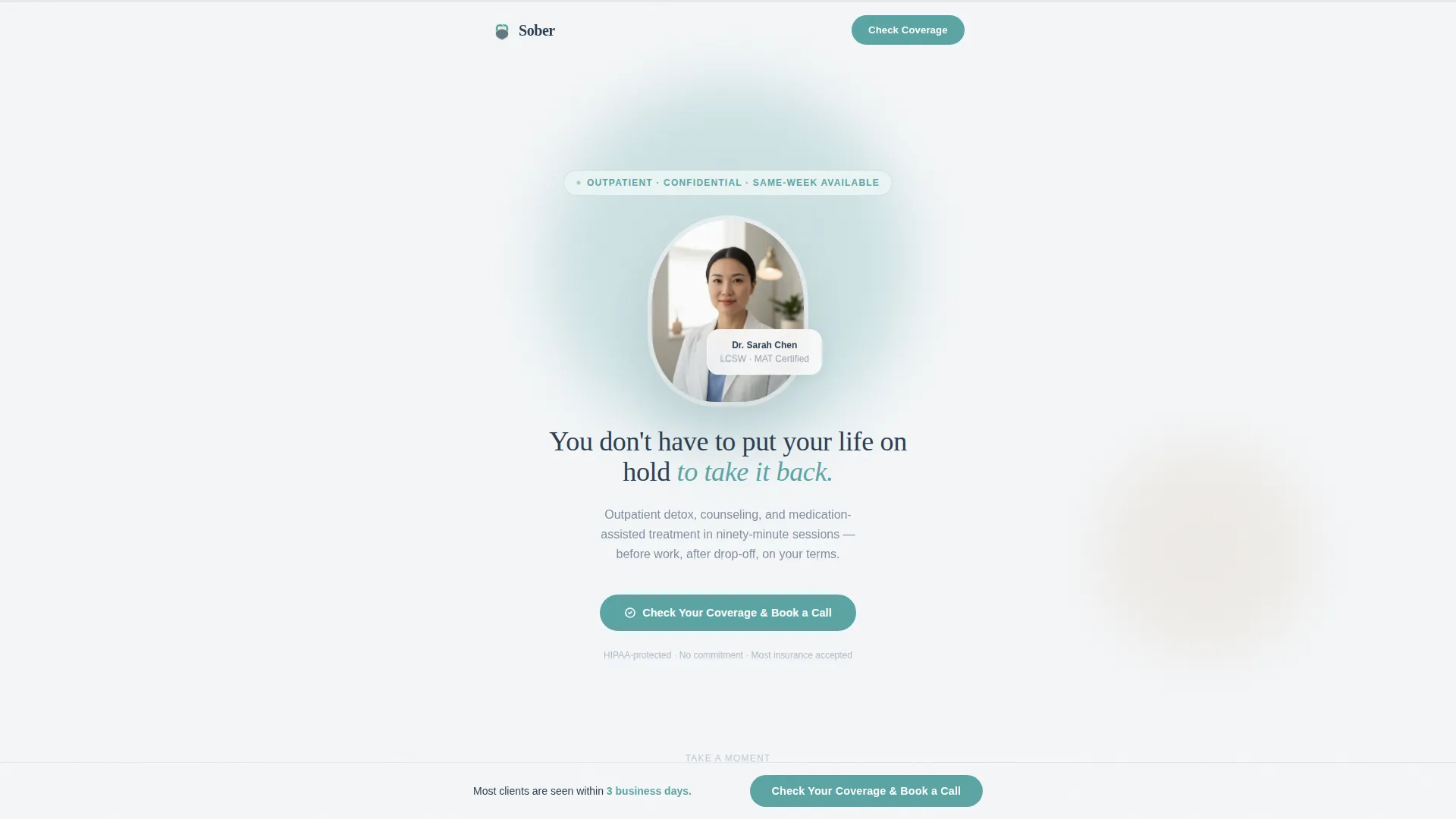
- Portrait-centered hero section with a teal call-to-action button and a single headline
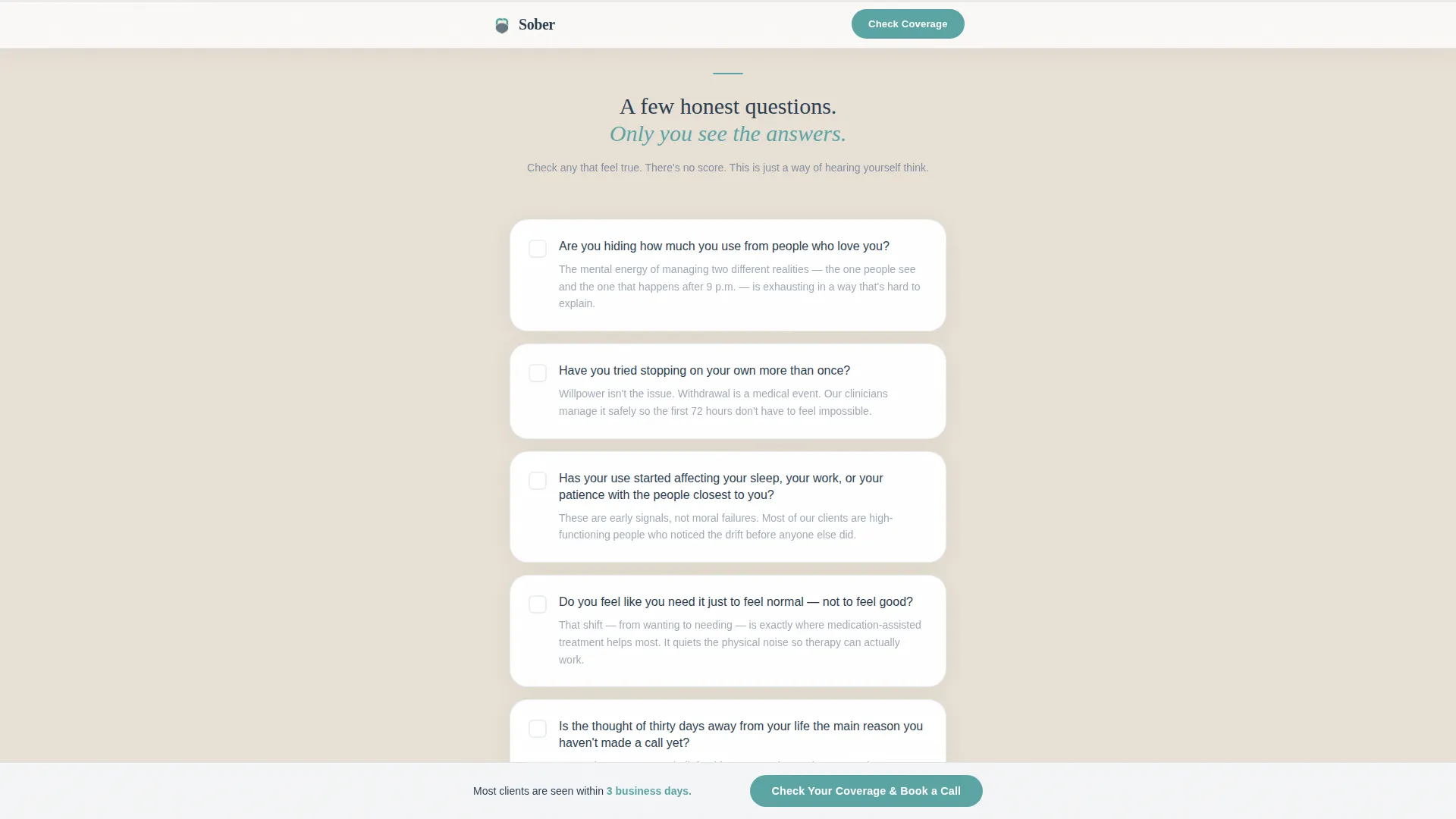
- Interactive six-question checklist with a teal progress bar that responds as visitors engage
- Trust signals section featuring an insurance, privacy, and credentials bento layout
Feature list
This template ships with a tightly scoped set of interactive and visual features. Each one is grounded in the specific needs of outpatient rehab patient acquisition.
Portrait-Centered Hero Section
A softly lit clinician photograph anchors the top of the page. Shallow depth of field keeps a modern treatment room visible but blurred behind the subject. A single slate-colored sentence and a teal call-to-action button sit directly beneath the portrait, with no navigation bar or logo clutter to distract.
Interactive Checklist with Progress Bar
Six honest, first-person questions form a self-assessment scroll. As visitors check boxes, a teal progress bar at the top of the page fills incrementally. The page content responds to engagement, shifting from general program information toward insurance verification details and same-week availability language as more boxes are checked.
Persistent Bottom Call-to-Action Bar
After the third checklist question, a fixed bottom bar appears and remains visible throughout the rest of the scroll. It carries the primary call-to-action label and stays available without interrupting the reading flow, giving visitors a low-effort path to act whenever they feel ready.
Program Breakdown Section
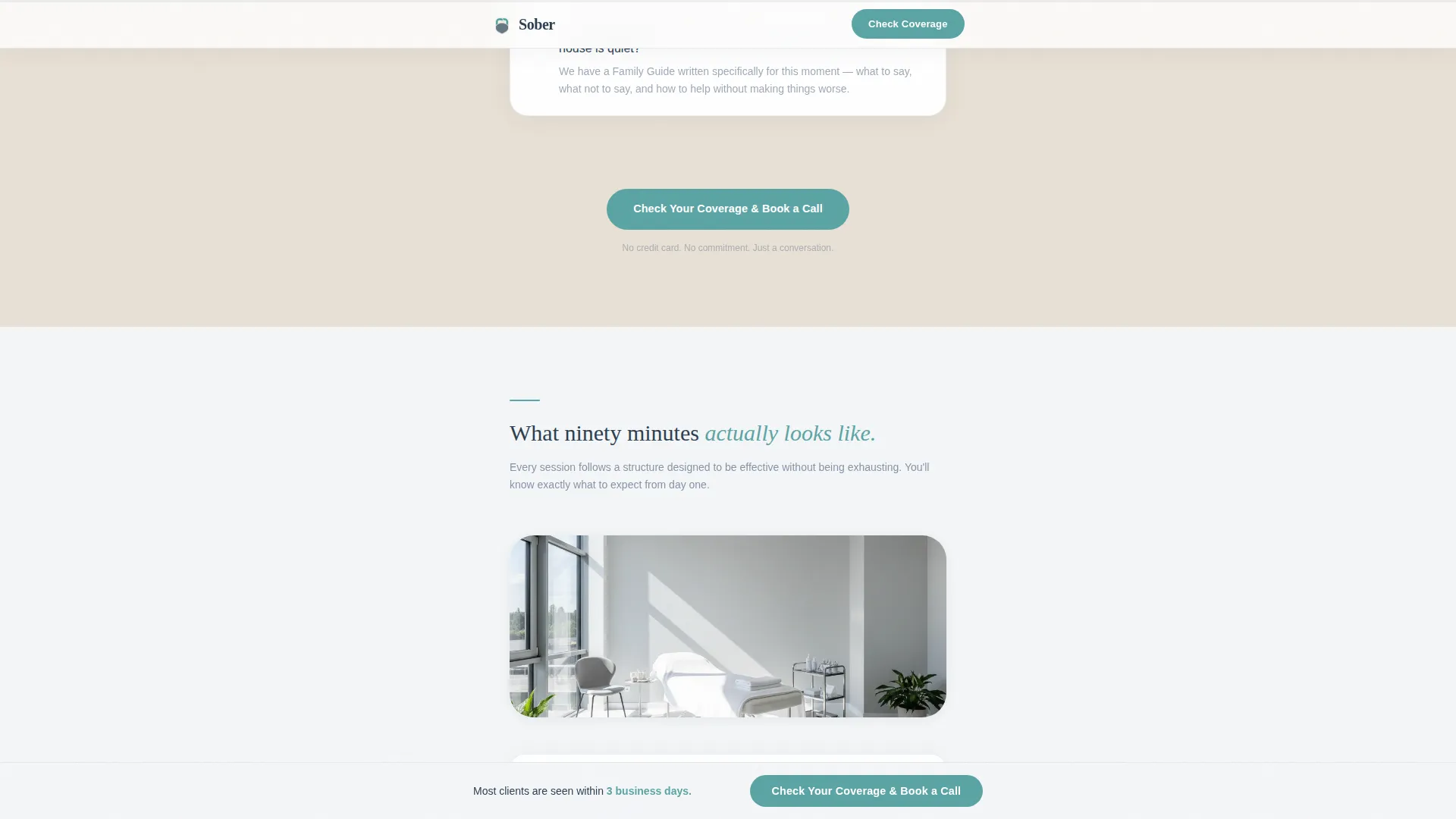
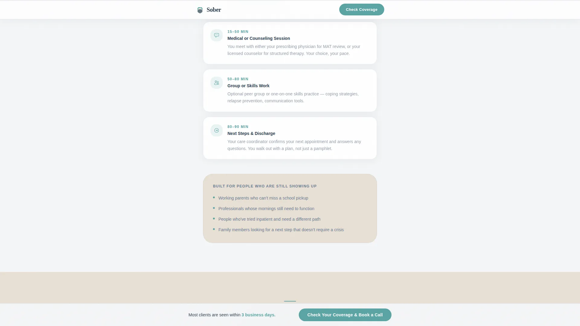
A dedicated asymmetric layout section explains what a 90-minute outpatient session actually contains. It covers outpatient detox, counseling, and medication-assisted treatment in plain language, giving visitors a concrete picture of what the commitment looks like in their actual day.
Trust Signals Bento Layout
A bento-style grid section surfaces insurance logos, a HIPAA badge, clinician credentials, and session count statistics. These trust signals are grouped visually to feel like a quick scan rather than a legal disclaimer, making them reassuring rather than overwhelming.
Secondary Family Guide Path
Below the primary booking call-to-action, a secondary option offers a downloadable family guide. This path is built for the visitor who arrives at 2 a.m. searching for a loved one and is not yet ready to book a call. It keeps them engaged with the clinic without requiring an immediate commitment.
Page sections overview
| Section | Purpose |
|---|---|
| Hero Portrait | Opens with a clinician photo, one-line headline, and teal booking button |
| Checklist Assessment | Six honest questions with a teal progress bar and responsive content |
| 90-Minute Breakdown | Explains session structure using an asymmetric program layout |
| Trust Signals Bento | Displays insurance logos, HIPAA badge, and clinician credentials |
| Final Call to Action | Primary booking path plus secondary family guide download option |
| Footer | Linear single-row footer with essential links |
Design & branding system
The visual identity follows a Medical Clarity theme using the Soft Mist color system. The palette is designed to feel clinical enough to signal professional care while remaining warm enough to lower a visitor's guard at their most vulnerable moment.
- Fog white (#F4F6F8) and warm linen (#E8E0D5) alternate as section backgrounds to create visual breathing room
- Calm slate (#6B7C93) carries all body text, providing authority without harshness
- Reassuring teal (#5BA4A4) is reserved for buttons, the checklist progress bar, and trust signal accents; DM Sans handles body copy while Fraunces brings emotional weight to display headings
Mobile & speed optimization
This template is built with a mobile-first layout priority. Late-night phone searches are the dominant traffic pattern for outpatient rehab queries, so every section is designed to feel focused and readable on a small screen without requiring zooming or horizontal scrolling.
- Single-column flow keeps the layout clean and tap-friendly on any phone screen size
- No heavy video assets are used; animations are limited to checklist interactions, scroll reveals, and a grain overlay
- The persistent bottom bar is positioned for thumb reach, keeping the primary call-to-action accessible during mobile scroll
How this template helps you convert
The conversion strategy is built around internal readiness rather than external pressure. By the time a visitor reaches the booking button, they have already answered six honest questions in their own words, which means the decision to click feels like their own idea.
- The checklist builds incremental commitment, each checked box is a micro-yes that primes the visitor for the final call-to-action click.
- The persistent bottom bar removes the need to scroll back up, keeping the booking path available at any point in the visitor's journey.
- The secondary family guide download captures visitors who are not yet ready to call, giving the clinic a second conversion path without adding a form to this page.
Other information about this template
This template is part of a Health and Medical category collection focused on rehabilitation and therapy. It is optimized for outpatient rehab centers in the United States that bill in USD and communicate in English. The layout direction is click-through, meaning the page itself contains no intake form. The click leads to a separate confidential assessment and booking page.
- Template style: Single Column Flow with a linear single-row footer pattern
- Animation level: Medium, covering checklist interactions, scroll-triggered reveals, a magnetic call-to-action effect, and a subtle grain overlay
- Interactivity level: High, built around the checkbox progress system and the persistent bottom call-to-action bar
- Typography pairing: DM Sans for body readability and Fraunces as a display serif for headlines that carry emotional weight
Theme
Medical Clarity
Creative direction
Checklist & Audit
Color system
Soft Mist
Style
Single Column Flow
Direction
Click-Through
Page Sections
Portrait-centered Hero with Single Call to Action
Interactive Six-question Checklist
Persistent Bottom Call-to-action Bar
Minute Program Breakdown
Trust Signals Bento Grid
Secondary Family Guide Download Path
Related questions
Does this template include the intake form or booking page?
Can the checklist questions be customized for a specific clinic?
Is the family guide download path included in this template?
What devices does this template display well on?
Can this template support a clinic that offers multiple treatment types?



