Diabetic Foot Care Clinic Landing Page Template
Sole is a diabetic foot care landing page template built for podiatry clinics serving type 2 diabetics over fifty. It centers on an interactive 10-point foot risk audit table that compares a visitor's current habits against clinical guidelines. Award badges, patient voice cards, a PDF download form, and a booking widget work together to move cautious visitors toward a real appointment.
by Rocket studio
Quick summary
Sole is a single-page landing page template for a diabetic foot care clinic. It leads with earned authority through award badges, then guides visitors through an interactive 10-row comparison checklist that surfaces personal risk gaps. By the time visitors reach the call to action, they have already seen exactly where their foot care routine falls short of clinical recommendations.
Who this template is for
This template is built for podiatry practices and diabetic foot care clinics that want to convert cautious, self-managing patients into booked appointments. It works especially well for clinics that have earned formal recognition and want that credibility to do the work before a visitor ever reads a paragraph.
- Certified podiatrists running a diabetic foot care clinic and looking to generate qualified leads online
- Clinic marketing teams who need a content-led, audit-style landing page rather than a generic service brochure
- Healthcare providers serving type 2 diabetics aged fifty and older who were advised by their primary care doctor to monitor their feet
What problem this template solves
Many type 2 diabetics over fifty know they should watch their feet, but nobody has shown them what that actually means. A standard clinic webpage lists services. This template audits the visitor's own habits and makes the knowledge gap impossible to ignore.
- Visitors arrive with vague awareness but no clear sense of their personal risk level
- Generic clinic pages do not create urgency for people who feel no pain yet
- The checklist format replaces passive browsing with active self-assessment, so the visitor is engaged before the call to action appears
What you get with this template
You get a fully structured, section-led landing page designed around a high-interactivity audit experience. Every section has a clear job, from establishing clinical credibility at the top to closing with a gated PDF download and a secondary booking path.
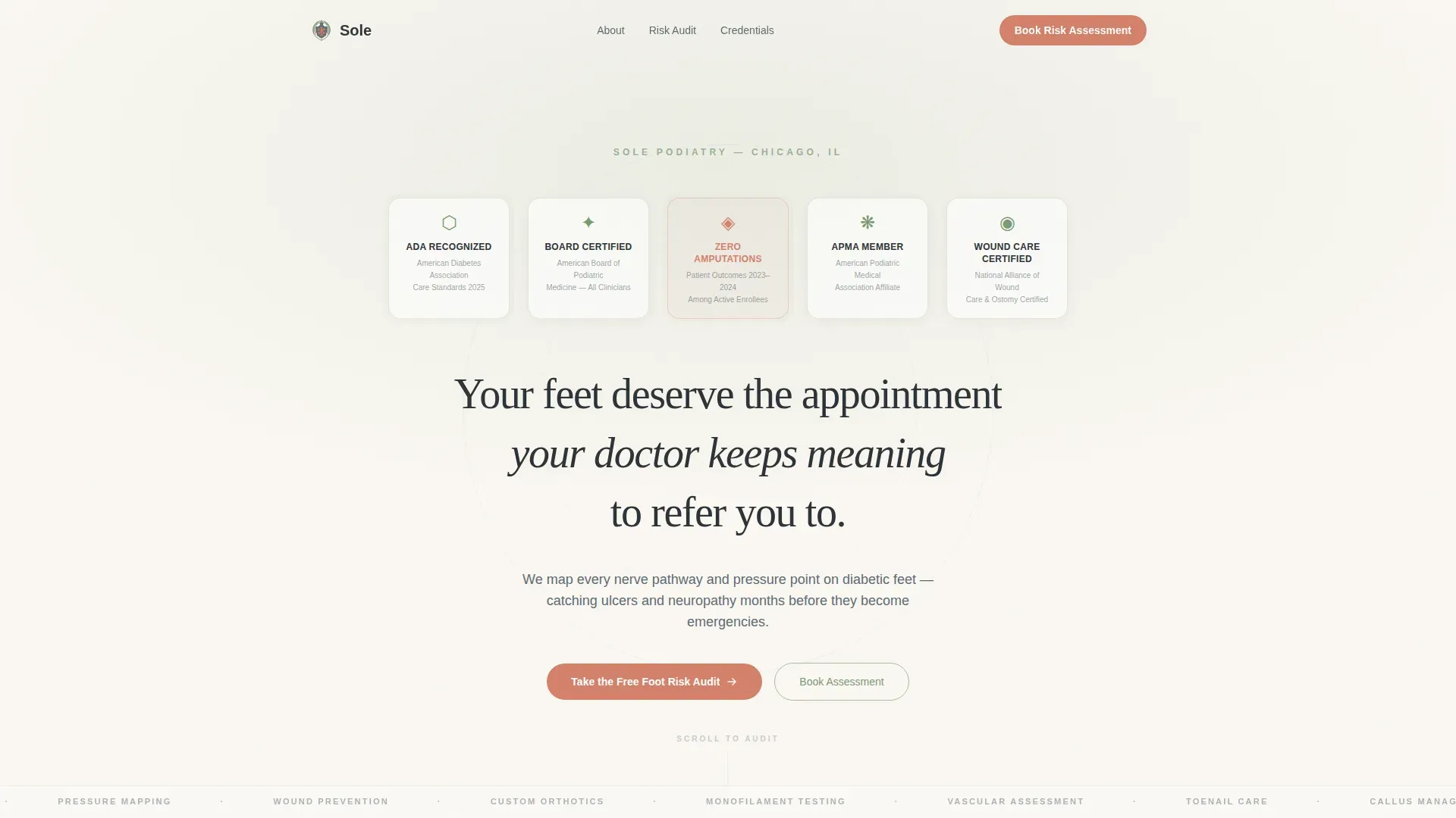
- A hero section with an award badge wall, a serif headline, and supporting subtext
- An interactive 10-row comparison table that scores visitor habits against clinical foot care guidelines in real time
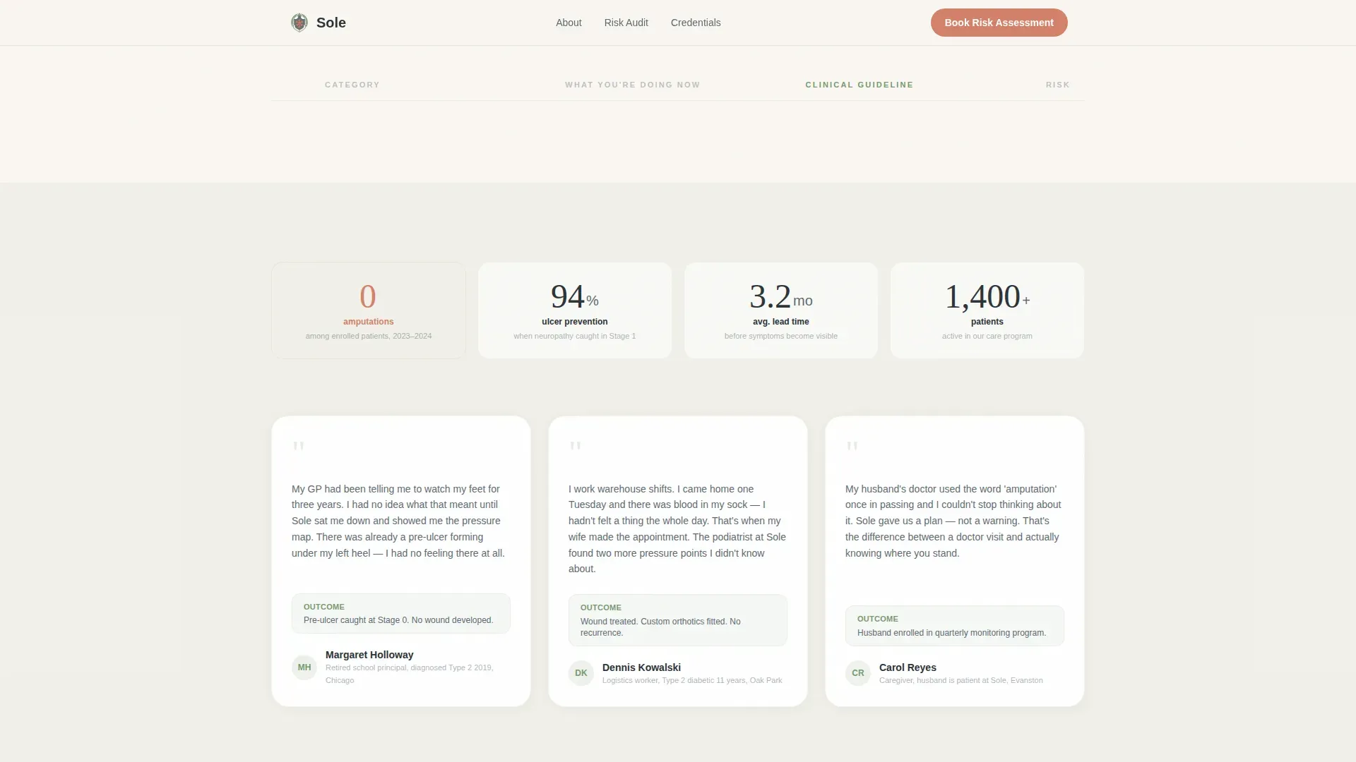
- A social proof section with a stats bar and three patient voice cards, followed by a two-field download form and a scheduling widget
Feature list
This template is built around a small number of high-impact components. Each one addresses a specific moment in the visitor's decision journey.
Interactive Diabetic Foot Risk Checklist
The core of the page is a 10-row comparison table. Each row places "What You're Doing Now" beside "What Clinical Guidelines Recommend." Rows cover numbness frequency, footwear choices, toenail trimming method, moisturizing routine, and annual exam history. A live score counter updates as visitors work through each row, making their personal risk level visible before they finish the page.
Award Badge Header Wall
The hero section displays ADA-recognized care seals, board certification insignia, and a "Zero Amputation Rate 2023" badge on a warm linen background. Each badge carries a micro-caption. There is no stock photography. The design communicates earned clinical authority through credentials alone.
Gated PDF Audit Download
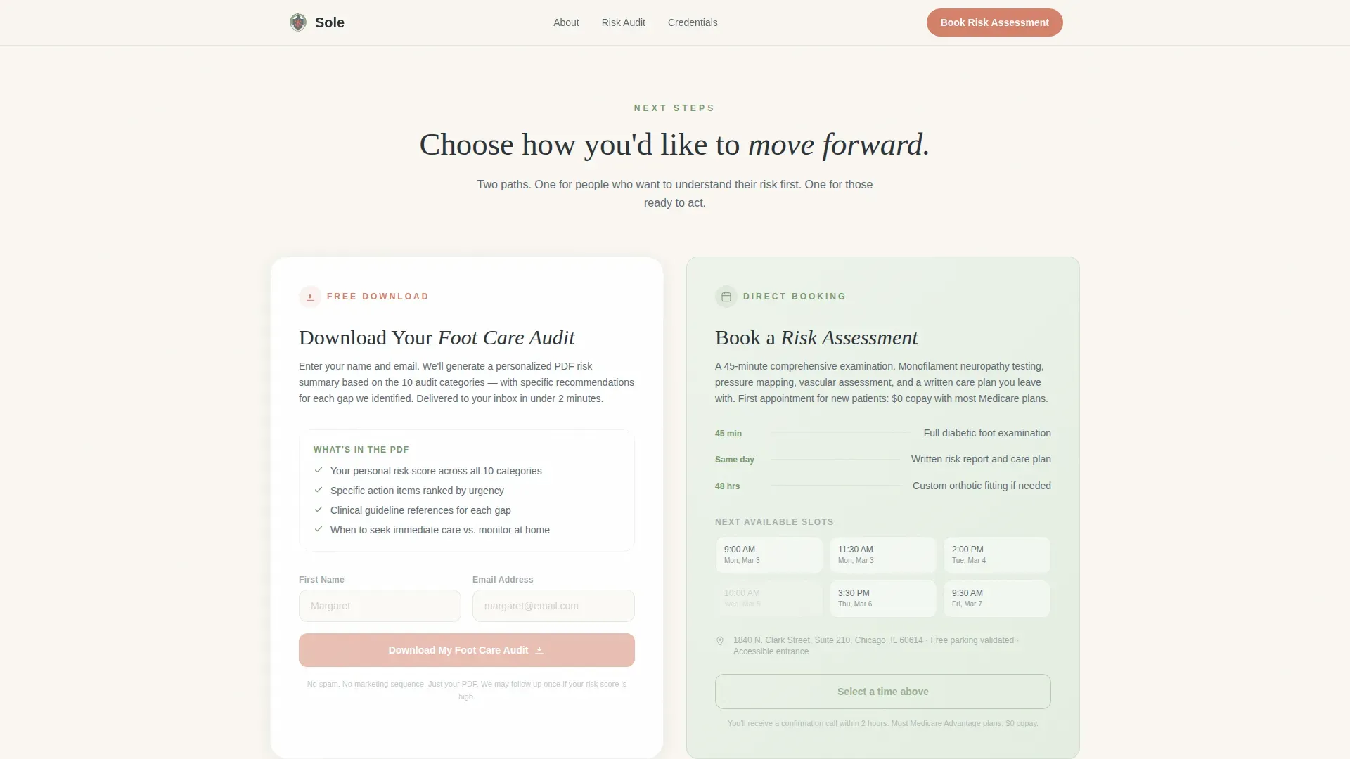
The primary call to action is a two-field form that collects a visitor's first name and email address. On submission, the visitor receives a personalized PDF risk summary based on their checklist responses. The form is gated, making the download feel earned rather than freely available.
Secondary Booking Widget
Below the download form, a scheduling widget offers a direct path for visitors who are ready to act immediately. This second conversion path serves patients who have already decided they need a professional assessment and do not want to wait for an email.
Patient Voice Cards and Stats Bar
Three patient voice cards present specific outcome-focused testimonials. A stats bar sits above the cards and surfaces key clinic metrics. Together they provide the social proof that supports the risk message established by the checklist.
GSAP Scroll-Reveal Animations
Sections and checklist rows entrance with staggered GSAP animations as the visitor scrolls. This pacing keeps the audit experience deliberate and makes each row feel like a reveal rather than a list.
Page sections overview
| Section | Purpose |
|---|---|
| Award Badges Hero | Establish clinical credibility before the visitor reads a word |
| Risk Audit Checklist | Drive self-assessment with a 10-row interactive comparison table |
| Social Proof Bar | Reinforce trust with clinic stats and outcome-focused patient quotes |
| PDF Download Form | Convert engaged visitors with a gated two-field audit download |
| Booking Widget | Offer an immediate scheduling path for visitors ready to act now |
| Linear Footer | Close the page with a clean single-row footer |
Design & branding system
The visual identity follows a Healing Space theme built on a Soft Mist color system. The palette reads as clinical and trustworthy without feeling cold or institutional. Every color choice carries a specific functional meaning.
- Warm linen (#FAF7F2) serves as the base background, softening the clinical context into something approachable
- Calming sage (#A8BDA1) covers section backgrounds and trust indicators, keeping the upper half of the page composed and steady
- Muted slate (#5E6B73) handles all body text for a strain-free reading experience, while coral (#D4816B) appears only on risk flags and primary buttons so it carries real weight each time it surfaces
- Typography pairs Fraunces as the serif display face with DM Sans for body text, creating editorial contrast between headline authority and readable prose
Mobile & speed optimization
The layout is built desktop-first to support the comparison table's readability across wider viewports. On smaller screens, the table and checklist stack into a clear vertical flow without losing the audit logic.
- Server Components handle static layout rendering, while Client Components manage the interactive checklist and live score counter
- The mobile stack preserves the section order and call-to-action hierarchy, so the download form and booking widget remain easy to reach on any device
- Medium-intensity GSAP animations are scoped to meaningful moments and do not block content from appearing on slower connections
How this template helps you convert
The page is structured to build personal urgency before asking for anything. Every section earns the next click rather than demanding it.
- The award badge wall establishes clinical authority immediately, so a visitor trusts the source before they engage with the checklist
- The interactive comparison table makes the visitor's own knowledge gap visible row by row, creating specific, felt urgency that a generic service page cannot replicate
- The gated PDF audit converts that urgency into a low-friction lead action, and the secondary booking widget catches visitors who are ready to skip the PDF and schedule directly
Other information about this template
This template is categorized under Health and Medical, specifically within the Podiatry and Foot Care subcategory, with a niche focus on diabetic foot care clinic use cases. It is localized for English (US) audiences with date formatting in MM/DD/YYYY format. Pricing is not displayed on the page. The template is a strong fit for clinics serving patients who were directed by a general practitioner to monitor their foot health but received no structured guidance. The Checklist and Audit creative direction makes it a natural Content and Resource destination rather than a transactional service page.
- Template style is Comparison Table, with the audit checklist as the structural centerpiece
- The header concept is Award Badges, using a credential wall rather than photography as the trust anchor
- The landing page direction is Content and Resource, prioritizing education and lead capture over direct service sales
- Animation intensity is set to medium, using GSAP scroll reveals and stagger entrances to pace the audit experience without overwhelming the visitor
Theme
Healing Space
Creative direction
Checklist & Audit
Color system
Soft Mist
Style
Comparison Table
Direction
Content/Resource
Page Sections
Interactive 10-row Foot Risk Checklist
Award Badge Credential Wall
Gated PDF Risk Summary Download
Secondary Appointment Booking Widget
Social Proof Stats Bar and Patient Cards
GSAP Scroll-reveal Animations
Related questions
Who is the target patient for this landing page template?
What does the interactive checklist actually do?
How does the PDF download form work?
Can visitors book an appointment directly from the page?
Does the page use real patient testimonials?



