Podiatrist Advanced Booking Website Template
Sole is a split-screen landing page template built for podiatrists offering virtual consultations. It uses a FAQ-driven layout to walk hesitant patients through every objection before they book. With a warm clinical visual identity, a three-step progressive booking form, and a free photo assessment path, it turns first-time visitors into scheduled appointments.
by Rocket studio
Quick summary
Sole is a single-page podiatrist virtual consultation template designed to convert skeptical visitors into booked patients. It pairs a warm portrait-centered hero with a scroll-driven FAQ structure that answers real patient doubts one by one. The result is a page that feels reassuring before it feels clinical, and closes with a clear, low-friction booking path.
Who this template is for
This template is built for podiatrists and foot care clinics that want to offer virtual visits and need a landing page that earns patient trust quickly. It suits solo practitioners and small practices equally.
- Podiatrists launching or expanding a telehealth consultation service
- Clinics targeting runners, diabetic patients, or parents with pediatric foot concerns
- Foot care providers who want a lead generation page without a full website build
What problem this template solves
Many patients avoid booking a podiatrist appointment because the process feels uncertain. They wonder whether a screen-based visit is real medicine, what happens if they need physical treatment, and whether their insurance applies. This template addresses every one of those doubts before they become drop-off points.
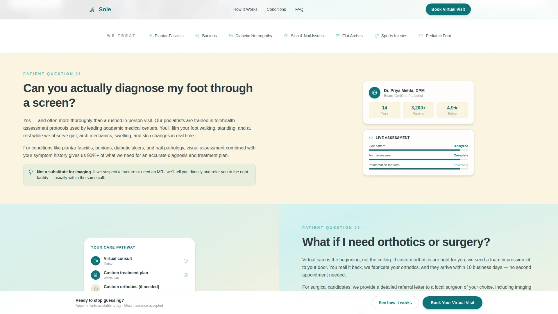
- Hesitation around virtual diagnosis credibility is tackled head-on in the first FAQ section
- Concerns about follow-up care, orthotics, and surgery are answered in a dedicated escalation section
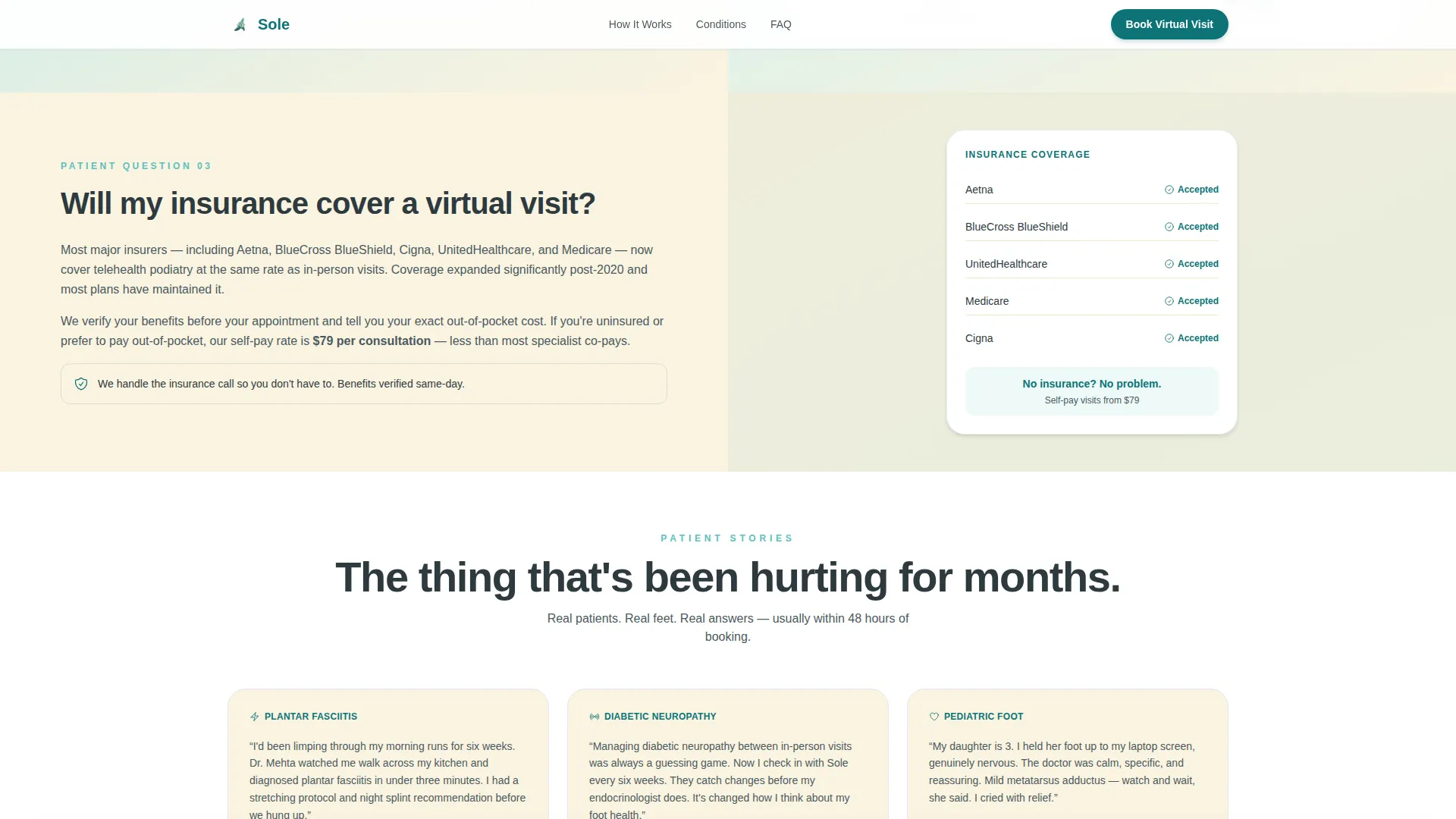
- Insurance and cost questions are resolved before the booking form ever appears
What you get with this template
The template ships as a fully structured single-page layout with five distinct content zones, each serving a specific role in the patient conversion journey. Every section is ready to populate with your own content and credentials.
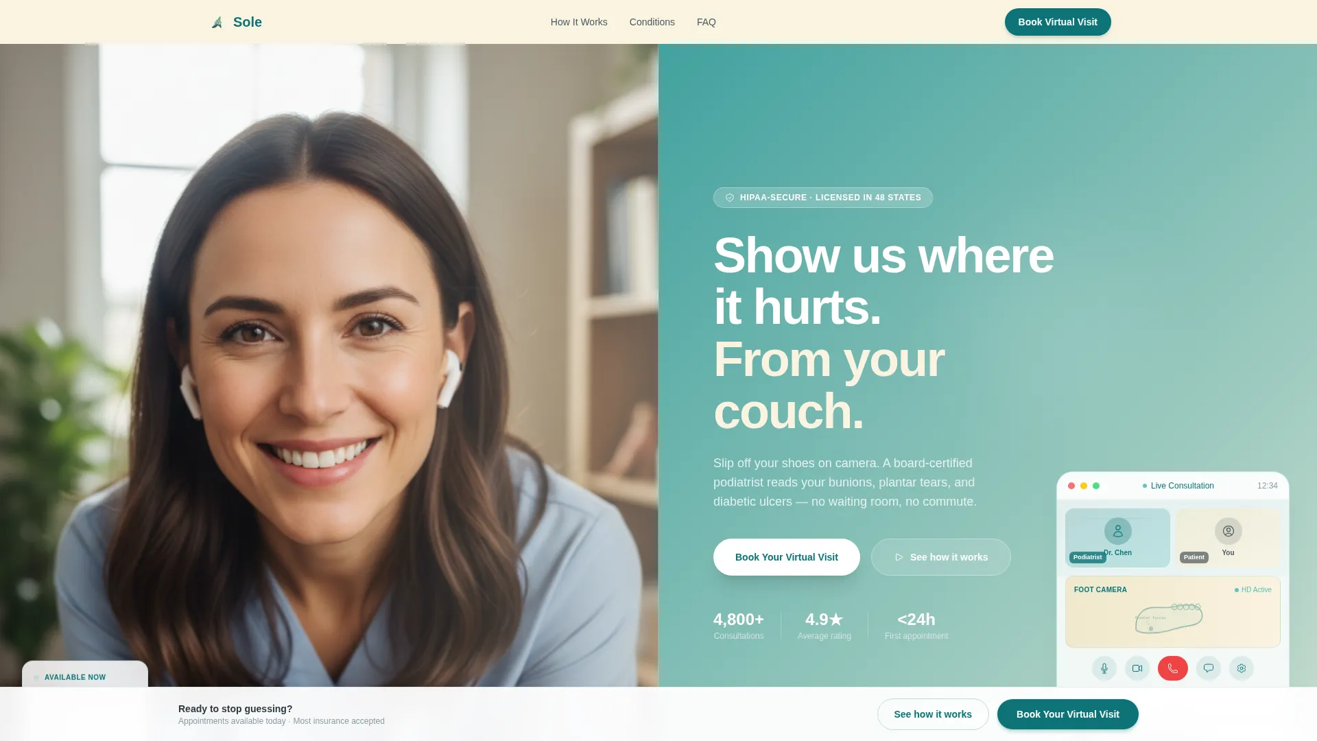
- A 50/50 split-screen hero with a doctor portrait panel and a teal-to-sand gradient headline panel
- Three FAQ-driven split sections with space for looping video or illustration on one side and answer text on the other
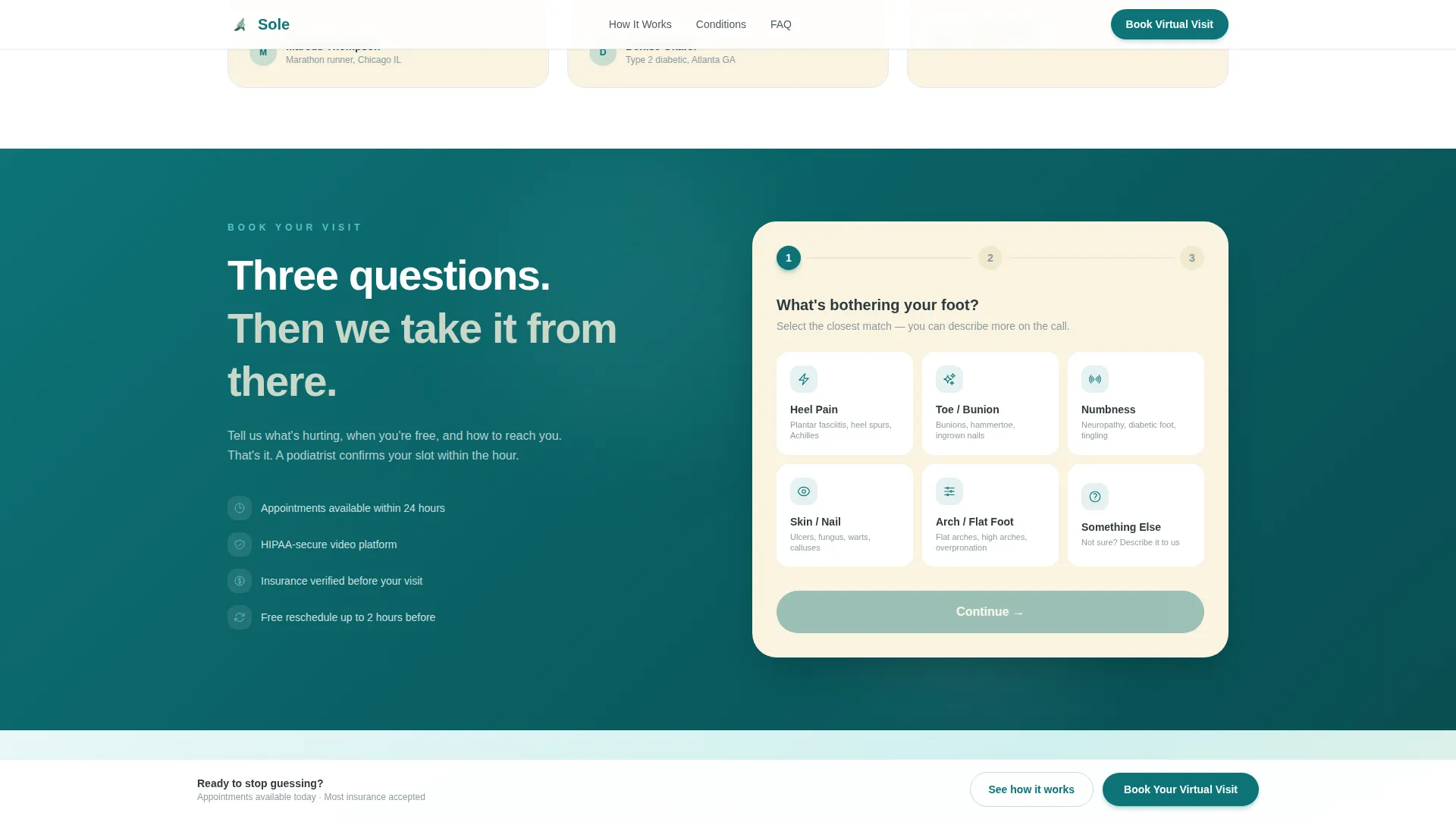
- A three-step progressive booking form paired with a low-commitment free photo assessment path
Feature list
A paragraph introducing the feature set: every feature below is built directly from the template brief, covering layout mechanics, interactive components, visual identity, and conversion structure.
Split-Screen Hero Layout
The hero divides the viewport evenly. The left panel holds a portrait-centered composition of the podiatrist in a natural home-office setting. The right panel carries a teal-to-sand gradient, the primary headline, and an animated video call interface sketch that fades in on load.
FAQ-Driven Scroll Sections
Each of the three core content sections is structured around a real patient objection. The questions escalate from credibility doubt to logistics to commitment. One side of each split holds the written answer; the other supports a looping video clip or illustrative visual.
Three-Step Progressive Booking Form
The booking form reveals itself in three sequential steps. Step one uses a visual foot concern selector with options including heel pain, toe deformity, numbness, skin and nail issues, and other. Step two captures insurance provider and preferred appointment window. Step three collects name, phone, and email.
Sticky Call-to-Action Bar
After the visitor scrolls past the third FAQ section, a sticky bottom bar appears with the primary "Book Your Virtual Visit" call to action. It stays visible as the visitor continues reading, providing a persistent booking prompt without interrupting the content flow.
Free Photo Assessment Path
Below the final FAQ, a secondary conversion path invites visitors to send a photo for a free two-minute assessment. This lower-commitment option still captures contact information and starts the clinical relationship for visitors not yet ready to book.
Soft Gradient Visual System
Section transitions use long, slow seafoam-to-sand gradients. There are no sharp breaks or neon accents. The palette and typography choices create a calm, professional atmosphere that supports patient trust throughout the scroll experience.
Page sections overview
| Section | Purpose |
|---|---|
| Hero Split Screen | Introduces doctor and primary headline |
| Credibility FAQ Section | Addresses virtual diagnosis skepticism |
| Escalation Path Section | Clarifies orthotics and surgery options |
| Insurance FAQ Section | Resolves cost and coverage concerns |
| Booking Form Section | Captures lead via three-step form |
| Photo Assessment Path | Provides low-commitment alternative entry |
| Footer | Closes with horizontal flow layout |
Design & branding system
The visual identity uses the Teal Catalyst color system, a palette chosen to feel like a treatment room with natural light coming through frosted glass. The tone is calm and professional without being cold or institutional.
- Colors: deep clinical teal (#0D7377) for headers and calls to action, seafoam (#5BC0BE) across gradient backgrounds, warm sand (#FAF3E0) for content panels, and charcoal (#2E3A3F) for body text
- Typography: DM Sans for headings, Manrope for body text, both chosen for clean legibility at clinical reading distances
- Gradients move slowly from seafoam to sand across section transitions, never sharp, never neon
Mobile & speed optimization
On desktop, all hero and FAQ sections display as 50/50 horizontal splits. On smaller screens, those splits collapse to vertically stacked layouts so no content is hidden or compressed. The template is built with mobile-first reflow in mind.
- Desktop split panels collapse to single-column stacks on mobile devices
- Images are lazy-loaded to reduce initial page weight
- CSS scroll behavior is set to smooth for a fluid, natural browsing experience
How this template helps you convert
The page is engineered as a patient objection funnel. Each scroll section answers a specific doubt before presenting the next. By the time a visitor reaches the booking form, the primary concerns have already been resolved.
- The FAQ sequence mirrors the internal conversation a hesitant patient has before booking, dissolving skepticism in the correct order so trust builds naturally
- The three-step progressive form reduces perceived effort by revealing only one stage at a time, lowering the psychological barrier to completing the booking
- The free photo assessment path creates a second conversion lane for visitors who are not ready to commit, capturing their contact details while beginning a genuine clinical interaction
Other information about this template
This template is part of the Health and Medical category and sits within the Podiatrist Website subcategory, specifically designed for the virtual consultation niche. It is built for the United States market, with English language copy, USD pricing references, and MM/DD/YYYY date formatting throughout the booking form.
- The template style is Split Screen (50/50) using a Soft Gradient theme
- Animation level is medium, including reveal-on-scroll effects, parallax movement, and the animated video call interface sketch in the hero
- Interactivity is high, driven by the visual foot concern selector and the three-step progressive disclosure form
- The footer uses a Vercel Horizontal Flow pattern (Pattern 3), providing a clean close to the page
- Social proof elements include condition-specific patient quotes, credential badge displays, and stat counters
- The creative direction is FAQ-Driven, the header concept is Portrait-Centered, and the lead generation direction centers on the "Book Your Virtual Visit" primary call to action
Theme
Soft Gradient
Creative direction
FAQ-Driven
Color system
Teal Catalyst
Style
Split Screen (50/50)
Direction
Lead Generation
Page Sections
Split-screen Hero with Doctor Portrait
Faq-driven Objection Scroll Sections
Three-step Progressive Booking Form
Sticky Bottom Call-to-action Bar
Free Photo Assessment Conversion Path
Teal Catalyst Soft Gradient Visual System
Related questions
What kind of podiatrist practice is this template built for?
Can I replace the FAQ questions with my own patient concerns?
Is the free photo assessment section included in the template?
How does the three-step booking form work?
Does the template work on mobile devices?



