Iceland Travel Advanced Booking Website Template
Solstice is a dark, immersive landing page template built for solo Iceland travel expeditions. It uses a masonry grid of cinematic scene cards, a full-viewport header lifestyle shot, and a progressive click-through call to action sequence to carry visitors from emotional discovery to booking intent. No forms, no friction, just a story that earns the click.
by Rocket studio
Quick summary
Solstice is a single-page, click-through landing page template designed for a one-person Iceland expedition service. It combines a full-viewport lifestyle header, a scrolling masonry card grid, and a progressive call to action sequence to move solo travelers from curiosity to booking action. The dark, cinematic visual system makes every scroll feel like a scene from the trip itself.
Who this template is for
This template is built for boutique expedition operators and solo travel guides who serve independent-minded clients. It suits services where the emotional draw of the journey matters more than a feature checklist. If your offer is experience-first and your ideal client books with their gut, this page is designed for them.
- Solo travel guide operators running small-group or one-person Iceland expedition services
- Independent travel designers targeting thirty-something professionals ready for a life-reset journey
- Hospitality and adventure brands that need a high-impact, click-through landing page without a contact form
What problem this template solves
Most travel landing pages bury the experience under bullet points, pricing tables, and form fields. The visitor never feels the trip before they see a cost. Solstice reverses that sequence entirely.
- Visitors scroll through a cinematic story before any pricing is introduced, building emotional commitment first
- The masonry grid removes the sterile, catalog feel of standard travel booking pages
- The progressive call to action sequence earns each click gradually, moving from curiosity to specific booking intent across the page
What you get with this template
Solstice delivers a complete, ready-to-customize landing page structure. Every visual and functional element described below is part of the template layout.
- A full-viewport header section with a lifestyle composition and a delayed, fade-in headline
- A staggered masonry card grid where each card reveals a first-person journal line on hover
- A three-stage call to action sequence using ghost-outline and solid aurora-green button variants
Feature list
Solstice is built around a set of deliberate, story-driven design choices. Each feature serves the single goal of making the visitor feel the expedition before they ever see a price.
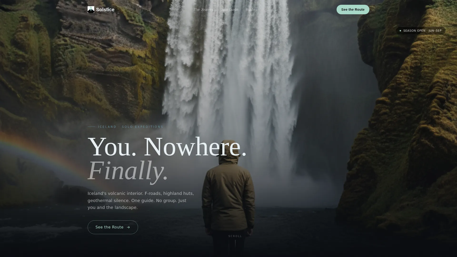
Full-Viewport Lifestyle Header
The header fills the entire screen with a single cinematic image: a solo figure at the edge of Skógafoss, hood up, surrounded by violent white waterfall motion. No headline interrupts the first beat. A single line fades in at the lower third after a short pause, anchoring the emotional tone immediately.
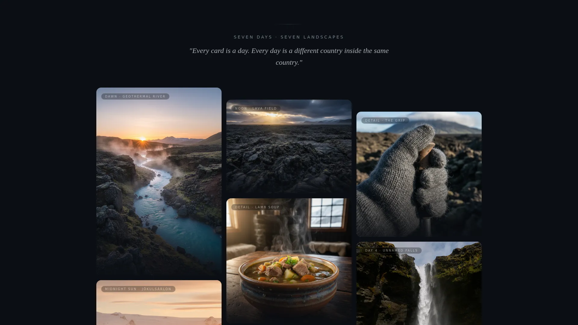
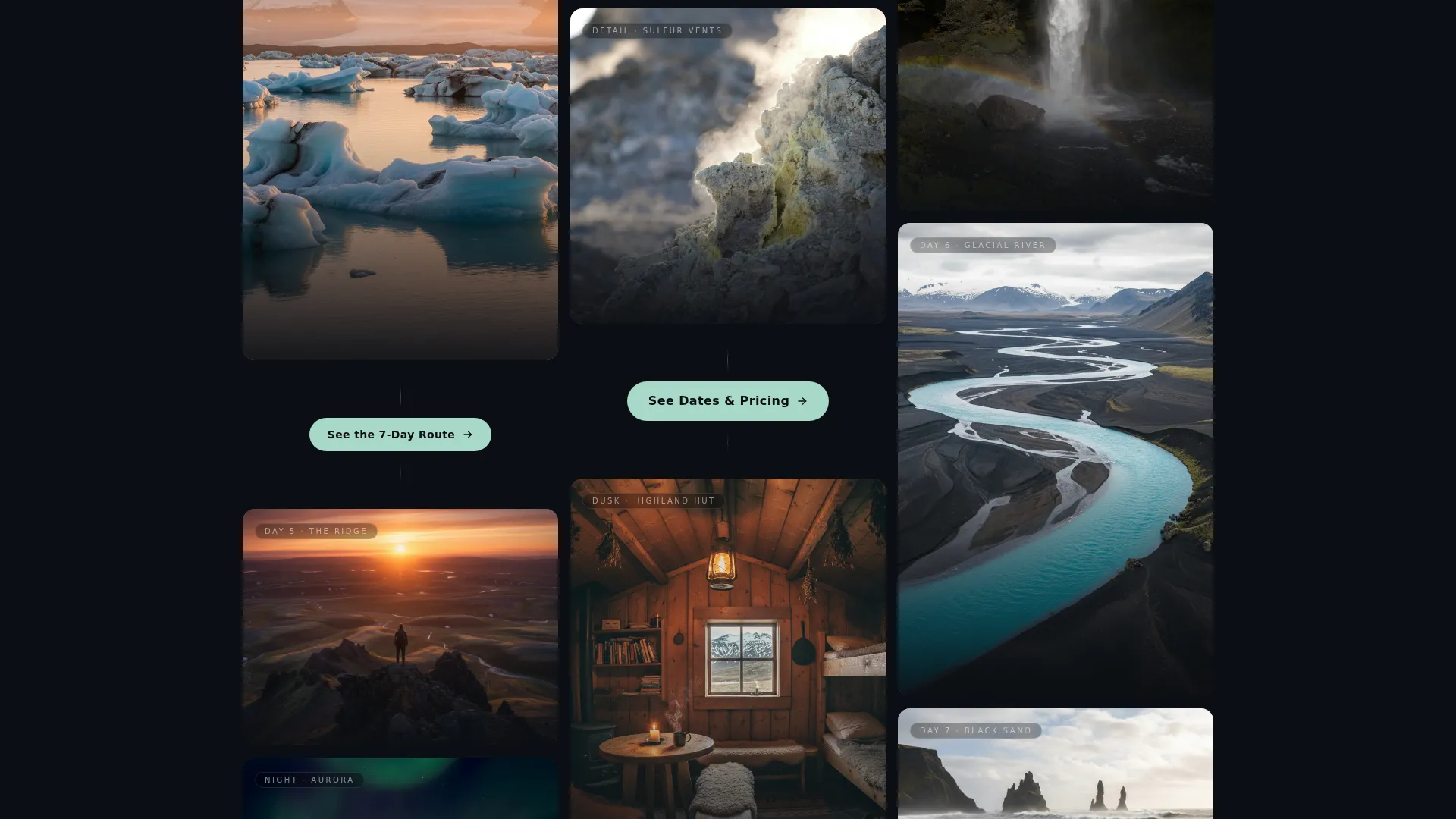
Masonry Card Grid with Hover Reveals
The scrolling grid staggers cards in varying sizes to mirror the rhythm of a real journey. Larger frames hold wide landscape moments; smaller crops hold intimate details like a gloved hand or a steaming soup bowl. Each card reveals a single first-person journal line on hover, keeping the narrative voice consistent throughout.
Progressive call to action Sequence
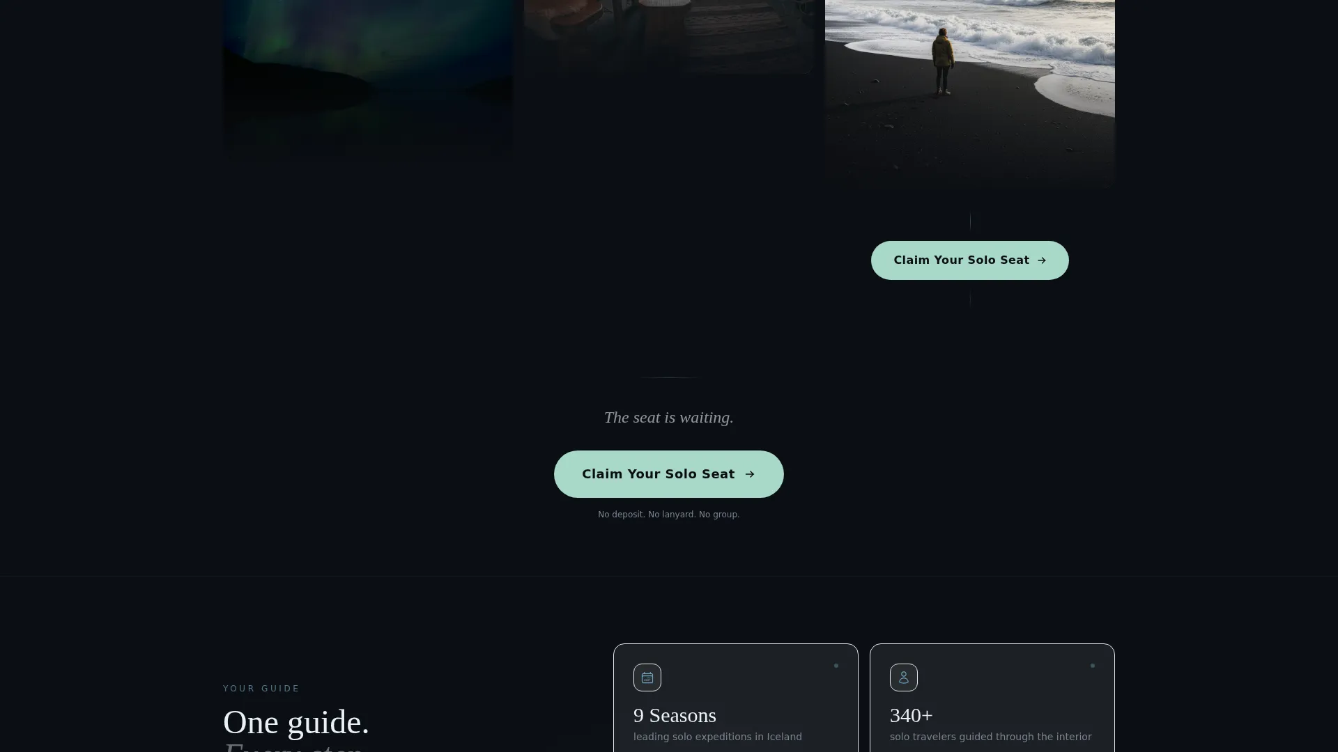
The call-to-action evolves across the page in three stages. It opens as a ghost-outline button over the header, then returns as a solid aurora-green button after every fourth card. The copy grows more specific each time: from "See the Route" to "See Dates & Pricing" to "Claim Your Solo Seat," guiding the visitor toward a firm decision.
Dark Immersive Color System
The Ocean Calm palette uses abyssal black as the dominant background, glacial meltwater blue for accent lines and hover states, volcanic ash gray on card surfaces, and aurora pale green reserved exclusively for calls to action and active elements. The result is a page that feels lit from within rather than designed from a template library.
No-Form Click-Through Architecture
There is no contact form on this page. The single ask is a click. The page earns that click by delivering emotional impact first, then routing visitors directly to the full itinerary and booking page. This reduces friction and keeps the visitor's focus on the experience, not the paperwork.
Page sections overview
| Section | Purpose |
|---|---|
| Full-Viewport Header | Opens with a cinematic lifestyle shot and a delayed fade-in headline |
| Ghost call to action Button | First call-to-action appears as a subtle outline over the header image |
| Masonry Card Grid | Scrolling scene sequence of expedition moments in staggered sizes |
| Progressive call to action Blocks | Solid aurora-green buttons resurface after every fourth card with specific copy |
| Final call to action Stage | Closes the scroll with the most direct booking prompt: "Claim Your Solo Seat" |
Design & branding system
The visual identity follows a Dark Immersive theme built on the Ocean Calm color system. Every color choice is intentional, tied to the geography and mood of an Iceland expedition.
- Background, surface, and accent colors: abyssal black (#0B0E13), volcanic ash gray (#3A3D42), glacial meltwater blue (#6BA3BE), and aurora pale green (#A8D8C8) for calls to action and active states only
- Card surfaces float against the black background like darkroom photographs, each lit from within
- The aurora pale green is reserved strictly for calls to action and active elements, keeping it visually distinct and action-signaling throughout the page
Mobile & speed optimization
The masonry layout and card-reveal interactions are designed with responsive behavior in mind. The template structure supports clean reflow across screen sizes without breaking the cinematic scroll experience.
- Card grid scales gracefully across viewport widths, maintaining the stagger rhythm on smaller screens
- Hover-reveal interactions adapt to touch behavior on mobile devices, preserving the journal-entry effect
- The no-form architecture removes heavy form scripts, keeping the page lean and interaction-focused
How this template helps you convert
Solstice is built as a click-through landing page, meaning every design decision exists to earn one action: the click to the booking page. The conversion logic is layered and deliberate.
- The header creates emotional investment before any offer is presented, so the visitor arrives at the first call to action already engaged
- The masonry sequence sustains that engagement across the scroll, reintroducing the call to action at intervals so it never feels like a hard sell
- Each call to action stage grows more specific and commitment-ready, so by the time the visitor reaches "Claim Your Solo Seat," they have already decided
Other information about this template
Solstice is built specifically for the Iceland solo travel guide niche, where the buyer is choosing an experience as much as a service. The template's structure reflects that buying behavior directly.
- The template is categorized under Travel & Hospitality, with a focus on Iceland travel and solo expedition services
- It is designed as a single-page click-through layout, meaning the booking conversion happens on a separate destination page
- The Masonry and Pinterest-style grid layout is a deliberate choice for visual storytelling in the adventure and expedition travel space
Theme
Dark Immersive
Creative direction
Cinematic Sequence
Color system
Ocean Calm
Style
Masonry/Pinterest
Direction
Click-Through
Page Sections
Full-viewport Cinematic Header
Staggered Masonry Card Grid
Three-stage Progressive Call to Action
Ocean Calm Dark Color System
No-form Click-through Layout
Related questions
Does this landing page include a booking form?
Can I update the card images and hover text to match my own expedition?
How does the three-stage call to action sequence work?
Is this template suited only to Iceland travel services?


