Switzerland Travel Reviews Website Template
Sommet is a dark, immersive landing page template built for a Switzerland luxury travel concierge. It pairs a cinematic masonry grid with a destination-responsive header to guide ultra-high-net-worth visitors from first glance to itinerary request. The design uses a Northern Lights color system and a film-like scroll sequence to make every interaction feel like a private preview of the Alps.
by Rocket studio
Quick summary
Sommet is a single-page template designed for a Switzerland luxury travel concierge. It opens with a full-viewport, destination-reactive search experience and unfolds into a masonry grid of cinematic experience cards. The Northern Lights color system keeps everything dark and atmospheric, while persistent and in-card calls to action guide visitors toward booking without ever feeling like a hard sell.
Who this template is for
This template is built for high-end travel concierge brands that trade in access and exclusivity rather than standard tour packages. It suits founders and creative directors who want their landing page to feel like a curated editorial experience, not a booking engine.
- Luxury Switzerland travel agencies and concierge operators targeting ultra-high-net-worth clients
- Independent travel designers presenting bespoke alpine itineraries to C-suite executives or multigenerational families
- Boutique hospitality brands whose offer is defined by access to experiences that do not appear in any brochure
What problem this template solves
Most travel landing pages lead with price grids, package lists, or generic hero images. For a luxury concierge brand, that presentation undercuts the offer before a single word is read. Sommet solves the credibility gap between an extraordinary service and the digital first impression it deserves.
- Visitors arrive at a polished, atmospheric page that signals exclusivity through design, not just copy
- The masonry sequence replaces a feature list with a felt experience, letting the work speak before the pitch begins
- Every interaction path, from card expansion to persistent call to action, is calibrated to earn the click rather than demand it
What you get with this template
You get a fully designed, single-page layout built around two core interaction moments: the destination-responsive header and the cinematic masonry grid. Together they create a scroll journey that moves visitors from curiosity to intent.
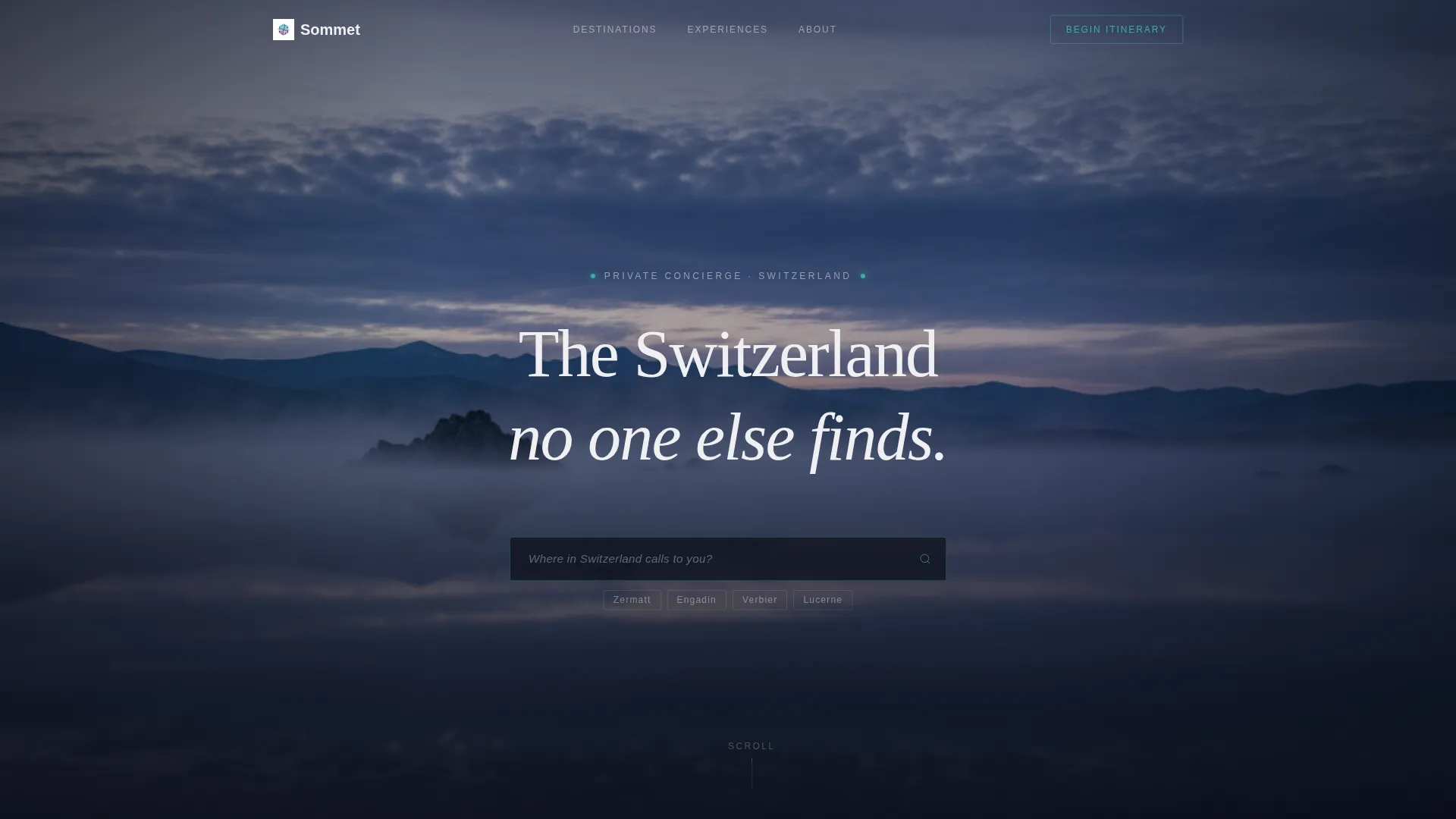
- A full-viewport header with a luminous teal search field, live destination crossfade video backgrounds, and placeholder copy that sets the concierge tone immediately
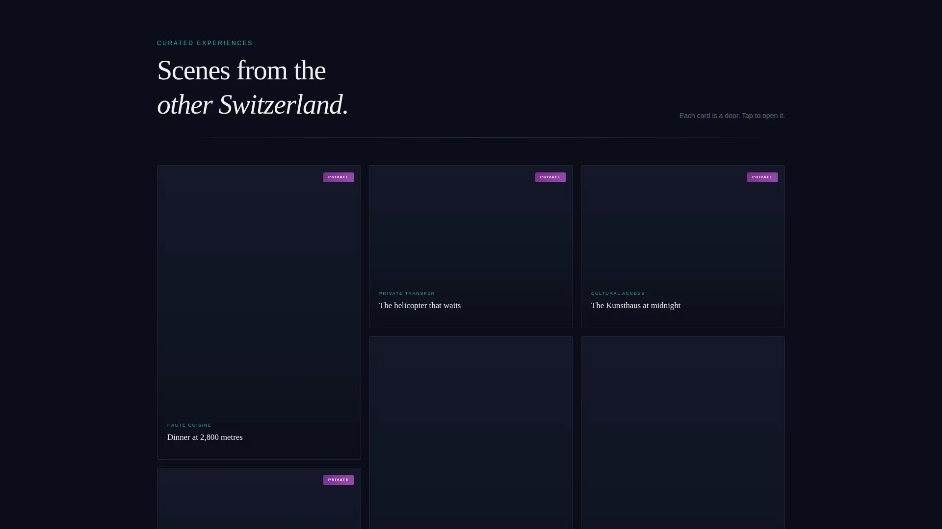
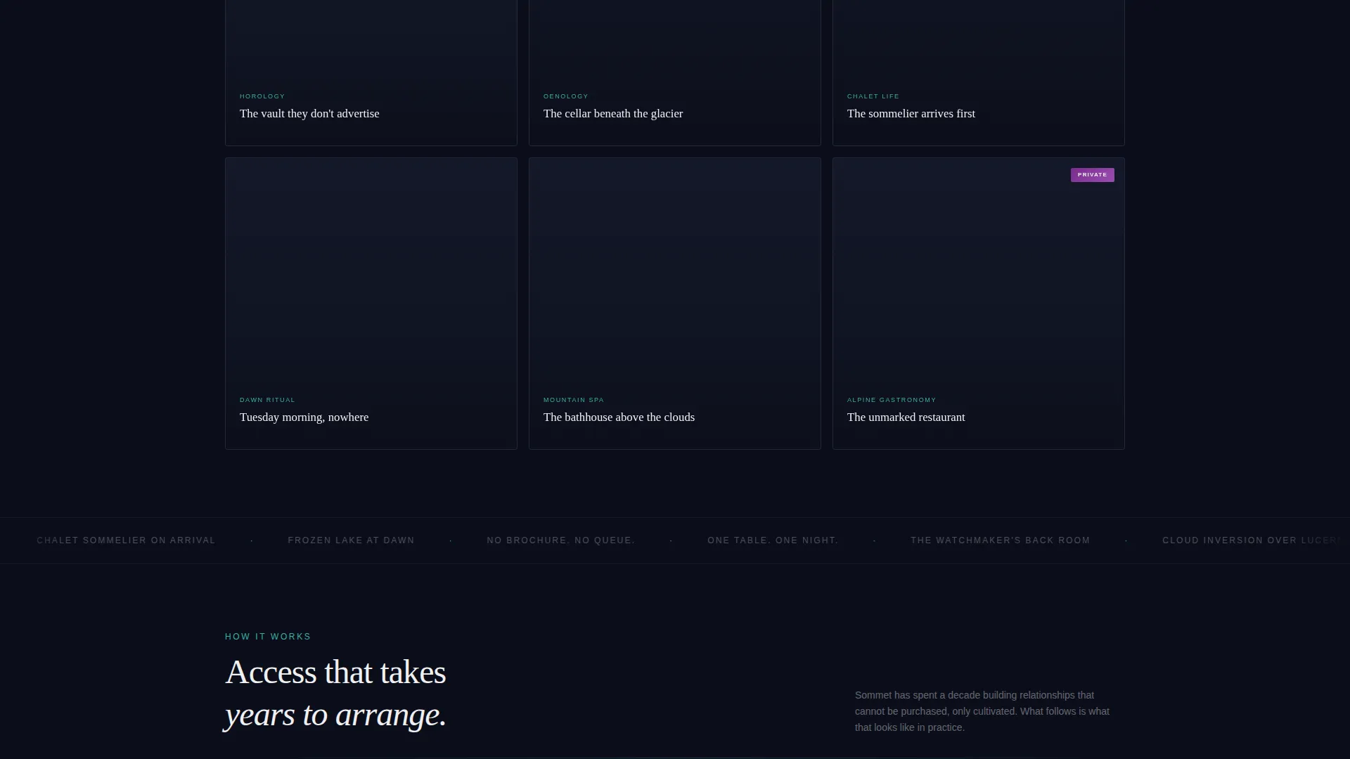
- A staggered masonry grid of experience cards, each expandable into a micro-story with two additional images and a "Request This Experience" link
- A persistent, pulse-triggered "Begin Your Itinerary" call-to-action button that appears in the lower-right corner and activates gently after the visitor has absorbed three rows of content
Feature list
This template includes purpose-built components that work together as a coherent editorial system. Each feature listed below is drawn directly from the design brief.
Destination-Reactive Video Header
The header occupies the full viewport and centers a single glowing teal search field over a slow-motion aerial drone clip of Lake Lucerne at blue hour. As a visitor types a destination, the background footage crossfades to match, creating a live, responsive atmosphere that no static hero image can replicate.
Cinematic Masonry Grid
The masonry layout presents experiences as scenes rather than listings. Cards load in a staggered, parallax-shifted sequence, mixing tall cinematic formats with square intimate frames. Each card carries a single-line white caption and builds in exclusivity row by row, so the scroll itself feels like a narrative arc.
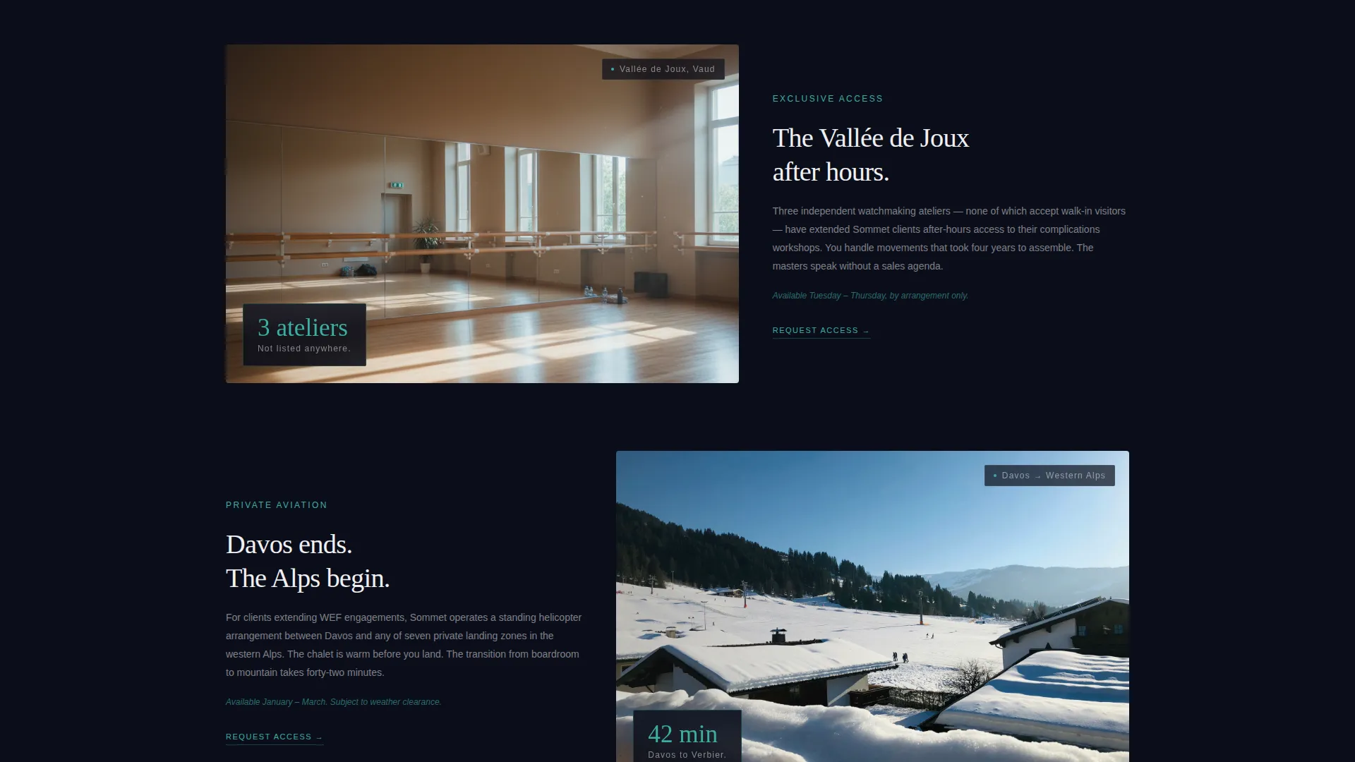
Expandable Experience Cards
Tapping or clicking any masonry card opens a micro-story view with two additional images and a "Request This Experience" link. This in-card conversion path lets visitors go from discovery to inquiry without ever leaving the page context.
Persistent Pulse call to action
The "Begin Your Itinerary" button lives in the lower-right corner and stays present throughout the scroll. After the visitor has passed three rows of the grid, the button pulses once, drawing attention at exactly the right moment of intent without interrupting the browsing experience.
Northern Lights Color System
The palette is built around four values: abyssal night (#0B0E1A) as the dominant background, glacial teal (#3CAEA3) for hover states and active card borders, aurora violet (#7B2D8E) for premium badges and accent gradients, and fresh snowfield white (#F0F0F2) for all typography and dividing lines. The result is a visual atmosphere that feels like a mountain pass at 2 a.m. with an aurora overhead.
Single-Line Card Captions
Each masonry card carries one line of white caption copy in place of a description block. Examples from the brief include "Dinner at 2,800 meters," "The vault they don't advertise," and "Tuesday morning, nowhere." This format keeps the grid uncluttered and lets the imagery do the persuading.
Page sections overview
| Section | Purpose |
|---|---|
| Full-Viewport Header | Immerses the visitor and triggers destination-reactive video on input |
| Masonry Grid | Delivers the cinematic experience sequence as scrollable scene cards |
| Expandable Card Stories | Converts card interest into a micro-story and inquiry link |
| Persistent call to action Button | Anchors the primary conversion path throughout the entire scroll |
Design & branding system
The visual identity is built on a Dark Immersive theme using the Northern Lights color system. Every design decision reinforces the feeling of a private alpine night: deep, velvet, and occasionally lit by impossible color.
- Backgrounds stay in near-black (#0B0E1A), with glacial teal (#3CAEA3) reserved for interactive states, aurora violet (#7B2D8E) used sparingly on premium badges and gradients, and fresh snowfield white (#F0F0F2) floating clean against the darkness for all text
- Typography is set in white against dark backgrounds so copy reads like breath in cold air, precise and unambiguous
- Teal pulses through hover states and active card borders, giving the interface a sense of quiet responsiveness without breaking the atmospheric tone
Mobile & speed optimization
The template is designed so the masonry grid and full-viewport header translate cleanly to smaller screens. The staggered card loading and parallax shifts are structured to work within a responsive layout without losing the cinematic quality of the desktop experience.
- Card expansion into micro-story view is touch-friendly, so mobile visitors can access the full experience narrative and inquiry link without friction
- The persistent call to action button is positioned and scaled for thumb reach on mobile viewports, keeping the primary conversion path accessible throughout the scroll
How this template helps you convert
Sommet is built around a philosophy of earning the click rather than demanding it. Every structural and visual decision is calibrated to move visitors from atmospheric immersion to genuine intent.
- The destination-reactive header personalizes the experience from the first keystroke, signaling that this concierge already understands what the visitor wants before they have finished typing
- The masonry grid builds a progressive narrative of exclusivity, so by the final row the visitor is not browsing options but composing a trip in their head
- The persistent call to action and in-card inquiry links provide two distinct conversion paths, meeting visitors at whichever moment of intent arrives first
Other information about this template
Sommet is categorized under Travel and Hospitality, with a specific focus on Switzerland luxury travel. The intersection of the Dark Immersive theme, Cinematic Sequence creative direction, and Click-Through landing-page direction makes it a precise fit for concierge brands that compete on access and atmosphere rather than price and volume.
- The template style is Masonry and Pinterest-inspired, making it well suited for experience-led brands where visual storytelling carries more weight than structured product listings
- The header concept is built around Location Input, a design pattern that immediately involves the visitor and sets a personalized, concierge tone from the first second of the visit
- The color system is designed to evoke the Northern Lights over alpine terrain, a visual language that resonates strongly with the target audience of ultra-high-net-worth couples, Davos-adjacent executives, and multigenerational families seeking off-brochure Switzerland experiences
Theme
Dark Immersive
Creative direction
Cinematic Sequence
Color system
Northern Lights
Style
Masonry/Pinterest
Direction
Click-Through
Page Sections
Destination-reactive Video Header
Cinematic Masonry Grid
Expandable Experience Card Stories
Persistent Pulse Call-to-action
Northern Lights Color System
Related questions
What kind of travel brand fits this template best?
Can I customize the masonry card captions and imagery?
How does the destination crossfade feature work in the header?
Does the template include the itinerary builder page?
Is this template suited for a portfolio of experiences or just one?


