Sensitive Skin Beauty Professional Website Template
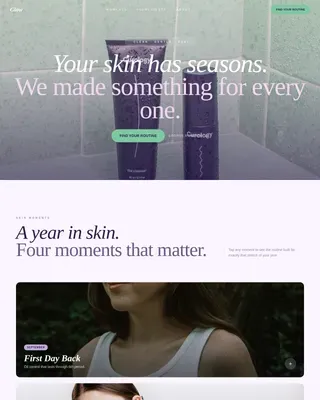
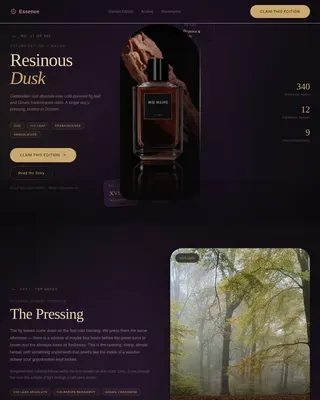
Soothe is a calming sensitive skin landing page template built for natural remedy guides and freemium content products. It features a dark full-bleed hero, scroll-linked before/after card reveals, a filterable remedy grid, and a free starter kit form. The design uses a soft mist palette with layered floating cards to create a therapeutic, trustworthy feel from the first scroll.
by Rocket studio
Quick summary
Soothe is a single-page template designed for sensitive skin home remedy guides. It opens with a dewy macro hero image and a fade-in headline, then moves visitors through layered before/after card reveals, a filterable remedy grid, and a freemium call to action. The result is a calm, credible page that earns trust before it asks for anything.
Who this template is for
This template was built for creators, wellness educators, and independent publishers offering natural skincare content to reactive-skin audiences. It suits anyone who wants to turn a library of home remedies into a structured, conversion-ready page.
- Natural remedy content creators and sensitive skin educators
- Independent wellness publishers launching a freemium or low-cost membership
- New mothers, eczema sufferers, or advocates building resources for reactive-skin communities
What problem this template solves
Many sensitive skin guides live in scattered blog posts or cluttered e-commerce pages. Visitors land, skim, feel overwhelmed, and leave before they trust the source. Soothe is built to fix that experience.
- Visitors see proof of depth before a single form field appears
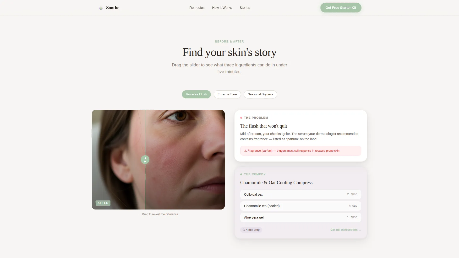
- The before/after reveal format shows the problem and solution side by side
- The freemium gate feels generous, not grabby, because three full remedies are visible first
What you get with this template
You get a fully structured overlap/layered landing page with every section pre-designed and ready to populate with your own remedy content. Nothing needs to be built from scratch.
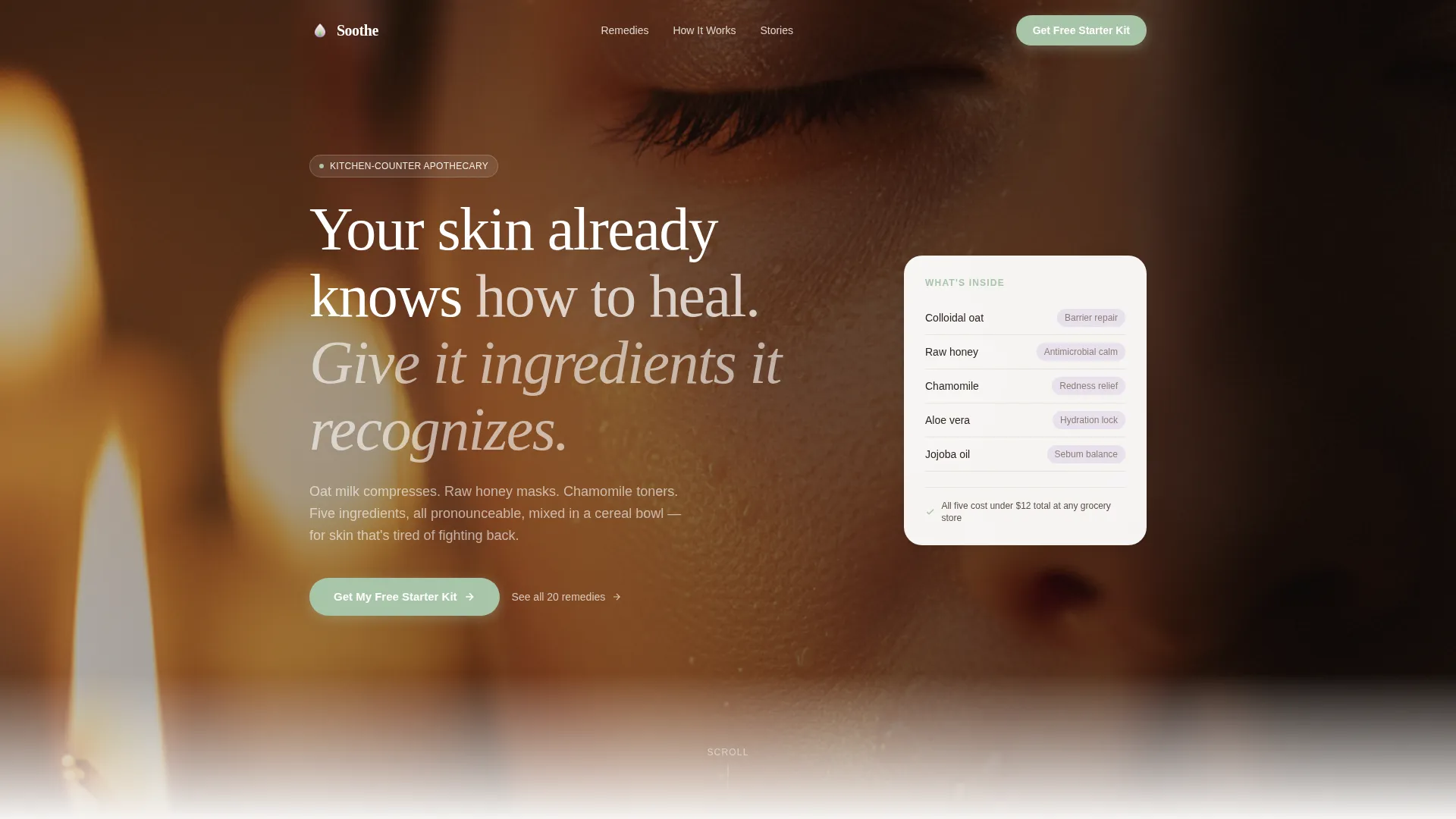
- A full-bleed hero section with a translucent headline overlay and a floating proof card
- A scroll-linked before/after reveal system covering three skin concern scenarios
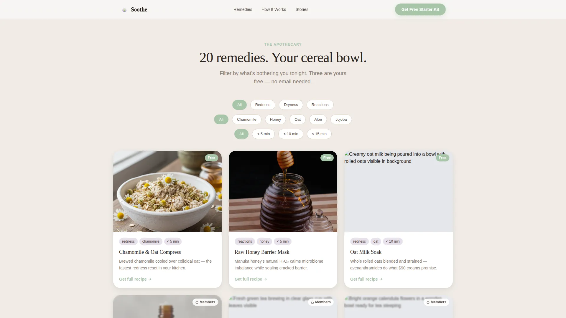
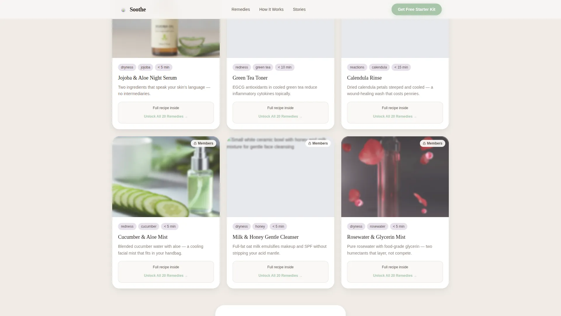
- A marketplace-style remedy grid showing twenty slots, three open and seventeen behind a soft frosted overlay
- A freemium call-to-action section with a first-name and email form, a three-option toggle, and an upsell path to a paid membership
- A testimonials section for three specific skin stories with ingredient callout support
- A minimal footer following a clean, uncluttered pattern
Feature list
This section covers the core built-in components that make Soothe work as a conversion-focused sensitive skin landing page.
Scroll-Linked Before/After Card Reveals
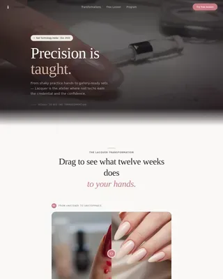
Each remedy section opens as a layered card showing an irritated-skin scenario. The visitor scrolls or swipes to dissolve it into the after state: calm skin, a three-ingredient recipe, and a sixty-second mixing video slot. Cards stack and overlap as the page progresses, keeping visitors scrolling to find their specific condition.
Filterable Remedy Marketplace Grid
A grid of twenty remedy cards sits at the midpoint of the page. Visitors can filter by skin concern, ingredient, or prep time. Three cards are fully visible and interactive. The remaining seventeen sit behind a frosted overlay with a clear unlock prompt, making the gate feel like a natural next step rather than a wall.
Freemium Starter Kit Form
The primary call-to-action collects first name and email only. A single toggle asks visitors to identify their biggest skin frustration from three preset options: redness, dryness, or reactions to products. This keeps friction low while giving you useful segmentation data at the point of sign-up.
Dark Full-Bleed Hero with Fade-In Headline
The header uses a macro close-up of dewy, unretouched skin lit by a single warm source. The headline fades in as a translucent overlay on top of the image. A floating proof card sits below the headline to anchor credibility before the visitor scrolls.
Layered Floating Card System
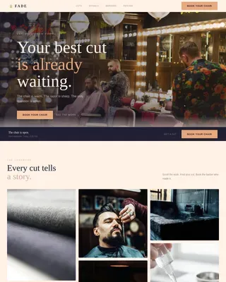
Throughout the page, cards float over soft beige backgrounds using feathered, shallow shadows. The overlap/layered structure means sections feel connected rather than stacked in rigid rows. This design pattern creates visual depth without adding visual noise.
Testimonials Section with Ingredient Transparency
Three testimonial blocks present real skin stories tied to specific conditions. The section supports ingredient callout formatting so visitors can see exactly which natural components helped each person. This is where social proof and product transparency work together before the final call to action.
Page sections overview
| Section | Purpose |
|---|---|
| Full-Bleed Hero | Opens the page with a warm macro skin photo, fade-in headline, and floating proof card |
| Before/After Reveals | Stacked swipe cards show three skin concerns dissolving into calm-skin remedy results |
| Remedy Marketplace Grid | Twenty filterable remedy cards with three open and seventeen behind a frosted gate |
| Testimonials and Trust | Three specific skin stories with ingredient callouts to build credibility |
| Freemium Call to Action | Email form with a three-option frustration toggle and membership upsell path |
| Minimal Footer | Clean, uncluttered footer with essential links and no visual competition |
Design & branding system
The visual identity follows a Soft Mist theme. Every color in the palette was chosen to feel restful and credible, the way a clean, uncluttered bathroom shelf feels calming before you even pick anything up.
- Cloud-white (#F7F5F3), barely-there lavender (#E8E0EC), and steamed-oat beige (#D9CEBD) form the base palette, with aloe-water green (#A8C5AA) reserved for buttons and progress indicators
- Typography pairs Fraunces, a warm editorial serif, for display headings with DM Sans for all body text, keeping the page readable without feeling clinical
- Layered cards use feathered shadows so shallow they appear to hover, and linen-texture backgrounds give the page an apothecary warmth that reinforces the natural remedy positioning
Mobile & speed optimization
Soothe was designed with a mobile-first priority, recognizing that the core audience is most likely to land on the page while mid-flare, in a bathroom, on a phone. Every section was laid out for thumb-friendly scrolling before desktop was considered.
- The before/after reveal uses a swipe interaction designed for touchscreen use, not just mouse drag
- Images are set to lazy-load so the initial view appears quickly even on slower connections
- The remedy grid and form toggle are both sized and spaced for comfortable one-handed mobile use
How this template helps you convert
The conversion strategy is built into the page structure itself. Visitors are never asked to trust before they have been given a reason to.
- Three full remedies are visible before any gate appears, demonstrating real depth and proving the content works before the visitor commits to sharing their email.
- The free starter kit form asks only for a name and email, with a single low-friction toggle, making the sign-up feel like a natural next step rather than a transaction.
- The frosted overlay on the remaining seventeen remedies creates a visible, curiosity-driven nudge toward the paid membership without aggressive urgency tactics.
Other information about this template
This template sits at the intersection of the beauty and personal care category, the sensitive skin beauty subcategory, and the sensitive skin home remedy niche. It is designed as a digital wellness content product with a freemium-to-membership conversion path.
- The template style is Overlap/Layered, and the layout theme follows a Marketplace Grid structure
- The creative direction is Before/After Reveal, and the header concept is Dark Full-Bleed with a warm glow effect
- The landing page direction is Freemium/Trial, meaning the free offer does the convincing and the paid offer is a clear, optional upgrade
- Suitable for launching a downloadable starter kit, a printable patch-test protocol, or an annual remedy membership
- The Fraunces and DM Sans type pairing is intentional: editorial warmth balanced with clinical-free readability
Theme
Marketplace Grid
Creative direction
Before/After Reveal
Color system
Soft Mist
Style
Overlap/Layered
Direction
Freemium/Trial
Page Sections
Scroll-linked Before/after Card Reveals
Filterable Remedy Marketplace Grid
Freemium Starter Kit Form
Dark Full-bleed Hero Section
Layered Floating Card System
Testimonials with Ingredient Callouts
Related questions
Can I show my own remedy content in this template?
How does the freemium gate work on this landing page?
Is this landing page built for mobile users?
What does the starter kit call-to-action collect from visitors?
Can I adapt this template for a niche other than sensitive skin?