Neo-Retro Moroccan Casual Dining Landing Page Template
Souk is a Neo-Retro Moroccan casual dining landing page template built as a modular card grid. It serves up a full-bleed hero, a scroll-driven menu grid with dish stories and prices, interior and neighborhood cards, a slide-up cart, and a three-field reservation form, all wrapped in a warm Sunset Mesa color system built to turn first-time visitors into same-night orders.
by Rocket studio
Quick summary
Souk is a single-page, card-grid landing page template designed for a Moroccan casual dining restaurant. The layout flows like browsing a neighborhood souk, dish cards, interior shots, and local culture cards stack in a breathing bento grid. The Sunset Mesa palette, retro-serif typography, and floating order button work together to move hungry visitors from first scroll to confirmed pickup or reservation in under sixty seconds.
Who this template is for
This template was built for a specific kind of restaurant owner: one who wants their food to do the selling before a visitor ever taps "Order." If you run a Moroccan casual dining spot and your guests are young couples, families celebrating without the fuss of white tablecloths, or remote workers who have turned the weekly mint tea and afternoon pastilla into a ritual, this template was designed with your audience in mind.
It is equally useful for restaurant designers and developers who need a production-ready, fully styled starting point for a neighborhood dining client. The brief behind this template reflects the energy of a place where locals become regulars and every meal feels like a small occasion.
- Moroccan casual dining restaurant owners launching or refreshing their online presence
- Food and beverage web designers building a client site with a strong cultural identity
- Hospitality entrepreneurs who want to serve both walk-in guests and online pickup orders from a single page
What problem this template solves
Most restaurant landing pages fail the visitor at exactly the wrong moment. A guest arrives on their phone on a Friday night, they are hungry, they want to eat something that is not another burger, and the page either takes too long to load meaning, loads a static PDF menu, or buries the "Reserve" button three scrolls deep. By the time they find it, they have already opened a Taco Bell tab.
This template solves the gap between appetite and action. Every design decision, from the floating "Order for Pickup" button to the dish cards that tell a two-line origin story alongside the price, is aimed at shortening the distance between craving and commitment. The page is built for mobile-first discovery because restaurant visits are planned on phones, not desktops.
- Visitors leave before ordering because the menu is hard to browse on mobile
- Reservation flows ask too many questions, losing guests who just want a table for two on Saturday night
- The restaurant's atmosphere and food story never translate through generic template designs
What you get with this template
You get a complete, section-by-section landing page ready to populate with your own photos, dish names, prices, and neighborhood details. The template is structured so that every visual and every word serves one purpose: getting the visitor to order or reserve before they close the tab.
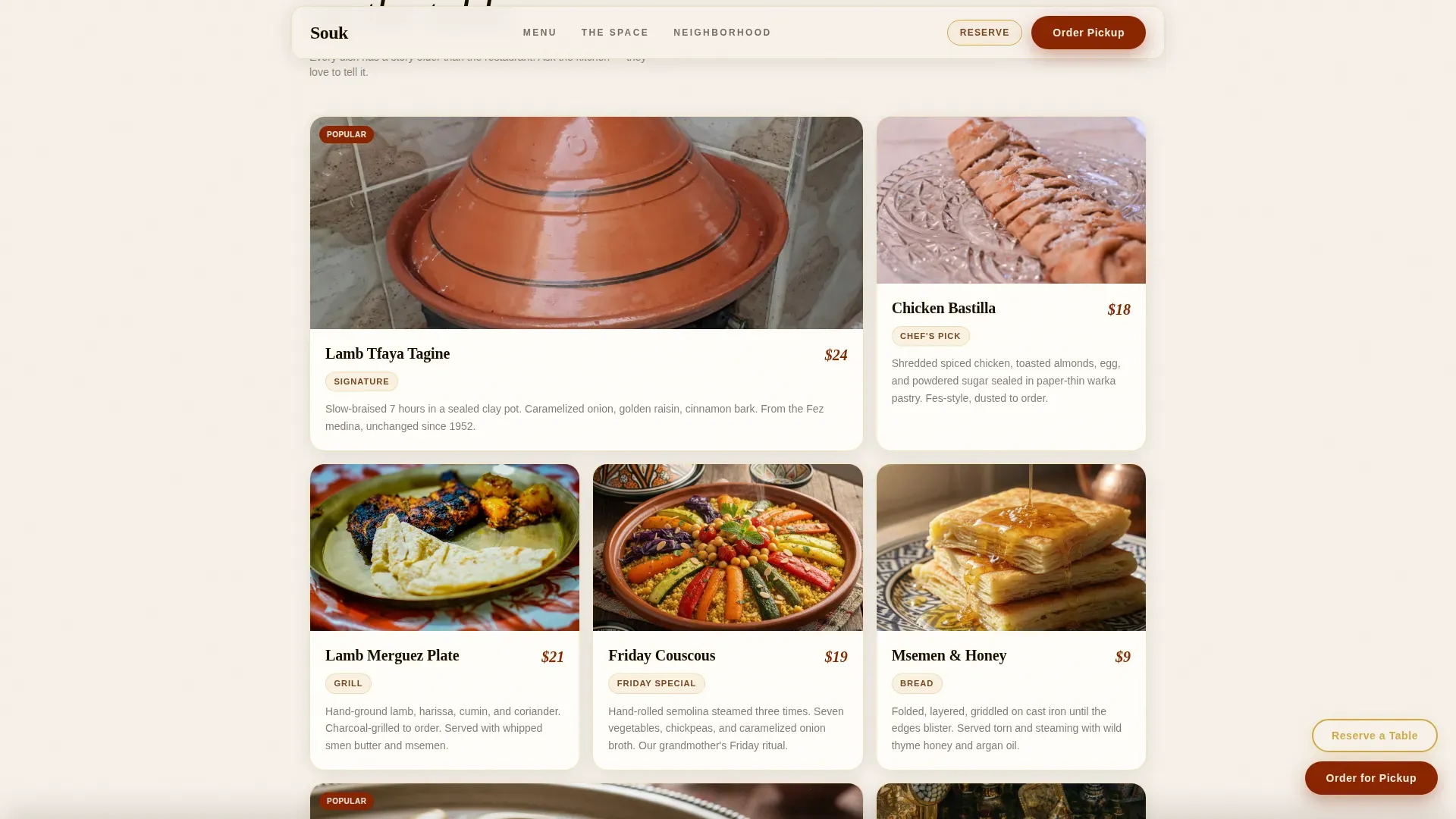
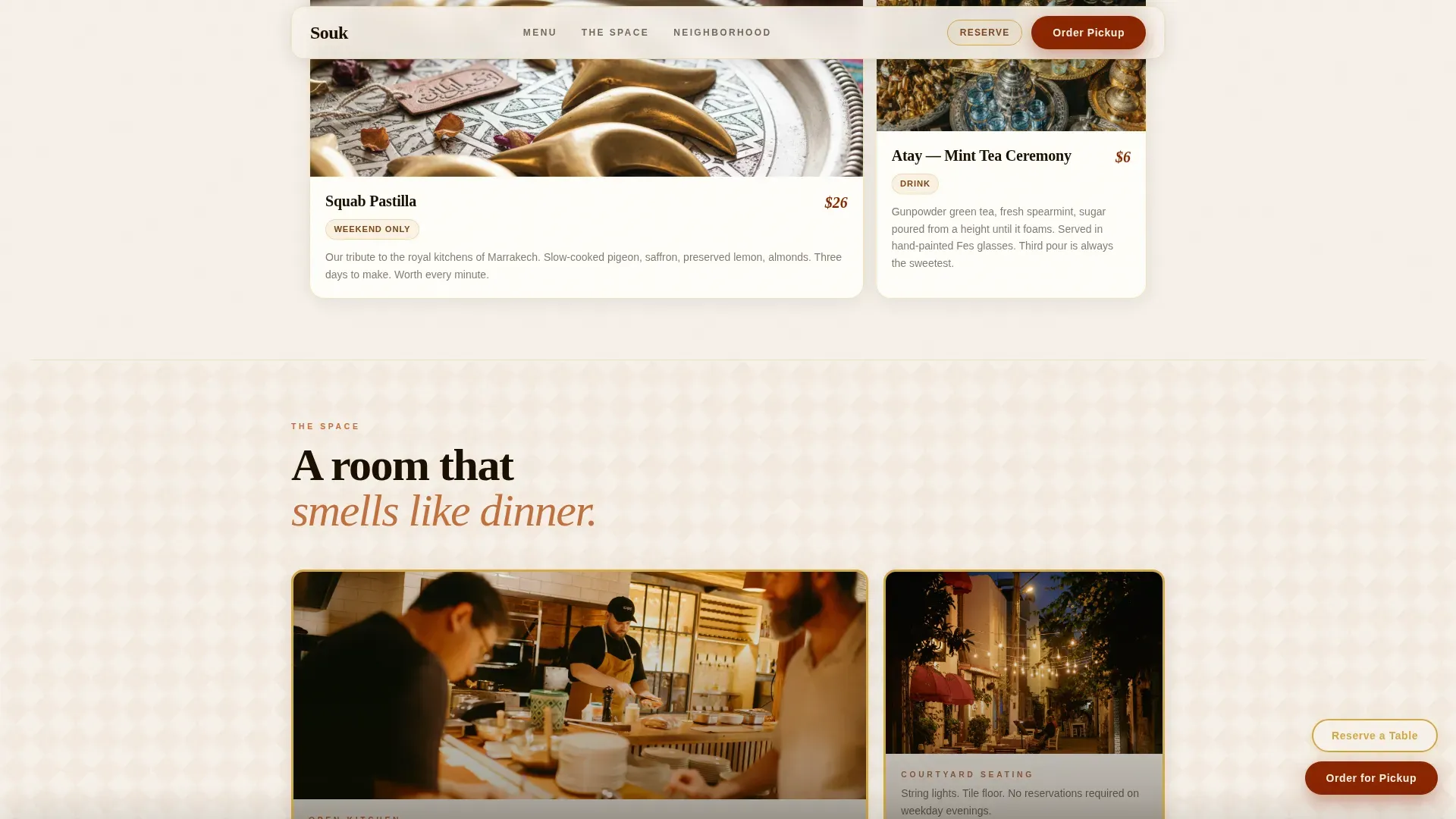
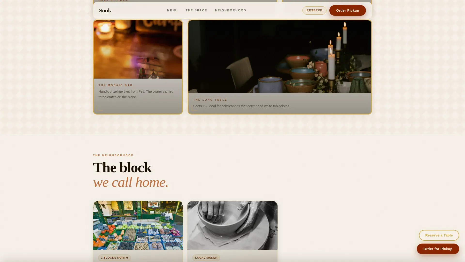
The card grid is the heart of the layout. Cards vary between single, double, and full-width slots so the page breathes and scrolls like a souk stall, not a spreadsheet. Each dish card carries a tight overhead photo, a hand-lettered-style dish name, a two-line origin story, and a price marked in harissa red. Interior cards use rounded corners and brass borders to frame the open kitchen, the courtyard seating, and the mosaic bar like vintage postcards. Neighborhood cards connect the restaurant to the city around it, the Saturday farmer's market, the owner's playlist, the local ceramicist who hand-threw the bowls on the table.
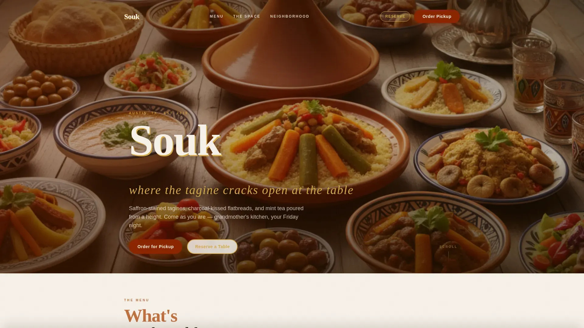
- Full-bleed hero section with an overhead communal table photo and retro-serif restaurant name overlay
- Modular bento card grid covering menu dishes, restaurant interior, and neighborhood culture
- Floating "Order for Pickup" button, slide-up cart drawer, and three-field reservation modal
Feature list
This template includes the following built-in features, each rooted in the brief behind Souk.
Full-Bleed Hero with Retro-Serif Name Overlay
The hero opens with a captivating full-bleed overhead photo of a communal table mid-meal, hands reaching, steam rising, honey dripping from torn msemen. A captivating photo background is an essential feature of the hero section to establish ambiance, and this one delivers it without staged symmetry. The restaurant name is set in a chunky retro-serif with rounded terminals, rendered in plaster white with a subtle brass drop shadow. No separate title slide, no generic stock imagery, the hero is alive from the first pixel.
Modular Bento Card Grid
The menu, space, and neighborhood sections all live inside a single breathing grid. Cards vary between single, double, and full-width slots, so the scroll feels editorial rather than tabular. Each dish card carries a tight overhead photo, a name in hand-lettered type, a two-line story about the dish's origin, and a price in harissa red. The interactive menu display uses the grid's geometric rhythm to enhance browsing, more like flipping through a food magazine than reading a spreadsheet. Digital menus on the landing page showcase key authentic dishes in an easy-to-read format, and this grid does that while also telling the story behind every plate.
Floating Order Button and Slide-Up Cart
After the menu section loads, an "Order for Pickup" button in harissa red pins itself to the screen as a floating element. Tapping it opens a slide-up cart drawer pre-populated with the menu cards the visitor has already browsed, with quantities adjustable inline. There is no separate menu page and no redirect. The cart drawer keeps the visitor inside the page experience and removes every unnecessary step between craving and checkout.
Three-Field Reservation Modal
The reservation path is intentionally minimal: party size, date, and phone number. Three fields, one tap to confirm. A clean, modern call-to-action for bookings stands out against the ornate background elements of the grid, which is exactly how this modal is designed, a clear harissa red or brass-outlined button that interrupts the browsing flow just enough to capture a booking without frustrating the guest.
Inline Social Proof and Neighborhood Cards
The grid includes an inline quote card for social proof and a set of neighborhood context cards that connect the restaurant to local culture. These cards reference the Saturday farmer's market nearby, the owner's curated playlist, and the ceramicist whose bowls are on every table. Sections dedicated to showcasing cultural craftsmanship enhance the connection between guests and the restaurant's history, and these neighborhood cards serve exactly that role.
Scroll Animations and Hover Interactions
Cards reveal on scroll with staggered entrance animations. Each card lifts slightly on hover, giving the grid a tactile, physical quality. The floating order button enters with a smooth upward slide after the menu section becomes visible. These interactions are set at a medium intensity, present enough to feel alive, restrained enough not to distract from the food photography.
Page sections overview
| Section | Purpose |
|---|---|
| Full-Bleed Hero | Establish atmosphere and brand identity with an overhead communal table photo and retro-serif restaurant name |
| Menu Card Grid | Serve dish photos, origin stories, and harissa-red prices in a browsable bento layout |
| Space Interior Cards | Showcase the open kitchen, courtyard seating, and mosaic bar through vintage-postcard-style framed photos |
| Neighborhood Culture Cards | Connect the restaurant to local culture through market, playlist, and ceramicist story cards |
| Reserve and Order | Capture bookings via a three-field reservation modal and a floating pickup order button |
| Minimal Footer | Close the page with a clean horizontal footer pattern |
Design & branding system
The visual identity follows the Sunset Mesa color system, a palette that feels like a riad courtyard at golden hour. Dusty warmth bounces off whitewashed walls while copper lanterns throw amber halos onto zellige tile. The design aims to create high visual contrast by pairing bold spice tones with neutral desert shades, which makes both the food photography and the interactive elements pop against the page canvas.
Typography pairs Fraunces, a warm variable serif display font, with DM Sans for body copy. This mix of clean sans-serif for readability combined with elegant headers reflecting a neo-retro feel is exactly what the brief calls for. Section dividers and background overlays use geometric and Arabesque patterns, Zellij mosaic tilework motifs and Islamic keyhole shapes, to reinforce the cultural identity without overwhelming the food photography. Visuals include high-resolution overhead shots of key dishes like couscous and tagines, as well as warm-lit interior shots and intricate tile details.
- Sunset Mesa color roles: plaster white (#F5F0E8) for card backgrounds and page canvas, terracotta (#C2703E) for headlines and section dividers, harissa red (#8B2500) for prices and interactive highlights, aged brass (#D4A843) for icon borders and hover states
- Fraunces display serif for headlines and dish names; DM Sans for body text, captions, and form labels
- Arabesque and Zellij geometric pattern elements used as section dividers and card background overlays
Mobile & speed optimization
Restaurant discovery is overwhelmingly mobile. Guests are visiting a restaurant's page from a phone, usually on a Friday evening, usually hungry, and usually not willing to wait. The template was designed with a mobile-first layout, meaning every card size, button placement, and font scale was considered for a small screen before being adapted upward to desktop.
Images across the page are lazy-loaded so the visitor sees the hero and the first row of menu cards immediately, without waiting for the neighborhood section assets to arrive. Static sections are built with Server Components, keeping the initial page load light. The floating order button and slide-up cart are engineered to feel instant on mobile, tap, browse, confirm.
- Mobile-first card layout with fluid grid that adapts from single-column on small screens to multi-column on tablet and desktop
- Lazy-loaded images so above-the-fold content appears without delay
- Server Components used for static sections to reduce client-side JavaScript weight
How this template helps you convert
The page is not structured as an information brochure. It is structured as a conversion sequence. Every section exists to move the visitor one step closer to tapping "Order for Pickup" or "Reserve a Table."
- The hero creates immediate appetite and atmosphere. A visitor who has never heard of the restaurant feels the warmth of the space and the quality of the food before they read a single word. That first moment of visual impact is the foundation of every conversion that follows.
- The menu card grid builds a specific craving. Each dish card, the lamb merguez with its two-line origin story, the chicken bastilla dusted with cinnamon sugar, the honey-drizzled msemen, adds a micro-conversion layer. By the time the visitor reaches the floating button, they are not deciding whether to order. They are deciding between the chicken and the beef kefta.
- The floating order button and reservation modal remove all remaining friction. The button is always visible after the menu section loads. The reservation modal asks only three questions. The cart opens pre-filled. Every friction point that normally causes a guest to abandon has been designed out of the flow.
Other information about this template
This section covers additional context that helps you understand the full value and creative background of the template.
The Souk neo retro Moroccan casual dining landing page template draws its creative direction from a Local and Neighborhood philosophy. The goal is not to make the restaurant look like a franchise or a generic food-hall concept. The goal is to make it feel like the most alive corner of a thriving city block, the kind of place you tell your wife about on the drive home, or recommend to a friend who is flying into town and wants one meal that is worth the trip.
Morocco has one of the most celebrated food cultures on the planet. Moroccan food carries the flavors of the Atlas Mountains, slow-cooked lamb, charcoal-kissed flatbreads, preserved lemons, spiced couscous, and the warmth of middle eastern hospitality that has been refined over centuries. The Atlas Mountains appear not just as a geographic reference but as a metaphor for depth and craft: recipes carried down through generations of Moroccan people, paying homage to a rich history that long predates any modern restaurant trend. Middle Eastern culinary traditions are woven into every dish, from the layered bastilla to the harissa-rubbed chicken to the sweet mint tea served at the close of every meal.
Visitors discovering Moroccan food for their first visit often arrive not knowing what to expect. They have heard it described but have never tasted the contrast of sweet and savory in a tagine, or felt the ritual slowness of a proper mint tea service. This template gives that first visit a digital preview, a visual food tour through the menu, the space, and the neighborhood, so the guest arrives already invested.
The template is a useful example for any restaurant owner who wants to understand the benefits of a well-designed digital presence. Luckily, you do not need to build it from scratch. A well-designed landing page can effectively showcase a restaurant's unique offerings and ambiance, and incorporating local design elements into landing page templates resonates with the target audience in ways that generic themes simply cannot.
Landing page templates for restaurants can enhance online visibility and attract more customers. Using a template like this one can streamline the process of creating a restaurant's online presence considerably. The key features here include a warm terracotta color palette, Zellij mosaic pattern details, and high-quality imagery of tagines and tea, which are also the elements that make a Moroccan casual dining page feel credibly authentic rather than cosmetically themed.
The creative direction was inspired by the sense of wonder you feel walking into a neighborhood restaurant that has clearly been filled with love and intention. The art of creating that feeling digitally requires the same attention to detail: the right colors, the right textures, the right moment captured in every photo. This template gives you the structure to deliver that experience to anyone visiting your page, whether they are locals who already eat lunch nearby every week, or travelers who found you while searching for somewhere interesting to eat in the city.
Think about the difference between eating at a place that feels alive versus a place that feels like a copy. Imagine a guest who has already spent a week sampling familiar chains, a burger here, a standard chicken wrap there, and who suddenly lands on a page that smells different, visually speaking. That guest is ready to eat something they have never tried before. They are ready to explore. This template gives your restaurant page the personality to be that destination, not a fallback.
The page structure also works well for restaurants that want to serve both the dinner crowd and the weekend brunch crowd. Breakfast visitors and lunch guests can discover the menu just as easily as someone planning a Friday night out. The morning coffee and pastry culture of Morocco translates beautifully into a neighborhood café context, and the template's card grid is flexible enough to surface those offerings alongside the evening menu.
- This template is a single-page layout, not a multi-page website
- The brand name "Souk" and all placeholder text are fully customizable
- Neighborhood card content references Austin, Texas context in the default build; this can be updated to any city
- The template references Taco Bell and Del Taco in the broader competitive landscape, the real opportunity is to serve guests who are actively looking for something beyond fast food and chain dining, and this template positions a Moroccan restaurant as exactly that alternative
- David Lynch once described the best creative work as something that catches an idea and refuses to let it become generic; this template follows that philosophy by refusing to look like every other restaurant page on the internet, it is specific, textured, and committed to a singular identity
- David Lynch's approach to atmosphere and sensory layering is a useful creative parallel here: just as David Lynch builds worlds through specific detail rather than broad strokes, this template builds appetite through specific dish stories, specific textures, and specific moments rather than generic "welcome to our restaurant" copy
- The David Lynch parallel extends to the photography direction: the hero shot is not composed for a stock catalogue, it is mid-meal, slightly blurred, and alive, which is closer to how David Lynch would direct a dining scene than how a brand photographer would shoot one
- The template is currently set up for USD pricing and US date formats but can be adapted to other currencies and date conventions
Theme
Neo-Retro
Creative direction
Local & Neighborhood
Color system
Sunset Mesa
Style
Card Grid (Modular)
Direction
Direct Sales
Page Sections
Full-bleed Hero with Retro-serif Overlay
Modular Bento Card Grid
Floating Order Button and Slide-up Cart
Three-field Reservation Modal
Neighborhood and Social Proof Cards
Scroll Reveals and Hover Lift Animations
Related questions
Can I update the menu cards with my own dishes and prices?
Does the template work for restaurants that serve breakfast and lunch as well as dinner?
How does the reservation flow work for guests?
Is this template designed for mobile users first?
Can I adapt the neighborhood cards to reflect my own local area?