Indigenous-Owned Business Pricing & Packages Website Template
Sovereign is a bold, card-grid landing page template built for indigenous-owned marketing agencies. It leads with a three-tier service bundle display, guides visitors through a side-by-side comparison journey across four marketing disciplines, and closes with a two-step conversion form. The Neo-Retro Citrus Burst palette and slab-serif type give every section an unmistakable cultural confidence.
by Rocket studio
Quick summary
Sovereign is a modular, card-grid landing page template designed for an indigenous-owned marketing agency. It opens with a retro punch-card bundle display, walks visitors through escalating service-tier comparisons, and drives upgrades through a sticky bottom bar and a two-step qualifier form. Bold color, halftone texture, and cultural storytelling shape every section.
Who this template is for
This template is built for indigenous-owned marketing agencies that lead with cultural authenticity, not corporate conformity. It speaks directly to the people doing serious brand work inside and alongside tribal communities.
- Tribal enterprise directors launching tourism campaigns or community-facing product lines
- Native-owned businesses ready to break into mainstream retail with a strong visual identity
- Indigenous nonprofits that need fundraising collateral that honors tradition and commands boardroom attention
What problem this template solves
Most agency landing pages flatten service offerings into a price list. They fail to show the real gap between a standard approach and one rooted in cultural depth and strategic expertise. Sovereign makes that gap impossible to ignore.
- Generic agency pages bury the value of cultural competency under a wall of bullet points
- Visitors leave without understanding what a real upgrade in storytelling and brand identity actually looks like
- Indigenous-led agencies lose opportunities because their page feels as generic as the agencies they outperform
What you get with this template
You get a fully structured, single-page layout built around a modular card grid. Every section has a defined job, and every visual choice reinforces the agency's authority and cultural identity.
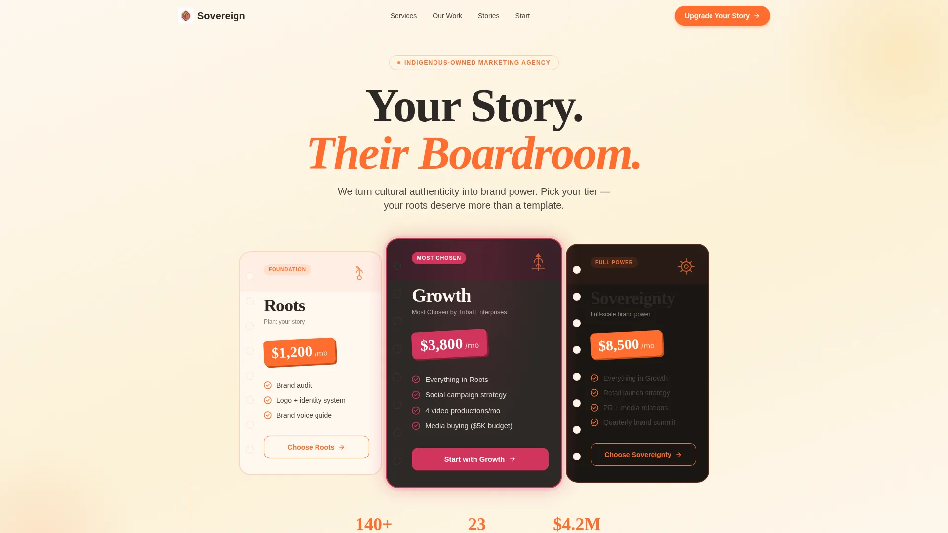
- A three-card bundle header styled as retro punch cards, each showing a package tier, a hero icon, and an angled starting price
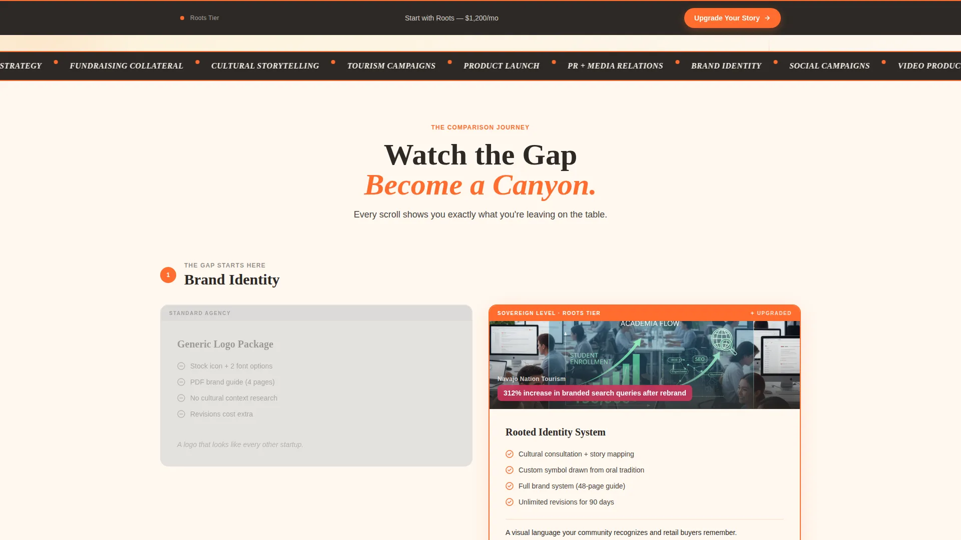
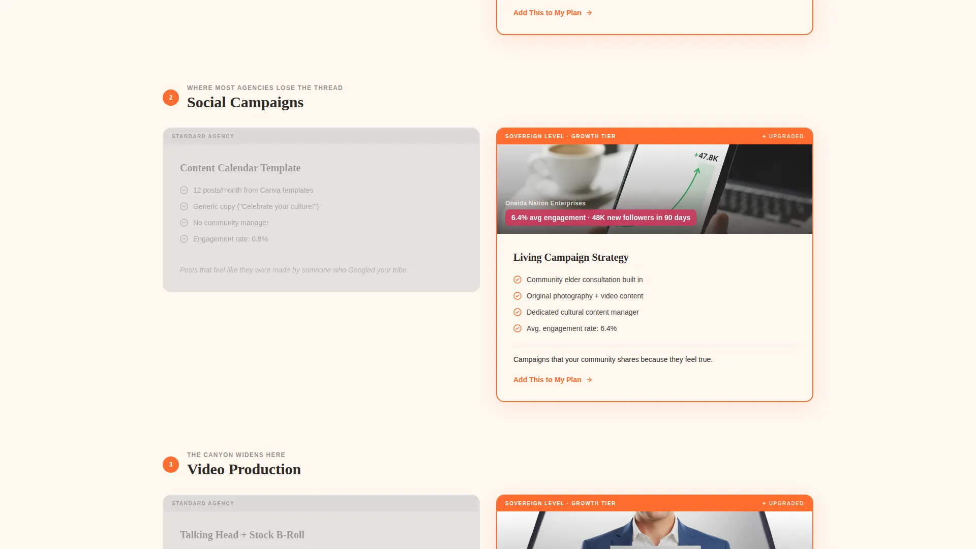
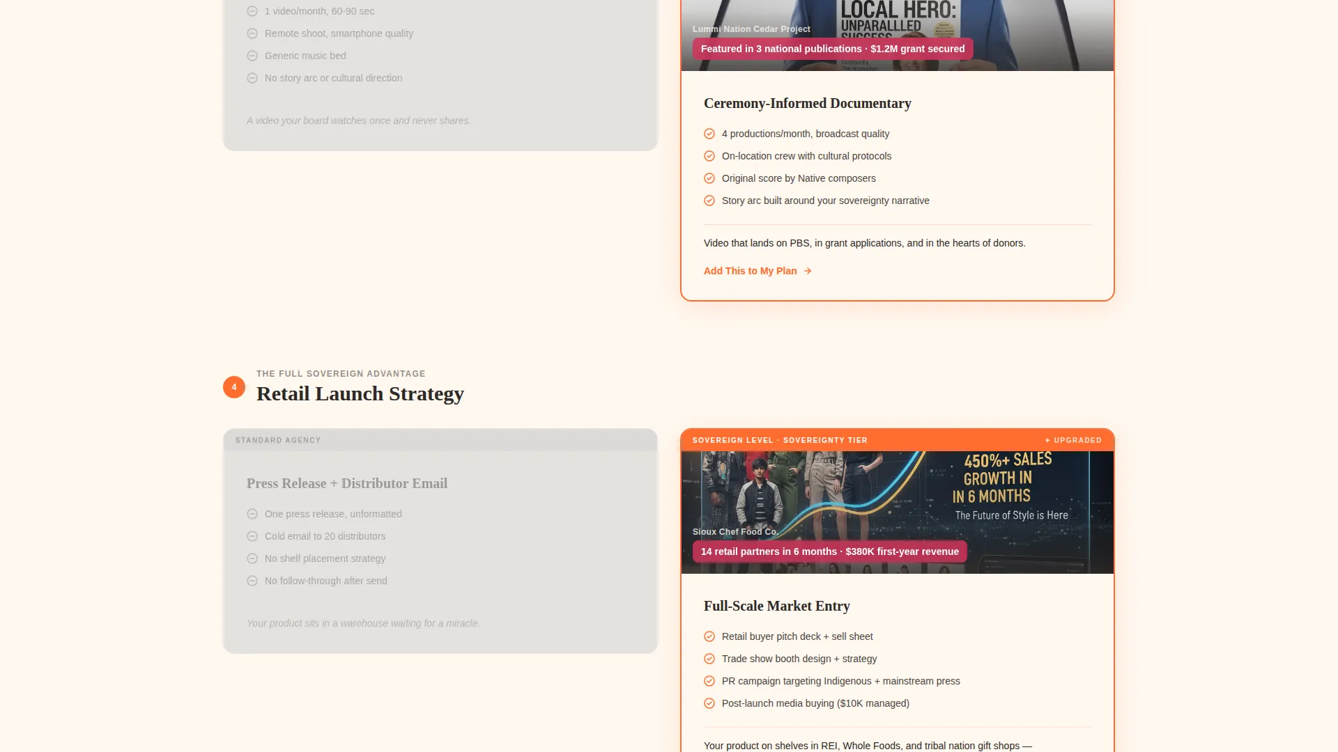
- A four-discipline comparison journey pairing desaturated "Standard" cards against vibrant "Upgraded" cards with mini case study thumbnails
- A sticky bottom bar with a dynamic primary call to action and a two-step conversion form with a visual tier picker and short qualifier
Feature list
This template covers every functional layer a high-converting agency landing page needs, from first impression through form submission.
Three-Tier Bundle Header Display
The header arranges three service packages side by side as retro punch cards. Each card carries a package name in bold slab-serif type, a tangerine line-art icon, and a stamped starting price. The middle card is physically larger and marked with a magenta border pulse to signal the most popular choice.
Comparison Journey Card Layout
Four marketing disciplines each get their own section. In every section, a flat, desaturated "Standard" card sits next to a full-color "Upgraded" card with a mini case study thumbnail. The stakes escalate from logo design through full-scale product launch, making the value gap feel wider with every scroll.
Sticky Upgrade Call-to-Action Bar
A persistent bottom bar stays visible as the visitor scrolls. Its label updates dynamically to reflect the service tier most relevant to the current section in view. This keeps the primary action front and center without interrupting the reading flow.
Two-Step Conversion Form
The form opens with a visual card picker where visitors choose their current service tier. The second step asks three qualifier questions: business type, current monthly marketing spend range, and an open field asking "What story isn't being told yet?" This sequence warms the lead before any sales conversation begins.
Neo-Retro Visual Identity System
Halftone dot textures, rounded card corners, and slab-serif typography create a vintage-diner aesthetic that feels warm and confident. Electric tangerine drives borders and calls to action. Magenta highlights upgrade tiers. Grapefruit washes section backgrounds. Mesquite charcoal anchors all body text.
Modular Card Grid Structure
Every content block is a self-contained card. The grid layout makes it straightforward to reorder sections, swap service disciplines, or adjust package tiers without disrupting the overall visual system.
Page sections overview
| Section | Purpose |
|---|---|
| Bundle Tier Header | Introduces three service packages as retro punch cards with tiered pricing |
| Brand Identity Comparison | Contrasts standard logo work with culturally grounded brand identity |
| Social Campaigns Comparison | Shows the gap between generic posting and indigenous storytelling campaigns |
| Video Production Comparison | Escalates the comparison to motion content with case study thumbnails |
| Media Buying Comparison | Presents the final and widest tier gap before the conversion form |
| Sticky Upgrade Bar | Keeps the primary call to action visible and tier-relevant throughout the scroll |
| Two-Step Qualifier Form | Collects tier selection, business type, spend range, and open story field |
Design & branding system
The Citrus Burst color system pulls from the warmth of a Route 66 diner sign at dusk. Every color has a specific role, and nothing is interchangeable.
- Electric tangerine (#FF6D2E) drives all calls to action and card borders; sun-ripe grapefruit (#F7B733) washes section backgrounds; cream linen (#FFF8F0) holds breathing space between cards
- Deep mesquite charcoal (#2D2926) anchors all body text for strong legibility; prickly pear magenta (#D1345B) marks upgrade-tier highlights and the pulsing border on the hero card
- Bold slab-serif typography, halftone dot textures, and rounded card corners complete the Neo-Retro aesthetic
Mobile & speed optimization
The modular card grid adapts naturally to smaller viewports. Each card is a discrete unit, so stacking and reflow happen without breaking the visual hierarchy.
- Cards restack vertically on mobile while preserving the color hierarchy and tier distinctions
- The sticky bottom bar remains accessible on touch screens without covering critical content
- Halftone textures and flat card backgrounds keep the visual load light across device sizes
How this template helps you convert
Sovereign earns the upgrade click by making the value gap visible, not by discounting. Every structural choice moves a hesitant visitor closer to a confident decision.
- The escalating comparison journey raises the perceived cost of staying at the standard tier. By the final section, the visitor has seen four concrete examples of what they are leaving on the table, and the gap feels too wide to justify.
- The two-step form filters for qualified leads before any conversation happens. Visitors self-select their tier, identify their business type, and articulate their own unmet need, arriving at the sales conversation already aligned with the offer.
Other information about this template
This template is categorized under Retail and E-Commerce with a focus on indigenous-owned businesses. It is built as a single-page landing structure using a Bento Grid-style modular layout and a Neo-Retro theme. The creative direction follows a Comparison Journey flow, and the landing page direction is set up for click-through and upgrade conversion. The header concept in the matched intersection context was originally tagged as a Search Box configuration, but the brief overrides this with the Bundle Deal punch-card display described above.
- The template suits indigenous-owned art galleries, Native product lines, and tribal enterprise service pages that need a strong visual identity alongside clear service tiers
- The color system is classified as Dopamine Pop in the intersection data, which aligns with the high-saturation, high-contrast Citrus Burst palette used here
- Package names (Roots, Growth, Sovereignty) and icons (seed, stalk, full sun) are included in the brief as named starting points and can be renamed to match any agency's actual service structure
Theme
Neo-Retro
Creative direction
Comparison Journey
Color system
Dopamine Pop
Style
Bento Grid
Direction
Click-Through
Page Sections
Three-tier Retro Bundle Header
Four-discipline Comparison Journey
Dynamic Sticky Upgrade Bar
Two-step Qualifier Conversion Form
Modular Card Grid Layout
Neo-retro Citrus Burst Visual System
Related questions
Can I rename the service tiers and update the pricing on the bundle cards?
Is this template only useful for marketing agencies?
How does the sticky upgrade bar update as visitors scroll?
What information does the two-step conversion form collect?
Can the comparison sections be reordered or expanded beyond four disciplines?



