Civil Engineer Profile Portfolio Website Template
Span is a dark, immersive landing page template built for civil engineers who work at the professional level. It uses an asymmetric 60/40 grid, a Void & Violet color system, and a case study narrative layout to present structural engineering credentials with authority. The template guides contractors, agencies, and developers toward a direct project inquiry or a downloadable capability statement.
by Rocket studio
Quick summary
Span is a single-page landing page template designed for a civil engineer personal brand. It uses a dark asymmetric grid, full-bleed project photography, and a sequential case study layout to build credibility with general contractors, municipal agencies, and developers. Two conversion paths, a direct inquiry form and a downloadable capability statement, give visitors a clear next step.
Who this template is for
This template is built for licensed professional engineers who need a personal brand presence that speaks to sophisticated, project-focused clients. It fits practitioners working in structural, transportation, or site civil disciplines who win work through reputation and proposal review rather than volume marketing.
- Licensed civil or structural engineers building a direct outreach presence
- Independent consultants targeting general contractors and municipal procurement teams
- Professional engineers (PEs) who need a credibility-first page to support proposal submissions
What problem this template solves
Most engineers either have no personal website or rely on a generic firm page that buries their individual expertise. Neither approach helps a procurement manager or general contractor understand what this specific engineer has done and why they should be trusted with a complex structure.
- No clear way to communicate project-scale experience without a lengthy document
- No dedicated conversion path for cautious procurement contacts who need internal sign-off
- No visual identity that matches the precision and weight of structural engineering work
What you get with this template
You get a complete, single-page layout organized around three escalating case studies, two conversion paths, and a visual system designed to feel authoritative rather than decorative. Every section has a defined purpose rooted in engineering communication.
- An asymmetric 60/40 grid pairing full-bleed project photography with structured engineering narrative columns
- A primary contact form capturing firm name, project type, construction value range, and a project description
- A secondary PDF gate offering a downloadable capability statement in exchange for email and firm name
Feature list
This template is built around specific layout and interaction choices described in the source brief. Each feature supports the goal of communicating engineering authority to a professional audience.
Full-Bleed Aerial Header with Delayed Reveal
The header opens with a large aerial infrastructure photograph desaturated to near-monochrome with a faint violet color grade in the shadows. No headline appears for the first three seconds. The engineer's name and PE credentials then fade in at the bottom left in thin, wide-tracked sans-serif type, restrained and precise, the way a stamp appears on a drawing set.
Asymmetric 60/40 Case Study Grid
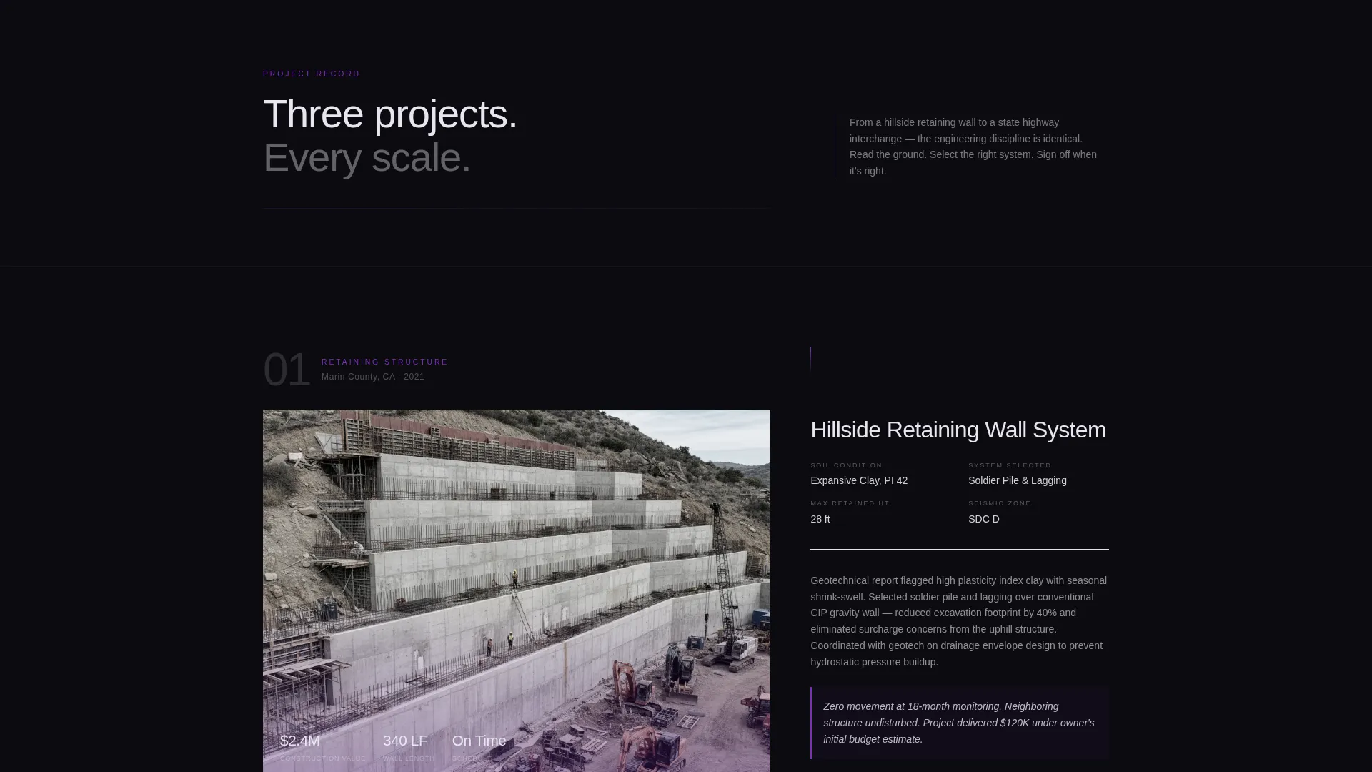
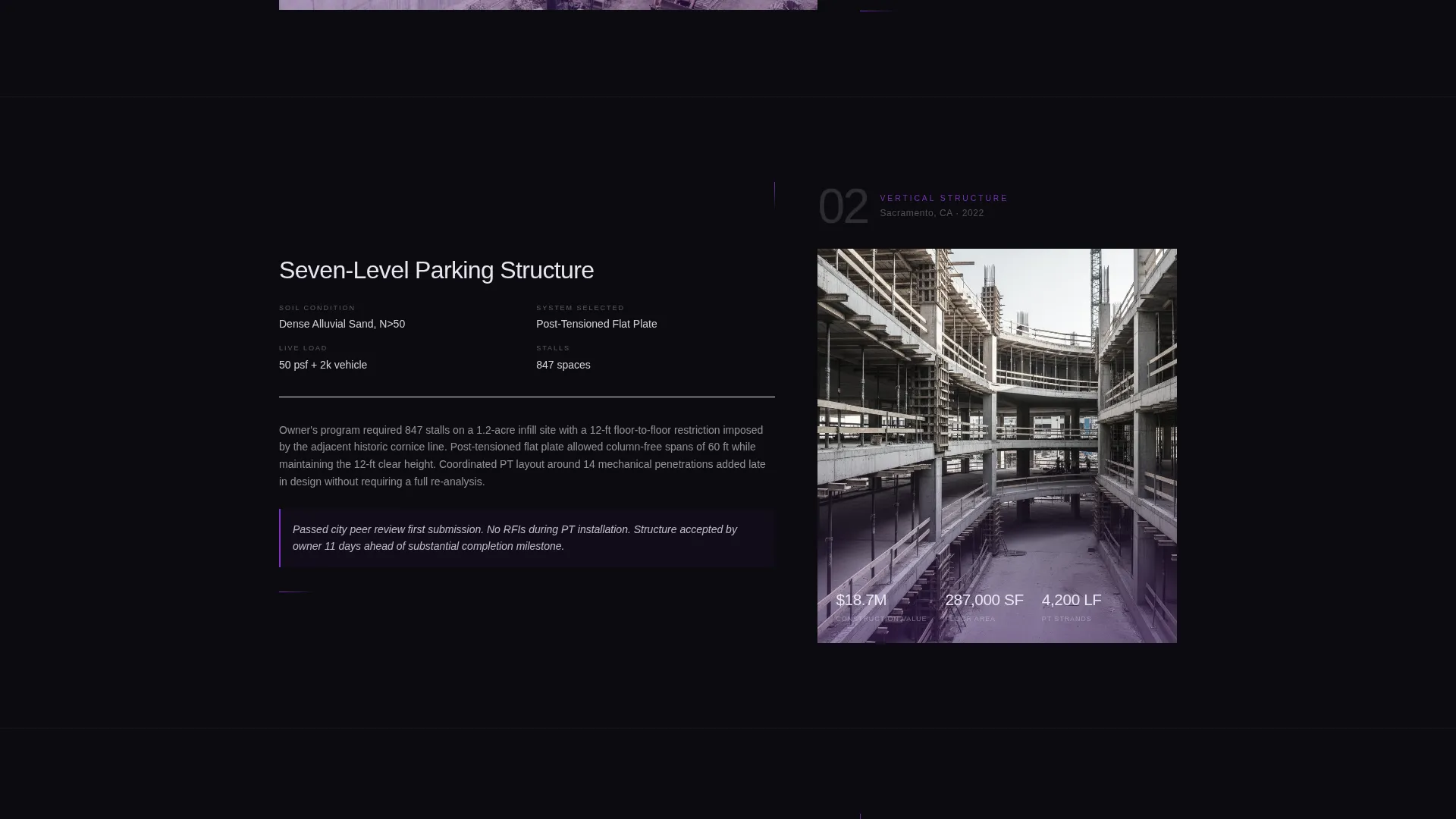
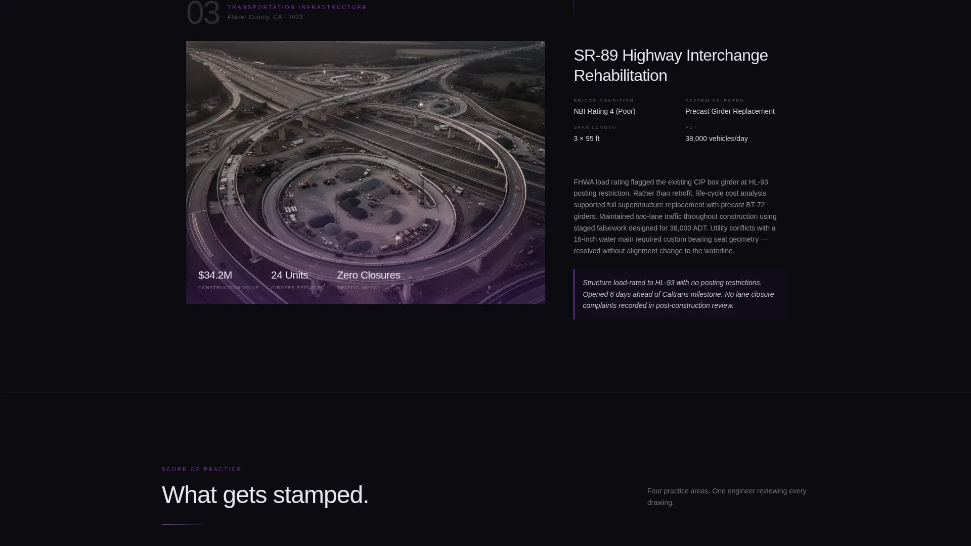
The 60-column carries full-bleed project photography and embedded drone footage. The 40-column holds the engineering story for each project: soil conditions, structural system selection, load calculation summaries, permitting obstacles, and final outcome. This split keeps visual impact and technical detail in constant balance.
Escalating Project Narrative Structure
Three case studies scroll in order of increasing complexity: a retaining wall, a parking structure, and a highway interchange. Each transition moves the reader from one project to the next, building a layered argument that this engineer works confidently at every scale.
Dual Conversion Path Design
After the third case study, a primary call-to-action invites visitors to discuss their next structure. A secondary path offers a one-page capability statement as a downloadable PDF, requiring only email and firm name, giving procurement managers something to share internally before making direct contact.
Violet Accent Line Navigation System
Ultraviolet accent lines run through the layout like rebar ties connecting a structural cage. They guide the eye between sections and reinforce the engineering metaphor visually, keeping the dark layout readable and directional without relying on heavy typographic weight.
Void & Violet Dark Color System
The full palette uses deep structural black, reinforced charcoal, ultraviolet accent, and pale engineering white. Applied consistently across backgrounds, typography, and data callouts, the system creates a cohesive visual identity that feels like working at midnight under a single desk lamp.
Page sections overview
| Section | Purpose |
|---|---|
| Full-bleed header | Establish scale and credibility on arrival |
| Name and credentials reveal | Introduce the engineer with precise, delayed type |
| Case study one | Present retaining wall project with narrative detail |
| Case study two | Present parking structure with escalating complexity |
| Case study three | Present highway interchange as the credibility peak |
| Primary inquiry form | Capture qualified project leads from serious contacts |
| Capability statement gate | Offer a PDF download for cautious procurement managers |
Design & branding system
The visual identity is built on a Dark Immersive theme using the Void & Violet color system. Every color choice is functional: it directs attention, signals hierarchy, and reinforces the feeling of precision work done under pressure.
- Deep structural black (#0B0B0F) and reinforced charcoal (#1A1A2E) form the primary background layers
- Ultraviolet accent (#7B2FBE) is used sparingly on lines, hover states, and key callouts to draw the eye with force
- Pale engineering white (#E8E6F0) is reserved for primary typography and data callouts, keeping contrast clean and readable
Mobile & speed optimization
The template is designed with a layout that can adapt from a wide asymmetric desktop grid to a vertically stacked mobile view. The visual hierarchy, large photography first, narrative column below, translates naturally to smaller screens.
- The 60/40 grid collapses to a single column on narrow viewports, keeping case study content readable
- Full-bleed images and drone footage placeholders are structured to prioritize above-the-fold content on mobile
- The dual conversion paths remain accessible at both viewport sizes without burying the inquiry form
How this template helps you convert
The entire layout is sequenced to earn trust before it asks for anything. By the time a visitor reaches the call-to-action, they have reviewed three projects of escalating scale and absorbed the engineer's technical decision-making process.
- The delayed credential reveal creates a first impression grounded in presence rather than promotion, setting a professional tone immediately.
- The escalating case study sequence builds a documented argument for the engineer's range, so the inquiry form appears after credibility is fully established.
- The capability statement PDF gate gives risk-averse procurement contacts a low-commitment entry point, increasing the chance they return with a real project.
Other information about this template
This template is part of the Personal and Resume category, specifically designed for the civil engineer personal brand website niche. It sits at the intersection of dark visual design and B2B professional services outreach, making it relevant for a narrow but high-value audience.
- The template style is classified as Asymmetric Grid (60/40), which is uncommon in the personal brand space and signals design sophistication to technically minded clients
- The Partnership and B2B landing page direction means every layout decision prioritizes qualified lead capture over general brand awareness
- The Case Study Narrative creative direction borrows from architecture and engineering portfolio conventions, presenting work as documented proof rather than promotional claims
- This template is well-suited to practitioners working on mid-rise mixed-use projects, bridge rehabilitation proposals, and developer-driven structural review engagements

Theme
Dark Immersive
Creative direction
Case Study Narrative
Color system
Void & Violet
Style
Asymmetric Grid (60/40)
Direction
Partnership/B2B
Page Sections
Full-bleed Aerial Header with Delayed Credential Reveal
Asymmetric 60/40 Case Study Grid
Escalating Three-project Narrative
Dual Conversion Path Layout
Violet Accent Line System
Void & Violet Dark Color System
Related questions
Can I replace the case study projects with my own work?
Do I need design experience to customize this template?
What is the capability statement PDF gate and how does it work?
Who are the intended clients for this type of landing page?
Can I use this template if I work across multiple engineering disciplines?



