Complete Home Décor & Lifestyle Pre-Launch & Coming Soon Website Template
Ember is a modular card-grid landing page built for incense and aromatherapy retailers running limited-time flash sales. It pairs a Neo-Retro Obsidian & Gold visual identity with urgency mechanics: a hero bundle countdown, flip-on-hover product cards with micro-timers, a full-width video interstitial, and a sticky cart bar. Every click routes directly to a pre-loaded checkout.
by Rocket studio
Quick summary
Ember is a single-page flash deal landing page designed for incense and aromatherapy stores. It uses a dark editorial aesthetic rooted in Neo-Retro design, deep volcanic black, antiqued gold, and ash cream, to make every deal feel rare and worth acting on right now. Modular product cards, ticking countdowns, and a frictionless click-to-cart flow give shop owners a powerful tool for midnight restock events and limited-run bundle drops.
Who this template is for
Ember was built with a very specific kind of seller and buyer in mind. If you sell ritual-grade incense, hand-rolled herbs, essential oil blends, or curated aromatherapy kits, this template speaks your language. It is equally well-suited to gift-focused shops where a beautifully presented bundle carries more weight than a bullet list of product specs.
- Incense and aromatherapy retailers running time-limited flash sales or seasonal restock events
- Gift shop owners selling curated ritual kits to buyers who want something meaningful and ready to wrap
- Studio suppliers serving yoga teachers, wellness practitioners, and night-owl creatives who spend their evenings in a candle-lit room
What problem this template solves
Most e-commerce product pages are built to browse, not to buy right now. They spread attention across categories, related items, and navigation menus. For a flash sale, that structure works against you. When a deal expires, every second of hesitation is a sale you lose. Ember removes the friction by making urgency visible, the product irresistible, and the path to checkout a single tap.
- No form fields, no account walls, and no multi-step navigation: each card links directly to a pre-loaded checkout with the deal price already applied
- Visible stock counters and ticking gold timers make the scarcity feel real, not manufactured, helping visitors move from browse to buy before the moment passes
- The dark, unhurried editorial design slows the visitor down just enough to feel the atmosphere, then the urgency mechanics push them forward before the timer runs out
What you get with this template
Ember is a complete, single-page flash deal layout. Every section is pre-designed and ready to populate with your products, photography, and copy. The layout is structured so that urgency builds naturally as the visitor scrolls, starting with the hero bundle and deepening through staggered discount tiers.
- A hero bundle section with a pulsing gold countdown timer, editorial overhead photography layout, and a prominent "Claim the Midnight Kit" call-to-action button with a live unit counter
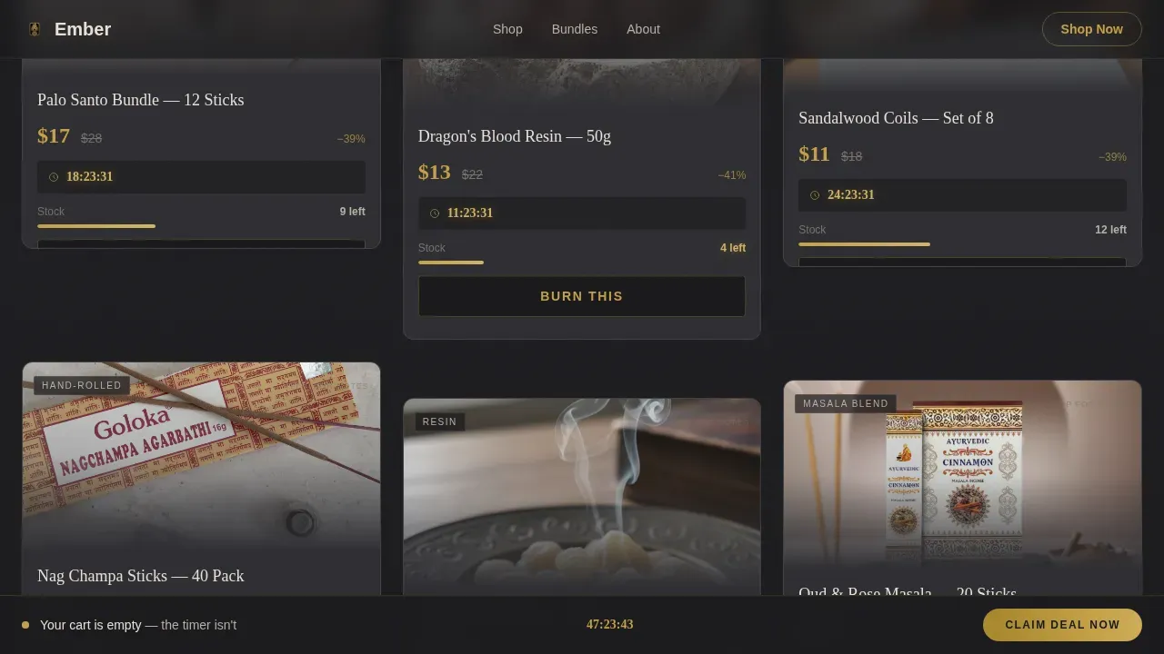
- A modular flash deal card grid with flip-on-hover interaction, per-card micro-countdowns, struck-through original prices in charcoal, and deal prices in gold
- A full-width video interstitial section, a deep discount card tier, and a sticky bottom bar that appears after the first scroll with a pulsing countdown reminder
Feature list
Ember packs a dense set of interaction and layout features into a single-page structure. Each feature serves a specific role in the conversion flow: draw attention, hold it, then direct it toward a single action. Vibe coding principles are central here. The template's design elements are not decorative choices made in isolation. They are calibrated so that the visual and emotional atmosphere of the landing page aligns precisely with the brand's message. Scent, ritual, and rarity are communicated through texture, color, and motion before a single word is read.
Hero Bundle with Live Countdown
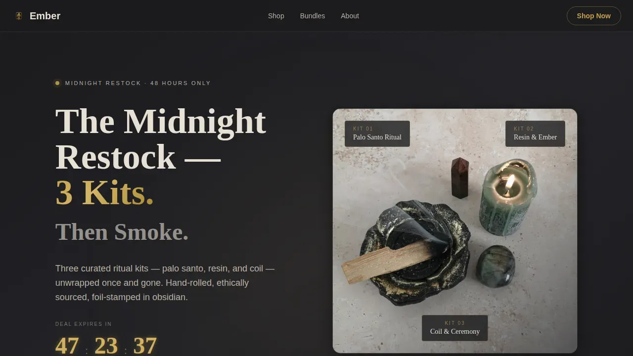
The hero section leads with an editorial overhead shot layout of three unwrapped ritual kits arranged on dark slate. A chunky retro serif headline anchors the offer: "The Midnight Restock." A gold countdown timer pulses beneath it, and a unit counter sits inside the primary call-to-action button. The section is lit to feel like an album-cover still life, warm light catching gold foil labels from the upper left. Effective flash deal landing pages often feature bold headlines that clearly communicate the offer, and this hero does exactly that in one focused composition.
Flip-on-Hover Product Cards
Each product card in the modular grid shows the product image, deal price in gold, struck-through original price in charcoal, and a "Burn This" call-to-action on the front face. On hover, the card flips to reveal scent notes and burn time details on the reverse. Every card also carries its own micro-countdown timer. Clear and concise calls to action are essential for guiding users on flash deal landing pages, and the single-action card design keeps the path to cart unambiguous for every item in the grid.
Staggered Card Grid Layout
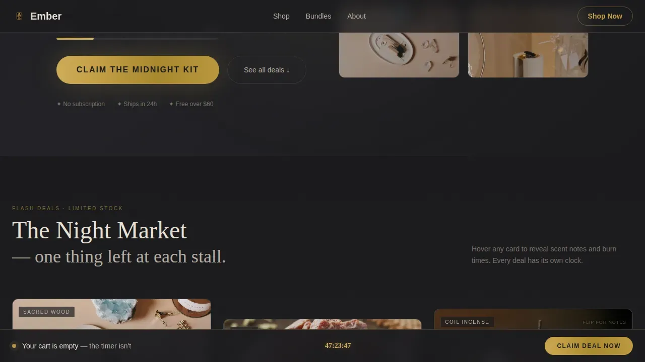
Products tile out in staggered modular rows below the hero. The rhythm is deliberate: scrolling feels like walking through a night market where every stall has exactly one thing left. Each row introduces a new product or mini-bundle. The grid structure makes it easy to add or remove items without breaking the layout. This modular approach also supports planning for different sale depths, letting you arrange products by discount tier or category within the same scrollable flow.
Full-Width Video Interstitial
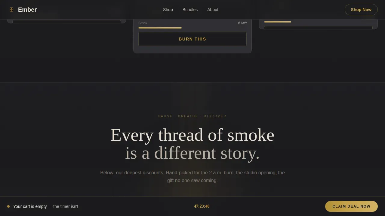
Midway through the page, a full-width section breaks the card grid with a slow-motion loop of a coil of incense burning against a black background. There is no sound, just smoke threading upward. The section resets the visitor's pace before presenting the final tier of deepest discounts. High-quality video on a landing page makes the experience more engaging and visually alive. This interstitial moment is where the template earns its atmosphere most fully, holding the visitor in the world of the brand before the final push to buy.
Sticky Urgency Bar
After the visitor scrolls past the hero, a sticky bottom bar appears. It reads "Your cart is empty, the timer isn't" and carries a subtle pulse animation on its countdown display. The bar stays visible throughout the rest of the scroll, serving as a persistent reminder without blocking content. Countdown timers can effectively create urgency on flash deal landing pages, and the sticky bar ensures that urgency is never out of sight, even when the visitor is deep in the product grid.
Single-Tap Checkout Flow
There are no form fields anywhere on this landing page. Every call-to-action button links directly to a pre-loaded checkout with the deal price already applied. The hero uses "Claim the Midnight Kit." Every product card uses "Burn This." Both route to cart in one tap. This frictionless flow matters most during flash sales, when hesitation costs conversions. Landing pages should include a strong call-to-action that encourages visitors to take the desired action, and Ember reduces the steps to that action to an absolute minimum.
Page sections overview
| Section | Purpose |
|---|---|
| Hero Bundle Deal | Anchors the offer with an editorial overhead layout, retro serif headline, gold countdown timer, unit counter, and "Claim the Midnight Kit" primary call-to-action |
| Flash Deal Grid | Staggered modular card rows with flip-on-hover scent details, micro-countdowns, struck-through prices, and "Burn This" single-tap cart links |
| Video Interstitial | Full-width slow-motion coil burn loop that resets visitor pace between the two discount tiers |
| Deep Discount Tier | Final staggered card grid presenting the steepest deals, designed to close the sale before the visitor reaches the footer |
| Sticky Cart Bar | Persistent bottom bar with pulsing countdown that appears after first scroll and stays visible throughout the page |
| Minimal Footer | Pattern 4 superhuman extreme minimal footer keeping the page focused on conversion with no distracting navigation |
Design & branding system
Ember's visual identity is built around a Neo-Retro theme that draws from 1970s apothecary aesthetics and Japanese minimalist packaging. The result feels like matte black lacquer boxes, foil-stamped labels, velvet trays, and brass hardware catching low amber light. The color system is disciplined: gold appears only on prices, countdown timers, and hover states, so every interactive moment lands with intention. Typography pairs Fraunces, a chunky retro serif used for display and headlines, with DM Sans for body text and card labels, keeping the hierarchy clear at every scale.
- Color palette: deep volcanic black (#1A1A1D) for backgrounds, smoky charcoal (#2E2E33) for card surfaces and struck-through prices, antiqued gold (#C5A047) strictly for prices, timers, and hover states, and pale incense-ash cream (#E8E0D5) for card face surfaces
- Typography: Fraunces serif for all display headlines and the primary call-to-action, DM Sans for body copy, card labels, scent note reverses, and the sticky bar message
- Animation system: card flip transitions on hover, countdown tick animations, pulse effect on the sticky bar countdown, and smooth sticky bar entry after first scroll
Mobile & speed optimization
Ember is designed desktop-first, given the editorial dark photography and multi-column card grid that benefit from a wider canvas. The template includes a mobile fallback layout that adapts the staggered grid to a single-column scroll, keeps the sticky bar visible on smaller screens, and adjusts the hero typography to stay readable on portrait-orientation devices. Flash deal landing pages should be optimized for mobile devices to capture a wider audience, and the mobile fallback here keeps every urgency mechanic intact.
- The staggered card grid collapses to a single-column layout on mobile, with flip interactions converted to tap-reveal for touch screens
- The sticky urgency bar and all countdown timers remain fully visible and functional at every screen size, so no visitor loses sight of the deal deadline
- Client components are used only where interactivity is required, keeping the rest of the layout as lightweight as possible to support fast initial render
How this template helps you convert
Effective landing pages should have a clear and compelling headline that captures the visitor's attention, but a great flash sale page does more than capture attention. It holds it, builds desire, and removes every obstacle between interest and purchase. Ember layers multiple conversion signals across the full scroll, each one reinforcing the last. Using social proof elements like stock counters and unit remaining indicators, alongside real countdown timers, creates the kind of pressure that moves people from consideration to action. Landing pages should load quickly to prevent visitors from leaving due to slow performance, and the architecture here keeps interactive components scoped to only what the page needs.
- Urgency is visible from the first pixel: the hero countdown timer, unit counter in the call-to-action button, and pulsing gold treatment on prices communicate scarcity without a single word of pressure copy, so the message lands cleanly for every visitor who arrives at any moment during the sale window
- The single-tap checkout flow eliminates every drop-off point between the card and the cart: no login prompts, no form fields, no redirects to a generic product page, just one click from the deal price to a pre-loaded checkout with the price already applied
- The sticky bar closes the loop on visitors who scroll without buying: after the first scroll, the persistent bottom bar with its pulsing countdown keeps the sale deadline in view, serving as a quiet but effective reminder that the deal will eventually expire
Other information about this template
Ember is part of a growing library of atmosphere-first templates built for retailers who want their online presence to feel as considered as their physical product. The template's design approach draws heavily on what practitioners of vibe coding describe as emotional resonance through design. Vibe coding emphasizes creating a unique emotional experience through design elements, and every layer of Ember, from the obsidian background to the gold hover states, is built to make visitors feel the brand before they read a word. The principles of vibe coding can be applied to various aspects of landing page development, including color schemes, typography, and imagery, and this template demonstrates that approach in a retail flash-sale context.
The no-code development approach behind this template means builders can go from idea to a live landing page without extensive coding knowledge. AI-powered no-code tools allow users to create landing pages without extensive coding knowledge, and this template is structured to work within that kind of natural-language, prompt-driven build process. No-code platforms enable users to build applications and websites using natural language prompts, which makes the Ember template accessible to creative founders, small studio teams, and independent shop owners who want a high-end result without a full development department involved.
Backend integration, when needed, enhances the functionality of landing pages by connecting them to various services and databases. Effective backend integration can streamline data collection and improve user experience on landing pages. Utilizing APIs is a common method for integrating backend services into landing pages, and backend integration allows for real-time data processing that can enhance the interactivity of flash sale pages. Automating backend processes can reduce manual work and increase efficiency for ongoing sale events.
From a planning perspective, Ember works best when you have two to six products or bundles ready to feature. The staggered grid can accommodate a half dozen items across the two discount tiers without feeling crowded. If you are planning a new year restock, a year's eve ritual bundle drop, or a midnight flash sale tied to a seasonal moment, the template's countdown mechanics and editorial layout give that event real visual weight. Sellers who have run similar events in the past year often note that the combination of visible scarcity and atmospheric design outperforms standard product page templates by a meaningful margin.
The ember midnight ritual flash deal landing page template is listed under the Retail & E-Commerce category, within the Home Decor & Lifestyle subcategory, at the Incense & Aromatherapy Store niche level. It is localized for USA-based stores using USD pricing and English copy. The footer follows Pattern 4, a superhuman extreme minimal treatment that keeps all attention on the products and the deal deadline, with no navigation links or secondary content to pull focus away from conversion.
- The template supports stock-counter display and unit remaining indicators as social proof signals across both the hero and the product card grid
- The video interstitial section is designed to hold a pre-exported silent loop file, meaning the atmospheric slow-burn coil footage is dropped in like any other media asset
- Sellers can update the countdown end times, product copy, and price displays without touching any structural code, making it practical for recurring sale events across the new year calendar and beyond
- The deep discount tier at the bottom of the page is intentionally the final section before the footer, positioning the strongest offers at the moment of highest commitment in the scroll journey
- This template represents a strong starting point for any aromatherapy or incense brand that wants to walk visitors through an experience rather than simply listing products in a grid
Theme
Neo-Retro
Creative direction
Flash Deal
Color system
Obsidian & Gold
Direction
Click-Through
Page Sections
Hero Bundle with Live Countdown Timer
Flip-on-hover Modular Product Cards
Full-width Video Interstitial
Persistent Sticky Urgency Bar
Single-tap Checkout Flow
Deep Discount Tier Card Grid
Related questions
Can I use this template for seasonal or new year sale events?
How does the flip-on-hover card interaction work on mobile?
Does this template require a developer to set up?
What types of products work best in the flash deal card grid?
Is the sticky bottom bar always visible during the scroll?



