Expert Language Tutor Landing Page Template
The Fluent corporate language instructor booking landing page template is built for enterprise language training services. It uses an editorial precision design style with a glacial Arctic White color scheme, oversized serif typography, and a transparent process layout. L&D managers, HR directors, and procurement leads can review instructor vetting, matching logic, and booking details before submitting a corporate rate sheet request form.
by Rocket studio
Quick summary
Fluent is a single-page landing page template designed for corporate language instructor booking services. The page design follows an editorial magazine aesthetic, with a manifesto header, numbered process sections, and a dual-path conversion form. Every section is built to earn the trust of budget-conscious decision-makers before asking them to share details or sign a request.
Who this template is for
This landing page speaks directly to enterprise buyers who need to justify training spend internally. The layout and content hierarchy are shaped around procurement-grade scrutiny, not casual browsing.
- Learning and Development (L&D) managers at multinational companies who own training budgets and need process proof before booking
- Human Resources directors onboarding expat executives who require fast, context-specific language lessons
- Procurement leads comparing vendor services on a spreadsheet and looking for a dedicated landing page with clear pricing signals
What problem this template solves
Corporate language training services often struggle to convert visitors because their page design fails to communicate operational maturity. A generic site with a simple contact form does not reassure a procurement lead comparing vendors. This dedicated landing page is built to fix that gap.
- It replaces vague service descriptions with a transparent, numbered process that walks visitors through instructor vetting, learner matching, and enterprise scheduling
- It positions the form as the final step in a trust-building sequence, not the first thing visitors see
- It gives procurement stakeholders a secondary path to a downloadable one-pager, reducing friction for buyers still building an internal case
What you get with this template
This template delivers a complete, single-page layout structured around corporate buyer psychology. Every landing page module serves a specific role in moving visitors from skepticism to form submission.
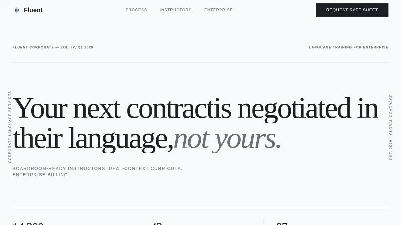
- A manifesto hero section with an oversized editorial compelling headline, a thin rule separator, and a small-caps stats bar showing hours delivered, languages offered, and Fortune 500 clients
- A transparent three-part process section covering instructor vetting criteria, industry-vertical matching logic, and enterprise scheduling details, each rendered as a numbered editorial spread with pull-quotes and oversized data numerals
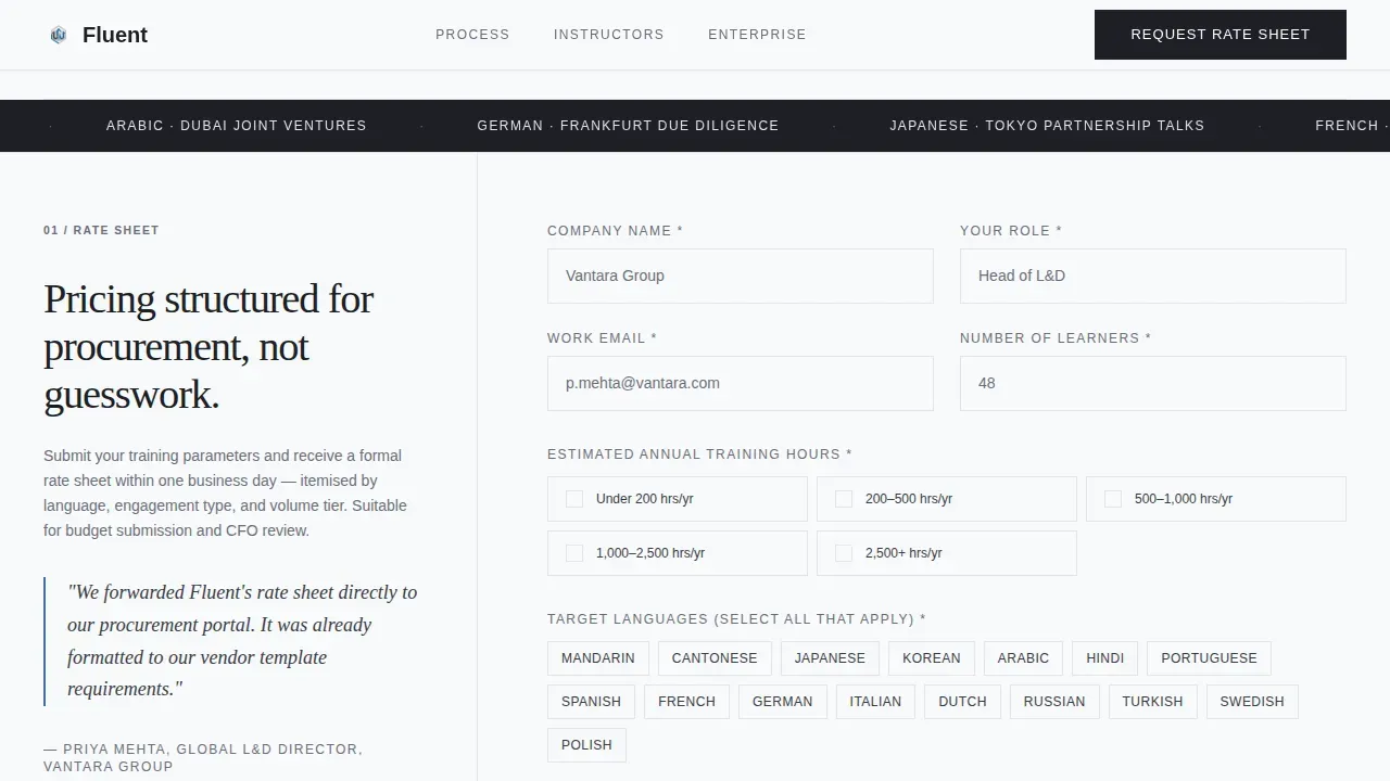
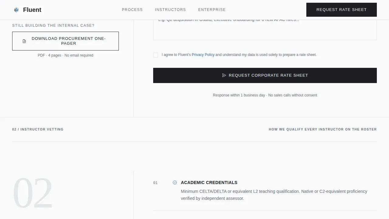
- A dual-path conversion module with a primary "Request a Corporate Rate Sheet" form and a secondary gated PDF download for stakeholders who need more time
Feature list
This landing page module set is built around editorial precision and procurement trust. Each feature is grounded in what the template actually delivers.
Manifesto Header with Stats Bar
The hero section uses a compelling headline set in oversized Fraunces serif type against unbroken white space. A thin charcoal rule separates the headline from a small-caps subhead. The subhead displays three key data points as social proof: corporate hours delivered, languages available, and Fortune 500 client count. No featured image, no illustration. The restraint of the page design is itself the statement.
Transparent Process Editorial Layout
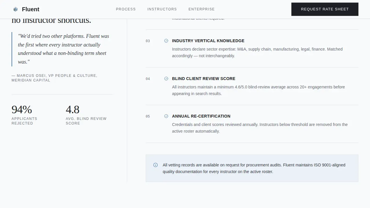
The page design style follows a magazine spread format across three numbered sections. Section one covers how instructors are vetted, including credentials, corporate experience minimums, and blind-review scores. Section two explains the matching process across industry vertical, target language, and proficiency level. Section three addresses enterprise scheduling and billing integration. Each section pairs pull-quotes from L&D managers in a left column with process detail on the right, and uses oversized numerals to break the layout grid. This design section approach helps visitors test the rigor of the service before they commit.
Dual-Path Conversion Form
The landing page includes two conversion paths. The primary path is a lead generation form that collects company name, estimated annual training hours, number of learners, and a multi-select field for target languages. The secondary path offers a gated PDF download for stakeholders still building the internal case. Both paths appear on the same page, so visitors can easily reach the option that fits their stage in the buying process. Limiting the form to essential fields helps reduce friction and keeps completion rates high.
Pull-Quote and Data Numeral Grid
Social proof is embedded throughout the page as formatted pull-quotes from real L&D managers and oversized data numerals that break the editorial grid. These elements are placed within each process section, not isolated in a testimonials block. This layout approach keeps building trust continuously as visitors scroll, rather than concentrating it in one section that short attention spans might skip.
Arctic White Editorial Color Scheme
The color scheme uses four values only: glacial white (#F8F9FB) as the base, pale silver-gray (#E2E5EA) for dividers, charcoal ink (#1D1F24) for all body type, and cold Nordic blue (#3A6EA5) reserved exclusively for links, buttons, and pull-quote accents. This custom design palette feels like a freshly printed annual report. Every drop of color is deliberate, which makes the action button and form calls-to-action stand out without visual noise.
Fraunces and DM Sans Typography System
Headlines use Fraunces, an expressive editorial serif that gives the page an authoritative, proposal-document feel. Body copy and user interface elements use DM Sans for clarity and readability. The contrast between the two typefaces creates a visually appealing hierarchy. Users can expect the type system to carry the page even in sections with minimal images or decorative elements.
Page sections overview
| Section | Purpose |
|---|---|
| Manifesto Hero | Opens with an oversized editorial headline and a stats bar showing hours, languages, and Fortune 500 clients |
| Instructor Vetting | Details credential checks, corporate experience minimums, and blind-review scores |
| Matching Engine | Explains how industry vertical, target language, and proficiency level guide instructor assignment |
| Enterprise Scheduling | Covers how sessions and billing are structured for enterprise use |
| Rate Sheet Form | Collects company name, annual training hours, learner count, and target languages |
| PDF Download call to action | Offers a gated procurement one-pager for stakeholders still building the internal case |
| Footer | Linear single-row layout with contact info and navigation links |
Design & branding system
The page design style follows a Corporate Precision theme that reads like a perfectly typeset proposal document. Every element earns its place on the page. The layout uses wide margins, clean grid breaks, and deliberate white space to signal operational maturity before a single word is read.
- Typography: Fraunces serif for all headlines and pull-quotes; DM Sans for body copy, form labels, and user interface elements; small caps used in the stats subhead for typographic restraint
- Color scheme: glacial white base (#F8F9FB), silver-gray dividers (#E2E5EA), charcoal ink text (#1D1F24), and Nordic blue (#3A6EA5) used only for links, buttons, and pull-quote accents
- Animations: masked text reveals on scroll, scroll-triggered section fades, and staggered stat counters add motion without distracting from the editorial page design
Mobile & speed optimization
Even though this landing page is designed desktop-first for L&D managers reviewing on wide monitors, the site layout is built to remain fully functional on smaller screens. Over 55% of web traffic is mobile, and more than half of professional inquiries often begin on a mobile device, so the template does not ignore that reality.
- The layout adapts across screen sizes so the editorial column structure, form fields, and action button remain accessible without horizontal scrolling
- The page is built static-first, using IntersectionObserver for scroll reveals instead of heavy JavaScript libraries, which supports fast load performance and helps reduce bounce from slow-loading pages
- The mobile friendly layout preserves the typographic hierarchy and color scheme so the page feels equally compelling on a phone or a 1440-pixel monitor
How this template helps you convert
A high-converting booking landing page for a corporate language instructor must blend professionalism with immediate trust-building. This template earns the form submission by proving process rigor before the form ever appears.
- The manifesto header uses a compelling headline and social proof data to establish authority in the first scroll position, so visitors understand the scale and credibility of the service before reading further
- The transparent process sections let procurement leads and L&D managers test the logic of instructor vetting and learner matching, giving them the evidence they need to justify spend to a CFO
- The dual-path conversion form reduces friction by offering two clear options, a rate sheet request for ready buyers and a PDF download for those still building their internal case, so no visitor leaves empty-handed
Other information about this template
This template is built to work within WordPress-based environments and is compatible with form-building workflows that connect to dedicated landing page tools. Users who need to customize the intake form or adjust field logic will find the layout straightforward to adapt.
- Fluent Forms is referenced in the keyword context for this template. The Dedicated Landing Page feature in Fluent Forms requires the Fluent Forms Pro plugin to be enabled. Once active, users can create a dedicated landing page for any form, assign it a unique URL, and access it via the WordPress admin panel sidebar without navigating away from the form builder.
- In form landing page mode, the form page strips away site navigation and focuses the visitor entirely on the form, which is exactly the intent of this template's conversion design. Users can access the form landing settings, apply a custom design, and click the save settings button to publish changes. The direct URL for the dedicated landing can then be shared with stakeholders or linked from email campaigns.
- The drop editor and html code options in compatible form builders give users additional control over the page design and layout without requiring developer support. Bonus points go to users who use the unique URL to run split tests between the rate sheet form and the PDF download path, since both conversion goals are already built into this template.
- This template supports compelling content for an online course or corporate training context, making it adaptable beyond language instruction. Language schools, corporate training providers, or consultants offering an online course could repurpose the layout with minimal adjustment to the page design style and color scheme.
- The form module is designed to qualify leads before they post a request. Prospective students or potential students exploring individual lessons rather than enterprise services will find the form fields clearly signal that this page is built for organizational buyers, not individual learners. Past students or real students at the individual level would be better served by a separate course landing page or a trial lesson sign-up page with student reviews and a simpler form.
- The page layout and design section structure make it easy for happy customers to be featured as pull-quote sources without disrupting the editorial flow. Case studies can be referenced within the process sections using the same oversized numeral and pull-quote format already built into the template.
Theme
Corporate Precision
Creative direction
Transparent Process
Color system
Arctic White
Style
Editorial/Magazine
Direction
Partnership/B2B
Page Sections
Manifesto Hero with Editorial Stats Bar
Transparent Three-part Process Layout
Dual-path Conversion Form Module
Pull-quote and Oversized Numeral Social Proof
Arctic White Corporate Color Scheme
Scroll-triggered Animation System
Related questions
Can I customize the form fields in the rate sheet section?
Does this template include the PDF download gating mechanism?
Is this landing page template suitable for individual language tutors?
How is the instructor vetting section structured visually?
Can the color scheme and typography be changed to match my brand?



