Autism Spectrum Care Education Website Template
Spectrum is a single-column landing page template built for autism spectrum patient education platforms. It guides newly diagnosed families, self-discovering adults, and special education coordinators through a calm, visually rich journey. A warm-toned design, illustrated explanations, and an inline progressive assessment work together to replace clinical overwhelm with genuine, paced understanding.
by Rocket studio
Quick summary
Spectrum is a patient education landing page template designed for autism spectrum care. It pairs warm visual storytelling with a step-by-step scroll journey and an inline assessment. The result is a page that feels like a conversation, not a clinical handout, built for the moment when families most need clarity and calm.
Who this template is for
This template is built for people and organizations offering autism spectrum education and support resources. It speaks directly to the emotional state of its visitors and meets them with structure rather than noise.
- Parents who recently received a child's diagnosis and need a calm first orientation
- Young adults exploring neurodivergence and looking for plain-language self-understanding
- Special education coordinators building support toolkits for students and families
What problem this template solves
Newly diagnosed families often leave clinical settings holding a paper list and a flood of unanswered questions. Most online resources either overwhelm with jargon or undersell the emotional weight of the moment. This template solves that gap directly.
- It replaces clinical confusion with warm, illustrated explanations that progress at the reader's pace
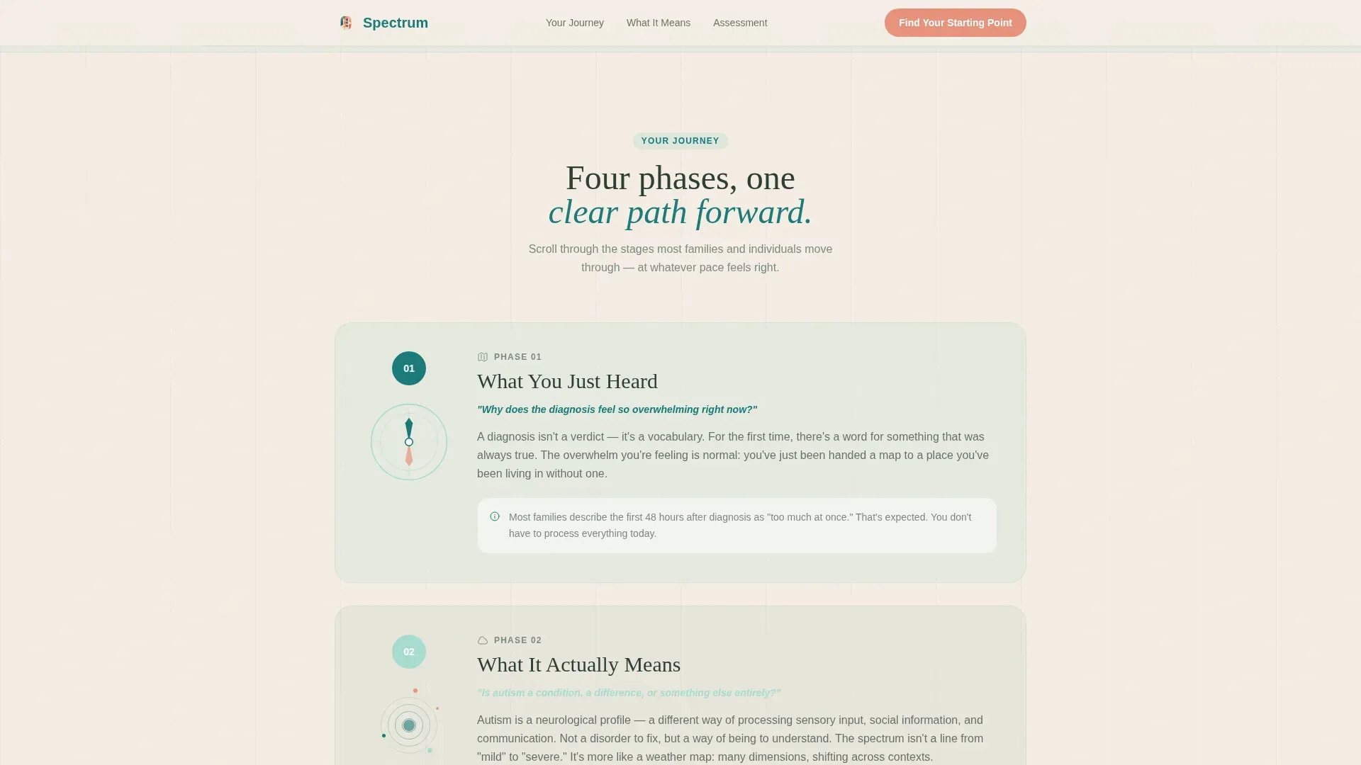
- It structures the journey into four clear phases so visitors always know where they are and what comes next
- It earns trust before asking anything, giving real education before the inline assessment ever appears
What you get with this template
You get a fully structured single-column landing page built around a guided scroll experience. Every section is purposeful, ordered, and designed to reduce cognitive load for an audience that is already managing a lot.
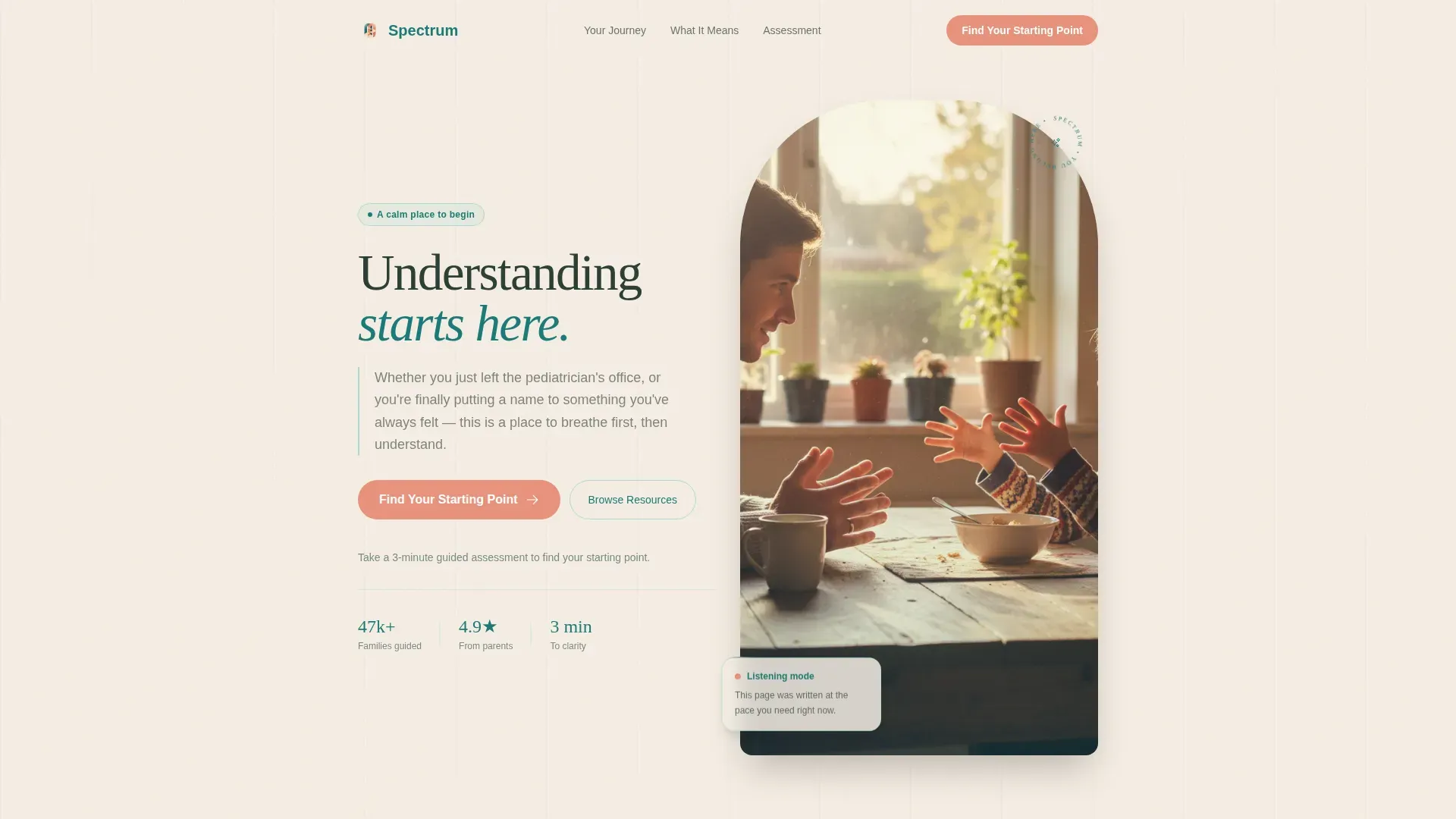
- A half-page hero with a photo-and-text composition, a clear headline, and a primary assessment call to action
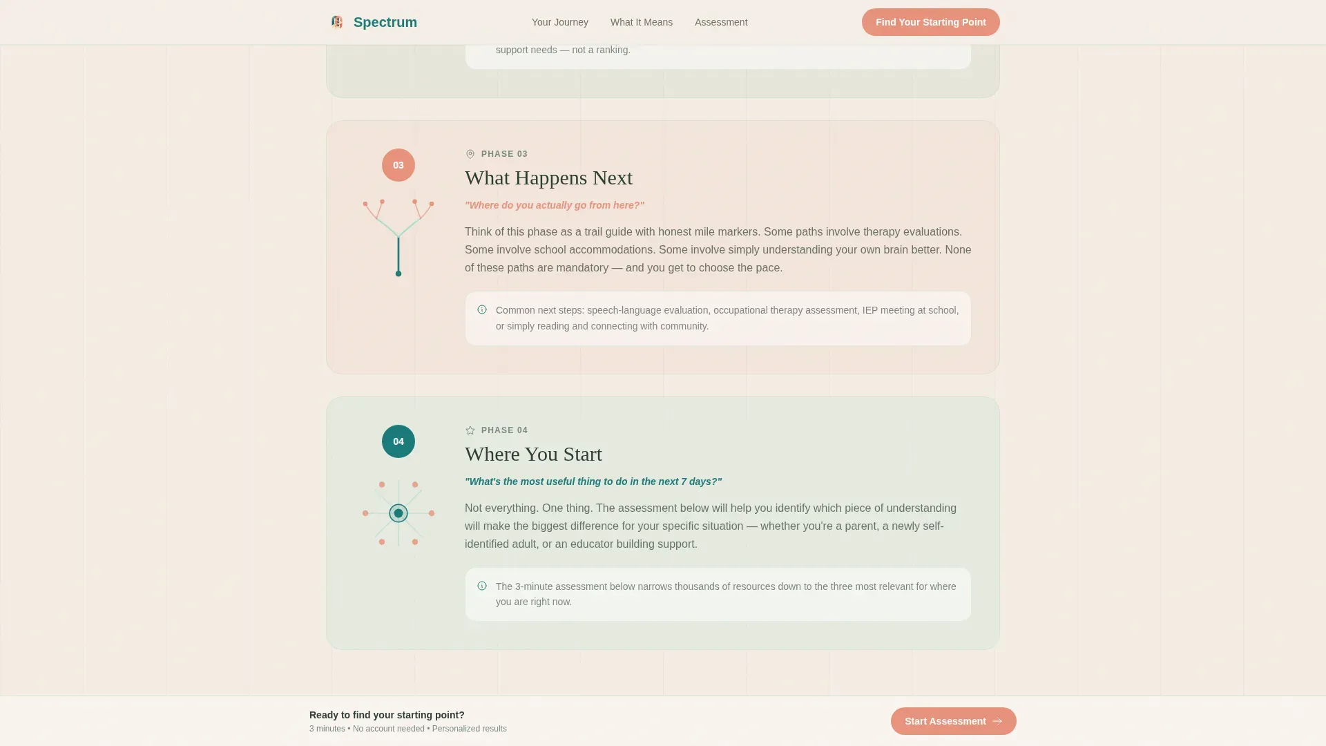
- Four numbered journey sections that mirror the real post-diagnosis experience, each with illustrated diagrams and plain-language paragraphs
- An inline progressive assessment with illustrated toggle cards, a teal progress bar, and low-friction question flow
- A testimonials section representing three distinct audience voices, plus a single-row footer
Feature list
This section covers the core functional and design components that make Spectrum distinct as a patient education landing page template.
Four-Phase Scroll Journey
The page is structured around four numbered phases: "What You Just Heard," "What It Actually Means," "What Happens Next," and "Where You Start." Each phase opens with a clarifying question before unfolding a visual explanation. The scroll feels like turning pages in a book written specifically for the reader.
Inline Progressive Assessment
The "Find Your Starting Point" assessment opens directly on the page without redirecting visitors. It begins with illustrated toggle cards asking "Who is this for?" before moving progressively into age, diagnosis stage, and primary concerns. A teal progress bar updates with each answer to show forward momentum.
Visual Explanation Illustrations
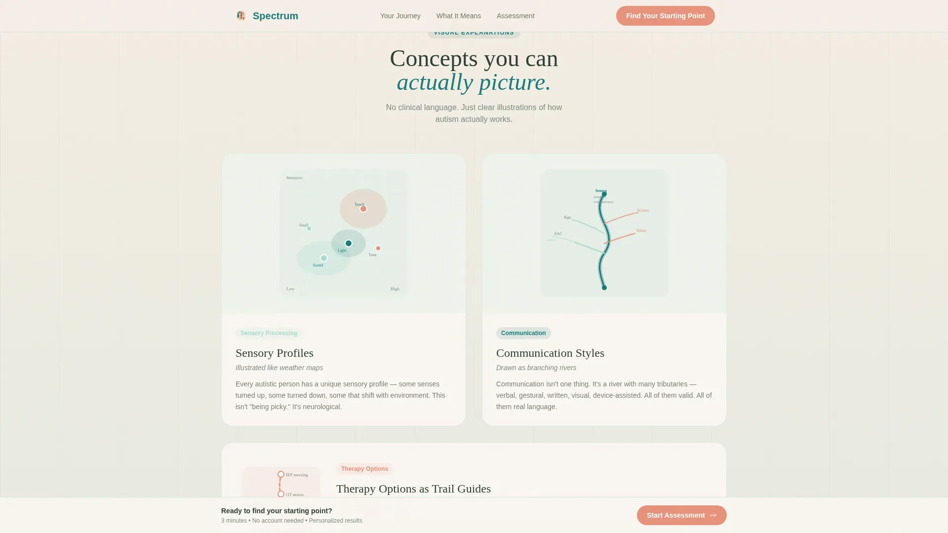
Sensory profiles are illustrated like weather maps. Communication styles are drawn as branching rivers. Therapy options are laid out like trail guides with honest distance markers. These visual metaphors replace abstract clinical language with images that make intuitive sense to a wide range of readers.
Persistent Assessment Call to Action
The primary call to action, "Find Your Starting Point," appears beneath the hero and again as a persistent bottom bar after the second scroll section. This keeps the next step visible without feeling pushy, because the page earns the click through education first.
Warm Organic Hero Section
The hero is a left-weighted text and right-photo composition. The photograph shows a parent and child mid-conversation at a kitchen table with natural window light. The scene captures listening, not performing, which immediately signals that this platform understands its audience.
Three-Voice Testimonial Section
The testimonials section features one voice from each primary audience type: a parent, a young adult, and a special education coordinator. This structure lets every visitor see someone like themselves reflected in the social proof, building trust across all three segments simultaneously.
Page sections overview
| Section | Purpose |
|---|---|
| Hero with assessment call to action | Orients visitors and introduces the guided assessment entry point |
| Four journey steps | Walks visitors through the real post-diagnosis experience in numbered phases |
| Visual explanation panels | Delivers illustrated sensory and communication education using metaphor-based diagrams |
| Inline assessment | Personalizes the experience with progressive low-friction questions and a teal progress bar |
| Testimonials section | Builds trust with three audience-specific voices reflecting real use cases |
| Single-row footer | Closes the page with a clean, minimal navigation and link structure |
Design & branding system
The visual identity follows a Soft Gradient theme built on the Teal Catalyst color system. Every color choice reflects sensory awareness, favoring warmth and calm over clinical sharpness.
- Deep teal (#1A7A7A) anchors headers and progress indicators; soft seafoam (#A8DCD1) washes across section backgrounds in gentle gradient transitions; warm sand (#F5EDE3) serves as the primary canvas
- Quiet coral (#E8927C) is reserved exclusively for interactive elements and the assessment call to action, giving it clear visual priority without visual aggression
- Typography pairs Fraunces serif headlines with DM Sans body text, creating a warm and unhurried reading rhythm across all section types
Mobile & speed optimization
This template is designed with mobile-first behavior, built for parents browsing in waiting rooms and educators checking resources late at night on their phones.
- Images are lazy-loaded so the page loads progressively without blocking early content
- Scroll reveal animations, marquee transitions, and step animations are set at medium intensity to remain smooth without draining device performance
- The inline assessment is touch-friendly, with illustrated toggle cards sized for easy thumb interaction on small screens
How this template helps you convert
This template earns conversions by building trust before asking for anything. The assessment does not feel like a gate because the page has already given genuine value by the time visitors reach it.
- Visitors absorb illustrated, plain-language education through the four-phase scroll journey before the assessment ever appears, so the call to action feels like a natural next step rather than an interruption
- The persistent bottom assessment bar keeps the next step visible throughout the scroll without repeating the same pressure, reinforcing the invitation gently and consistently
- The three-voice testimonial section ensures that parents, young adults, and educators all see a reflection of their own situation, reducing hesitation and increasing click-through confidence
Other information about this template
Spectrum fits within the Health and Medical category under the Autism Spectrum Care subcategory. It is built as a single-column flow landing page, making it well suited for platforms focused on autism spectrum patient education.
- The template style is Single Column Flow, which keeps cognitive load low and reading direction predictable for an audience that may be experiencing stress or sensory sensitivity
- The header concept is a Half-Page Photo and Text composition, pairing emotional visual storytelling with a clear, rounded serif headline
- The creative direction follows a Step-by-Step Guide pattern, mirroring the actual journey a family or individual takes after receiving a diagnosis
- The landing page direction is Quiz and Assessment, with the inline tool acting as the primary conversion mechanism and personalization engine
Theme
Soft Gradient
Creative direction
Step-by-Step Guide
Color system
Teal Catalyst
Style
Single Column Flow
Direction
Quiz/Assessment
Page Sections
Four-phase Scroll Journey
Inline Progressive Assessment
Visual Metaphor Illustrations
Persistent Assessment Call to Action
Three-voice Testimonial Section
Warm Organic Hero Composition
Related questions
Who is the ideal user for this template?
Can the inline assessment be customized with different questions?
Does the assessment redirect visitors to another page?
Is this template suitable for mobile visitors?
Can I use this template for an adult neurodivergence or self-advocacy platform?



