Autism Spectrum Digital Therapy App Landing Page
Spectrum is a hub and spoke landing page template built for an autism spectrum digital therapy app. It uses a calm, FAQ-driven layout to guide parents, late-diagnosed adults, and occupational therapists toward a free assessment sign-up. Every section answers a real visitor fear before asking for anything, building trust layer by layer in a sensory-friendly, mobile-first design.
by Rocket studio
Quick summary
Spectrum is a single-page, anchor-nav landing page template designed for a neurodivergent digital therapy companion. It follows an FAQ-driven spoke structure, a Healing Space visual identity, and a progressive lead-generation form. The template is built for parents, self-advocates, and occupational therapists who need reassurance before they commit to anything.
Who this template is for
This template was designed for the people who land on a therapy product page carrying real emotional weight. It meets them with warmth, clarity, and patient structure rather than pressure.
- Parents of autistic children who are exhausted after individualized education program meetings and need immediate clarity
- Late-diagnosed autistic adults, typically between ages 25 and 45, who are looking for a tool built around their experience
- Occupational therapists sourcing a low-clutter digital tool they can recommend to clients with confidence
What problem this template solves
Most digital health landing pages overwhelm visitors the moment they arrive. For a neurodivergent audience, that overwhelm can end the visit before a single word is read.
- The template removes visual clutter and sensory noise at the layout level, so the page itself models the product's core promise
- Visitor fears about clinical legitimacy, session experience, cost, and adult applicability go unanswered on most competitors' pages, causing drop-off before any form is reached
- The anchor navigation and progressive form structure let visitors move at their own pace, in their own order, without being pushed
What you get with this template
You get a fully structured, single-page layout that does the emotional work of a first therapy consultation before a visitor ever touches the form. Every section is purposefully sequenced.
- A Stacked Type Tower hero with an animated amber infinity symbol, five FAQ-driven anchor nav spokes, and a transparent pricing section
- A three-screen progressive lead-generation form with illustrated persona cards, plus a secondary "Talk to a Therapist First" calendar path
- Eight purpose-built sections covering social proof, app interaction showcases, clinician credentials, adult use cases, and a linear single-row footer
Feature list
This template delivers a tightly focused set of interactive and structural components drawn directly from the brief.
Stacked Type Tower Hero
The hero uses a three-line typographic tower in Fraunces display serif. Each line steps down in weight from light to bold, creating a visual rhythm that communicates calm before any feature copy appears. An animated SVG infinity symbol in amber breathes slowly beneath the tower.
FAQ-Driven Anchor Navigation
Five sticky spoke links sit at the top of the page, each phrased as a real visitor question. Clicking any link scrolls directly to the section that answers it. The nav remains fixed after initial scroll so visitors can jump between concerns freely.
Progressive Lead-Generation Form
The assessment form spans three screens. Screen one asks only who the tool is for, with three illustrated persona cards. Screen two captures a first name and email address. Screen three offers an optional diagnosis status and age range field. No screen demands more than feels comfortable.
"Talk to a Therapist First" Path
A secondary call-to-action opens a calendar embed for a fifteen-minute consultation. This path sits alongside the primary form so visitors who are not ready to self-assess still have a low-pressure next step.
Social Proof Integration Panels
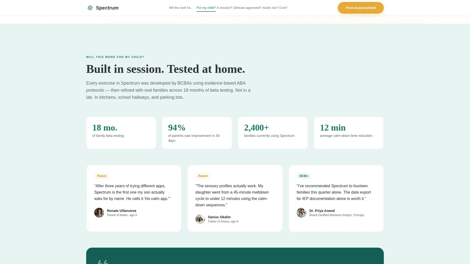
Dedicated sections carry pull quotes from board-certified behavior analysts and parents. Expandable detail panels let visitors read deeper without forcing all information into view at once. Short video clips of actual app interactions appear in the session showcase section.
Transparent Pricing Cards
A dedicated pricing section presents cost information clearly and without friction. Pricing is positioned after all trust-building spokes have been answered, so the visitor arrives at cost already informed and reassured.
Page sections overview
| Section | Purpose |
|---|---|
| Hero Tower | Introduce the app through calm typographic hierarchy and an animated infinity symbol |
| Anchor Nav | Give visitors five FAQ spoke links as sticky navigation they control |
| Will it work? | Address parent hesitation with BCBA pull quotes and parent testimonials |
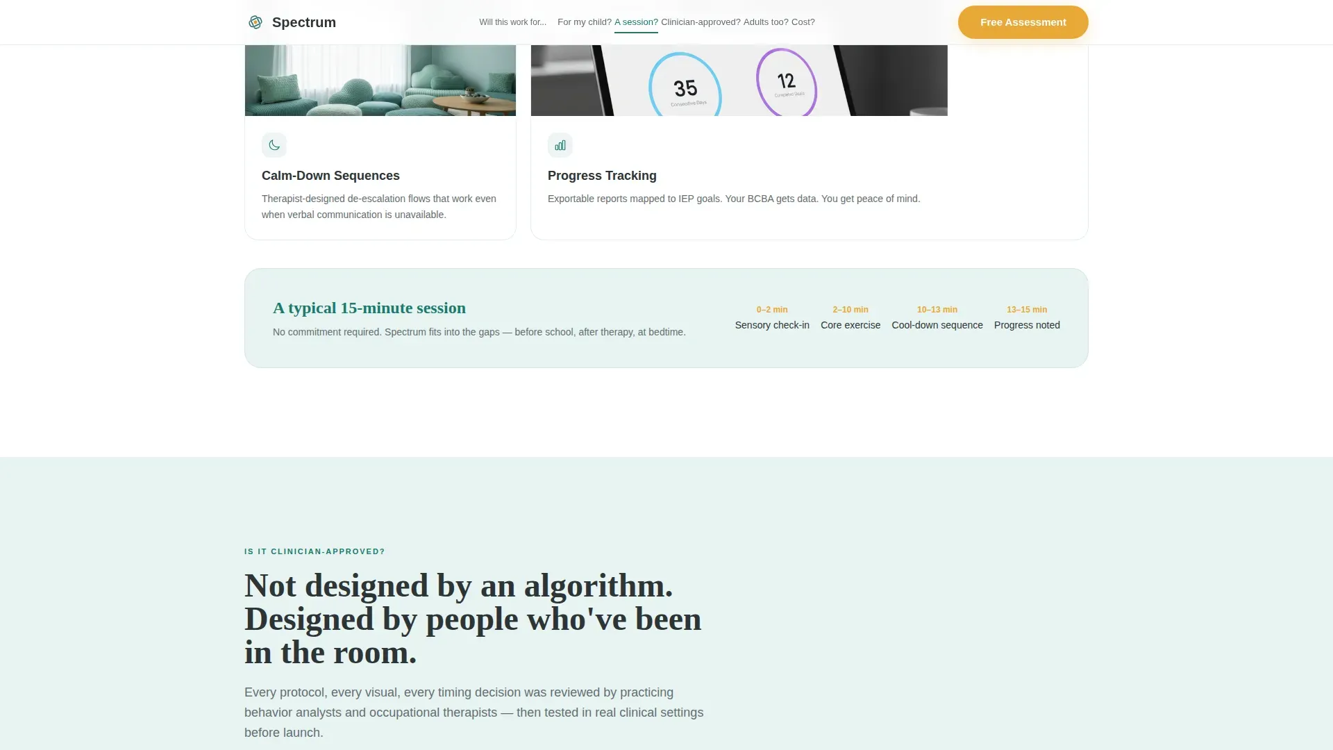
| Session showcase | Show what a session looks like using app interaction clips and a feature bento layout |
| Clinician approval | Present expert credentials and certification badges to establish legitimacy |
| Adult use cases | Speak directly to late-diagnosed adults with a dedicated narrative section |
| Pricing cards | Display transparent cost options after full trust has been established |
| Lead-gen form | Collect assessment sign-ups through a three-screen progressive form with a therapist path |
| Footer | Close with a linear single-row footer pattern |
Design & branding system
The visual identity follows a Healing Space theme. Every color and type choice is intentional, meant to feel like a calm therapy room rather than a clinical interface.
- Color system: deep therapeutic teal (#1A7A6D) as primary, soft mist (#E8F4F2) for section backgrounds, grounding charcoal (#2D3436) for body text, and warm amber (#E8A838) used exclusively on interactive elements and call-to-action pulses
- Typography: Fraunces display serif for the hero tower and major headings; DM Sans for all body copy, form fields, and navigation labels
- Backgrounds alternate between mist and white as the visitor scrolls, with teal deepening in concentration toward the conversion section; no jarring color transitions appear anywhere on the page
Mobile & speed optimization
The template is built mobile-first, because the primary visitor is a parent checking options on a phone, often in a parking lot or waiting room after a difficult appointment.
- Layout, typography sizing, and tap targets are designed for single-handed mobile use before desktop scaling is considered
- Animations use GSAP scroll reveals, SVG path draws, and stagger fades; imagery is lazy-loaded; static sections use Server Components to reduce initial load weight
- The progressive form keeps each screen minimal so the interaction feels manageable on a small display without scrolling past content that has not yet loaded
How this template helps you convert
The page earns the click before it ever asks for one. Conversion is built into the sequence, not bolted onto the end.
- The anchor nav lets visitors self-direct to their most urgent question first, which reduces bounce from visitors who do not want to read linearly and builds immediate trust through perceived control
- The progressive form removes commitment anxiety by asking only one small thing per screen, and the optional third field signals that the product respects the visitor's boundaries
- The secondary "Talk to a Therapist First" path captures visitors who are not ready to self-assess, turning a potential exit into a booked consultation rather than a lost lead
Other information about this template
This template belongs to the hub and spoke anchor nav category within the broader Healing Space theme system. A few additional details are worth noting for anyone evaluating it.
- Template style: Hub and Spoke with Anchor Nav, paired with the Teal Catalyst color system and an FAQ-driven creative direction
- Header concept: Stacked Type Tower using Fraunces serif at 96px display size, stepping down through three lines of increasing weight
- The lead-generation direction is intentional; the form appears only after the final FAQ spoke so trust is fully established before any data is requested
- Category context: Health and Medical, Autism Spectrum Care subcategory, Autism Spectrum Digital Therapy App niche


Theme
Healing Space
Creative direction
FAQ-Driven
Color system
Teal Catalyst
Style
Hub & Spoke (Anchor Nav)
Direction
Lead Generation
Page Sections
Stacked Type Tower Hero
Faq-driven Anchor Navigation
Progressive Three-screen Form
Therapist Consultation Path
Social Proof and Credential Sections
Transparent Pricing Cards
Related questions
What type of page is this template?
Who is this template designed for?
Does the template include video clips and testimonials?
Where does the pricing section appear on the page?
Can the progressive form be adjusted for different audiences?



