Drive-Through Business Booking Website Template
Spin is a single-page landing page template for drive-through laundry services. It uses a layered scroll-reveal layout with overlapping geometric shapes, an Obsidian and Gold color palette, and animated micro-interactions. Three service tiers fan out in the header, a sticky upgrade bar follows the scroll, and every section is built to turn a casual visitor into a confirmed booking.
by Rocket studio
Quick summary
Spin is a playful, visually bold landing page template designed for drive-through laundry businesses. It pairs deep obsidian tones with brushed gold accents and scroll-triggered animations to guide visitors from curiosity to checkout. Three service tiers are visible from the first scroll, and every section layers on value until upgrading feels like the obvious move.
Who this template is for
This template is built for drive-through laundry service owners who want a page that sells the experience, not just the price. It works equally well for new operators launching their first online presence and established locations refreshing a dated site.
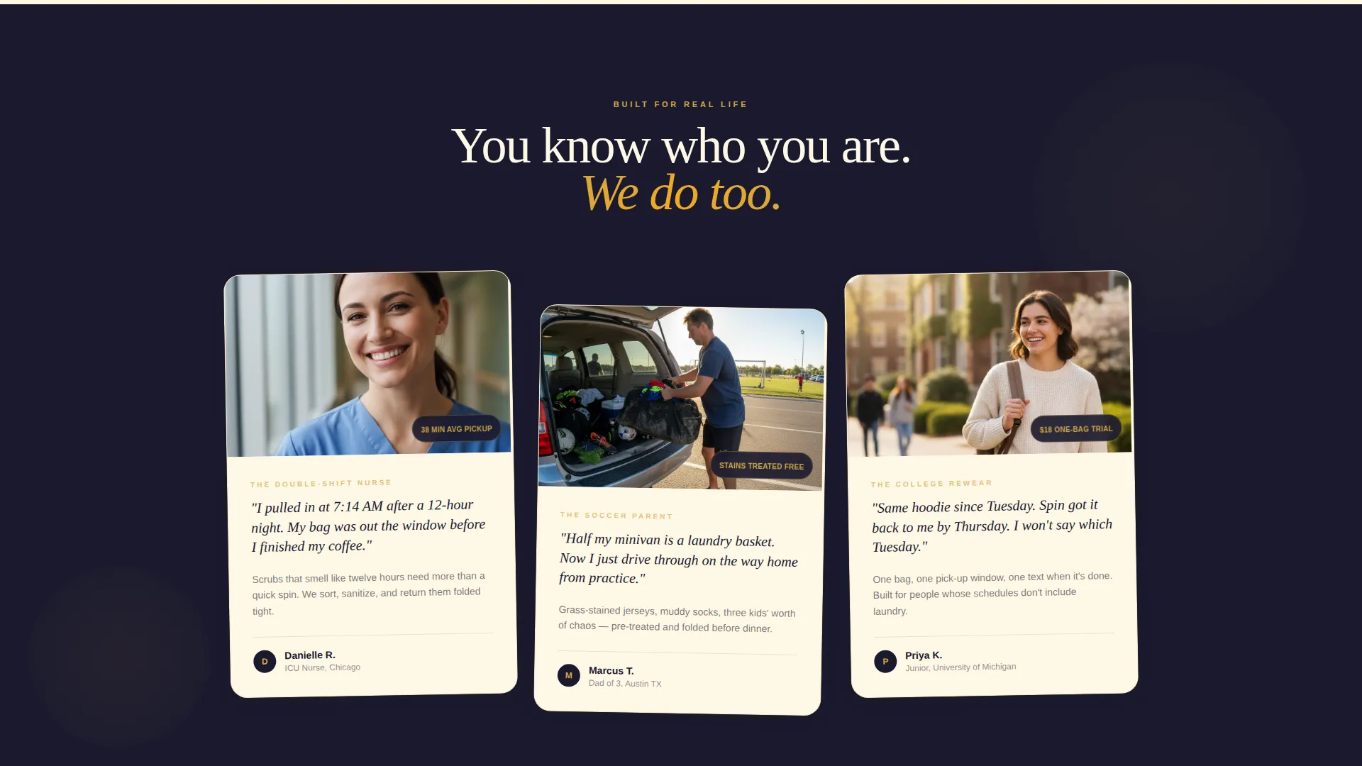
- Drive-through laundry owners targeting time-pressed customers like nurses, parents, and college students
- Service operators who want to present tiered pricing in a visually compelling, easy-to-follow format
- Small business owners who need a polished landing page without starting from a blank canvas
What problem this template solves
Most laundry service pages look like utility bills. They list prices without building desire, and they never make the premium tier feel worth it. Spin flips that dynamic entirely.
- Visitors leave before understanding the full value of higher service tiers
- Generic layouts fail to communicate the convenience and small luxury of a drive-through format
- Flat, static pages do not create the emotional pull needed to push a visitor toward booking
What you get with this template
Spin delivers a fully structured single-page layout with every section already in place. The design, animations, and copy framework are ready to be swapped with your real business details.
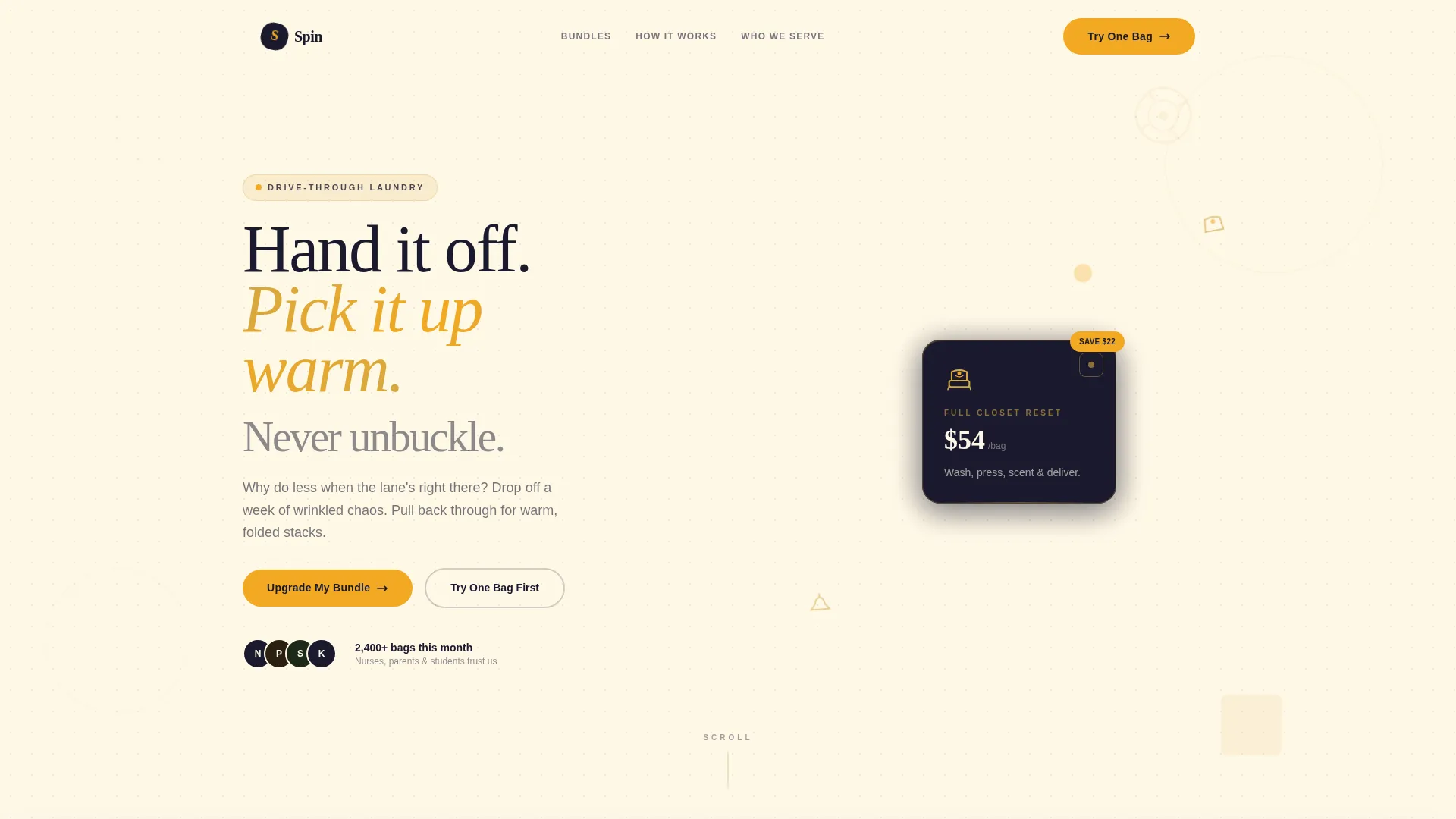
- A layered, overlap-style header with three fanned service tier cards and a pulsing savings badge
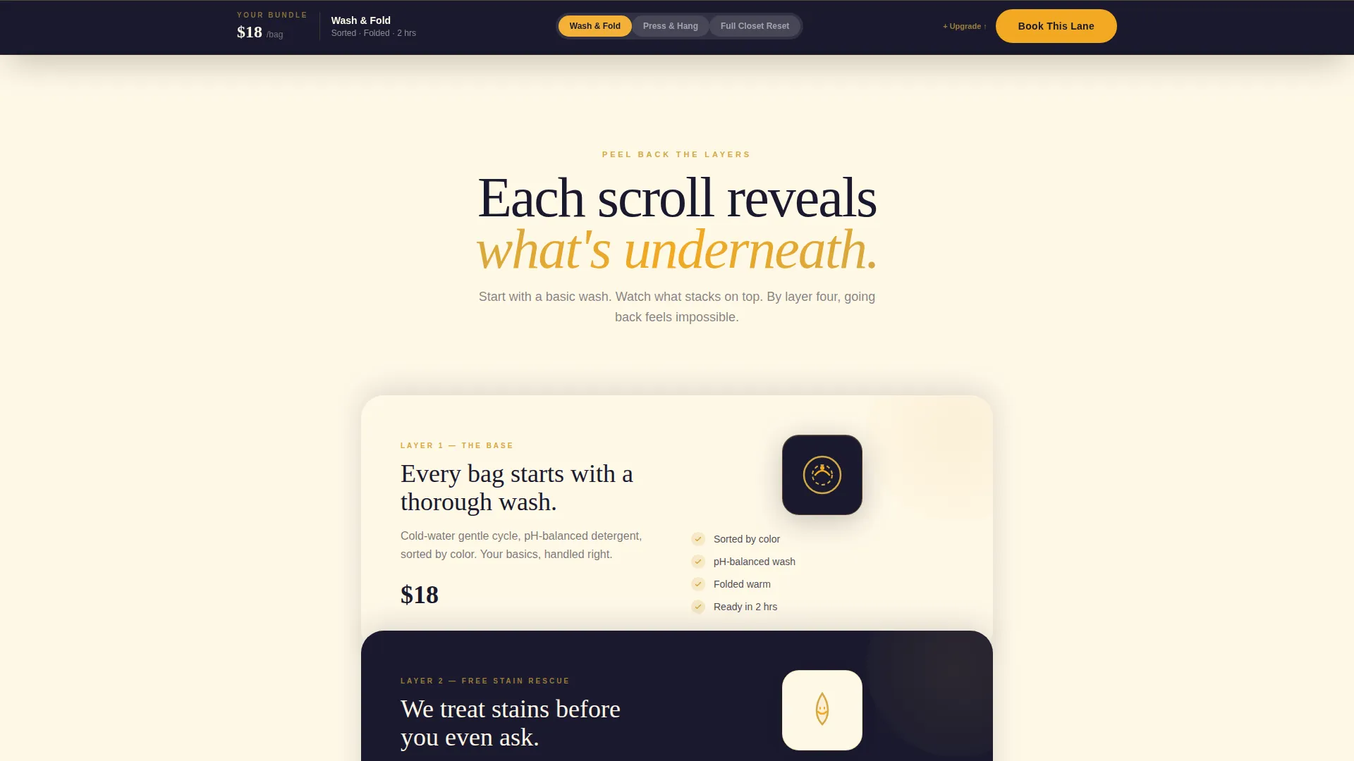
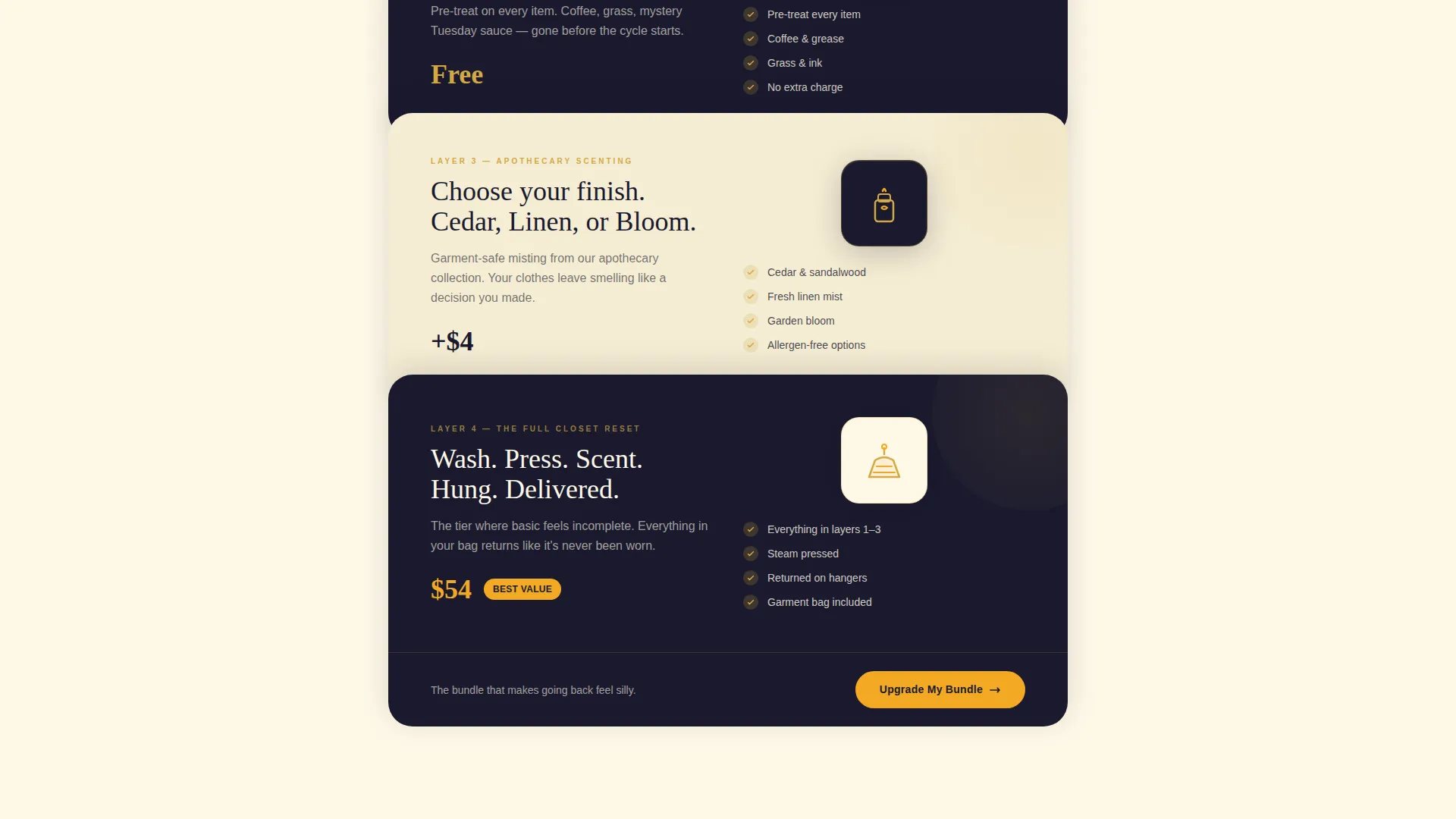
- Scroll-reveal sections that progressively stack bonus features, from free stain treatment to scenting options
- A sticky bottom bar with a one-tap upgrade toggle that animates the price and perk changes in real time
Feature list
This template is built around a clear set of visual and structural capabilities drawn directly from the design brief.
Fanned Tier Card Header
Three overlapping golden cards fan out like a dealt hand, each displaying a service tier with a playful geometric icon. Prices are visible upfront, and the top-tier card carries a gently pulsing marigold savings badge that draws the eye without being aggressive.
Scroll-Reveal Layer System
Each section slides into view over the previous one, mimicking the feeling of unwrapping a gift. The base wash tier appears first, then a card overlaps it showing free stain treatment, then another adds garment-safe scenting options with apothecary-style illustrations.
Animated Micro-Interactions
Scroll-triggered animations bring the page to life throughout. A sock icon tumbles, a hanger swings, and a receipt folds itself into an origami shirt shape. Geometric shapes rotate and restack as the visitor moves down the page.
Sticky Upgrade Bar
A persistent bottom bar tracks the visitor's current tier selection as they scroll. A single toggle slides the selection from Basic to Premium, and the card stack, price, and listed perks animate in real time to reflect the change.
Two-Path Conversion Design
The primary call to action reads "Upgrade My Bundle" and sits at the tier comparison point where the savings math is clearest. A secondary path, "Try One Bag First," captures the car model, preferred pickup window, and phone number for text-when-ready notifications.
Geometric Layering System
Overlapping circles, offset rectangles, and stacked parallelograms appear across every section. Gold outlines sit on obsidian cards that float above cream backgrounds, creating visible depth that makes each section feel like a new layer to discover.
Page sections overview
| Section | Purpose |
|---|---|
| Header with Tier Cards | Introduce all three service tiers at a glance with visible pricing and a savings badge |
| Scroll Reveal Layers | Stack bonus features progressively to build perceived value as the visitor moves down |
| Tier Comparison View | Show all three tiers side by side at the point where the upgrade call to action appears |
| Secondary Booking Path | Capture hesitant visitors with a lighter entry form for a single-bag trial |
| Sticky Upgrade Bar | Keep the current tier selection visible and toggleable throughout the entire scroll |
Design & branding system
The visual identity follows a Playful Geometric theme built on four carefully chosen tones. The palette reads like a luxury matchbox from a boutique hotel: unexpectedly refined for an everyday errand.
- Deep charcoal-black (#1A1A2E) as the base, brushed gold (#D4A843) for card outlines and accents, warm cream (#FFF8E7) for backgrounds, and marigold (#F2A922) for buttons and hover states
- Geometric shapes including overlapping circles, offset rectangles, and stacked parallelograms layer across every section to suggest movement and depth
- Gold-outlined obsidian cards float above cream backgrounds, and the tagline "Why do less when the lane's right there?" fades in on load to set the tone immediately
Mobile & speed optimization
The sticky upgrade bar and scroll-reveal layers are structured to work cleanly on smaller screens. The single-page format keeps everything within one continuous flow, which reduces friction on mobile devices.
- The tier cards and sticky bar are sized for thumb-friendly tapping on phone screens
- Micro-animations are tied to scroll position, so they trigger naturally on both desktop and mobile without requiring user input
- The two-path conversion structure keeps the booking entry short and focused, reducing friction for mobile visitors filling in the form
How this template helps you convert
Spin is engineered to move visitors from browsing to booking by making each scroll feel like a reward rather than a chore.
- The fanned header cards reveal pricing and tier differences immediately, so visitors understand the full offer before they scroll a single pixel further.
- The progressive layer system makes the basic tier feel incomplete by the time the premium tier appears, using visual stacking rather than hard-sell copy to create upgrade intent.
- The sticky upgrade bar keeps the decision visible and removes the need to scroll back up, so the moment a visitor feels ready to commit, the action is always one tap away.
Other information about this template
Spin sits within the Retail and E-Commerce category under the Drive-Through Business subcategory. It was designed with a Surprise and Delight creative direction and a Scroll Reveal progressive template style.
- The intersection match context aligns with drive-through service businesses that rely on convenience, speed, and a polished customer-facing first impression
- The header concept in the matched intersection is a Search Box layout, meaning the template structure supports simple, direct entry points for visitor intent
- The Click-Through landing page direction means every section is built to push a single decision forward rather than educate passively
- This template is suited for businesses that want their page to feel as satisfying as the service itself, turning a mundane errand into a small, repeatable luxury
Theme
Playful Geometric
Creative direction
Surprise & Delight
Color system
Dopamine Pop
Style
Scroll Reveal (Progressive)
Direction
Click-Through
Page Sections
Fanned Tier Card Header
Progressive Scroll-reveal Layers
Scroll-triggered Micro-animations
Sticky Upgrade Bar with Live Toggle
Two-path Conversion Structure
Related questions
Can I change the service tier names and prices?
Does the sticky upgrade bar work on mobile?
Is this template suitable for a laundry business without a drive-through lane?
Can I use the secondary booking path as the only conversion option?
How many sections does this landing page include?



