Marathon Coaching Landing Page Template
Splits is a marathon running coaching landing page built around a stats-first card grid layout. Every scroll depth delivers a new cluster of proof: aggregate results, a twelve-week pace curve, weekly training plan cards, and athlete transformation testimonials. The Industrial Raw design in deep black, electric indigo, and volt accent makes every number feel urgent and every click-through feel earned.
by Rocket studio
Quick summary
Splits is a single-page coaching template designed for marathon running services that lead with data, not motivation. A full-viewport stats wall opens the page, modular card clusters escalate proof as users scroll, and a volt-on-black call-to-action drives click-throughs to a training plan selection page. The layout is sharp, number-forward, and built for runners who trust splits over slogans.
Who this template is for
This template is built for running coaches and coaching businesses that want their results to do the talking. If your service is defined by precise interval pacing, structured training plans, and measurable race-day outcomes, this layout puts that evidence front and center.
- Marathon running coaches targeting mid-pack runners chasing a Boston Qualifier (BQ)
- Coaching services onboarding first-time marathoners who fear hitting the wall at mile twenty
- Ultra-distance runners stepping down to road racing who need data-backed guidance
What problem this template solves
Generic coaching pages bury their credibility under lifestyle imagery and vague promises. Runners researching marathon coaching need to see proof before they click. This template replaces stock photography with live-feel coaching metrics displayed as oversized numbers in a pulsing card grid.
- Coaches struggle to communicate precision and credibility without a long sales pitch
- Prospective runners leave pages that feel inspirational but not informational
- The gap between "we get results" and "here are the exact numbers" loses conversions
What you get with this template
You get a complete single-page coaching layout built around modular data cards that tile into a wall of evidence. Every section is a self-contained proof point, from aggregate stats to individual athlete arcs to weekly training breakdowns.
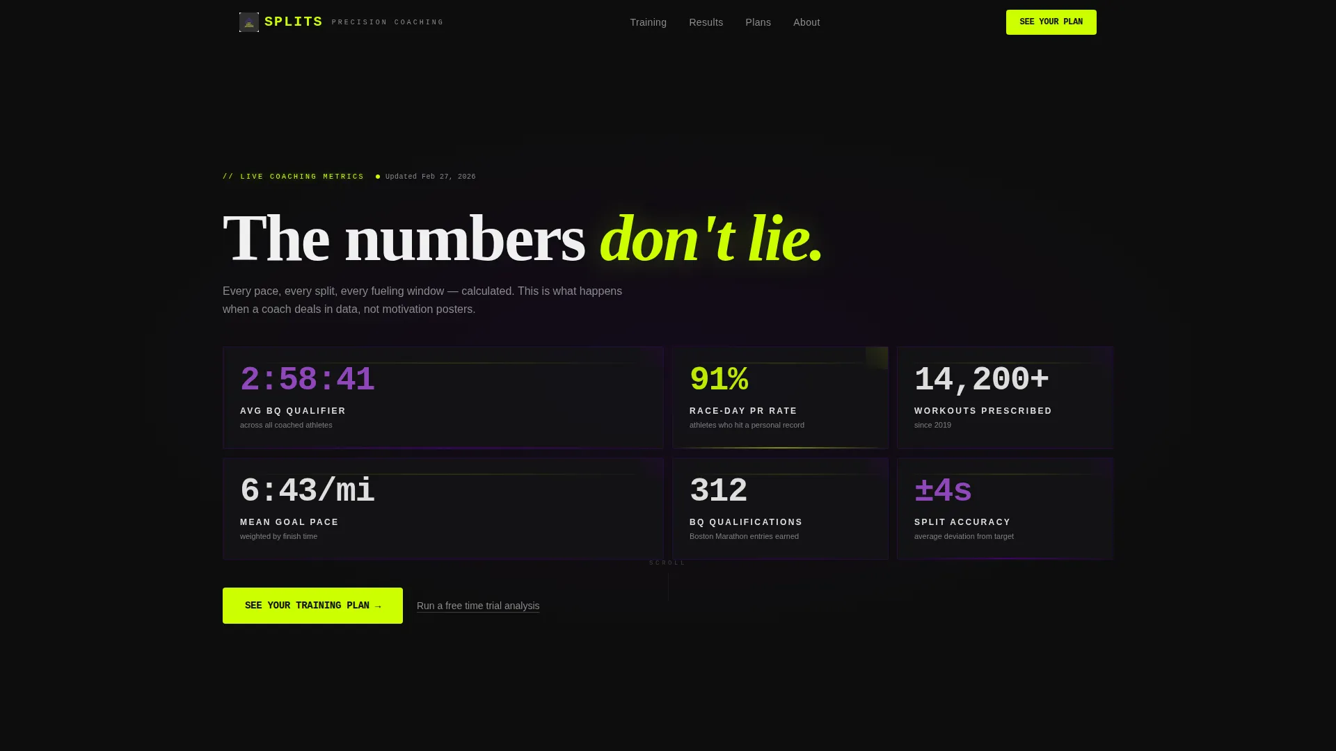
- A full-viewport stats wall header with four key coaching metrics in oversized monospace type
- Four escalating card clusters covering results, pace curves, weekly plan cards, and testimonials
- A sticky bottom bar call-to-action and a secondary skeptic-catching text link
Feature list
This template packs its persuasion into every card, every number, and every carefully placed volt accent. Here is what is built in.
Full-Viewport Stats Wall Header
The header is a dark grid of modular cards, each displaying one coaching metric in oversized mono type. Numbers render first, labels fade in a beat later, and the entire grid pulses subtly like a heart rate monitor at threshold. There is no hero image and no stock photography; the data is the visual.
Four-Cluster Scrolling Card Grid
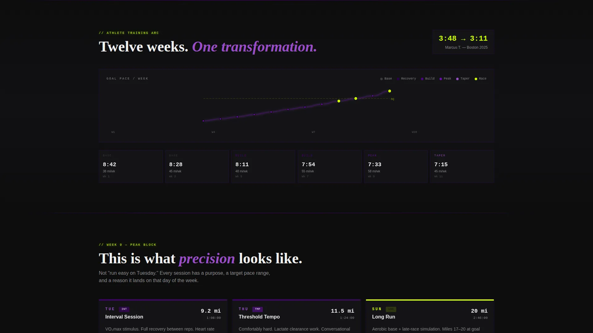
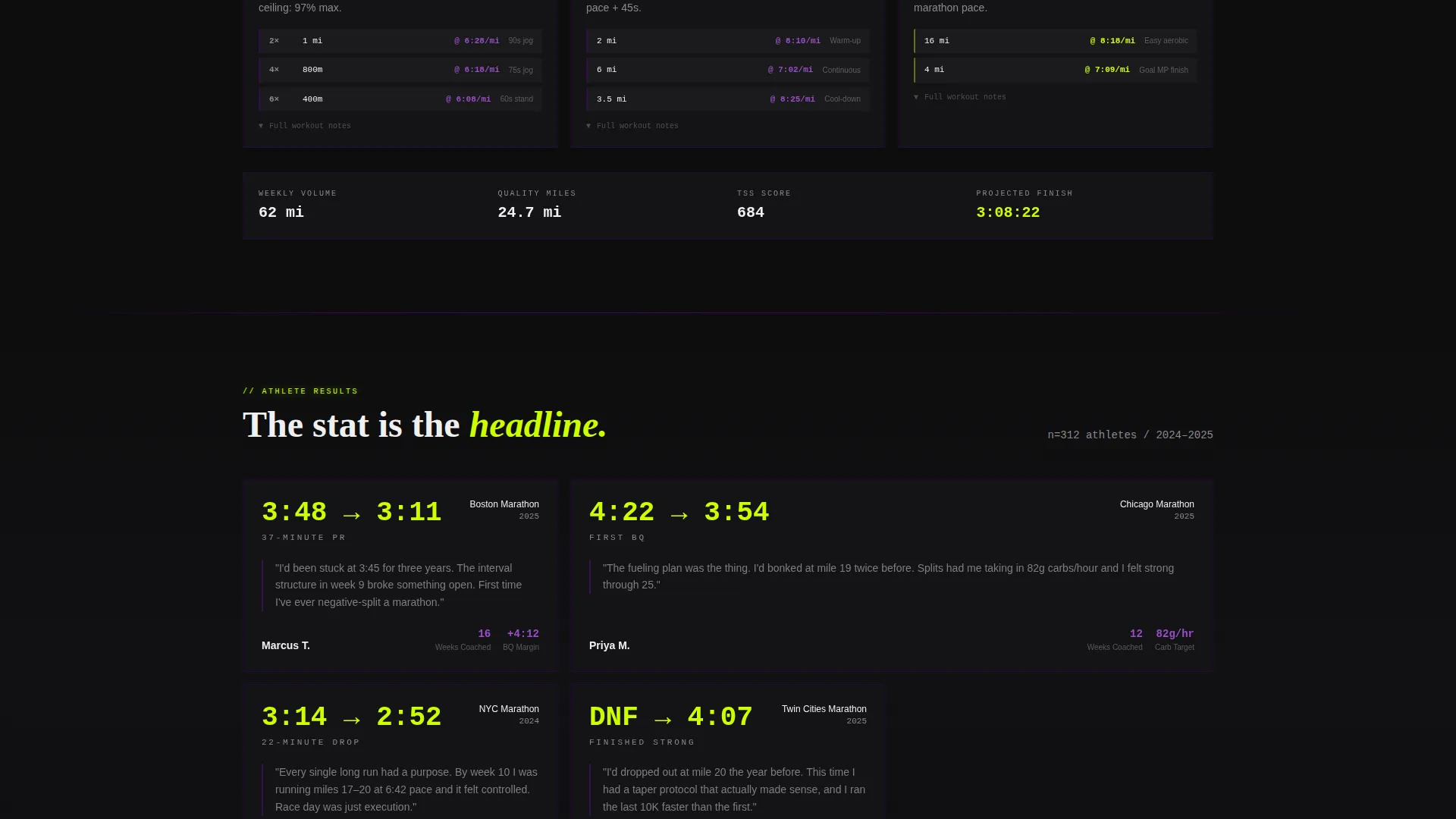
Each scroll depth unlocks a new cluster of proof. The first shows aggregate coaching results. The second visualizes a single athlete's twelve-week training arc as a declining pace curve. The third displays weekly plan cards with Tuesday intervals, Thursday tempo runs, and Sunday long runs with exact splits. The fourth presents testimonial cards where a stat like "3:14 to 2:52 in one cycle" is the headline.
Sticky Bottom Bar Call-to-Action
After the second card cluster, a sticky bottom bar appears and stays visible for the rest of the page. It displays the primary call-to-action, "See Your Training Plan," in volt text on a black bar. This keeps the conversion path visible without interrupting the card grid experience.
Secondary Skeptic-Catch Text Link
A secondary text link reading "Run a free time trial analysis" is placed for runners who need one more data point before committing. It catches the hesitant visitor who is almost ready but wants a low-stakes entry point first.
Testimonial Stat Cards
Testimonial cards lead with the performance number, not the name or the photo. The stat is the headline and the athlete's story is the caption beneath it. This format turns social proof into a data point rather than a feel-good anecdote.
No-Form Click-Through Flow
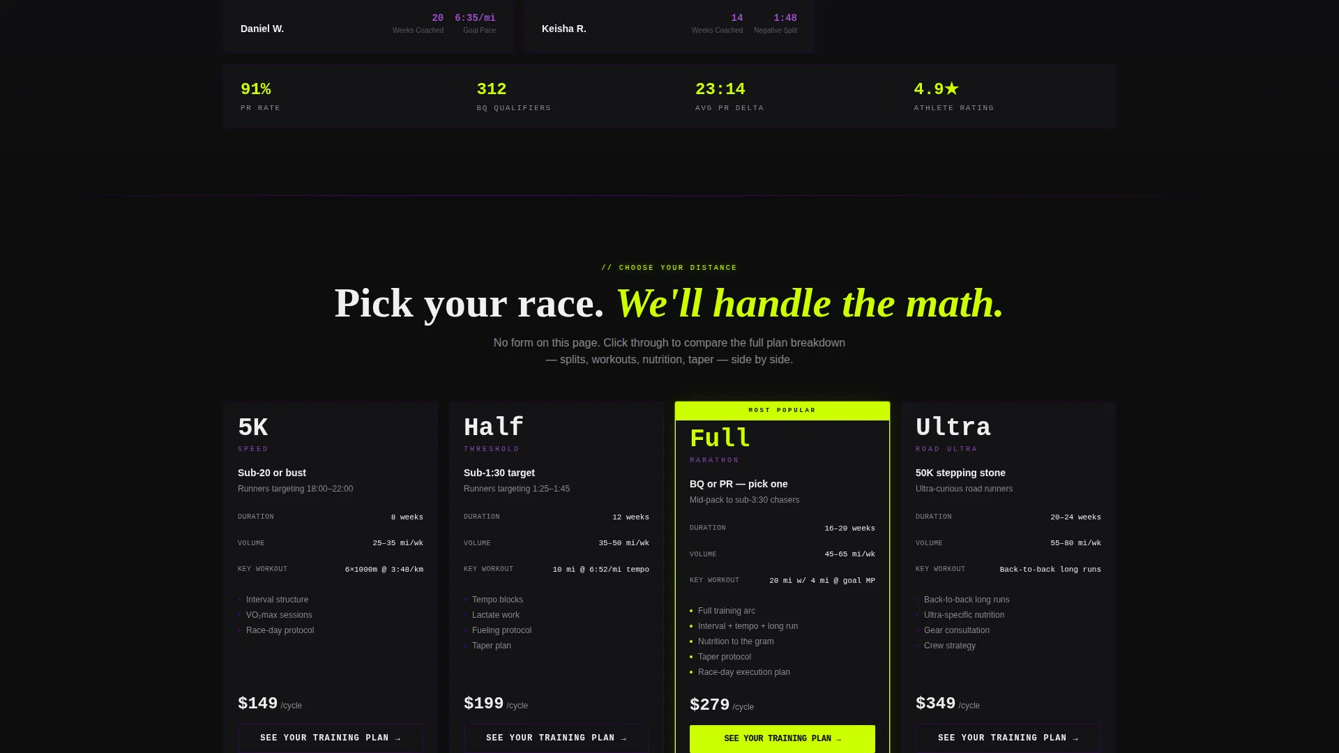
There is no form on this page. The primary call-to-action routes directly to a plan comparison page where runners choose between training tiers. This keeps the landing page friction-free and focused entirely on building the case before the decision moment.
Page sections overview
| Section | Purpose |
|---|---|
| Stats Wall Header | Opens with four key coaching metrics in a pulsing modular card grid |
| Aggregate Results Cluster | First card group showing overall coaching performance data |
| Athlete Pace Curve | Visualizes a twelve-week training arc as a declining pace line |
| Weekly Plan Cards | Tuesday intervals, Thursday tempo, Sunday long run with exact splits |
| Testimonial Stat Cards | Athlete transformation numbers as headlines with story captions |
| Sticky call to action Bar | Persistent bottom bar with primary call-to-action after second cluster |
| Secondary Text Link | Low-friction entry point for skeptical visitors before committing |
Design & branding system
The visual identity follows an Industrial Raw theme that feels like a parking garage converted into a run lab. Fluorescent tubes buzz over rubber flooring, chalk pace charts cover cinder block walls, and every color choice is intentional and disciplined.
- Deep asphalt black (#0D0D0D) dominates all backgrounds for maximum contrast and focus
- Electric indigo (#4B0082) washes over section dividers and card borders, adding depth without competing with data
- Volt accent (#CCFF00) appears only on calls-to-action and live-data highlights so the eye always knows where to tap
- Exposed concrete gray (#3A3A3C) fills mid-tone surfaces and secondary card backgrounds
Mobile & speed optimization
The modular card grid is designed to reflow naturally across screen sizes. Cards that tile side by side on desktop stack vertically on smaller screens without losing their data-forward impact.
- Oversized monospace numbers remain legible at mobile viewport widths
- The sticky bottom bar call-to-action stays anchored at the base of the screen on all device sizes
- Card clusters maintain their visual hierarchy when stacked in a single column on narrower displays
How this template helps you convert
This template builds trust through escalating specificity rather than persuasion copy. By the time a visitor reaches the call-to-action, they have already processed four layers of proof.
- The stats wall header captures attention immediately with real coaching numbers, establishing credibility before a single word of copy is read.
- The card cluster progression moves visitors from macro results down to granular weekly splits, making the coaching method feel transparent and trustworthy.
- The sticky call-to-action bar and the secondary text link give every visitor a next step that matches their readiness, reducing drop-off at the decision point.
Other information about this template
This template is suited to running coaches who want a page that positions their service as a precision tool rather than a motivational product. A few additional details worth knowing before you build with it.
- The page is designed as a click-through landing page, not a lead capture form page
- The primary call-to-action routes to a separate plan comparison page covering 5K-specific, half marathon, full marathon, and ultra training tiers
- The template style is Card Grid (Modular), making individual sections easy to reorder or expand
- The Competition Edge theme and Stats-First Impact creative direction align with coaches who serve performance-focused runners
- The Electric Indigo color system can be adjusted to match a coach's existing brand while keeping the Industrial Raw atmosphere intact
Theme
Competition Edge
Creative direction
Hero's Journey
Color system
Electric Indigo
Style
Card Grid (Modular)
Direction
Event Registration
Page Sections
Full-viewport Stats Wall Header
Four-cluster Scrolling Card Grid
Sticky Bottom Bar Call-to-action
Testimonial Stat Cards
Secondary Skeptic-catch Text Link
No-form Click-through Flow
Related questions
Does this template include a contact form or sign-up form?
Can I update the coaching stats shown in the header cards?
Who is the target audience for this template?
What does the secondary text link do?
Can the card clusters be reordered or expanded?