Cleaning Service Transparent Pricing Hub Website Template
Spotless is a hub-and-spoke cleaning service pricing landing page built around one idea: show the price before asking for anything. An anchor nav guides visitors through five service spokes, each with a pain-point opener, a line-item comparison pricing table, and a contextual call to action. The Dashboard Pro aesthetic makes every number feel trustworthy from the first scroll.
by Rocket studio
Quick summary
Spotless is a single-page, anchor-nav landing page template built for cleaning services that compete on price transparency. Five spoke sections cover Residential, Commercial, Airbnb Turnover, Move-In/Out, and a Custom Quote form. Every spoke leads with a pain point, proves its case with a side-by-side pricing table, and closes with a contextual call to action. The layout earns trust before it asks for contact details.
Who this template is for
This template is built for cleaning service operators who have lost customers to opaque flat-rate competitors and want their pricing to do the persuading. It is equally useful for web design professionals who need to deliver a polished, high-converting pricing page fast.
- Property managers handling large portfolio turnovers who need to justify costs to stakeholders and plan service budgets without surprise invoices
- Airbnb hosts running same-day checkout schedules who need instant, itemized pricing they can plan around
- Office managers and residential homeowners who have been burned before by hidden fees and want full line-item visibility before they commit
What problem this template solves
Most cleaning service websites bury their pricing or hide behind a "contact us for a quote" button. That ambiguity drives potential customers away before a conversation even starts. Transparent pricing builds trust, and 72 percent of consumers say they trust companies less when hidden fees appear after the fact. This template solves that trust gap head-on.
- Visitors land on a page where prices are visible immediately, removing the friction that kills conversions on standard service websites
- The comparison pricing table in each spoke proves the value proposition by showing line-item clarity against the industry norm of flat-rate-plus-extras pricing models
- The three-step progressive disclosure quote form lets users configure their own cost estimate before submitting contact details, making the form feel like a formality rather than a gate
What you get with this template
This one page template delivers a complete, structured pricing experience across six section blocks, all connected by a fixed anchor navigation bar. Every section has a clear goal and a specific conversion action. The template includes all layout components, interactive elements, and typographic styling described below.
- A hero section with a static product screenshot mockup of a mid-configuration pricing dashboard, headlined with "See Your Price Before We See Your Place"
- Five spoke sections, each with a pain-point stat opener, a zebra-striped comparison pricing table, and a spoke-specific call-to-action button
- A three-step progressive disclosure quote form using a square footage slider, service type radio buttons, and a contact and scheduling step, plus a secondary email-gated downloadable PDF rate card
Feature list
This template's features are designed to highlight pricing clarity and guide qualified leads toward a booking decision. Each component reflects the Dashboard Pro philosophy: less decoration, more information architecture.
Fixed Anchor Navigation Bar
A sticky top nav with five spoke links gives users instant access to any pricing section on the page. Visitors can jump directly to the service type that matches their need without scrolling past irrelevant content. The anchor links keep the one page experience fast and non-disruptive.
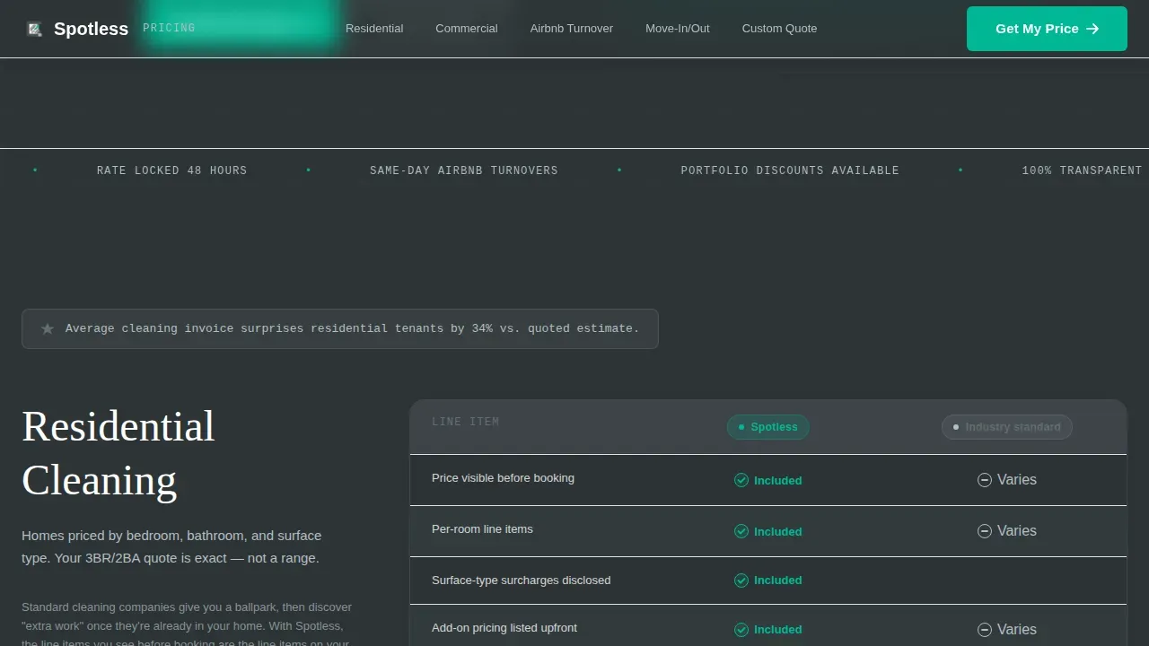
Side-by-Side Comparison Pricing Table
Each spoke section contains a comparison pricing table with tight columns and zebra-striped rows alternating between gunmetal and white. A signal-green checkmark marks every included line item on the Spotless side. Gray dashes display competitor ambiguity. This pricing table layout makes it easy for users to scan differences and determine value at a glance, without needing to read long paragraphs.
Three-Step Progressive Disclosure Quote Form
The quote form opens with a square footage range slider so users can estimate their cost before committing to anything. Step two presents service type radio buttons. Step three collects contact and scheduling details. This staged approach reduces decision fatigue and mirrors how interactive pricing sliders align vendor success with customer value. Potential customers who complete the form arrive as qualified leads with a price already in mind.
Email-Gated PDF Rate Card Download
A secondary conversion path offers a downloadable PDF rate card behind an email gate. This path is built for visitors who need to share pricing data with a decision-maker before booking. It catches a segment of users that the primary form might miss and adds another touchpoint for sales follow-up.
Contextual Spoke-Level Call-to-Action Buttons
Each of the five spoke sections ends with a unique, contextually worded call-to-action button. "Lock In This Rate" closes the Residential spoke. "Get a Portfolio Quote" addresses property managers. "Price My Turnover" speaks directly to Airbnb hosts. These specific labels outperform generic button copy and help increase conversions by matching the exact language each audience segment uses.
Scroll-Triggered Section Reveals with GSAP Stagger
Section content animates in on scroll using GSAP stagger timing and marquee effects where appropriate. These medium-weight animations add momentum without slowing the experience. The motion draws attention to key pricing metrics and table rows as users scroll, reinforcing the data-led, dashboard-style feel of the page.
Page sections overview
| Section | Purpose |
|---|---|
| Hero Dashboard Header | Display a static product screenshot mockup with the primary headline and establish the transparency value proposition |
| Residential Pricing Spoke | Lead with a pain-point stat, present a comparison pricing table, and close with a residential call to action |
| Commercial Pricing Spoke | Address office manager pain points with a line-item pricing table and a portfolio-level call to action |
| Airbnb Turnover Spoke | Serve same-day checkout hosts with itemized turnover pricing and a turnover-specific call to action |
| Move-In/Out Spoke | Cover tenant and landlord move scenarios with a detailed comparison table and a booking call to action |
| Custom Quote Form | Capture qualified leads through a three-step progressive disclosure pricing calculator and an email-gated PDF rate card |
Design & branding system
The visual identity follows a Dashboard Pro theme using a Monochrome Steel color palette. The aesthetic is deliberately minimal, the kind of clean design that feels like a finance app built for people who respect data over decoration. Ample white space in the layout reduces cognitive load and directs attention to the pricing itself, which is exactly where users need to focus.
- Four-color palette: gunmetal base (#2D3436), brushed aluminum (#636E72), clean-sheet white (#DFE6E9), and signal green (#00B894) reserved exclusively for checkmarks, selected states, and the primary call-to-action button
- Typography pairing of DM Sans for body and user interface text with Fraunces as an accent serif for headlines, creating a contrast between utility and authority
- Backgrounds alternate between gunmetal and white across sections to create hard visual breaks; text uses aluminum gray on light panels and white on dark panels to maintain legibility without softening the data-forward tone
Mobile & speed optimization
The template is built desktop-first, reflecting the primary audience of property managers who evaluate and plan service budgets from a workstation. However, all layout components are fully responsive and tested across major devices and screen widths. Mobile users get the same pricing clarity without sacrificing any table data or form steps.
- The anchor nav collapses cleanly on smaller screens so mobile visitors retain quick access to every spoke section without losing orientation on the page
- Comparison pricing tables reflow for narrow viewports, keeping row and column data legible on any device without requiring horizontal scrolling
- The three-step quote form is touch-optimized, with the square footage slider and radio buttons sized for mobile interaction, ensuring Airbnb hosts and other on-the-go users can price a job from their phone
How this template helps you convert
Reducing decision fatigue, building trust, and facilitating faster conversions are the core aims of this pricing dashboard layout. The page earns the click by showing the price first. Every structural decision reinforces that single, clear goal.
- The hero product screenshot and headline establish the transparency promise within the first viewport, so visitors immediately understand the value proposition without scrolling, which is the fastest way to reduce bounce rates on pricing pages and capture qualified leads early
- The comparison pricing table in each spoke section uses visual hierarchy, green checkmarks, and gray dashes to let users evaluate options without reading persuasive copy, turning each table into a self-contained proof point that drives conversions spoke by spoke
- The three-step progressive disclosure form lowers the perceived cost of engaging by showing users their estimated price before asking for their name, reversing the typical gate-then-reveal pattern that causes drop-off on most service landing pages and turning form completions into genuine sales conversations
Other information about this template
This section covers additional practical details about the template, its construction, and how it fits into common web design and software workflows.
The spotless transparent pricing dashboard landing page template is a pre-designed layout specifically engineered to communicate service cost with absolute clarity. It is built as one page with hub-and-spoke anchor navigation, meaning all content lives on a single URL with internal section links rather than across new pages. Teams that want to create additional service pages or new pages for specific markets can use the spoke structure as a repeatable module.
The template is built with component-level code using modern front-end tools and technologies, making it straightforward to customize colors, copy, and table data without deep software engineering knowledge. Customizable dashboard templates like this one allow users to adjust layouts and components to fit specific business needs. Developers who want to explore the code will find well-structured, readable markup that follows current web design conventions and can be adapted for various platforms.
This template can do an excellent job of serving as the pricing hub for a cleaning service website, sitting as a standalone landing page or embedded within a larger site structure. It stores all pricing data in static table components rather than dynamic software, so teams can update rates by editing table rows directly without needing a content management system or backend tools.
This template also works well alongside paid ad campaigns. When users arrive from a Google ad or a social ad, the spoke-level anchor links allow ad landing destinations to point directly to the relevant pricing section, improving relevance scores and keeping visitors in the right place from the moment they land. The social proof embedded in each spoke, specifically the inline stats and comparison tables, does the same trust-building work that testimonials perform on conventional service pages.
- The template includes inline social proof in the form of pain-point statistics displayed at the top of each spoke section
- Testimonials or customer logo bars can be added within the existing layout to further build trust near pricing tables, as customer testimonials placed next to pricing reduce risk perception and support the value story
- The PDF rate card download path is an effective tool for B2B sales cycles where a decision-maker needs to review and approve pricing before a booking is confirmed
- Monthly pricing details and annual discount information can be surfaced using the existing toggle or table row components without adding new code
- Premium features such as GSAP scroll animations and the multi-step form interactivity are included in the template and do not require additional plugins to activate
- Basic features like static comparison tables and anchor navigation are available out of the box and require no scripting to function
- A free template tier without animation or multi-step form logic may suit teams that want a simpler starting point before upgrading to the full interactive version
- The template's metrics-forward layout, with pricing displayed prominently and line items detailed per service type, helps users understand cost structure quickly and improves the quality of inbound sales conversations
- SEO metadata fields, page title structure, and descriptive heading hierarchy are set up to support standard search visibility practices without additional configuration


Theme
Dashboard Pro
Creative direction
Problem→Solution Arc
Color system
Monochrome Steel
Style
Hub & Spoke (Anchor Nav)
Direction
Comparison/Versus
Page Sections
Fixed Anchor Navigation Bar
Side-by-side Comparison Pricing Table
Three-step Progressive Disclosure Quote Form
Email-gated PDF Rate Card Download
Contextual Spoke-level Call-to-action Buttons
Scroll-triggered GSAP Stagger Animations
Related questions
Can I customize the pricing table data to match my actual service rates?
How does the three-step quote form work for visitors?
Is this template suitable for a cleaning service that offers both residential and commercial pricing?
What is the PDF rate card download and how does it fit into the page?
Can this landing page be used as a destination for a paid ad campaign?


