Entertainment Consulting Reviews Website Template
Premiere is a single-column landing page built for entertainment digital transformation consultants. It pairs an editorial magazine aesthetic with a B2B conversion structure: award badge headers, alternating testimonial mosaics, and a minimal briefing request form. The result reads like a trade publication feature, not a sales pitch, and it speaks directly to VP-level studio and streaming decision makers.
by Rocket studio
Quick summary
Premiere is a single-column flow landing page designed for a consultancy that helps entertainment companies modernize their operations. The template uses an editorial magazine tone, a warm typographic palette, and a mosaic of client testimonials to build authority quietly and cumulatively. It is built for B2B partnership conversion at the VP and C-suite level.
Who this template is for
This template is built for consultancies operating at the intersection of entertainment and digital infrastructure. It speaks to practices that need their landing page to carry the same weight as their reputation.
- Entertainment digital transformation consultants pitching mid-major studios and streaming platforms
- Indie production companies that have closed a funding round and need a credible digital presence fast
- Operations and strategy firms targeting VP-level decision makers who read the trades and skip generic sales pages
What problem this template solves
Most consulting landing pages either over-explain the service or bury the proof. For a buyer at a major studio or streaming platform, neither approach works. They need to feel the authority before they read the argument.
- Generic agency templates fail to signal peer-level credibility to entertainment industry executives
- Hero images and video reels slow the page down and distract from the substance of the offer
- Standard lead forms ask for budget and phone number, which signals a vendor relationship, not a strategic partnership
What you get with this template
You get a fully structured single-column landing page that functions like a curated editorial feature. Every layout decision reinforces the consultancy's authority rather than interrupting it.
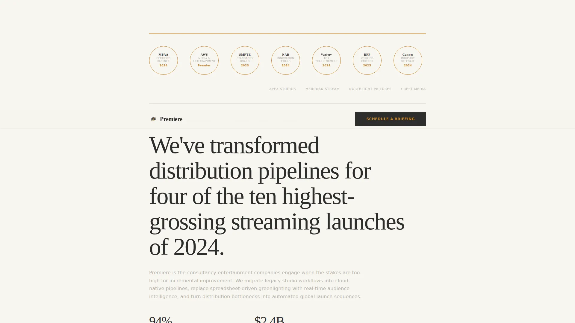
- An award badge header that renders industry recognition marks and partner certifications as embossed metallic seals against a warm white field
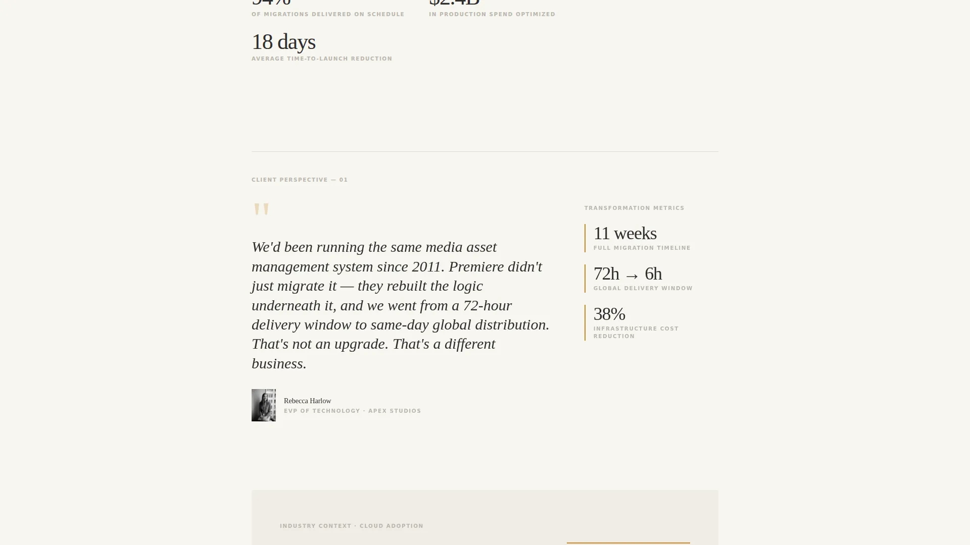
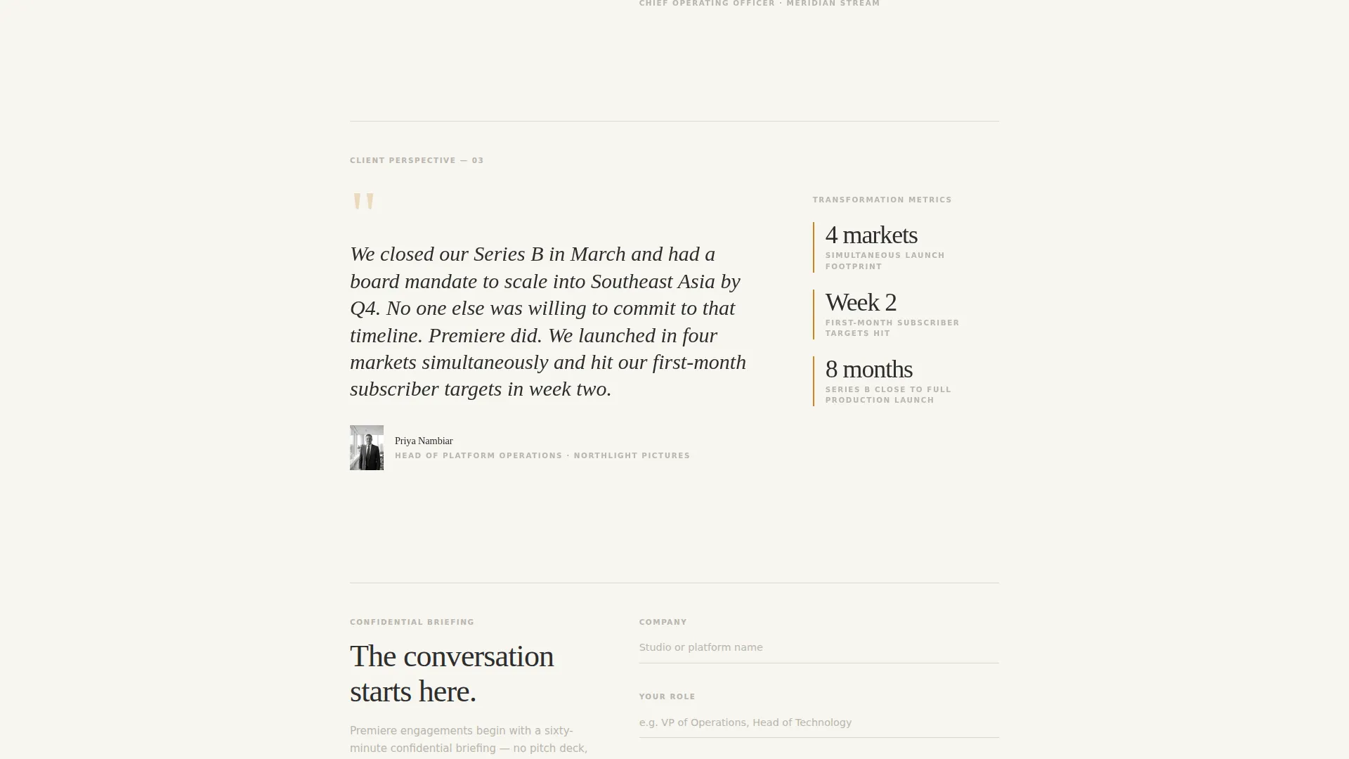
- A testimonial mosaic with alternating quote-forward and data-forward layouts, each pairing a pull quote with sidebar transformation metrics and an editorial black-and-white executive photograph
- Two conversion touchpoints: a minimal briefing request form and a gated PDF download for visitors who are not yet ready to speak
Feature list
This section describes the core built-in components of the Premiere template.
Award Badge Header Strip
The header opens with a horizontal gallery of industry recognition marks, partner certifications, and client logos. They are rendered as embossed metallic seals against the warm white background, arranged like masthead honors on a magazine cover. A thin saffron rule sits above the primary editorial headline, establishing the tone before a single word is read.
Editorial Headline and Dateline Block
Below the badge strip, a large serif headline states the consultancy's most compelling proof point in a single sentence. A dateline-style subhead follows, naming the founding year and total engagement count. Together they set authority without decoration, letting the type carry the message.
Alternating Testimonial Mosaic
The scroll is driven by a series of client testimonials, each presented as a magazine feature spread. Layouts alternate between quote-forward and data-forward arrangements. Each block includes a display-serif pull quote, a sidebar with transformation metrics such as migration timeline, cost reduction percentage, and launch velocity improvement, and a tight black-and-white editorial photograph of the client executive.
In-Stream Editorial Paragraphs
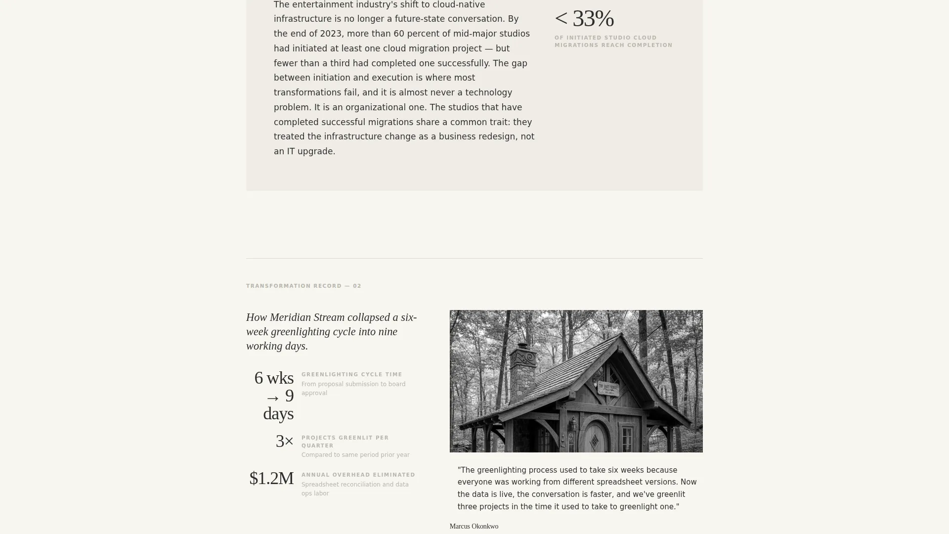
Between testimonials, short third-person paragraphs contextualize each transformation within a broader industry trend. They do not sell. They narrate. The cumulative effect positions the consultancy's work as a response to forces already in motion, not as a pitch for services.
Minimal Briefing Request Form
The primary conversion form asks for only three inputs: company name, the visitor's role, and a single dropdown asking where they are in their transformation. Dropdown options include Exploring, Mid-migration, and Rebuilding after a failed initiative. No phone number field, no budget question. The form signals a peer-level conversation.
Gated PDF Lead Magnet
A secondary conversion path offers a downloadable report titled "The Studio Transformation Index," gated behind email only. This path captures visitors who are researching rather than ready to engage, keeping them connected to the consultancy without requiring a commitment.
Page sections overview
| Section | Purpose |
|---|---|
| Award Badge Header | Establishes authority through industry recognition marks and partner certifications |
| Headline and Dateline | States the core proof point and founding context in editorial typeset style |
| Testimonial Block One | Opens the mosaic with a quote-forward client feature and sidebar metrics |
| Editorial Context Paragraph | Frames the first transformation within a broader industry trend |
| Testimonial Block Two | Shifts to a data-forward layout to vary the reading rhythm |
| Editorial Context Paragraph | Adds industry narrative between the second and third client features |
| Testimonial Block Three | Third client voice, followed immediately by the first call to action placement |
| First call to action Placement | Briefing request form positioned after the third testimonial |
| Testimonial Block Four | Fourth client feature deepens the cumulative case for transformation |
| PDF Lead Magnet | Secondary conversion path gated behind email for early-stage visitors |
| Closing call to action | Final briefing request form and closing editorial statement |
Design & branding system
The Cloud Canvas color system gives the page a matte-finish editorial quality. Every color choice is deliberate and restrained, which is exactly what the target audience expects from a publication-grade experience.
- Soft warm white (#F7F5F0) as the primary background, quiet charcoal (#2D2D2D) for body text, and muted cloud gray (#B8B5AD) reserved for pull quotes and divider rules
- Deep saffron (#C9862B) used exclusively for hyperlinks, badge outlines, and the call-to-action elements, providing a single confident accent without competing with the editorial type
- Large display serif typefaces for headlines and pull quotes, giving the page the feel of a Variety power issue spread printed on heavy stock with confident negative space and type that breathes
Mobile & speed optimization
The single-column flow structure means the layout translates cleanly from a large desktop reading environment to a smaller screen without restructuring. The editorial hierarchy is preserved at every breakpoint.
- Single-column layout removes the need for reflow-heavy grid shifts on narrow viewports, keeping the reading experience intact on mobile devices
- No hero video and no autoplay media means the page loads without heavy asset dependencies, letting the typography and content lead from the first render
- The mosaic alternates between two lean layout modes (quote-forward and data-forward), each requiring only text, a sidebar block, and a single photograph per testimonial unit
How this template helps you convert
The entire page is structured as a trust-building sequence that ends at a low-friction conversion point. It never rushes the reader, which is precisely why the reader stays.
- The award badge header and editorial headline establish credibility before any service description appears, so the reader arrives at the testimonials already oriented toward trust rather than skepticism.
- The alternating mosaic builds a cumulative case across four client voices. By the time the first call-to-action appears after the third testimonial, the visitor has already read three full transformations in the same format they use to read industry trade news.
- The two-path conversion model, a minimal briefing form and an email-gated PDF, meets visitors at different stages of intent without forcing either group through the wrong door.
Other information about this template
This template is built specifically for the entertainment consulting niche, where the buyer's experience of your page is as important as the page's content. A few additional details worth noting:
- The template style is a single-column flow, which means every section reads in sequence, building a single sustained argument rather than offering a menu of services
- The Partnership and B2B conversion direction means both conversion points are designed around starting a dialogue, not closing a transaction
- The Editorial Magazine theme and the Cloud Canvas color system are paired specifically to evoke the visual register of trade publications, which the target audience already trusts
- The header concept uses Award Badges rather than photography or video, making authority visual without relying on production assets that need regular updating
- The Testimonial Mosaic creative direction is the structural spine of the page, and it is designed to be populated with real client voices and real transformation data for maximum credibility
Theme
Editorial Magazine
Creative direction
Testimonial Mosaic
Color system
Cloud Canvas
Style
Single Column Flow
Direction
Partnership/B2B
Page Sections
Award Badge Header Strip
Editorial Headline and Dateline Block
Alternating Testimonial Mosaic
In-stream Editorial Narration
Minimal Briefing Request Form
Gated PDF Lead Magnet
Related questions
Can I use this template without existing client testimonials?
What makes the briefing form different from a standard contact form?
Is the PDF lead magnet document included in the template?
Who is this landing page template designed for?
Can I adapt the testimonial mosaic to fewer than four client stories?



