Entertainment SEO Agency Landing Page Template
Spotlight is a masonry-style landing page template built for entertainment SEO agencies. It pairs an editorial Ink & Paper visual identity with a content-driven layout that turns case studies into lead magnets. The giant serif headline, rotating clipping-card grid, and gated playbook download work together to build trust and capture qualified leads from publicists, distributors, and music managers.
by Rocket studio
Quick summary
Spotlight is a single-page template designed for entertainment SEO agencies. It opens with an oversized broadsheet headline and flows into a masonry grid of rotating case-study cards. Every card doubles as a lead magnet. A gated playbook download and a sticky call-to-action bar turn passive readers into qualified contacts.
Who this template is for
This template is built for agencies and professionals who sell search visibility to the entertainment industry. It speaks the language of release cycles, chart positions, and press windows.
- Entertainment SEO agencies pitching indie film distributors, podcast networks, and music publicists
- Agency founders or strategists who need a content-rich landing page that earns trust before asking for a lead
- Music publicists, label managers, and streaming teams evaluating an SEO partner before a major release
What problem this template solves
Entertainment clients have tight release windows. They need proof of results fast, not a polished brochure site. Most agency templates are too generic to communicate the urgency and specificity of entertainment SEO work.
- Generic agency templates fail to show campaign-specific metrics that entertainment clients trust
- There is no clear content-to-lead flow; visitors browse but have no reason to share their email
- The page does nothing to qualify intent or signal which release type the visitor is working on
What you get with this template
You get a fully structured single-page layout that leads visitors from an editorial headline through layered proof, then captures their details through a value-first download offer.
- A giant centered headline section styled as a broadsheet front page
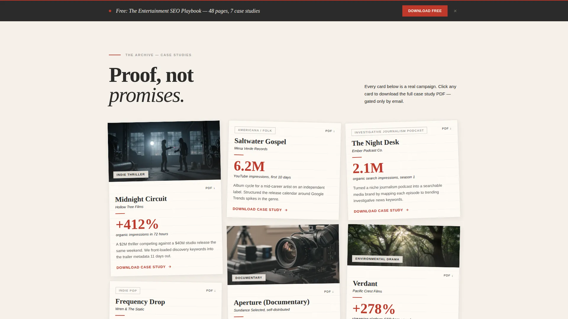
- A masonry grid of case-study cards formatted as newspaper clippings and magazine tear sheets
- A gated playbook download form with a role selector and an optional release-context field
Feature list
This template combines editorial design with a deliberate conversion flow. Every visual and structural decision serves both engagement and lead capture.
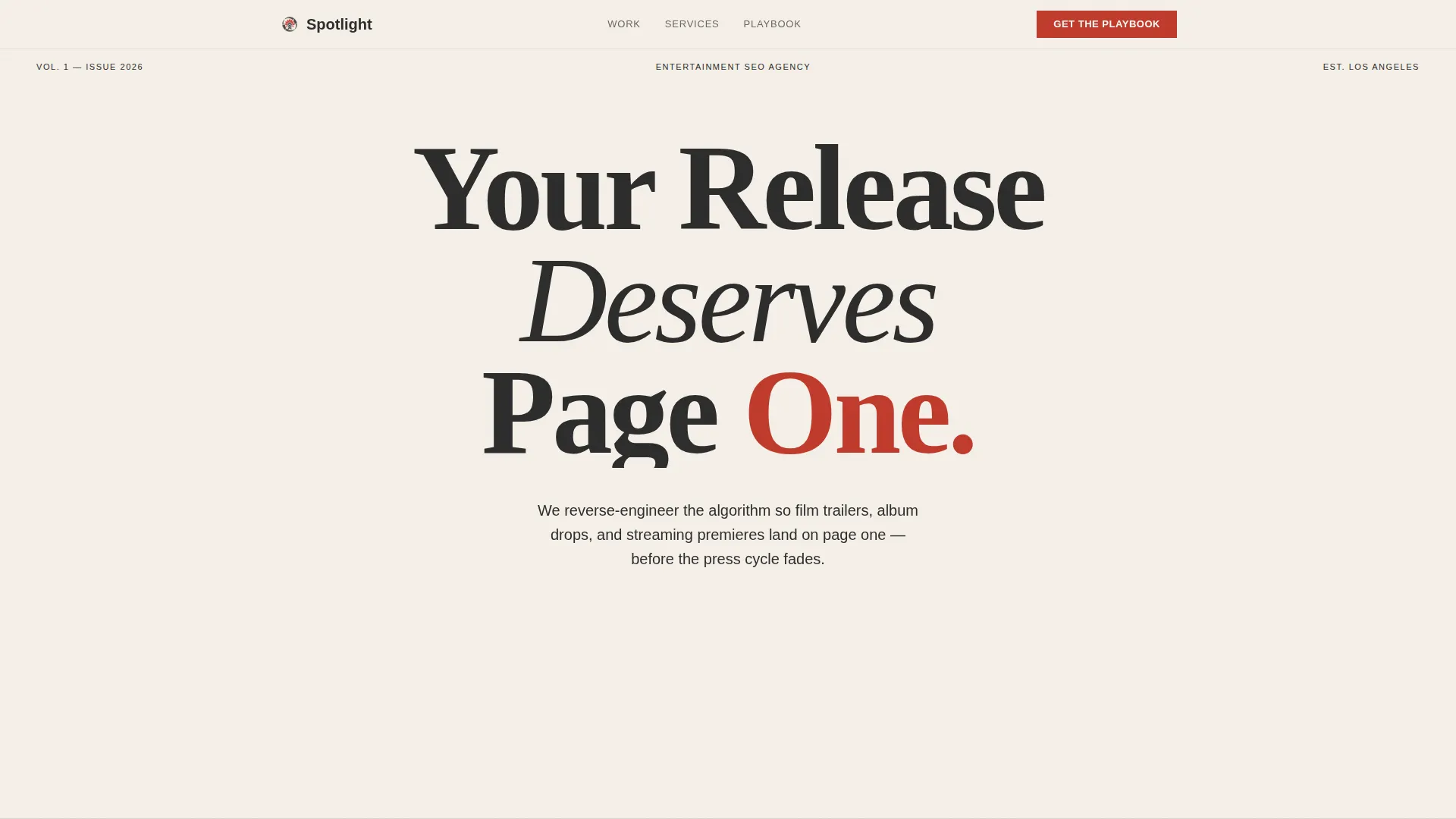
Giant Serif Headline Header
The header opens with enormous charcoal serif type set on a cream background. The letterforms scale past comfortable margins so the page feels typeset rather than assembled. A single-line subhead in pencil gray sits below it, and a red underline pulses once to draw the eye toward the scroll cue.
Masonry Case-Study Card Grid
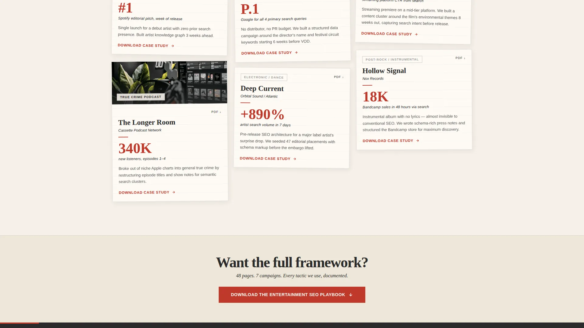
The main body is a masonry grid of case-study cards styled as newspaper clippings and streaming dashboard screenshots. Cards sit at slight rotations to reinforce the editorial archive feeling. Each card carries a campaign name, a genre tag, and one large red metric such as "+412% organic impressions in 72 hours."
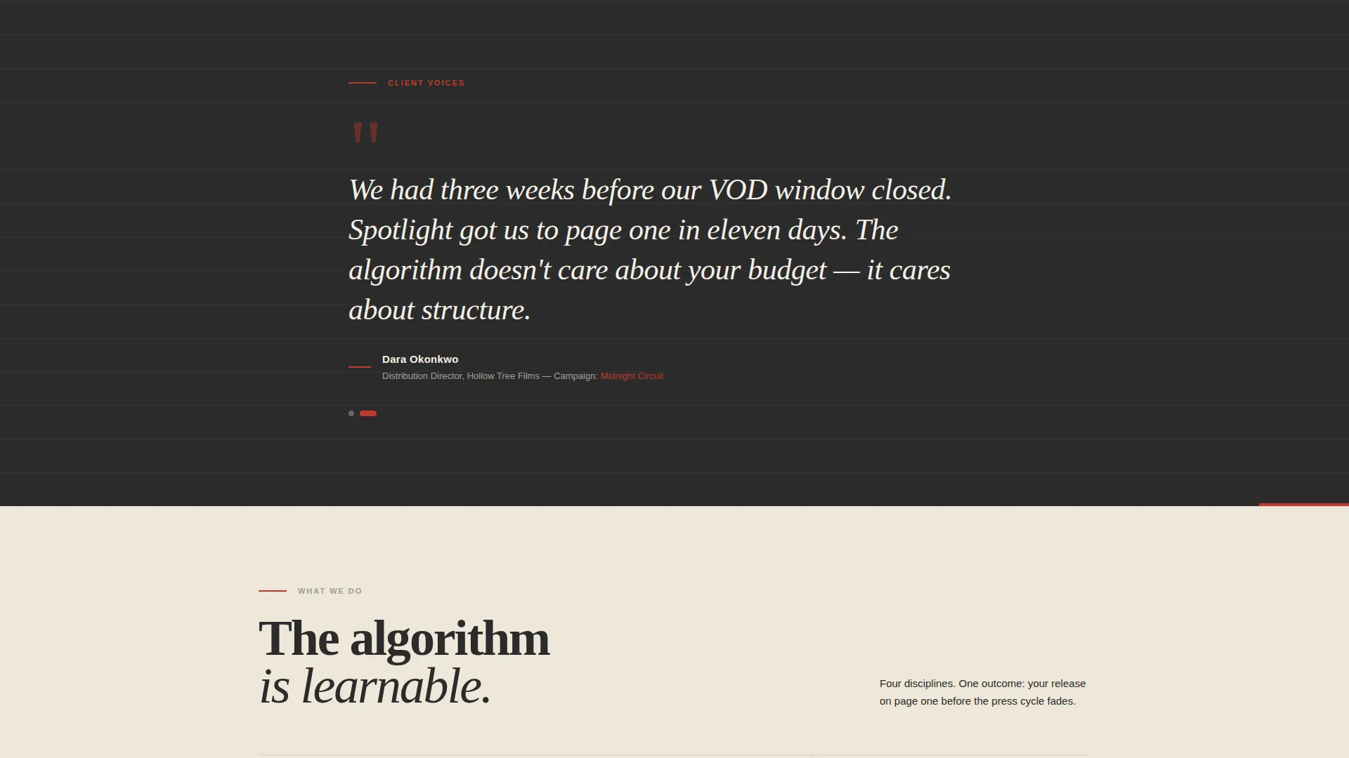
Pull-Quote Interstitials
Full-width client quote blocks break the masonry grid at intervals. They function like pull quotes in a feature article, giving the eye a moment of rest before the next row of evidence. The editorial red is used sparingly here, marking only the words that carry the most weight.
Gated Playbook Download Form
The primary call-to-action offers an Entertainment SEO Playbook in exchange for an email address. The form also collects the visitor's role from a short dropdown and includes one optional field asking about their next release. This structure qualifies intent while making the visitor feel personally addressed.
Individual Case-Study PDF Gates
Every card in the masonry grid links to a gated case-study PDF. The gate requires only the email already captured by the playbook form, so return visitors move straight to the content. This turns the entire grid into a layered lead-magnet system.
Sticky Bottom Call-to-Action Bar
After mid-scroll, a sticky bar appears at the bottom of the page repeating the playbook download offer. It keeps the primary conversion path visible without interrupting the reading flow of the case-study archive.
Page sections overview
| Section | Purpose |
|---|---|
| Giant Headline Header | Sets editorial authority and draws the visitor into the page |
| One-Line Subhead | Frames the agency's core promise in a single phrase |
| Red Pulse Underline | Visual scroll cue that transitions the eye downward |
| First Case-Study Row | Delivers immediate proof before the first call to action appears |
| Playbook Download call to action | Primary lead-capture form anchored after the first card row |
| Masonry Card Grid | Expanding archive of campaign results styled as press clippings |
| Pull-Quote Interstitials | Client voice breaks that add credibility and pacing |
| Sticky Bottom Bar | Persistent secondary call to action that reappears at mid-scroll |
Design & branding system
The visual identity follows an Ink & Paper theme. Every color and type choice reinforces the feeling of a print studio layout table lit by warm tungsten light.
- Color palette: soft newsprint cream (#F5F0E8) for backgrounds, smudged charcoal (#2B2B2B) for all primary type, pencil-sketch gray (#9E9D9B) for secondary text, and editorial red (#C0392B) used only for links, hover states, pull quotes, and key metrics
- Typography carries the full visual weight; serif faces handle headlines and card titles while the red appears sparingly enough that every instance reads as a deliberate editorial mark
- Layouts use slight card rotations and layered tear-sheet styling to build the feel of an archive table rather than a digital grid
Mobile & speed optimization
The masonry grid reflows cleanly for smaller screens without losing the editorial texture. Card rotations and pull-quote spacing are preserved at all viewport sizes.
- Card stack order is preserved on mobile so the most compelling metrics stay near the top of the scroll
- The sticky bottom bar remains functional on touch devices and does not obscure form fields
- Cream-to-white backgrounds and charcoal type maintain strong contrast across screen brightness settings
How this template helps you convert
The page is structured so that every scroll step increases commitment. Visitors read proof before they see a request, which lowers the friction of sharing their email.
- The masonry grid builds cumulative evidence row by row, so by the time the playbook call to action appears, the visitor has already seen multiple campaign results relevant to their release type.
- The three-field form (email, role, optional release detail) collects enough information to qualify the lead while the optional field makes the interaction feel like a conversation rather than a gate.
- The sticky bottom bar and per-card PDF gates create multiple conversion touchpoints across the full scroll depth, catching visitors who are ready to act at different stages of the page.
Other information about this template
This template is part of the Portfolio & Agency category and sits within the Entertainment Marketing and Agency subcategory. It is a strong fit for any entertainment SEO agency looking to present campaign proof in a high-credibility format.
- Template style: Masonry and Pinterest-style grid layout
- Theme: Ink & Paper editorial identity
- Color system: Cloud Canvas palette
- Creative direction: Immersive Visual through editorial density
- Header concept: Giant Headline Centered with no supporting image or video
- Landing page direction: Content and Resource hub with gated downloads as the primary conversion mechanism
Theme
Ink & Paper
Creative direction
Immersive Visual
Color system
Cloud Canvas
Style
Masonry/Pinterest
Direction
Content/Resource
Page Sections
Giant Serif Headline Header
Masonry Case-study Card Grid
Pull-quote Interstitial Breaks
Gated Playbook Download Form
Per-card PDF Lead Magnets
Sticky Bottom Call-to-action Bar
Related questions
Who is this landing page template designed for?
How does the lead-capture flow work?
Can I use this template if my agency serves multiple entertainment verticals?
What makes the masonry layout effective for an agency page?
Do I need design or development skills to customize this template?



