Summer Catering Gallery & Detail Landing Page Template
Spread is a gallery-and-detail landing page built for summer catering businesses. It opens with three price-anchored package cards, then unfolds into a moody marketplace grid of à la carte stations and add-ons. Prices are visible from the first scroll. Visitors browse, self-select, and click through to book, no quote forms, no ambiguity.
by Rocket studio
Quick summary
Spread is a single-page catering landing page template designed for summer food service businesses. It leads with three side-by-side package cards showing real per-head prices, then opens into a curated grid of stations and add-ons. A floating call-to-action bar follows the visitor down the page, making it easy to move from browsing to booking.
Who this template is for
This template is built for caterers who serve warm-weather events and need a page that sells the experience before the contract is signed. It suits operators running everything from backyard cookouts to polished rooftop cocktail hours.
- Catering businesses offering tiered summer menus with per-head pricing
- Independent caterers targeting office events, weddings, and neighborhood gatherings
- Food service operators who want clients to self-select a budget tier without a back-and-forth quote process
What problem this template solves
Most catering pages hide their prices and force potential clients to fill out a form before seeing any numbers. That friction kills momentum. Spread removes the guesswork by putting prices front and center from the very first section.
- Sticker-shock anxiety is reduced because costs are visible at every scroll depth
- Visitors can browse à la carte options and mentally build their own order before committing
- The floating call-to-action catches clients the moment they are ready, without requiring a form submission
What you get with this template
You get a fully structured, single-page layout that guides visitors from curiosity to commitment. Every section is purpose-built for a summer catering audience.
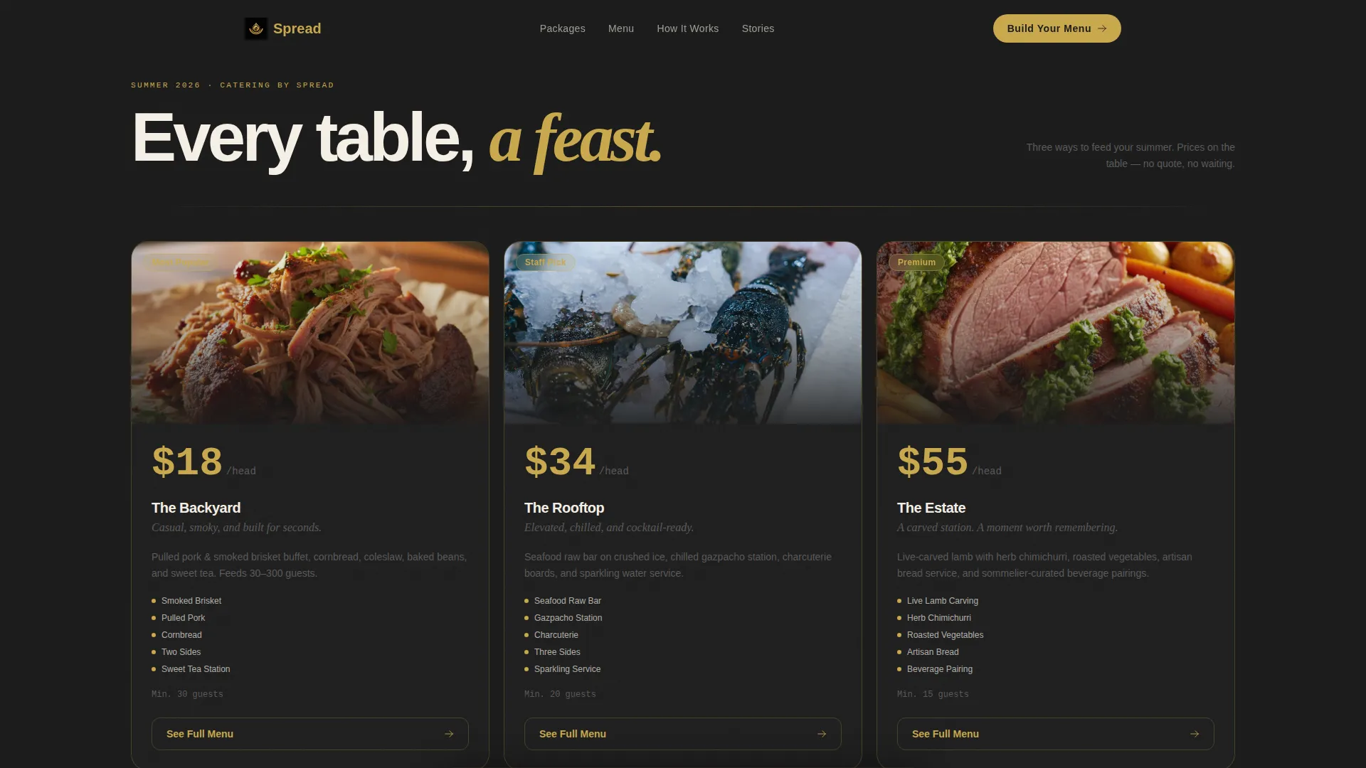
- A hero triptych with three package cards, each showing a food photograph, a package name, and a per-head price in oversized gold numerals
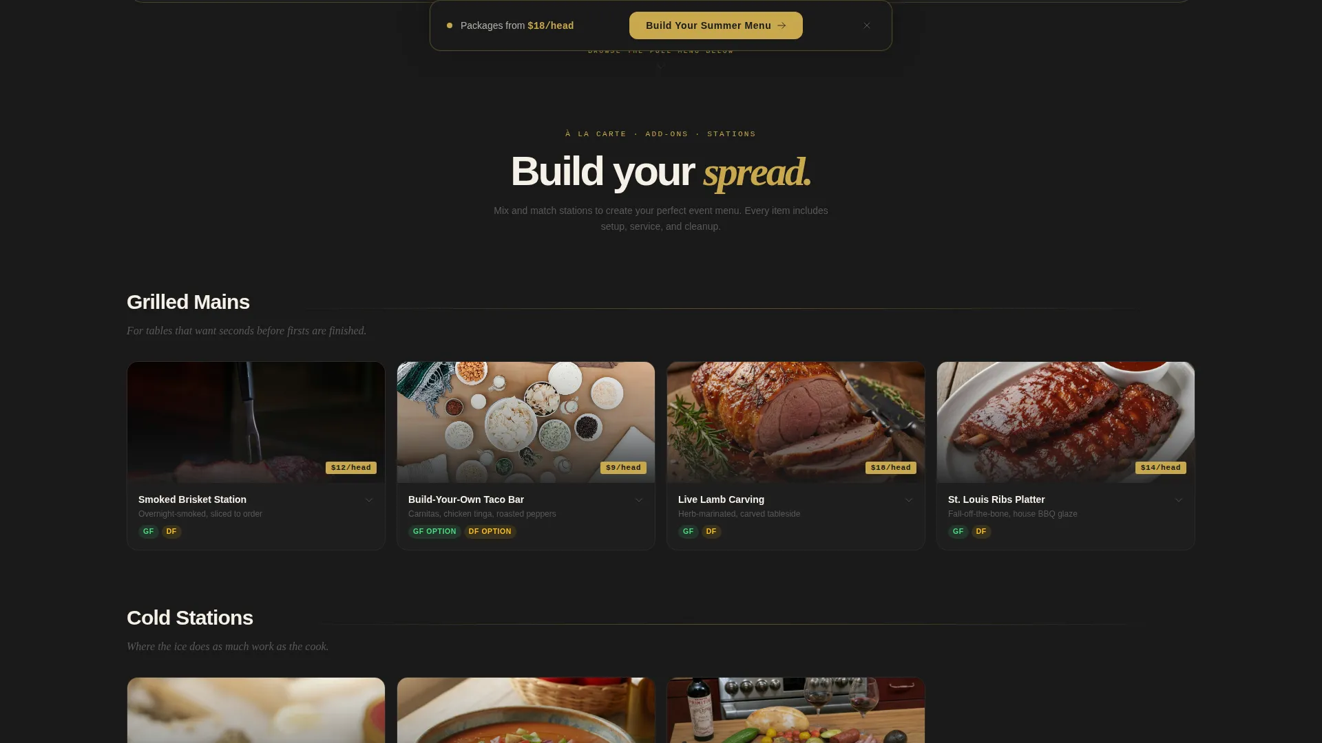
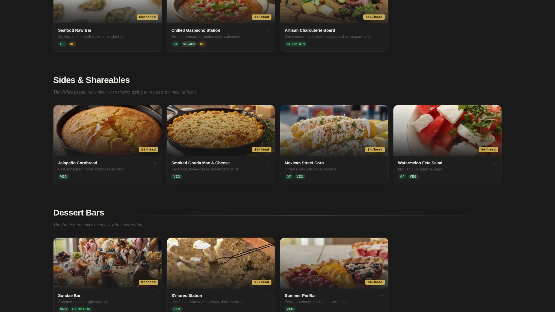
- A scrollable marketplace grid organized into five category sections, each tile carrying a moody food photo, a one-line description, and a gold price tag
- A floating "Build Your Summer Menu" call-to-action bar that appears after the hero and stays pinned throughout the scroll
Feature list
This section covers the core structural and design features delivered by this template.
Price-Anchored Hero Triptych
Three signature summer packages sit side by side in the opening frame. Each card shows a single overhead food photograph, a package name, and a per-head price set in large gold numerals on a deep obsidian card. The layout reads like a gallery triptych, not a pricing table, which makes the cost feel intentional rather than transactional.
Curated Marketplace Grid
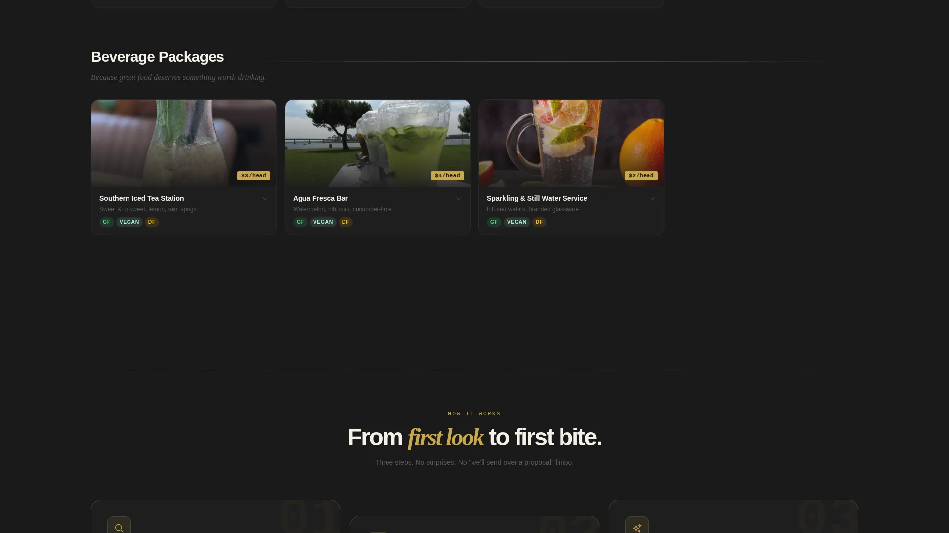
Below the hero, the page opens into a scrollable grid of individual stations and à la carte add-ons. Items are organized into five category sections: Grilled Mains, Cold Stations, Sides and Shareables, Dessert Bars, and Beverage Packages. Each category opens with a single italic editorial note that sets the mood before the tiles appear.
Expandable Detail Panels
Clicking any grid tile opens a detail panel for that item. The panel shows ingredients, dietary flags, minimum headcount, and a suggested pairing. This keeps the main grid clean while giving interested buyers everything they need to decide.
Floating Call-to-Action Bar
After the visitor scrolls past the hero, a pinned bar appears at the bottom of the viewport. It carries the primary call-to-action in gold text on an obsidian background. The bar stays visible throughout the scroll so the booking prompt is always one tap away.
Secondary Package Click-Throughs
Each of the three hero package cards includes a "See Full Menu" secondary link. These link through to a detailed package builder or booking page, giving visitors a direct path from the overview to a deeper commitment step.
Obsidian and Gold Visual System
The entire page uses a consistent four-color palette: deep charcoal-black for backgrounds, warm hammered gold for prices and interactive states, parchment cream for card surfaces and text containers, and muted smoke for body copy. The result is a high-contrast, editorial look that makes food photography stand out.
Page sections overview
| Section | Purpose |
|---|---|
| Hero Package Triptych | Presents three tiered packages with per-head prices and food photography upfront |
| Grilled Mains Grid | Showcases smoked and grilled protein stations with per-tile pricing |
| Cold Stations Grid | Displays chilled options like raw bars and gazpacho stations |
| Sides and Shareables | Covers accompaniment tiles with editorial category intro |
| Dessert Bars Grid | Features sweet station options with expandable detail panels |
| Beverage Packages Grid | Lists drink packages with pricing and pairing suggestions |
| Floating call to action Bar | Pins the primary booking prompt after the hero throughout scroll |
Design & branding system
The visual identity is built around a Marketplace Grid theme using an Obsidian and Gold color system. The palette evokes a chalkboard menu at a high-end smokehouse written in metallic pen, where every dish name glows against a dark background.
- Deep charcoal-black (#1A1A1A) serves as the primary page background, parchment cream (#F5F0E6) surfaces card containers and text areas, warm hammered gold (#C9A84C) highlights prices, badges, and hover states, and muted smoke (#3D3D3D) handles body copy
- Food photography is presented in tight, moody crop ratios inside grid tiles, with one larger overhead shot anchoring each hero package card
- Italic editorial lines introduce each grid category, adding a menu-editor voice that connects sections without requiring extra visual elements
Mobile & speed optimization
The grid layout and floating call-to-action are structured to translate cleanly from desktop to smaller screens. Category sections and detail panels are designed to stack without losing the visual hierarchy established on wider viewports.
- Package cards in the hero triptych reflow for single-column reading on mobile without losing price visibility
- The floating call-to-action bar remains accessible on touch devices, keeping the booking prompt reachable at any scroll position
- Grid tiles resize responsively so food photography stays legible and price tags remain visible at all screen widths
How this template helps you convert
The page is engineered around one principle: remove every reason a visitor might hesitate before clicking through. Prices are visible, options are browsable, and the next step is always in sight.
- Transparent per-head pricing at the top of the page eliminates the back-and-forth quote cycle that causes potential clients to leave and shop elsewhere
- The scrollable grid format lets visitors self-curate a mental order, which builds investment in the menu before they ever reach the call-to-action
- The floating bar captures commitment the moment a visitor has decided, without asking them to scroll back up or hunt for a contact link
Other information about this template
This template is categorized under Retail and E-Commerce, specifically within the Summer Season Business subcategory. It is a Gallery and Detail style landing page following the Curated Collection creative direction.
- The template is built for the summer season catering and food service niche, covering use cases from corporate picnics and graduation parties to rehearsal dinners and block parties
- The Curated Collection creative direction means the page is structured like a seasonal lookbook rather than a service brochure, which suits caterers who want their menu to feel editorial and premium
- The Price-Anchored header concept and Click-Through landing-page direction work together to reduce friction and move visitors toward a booking action without requiring a form on this page
- This template is suitable for operators offering headcount-flexible menus, where clients need to see per-person cost clearly before committing to a package size
Theme
Marketplace Grid
Creative direction
Curated Collection
Color system
Obsidian & Gold
Style
Gallery + Detail
Direction
Click-Through
Page Sections
Price-anchored Hero Package Cards
Scrollable Marketplace Menu Grid
Expandable Item Detail Panels
Persistent Floating Call-to-action
Secondary Package Link-throughs
Obsidian and Gold Brand Identity System
Related questions
Does this template include a contact or inquiry form?
Can I update the package names, prices, and photos in the hero section?
How many menu categories does the grid layout support?
What details show up in the expandable tile panel?
Is this template a good fit for caterers with headcount-flexible menus?



