Preschool (3-5) Products & Education Website Template
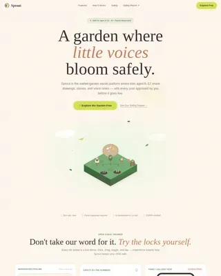
Sprout is a warm, card-grid landing page template built for preschool education apps targeting parents of children aged two to five. It follows a Day-in-the-Life scroll flow, features embedded interactive demos, a filterable curriculum grid, and a Community Hearth visual identity. The primary call to action offers free activities with no credit card required.
by Rocket studio
Quick summary
Sprout is a modular card-grid landing page template for preschool learning apps. It guides parents through a morning-timeline scroll, lets them try a letter-tracing demo and a counting game right in the browser, and leads them toward a free activity download. The design feels like a warm classroom: parchment textures, hand-drawn icons, and generous whitespace.
Who this template is for
This template is built for teams and founders launching a preschool education app aimed at children ages two to five. It speaks directly to the adults making the download decision, not just the children using the product.
- Parents of toddlers and preschoolers comparing learning apps late at night
- Kindergarten-prep caregivers looking for structured, screen-time-justified activities
- Grandparents searching for a meaningful gift that supports early learning
What problem this template solves
Most app landing pages list features at visitors. Parents of young children need something different. They need to feel the product before they commit, and they need to trust that it fits into a real family day.
- Generic feature lists fail to connect with sleep-deprived parents browsing on a phone
- Parents cannot evaluate learning quality from screenshots alone
- Visitors leave before converting when there is no low-friction entry point to try the product
What you get with this template
You get a fully structured, single-page layout that moves visitors from curiosity to action through interactive content and honest value delivery. Every section is designed to reduce hesitation and build trust before asking for anything.
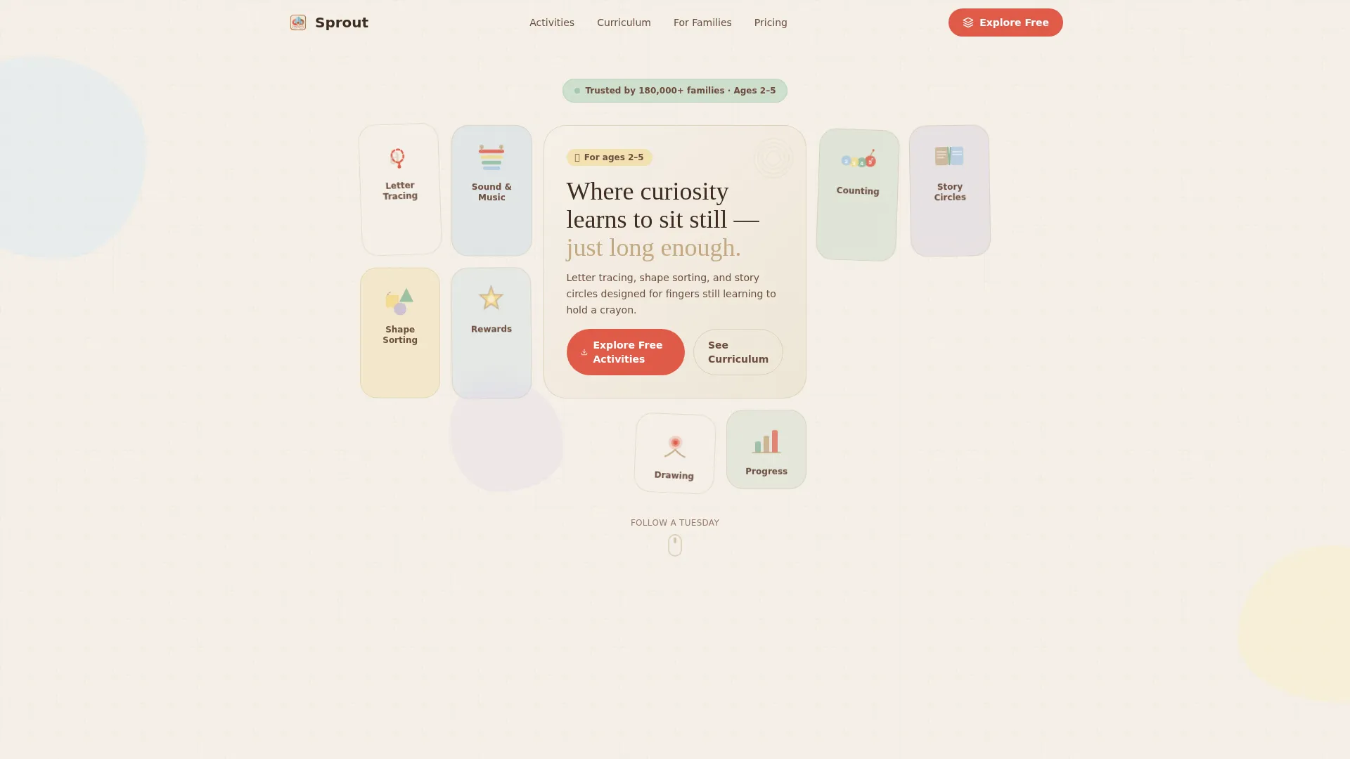
- An Icon Grid hero with a mosaic of hand-drawn activity cards and a central headline card
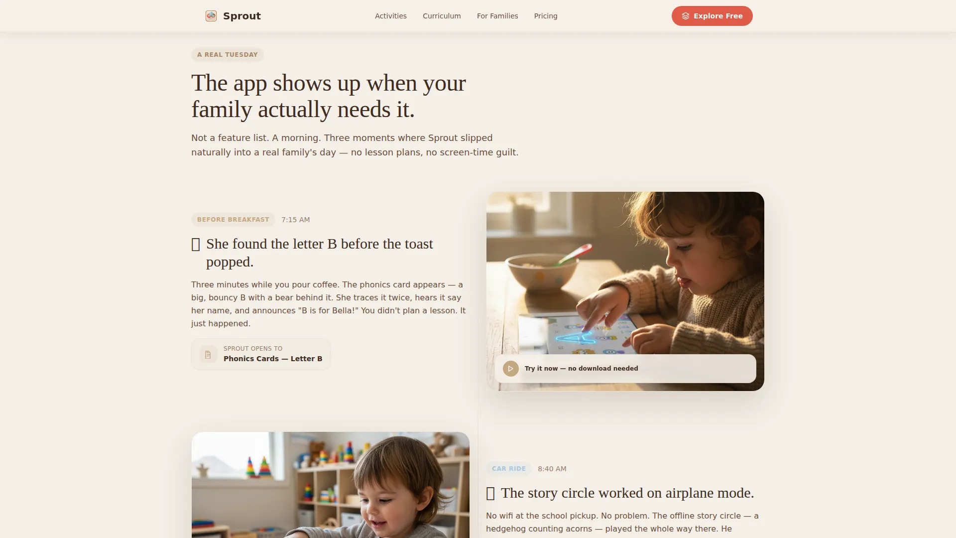
- A Day-in-the-Life morning timeline linking real family moments to specific app features
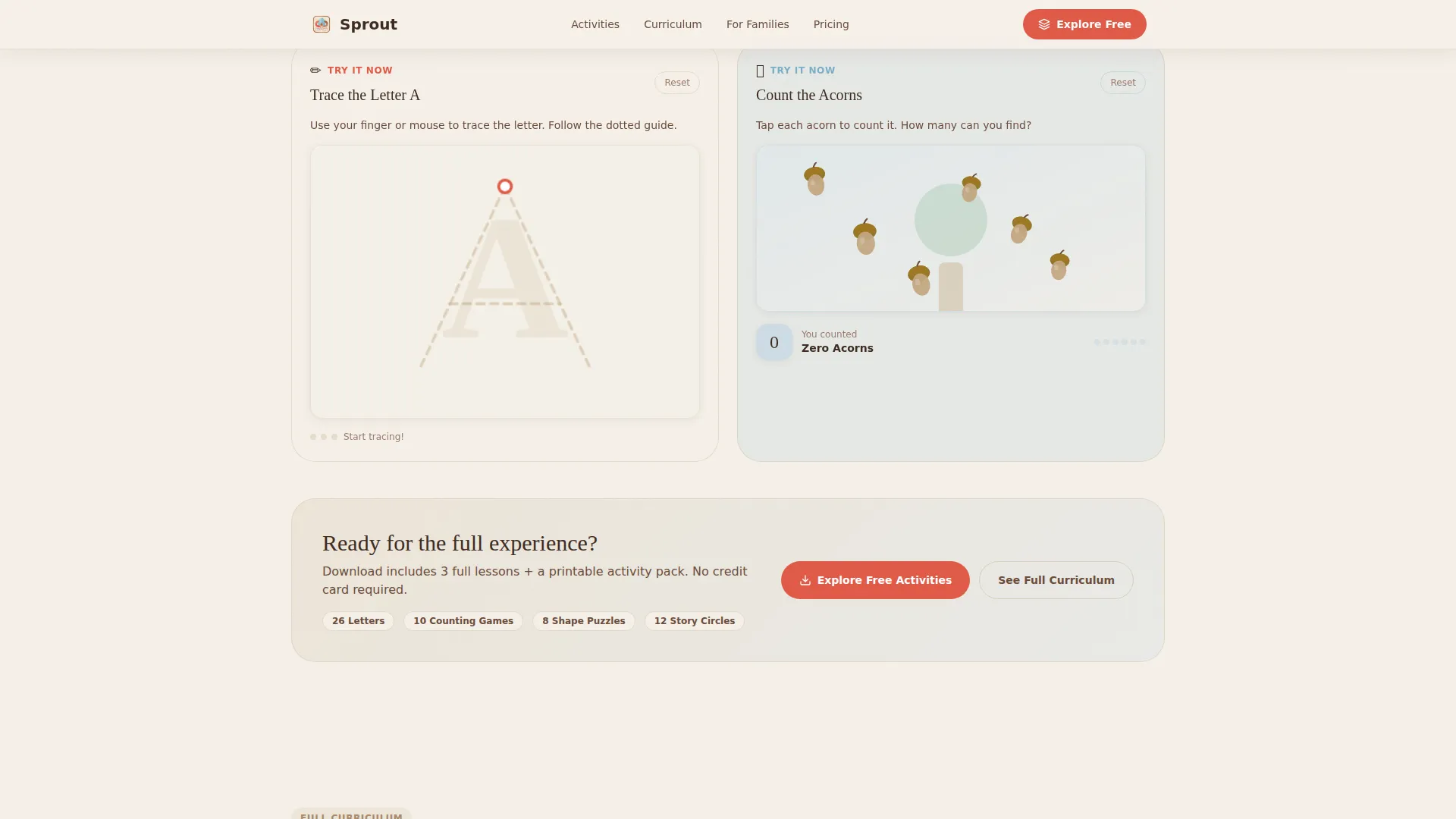
- Two embedded browser demos for letter tracing and counting, a filterable curriculum grid, and a parent testimonials section
Feature list
This template includes a focused set of interactive and visual components drawn directly from the brief. Each one earns its place on the page.
Icon Grid Hero Mosaic
The header displays a mosaic of rounded activity icon cards: a lowercase letter with a tracing path, a xylophone, a counting caterpillar, and a tiny open book. One larger center card holds the page headline. The layout breathes with generous whitespace and faint parchment card textures, feeling like a curated classroom bulletin board.
Day-in-the-Life Scroll Timeline
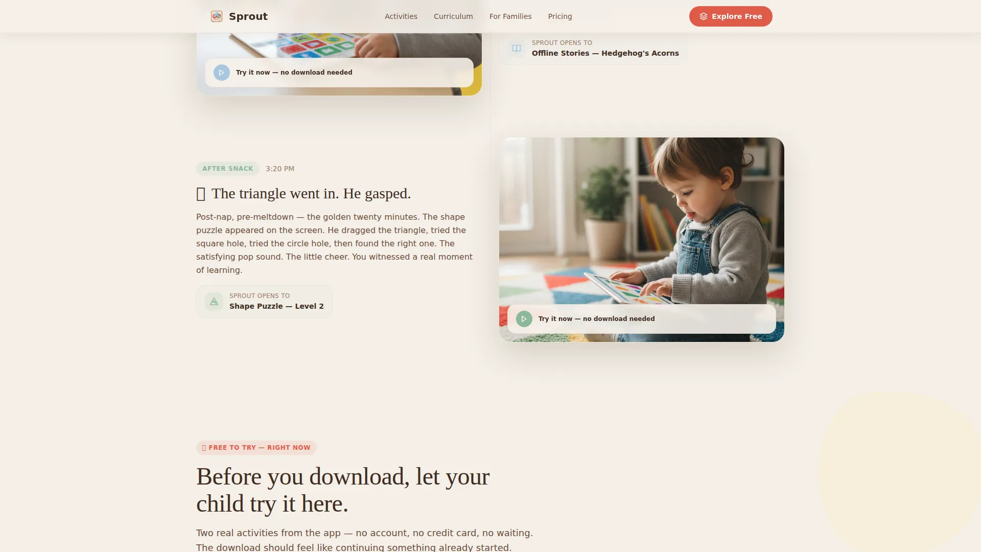
The page scrolls through a child's actual morning from waking up to rest time. Each moment, Before Breakfast, Car Ride, and After Snack, introduces a relevant app activity in context. This narrative pacing helps parents picture their own child using the app naturally, rather than reading a feature checklist.
Embedded Interactive Demos
Two interactive demo cards appear mid-scroll. One lets visitors trace a letter on a browser canvas. The other is a tap-to-count game. Both run directly in the browser without a download. They make the free activity offer feel like continuing something already started, not starting something unknown.
Filterable Curriculum Grid
A card grid displays every activity in the curriculum, sortable by age, skill, and duration. Parents and caregivers can scan the full scope of the learning content before committing. This section supports the secondary call to action: "See the Full Curriculum."
Social Proof Section
Parent testimonials with photos, star ratings, and specific age and outcome details appear before the page closes. Real names, real children's ages, and concrete learning results give hesitant visitors the final nudge they need.
Scroll-Triggered Card Animations
Card clusters reveal on scroll using clip-in entrance animations and float effects. The pacing slows at each content cluster, inviting the visitor to pause, tap a demo, and explore. Scroll-triggered entrances keep the page feeling alive without overwhelming the content.
Page sections overview
| Section | Purpose |
|---|---|
| Icon Grid Hero | Introduce the app with a mosaic of activity cards and a central headline |
| Morning Timeline | Show how the app fits naturally into a real family day |
| Interactive Demo Cards | Let parents try letter tracing and counting in the browser |
| Curriculum Filter Grid | Display every activity sortable by age, skill, and duration |
| Parent Testimonials | Build trust with specific, photo-backed social proof |
| Minimal Footer | Provide navigation links and closing context with minimal distraction |
Design & branding system
The visual identity follows a Community Hearth theme using the Cloud Canvas color palette. Every color choice and type pairing reinforces the warm, classroom-at-home feeling parents respond to.
- Colors: soft parchment white (#F5F0E8) background, warm hearthstone (#C4A882) for primary elements, gentle sky wash (#A8C8E0) for secondary accents, and playful poppy red (#E05A47) reserved for buttons and interactive highlights
- Typography: Fraunces warm serif headlines paired with DM Sans body text for a friendly, readable contrast
- Visual style: hand-drawn icon aesthetic, watercolor-inspired tones, faint card textures, and generous whitespace throughout
Mobile & speed optimization
Parents most often browse on a phone late at night. This template is built mobile-first, with touch interactions as a core design requirement rather than an afterthought.
- Touch-friendly tap targets and swipeable card clusters sized for adult thumbs on small screens
- Canvas-based demos are lazy-loaded so the page opens quickly before interactive elements are needed
- Static-first page structure keeps initial load light, with images sourced from Unsplash and Pexels
How this template helps you convert
The template is structured around giving value before asking for anything. Every section earns the next click by delivering something useful or engaging first.
- Embedded demos let parents experience the product immediately, so the free download feels like continuing a familiar activity rather than taking a risk on something unknown.
- The Day-in-the-Life timeline frames the app as a natural fit for real family routines, reducing the mental barrier of "will my child actually use this."
- The primary call to action, "Explore Free Activities," links to a printable pack and three unlocked lessons with no credit card required, removing every friction point from the first conversion step.
Other information about this template
This template was designed specifically for the preschool education app niche within the Kids and Family category. A few additional details are worth noting for anyone evaluating it for their project.
- The template style is a Card Grid (Modular) layout, making individual sections easy to reorder or expand as content needs grow
- The creative direction is Day-in-the-Life, a narrative scroll structure that works especially well for products embedded in daily family routines
- The header concept is an Icon Grid bento mosaic, a flexible pattern that can be adapted to showcase different activity types as a curriculum grows
- The lp direction is Content and Resource, meaning the page leads with free value before any paid or gated offer appears
Theme
Community Hearth
Creative direction
Day-in-the-Life
Color system
Cloud Canvas
Style
Card Grid (Modular)
Direction
Content/Resource
Page Sections
Icon Grid Hero Mosaic
Day-in-the-life Scroll Timeline
Embedded Interactive Browser Demos
Filterable Curriculum Card Grid
Parent Testimonials Section
Scroll-triggered Card Entrances
Related questions
Who is this landing page template designed for?
Do visitors need to download anything to try the demos?
What is the primary call to action on this template?
Can parents filter the curriculum section by age or skill?
Is this template suitable for mobile users?