Toddler (1-3) Products & Education Website Template
Sprout is a warm, playful toddler education landing page template built as a single-column quiz funnel. It guides parents through a five-question personalized assessment, then delivers a custom learning path for their child. The template features crayon-stroke micro-animations, bilingual milestone framing, and a two-field email signup, making it ideal for early childhood education apps targeting parents of toddlers aged 12 to 36 months.
by Rocket studio
Quick summary
Sprout is a single-column landing page template designed for toddler education apps. It opens with a full-bleed overhead photo and draws parents into a five-question quiz that builds a personalized learning path for their child. Every scroll feels intentional, warm, and parent-friendly, ending with a clear call to action that converts curiosity into sign-ups.
Who this template is for
This template is built for anyone launching or marketing a toddler-focused education app. It speaks directly to the emotional state of the parents most likely to download at 2 a.m. and the educators hunting for something better than a generic video playlist.
- First-time parents of toddlers aged 12 to 36 months who are anxious about developmental milestones
- Bilingual households wanting an app that reinforces two languages at once
- Daycare teachers and early childhood educators looking for structured, screen-safe circle-time tools
What problem this template solves
Most toddler app landing pages look the same. They list features, show a screenshot, and hope parents convert. That approach fails the exhausted parent who needs to feel understood before they hand over their email address.
- Parents arrive with real worries like speech delay and screen time guilt, and a generic features list does not address those fears
- Bilingual families rarely find tools that acknowledge both languages, so they bounce before reading a single testimonial
- Without a structured funnel, education app pages lose warm visitors who needed just one more reason to trust the product
What you get with this template
You get a fully designed, single-column landing page template built around a quiz-first conversion strategy. Every section flows from curiosity to confidence to commitment, with hand-crafted visual details that match the warmth parents expect from a children's product.
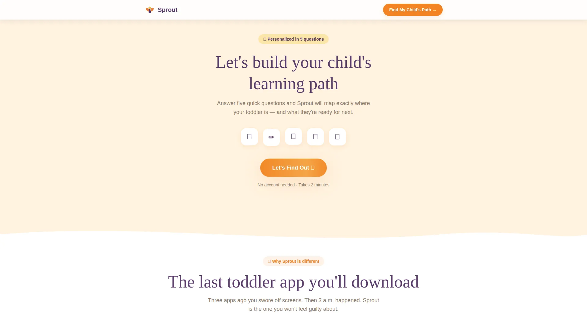
- A five-question interactive quiz with micro-animations including crayon strokes, bouncing fruits, and star sparkles
- A personalized results card showing a custom learning path, a developmental-stage badge, and a comparison message
- A two-path conversion section offering "Start Their Free Week" and a secondary "Send My Child's Learning Report" email capture
Feature list
This template includes several purpose-built components that work together to move a tired, skeptical parent from first glance to sign-up.
Five-Question Personalized Quiz
The quiz collects the child's age in months via a slider, languages spoken at home via tap-to-select tiles, current developmental milestones, parent worries through open-choice bubbles, and learning style observations. Each answer scrolls one question at a time, keeping the experience focused and unhurried.
Crayon-Stroke Micro-Animations
Every quiz answer triggers a small animation: a crayon stroke, a bouncing piece of fruit, or a tiny star sparkle. These are built with CSS animations preferred over JavaScript, keeping the interactions light and mobile-friendly. The effect makes the scroll feel like turning pages in a children's book.
Personalized Results Card
After the quiz, a results card appears with three recommended module themes tailored to the child's answers. It includes a developmental-stage badge and a gentle comparison message such as "Most 22-month-olds in bilingual homes start here," giving parents immediate context and confidence.
Dual Conversion Paths
The primary call to action reads "Start Their Free Week" in clementine orange with fig-purple type and leads to a two-field signup form. A secondary path offers a downloadable milestone summary report, capturing the email of parents who are not yet ready to commit but are still deeply interested.
Full-Bleed Hero with Fade-In Headline
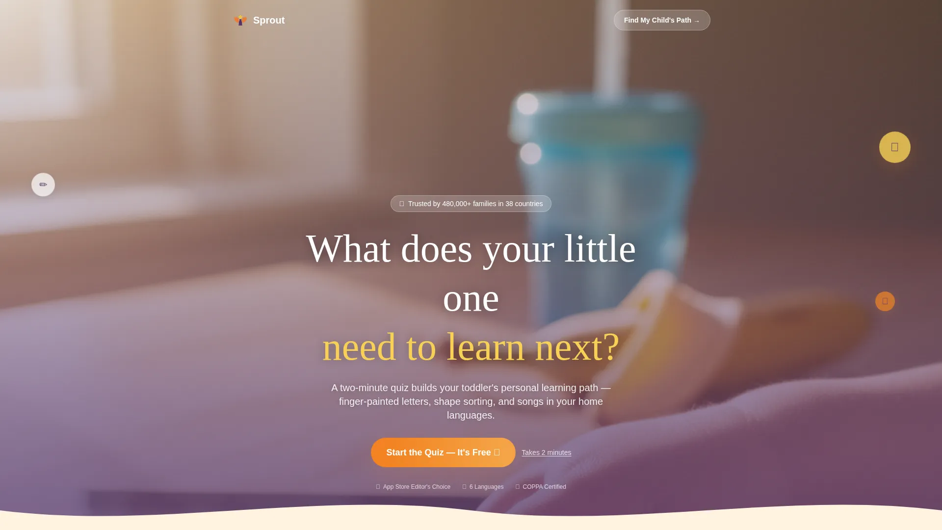
The header uses a real overhead photo of a toddler's hands on a tablet in morning light. A single rounded headline fades in over the image in hand-drawn type, creating an immediate emotional connection with the parent-eye-view composition.
Trust and Social Proof Section
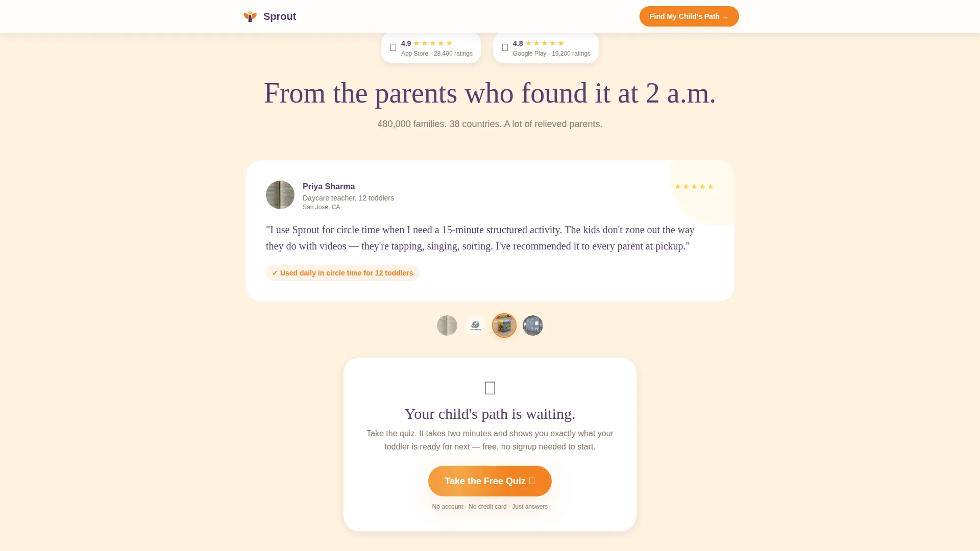
A dedicated section presents parent testimonials with child ages, app store ratings, and milestone badges. This section supports the quiz funnel by confirming that other real parents found the experience valuable before the visitor decides to sign up.
Page sections overview
| Section | Purpose |
|---|---|
| Hero Photo Header | Establishes emotional connection and invites quiz entry |
| Five-Question Quiz | Collects child data and demonstrates app intelligence |
| Personalized Results Card | Delivers tailored learning path and primary call to action |
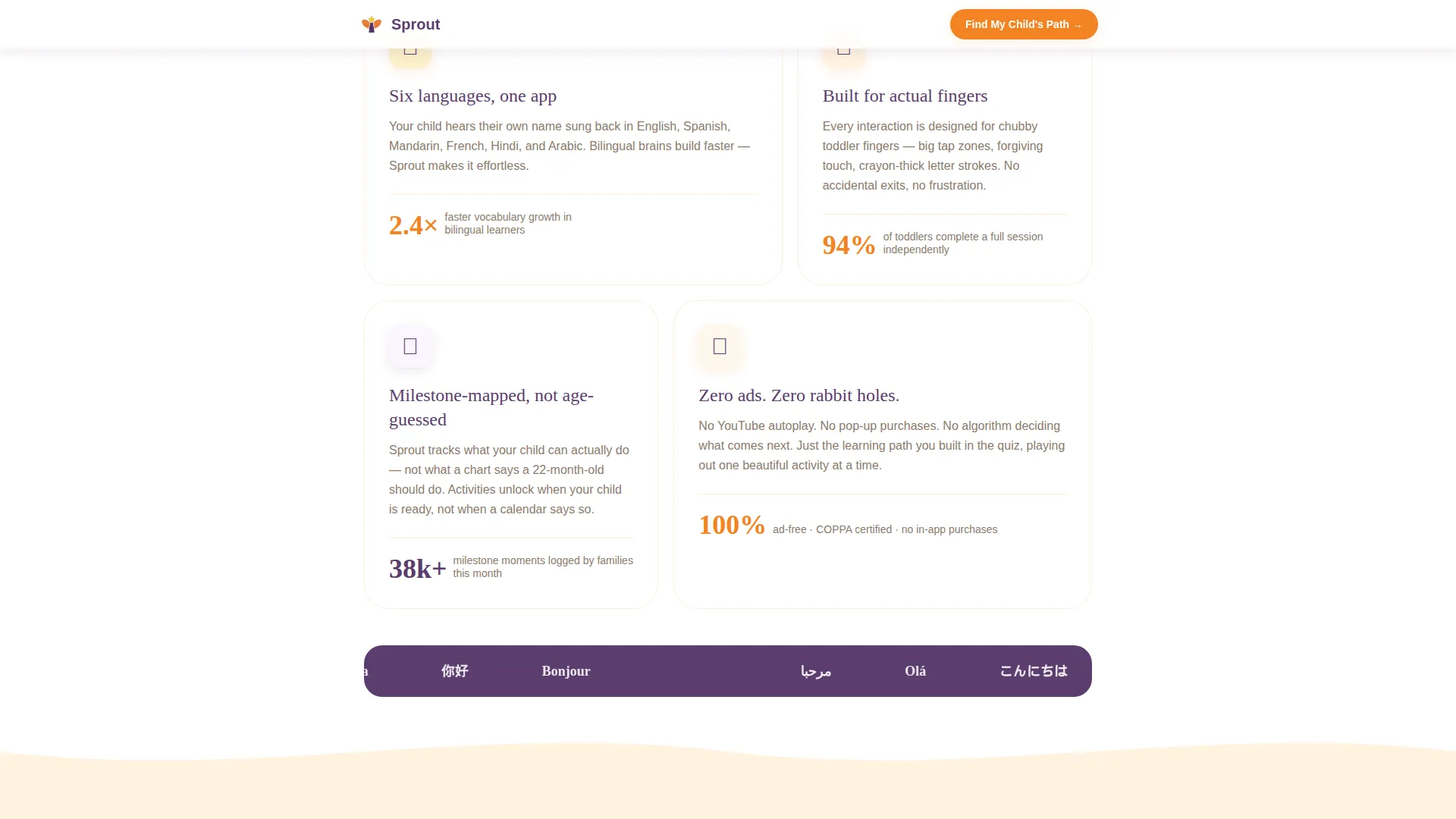
| Trust and Features | Explains how the app works and builds credibility |
| Social Proof Section | Reinforces trust with parent testimonials and ratings |
| Footer | Provides single-row navigation and secondary links |
Design & branding system
The visual identity follows a Warm Artisan theme that feels like a farmers-market fruit crate caught in golden-hour light. The palette is bright without feeling synthetic and sweet without losing structure.
- Colors: clementine orange (#F28322) and lemon-curd yellow (#F7D154) for buttons, progress bars, and illustration outlines; tangerine cream (#FFF3E0) and clean white alternating as section backgrounds; fig-purple (#5C3D6E) anchoring every headline and interactive element
- Typography: Fraunces serif for headlines to deliver a hand-drawn, board-book feel, paired with DM Sans for body text to keep everything readable and clean
- Textures: finger-painted and crayon-textured illustration outlines throughout, reinforcing the artisan theme without overwhelming the content
Mobile & speed optimization
This template is designed mobile-first, built for the parent reaching for their phone at 2 a.m. The quiz interactions, animations, and layout all prioritize the smaller screen before scaling up to tablet.
- CSS animations are preferred over JavaScript throughout the quiz section to keep interactions smooth on mobile devices
- The quiz uses a single-column scroll format so one question appears at a time, reducing cognitive load on small screens
- Tablet optimization is included for households where toddlers and parents share the same device for learning and browsing
How this template helps you convert
The quiz funnel strategy is the core conversion engine. By the time a parent reaches the results card, the template has already demonstrated that it understands their child better than any static feature list could.
- The quiz acts as the value demonstration itself: parents experience personalization before they commit, making the "Start Their Free Week" call to action feel like a natural next step rather than a cold ask
- The dual conversion path means parents who are not ready to sign up immediately still enter the funnel by requesting the milestone report, keeping warm leads reachable without pressure
Other information about this template
This template is a strong fit for consumer education technology products in the early childhood space. It is equally useful for mobile app launches, tablet-focused learning tools, and subscription-based toddler education services.
- The template style is Single Column Flow, keeping the visitor's attention on one thing at a time from hero to footer
- The creative direction is Quiz and Personalize, a proven funnel structure for products where personalization is the core promise
- The header concept is a Full-Bleed Photo, chosen to create an instant visual connection with the target audience through a parent-eye-view composition
- The color system is Citrus Burst, a warm and child-friendly palette that avoids the overused primary-color schemes common in children's products
- The landing page direction is a Quiz and Assessment funnel, meaning the page earns trust through interaction rather than through passive reading
Theme
Warm Artisan
Creative direction
Quiz & Personalize
Color system
Citrus Burst
Style
Single Column Flow
Direction
Quiz/Assessment
Page Sections
Five-question Personalized Quiz
Crayon-stroke Micro-animations
Personalized Results Card
Dual Conversion Path Design
Full-bleed Hero Section
Social Proof and Trust Section
Related questions
Can I use this template without a quiz feature already built?
Is this template suitable for a bilingual toddler education product?
What conversion paths does this landing page template include?
Who is the ideal audience for a landing page built with this template?
Can I adjust the colors and fonts to match my brand?