Tween (10-13) Products & Professional Website Template
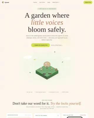
Sprout is a science-backed tween nutrition landing page template built for parents of 10 to 13-year-olds. It features a botanical visual identity, a looping Lottie hero animation, and a five-question inline quiz that personalizes calorie and nutrient recommendations in real time. The result is a warm, journal-like experience that earns parent trust before asking for anything.
by Rocket studio
Quick summary
Sprout is a single-page, quiz-driven nutrition landing page template designed for tween health and wellness brands. It guides parents of 10 to 13-year-olds through a personalized meal planning experience using an interactive five-question quiz. The zigzag layout, botanical color palette, and scroll-linked animations create a calm, trustworthy feel from the first second.
Who this template is for
This template is built for brands, practitioners, and creators working in the tween health and nutrition space. If your offer involves meal planning, supplement guidance, or family nutrition resources for children aged 10 to 13, Sprout fits your use case naturally.
- Parents of tweens searching for specific, science-backed nutrition answers at any hour
- Pediatricians and family health practitioners who want a shareable, parent-friendly resource
- Consumer health brands and subscription services targeting the tween wellness niche
What problem this template solves
Parents of tweens face a flood of generic nutrition advice that rarely accounts for their child's specific age, activity level, or mealtime challenges. Growth spurts, mood swings, and picky eating make standard guidance feel useless. Sprout turns that frustration into a focused, personalized conversation.
- Generic meal guides do not account for a child's activity level, dietary restrictions, or energy concerns
- Parents struggle to find credible, specific numbers like daily calorie or protein targets for their tween
- Most nutrition pages ask for a signup before delivering any real value, breaking trust immediately
What you get with this template
Sprout delivers a complete, ready-to-customize landing page with every section, animation, and interactive component already built into the structure. You get a warm editorial design, a functional quiz flow, and a results card experience that moves a visitor naturally toward your product or subscription page.
- A full-viewport Lottie hero animation paired with a headline and a pulsing quiz-entry button
- A five-question inline quiz with alternating illustrated and insight blocks that reveal dynamically as the visitor scrolls
- A personalized results card showing a nutrition profile and a sample weekly meal plan thumbnail, followed by dual calls to action
Feature list
This template is built around five core capabilities, each grounded in the brief.
Botanical Lottie Hero Animation
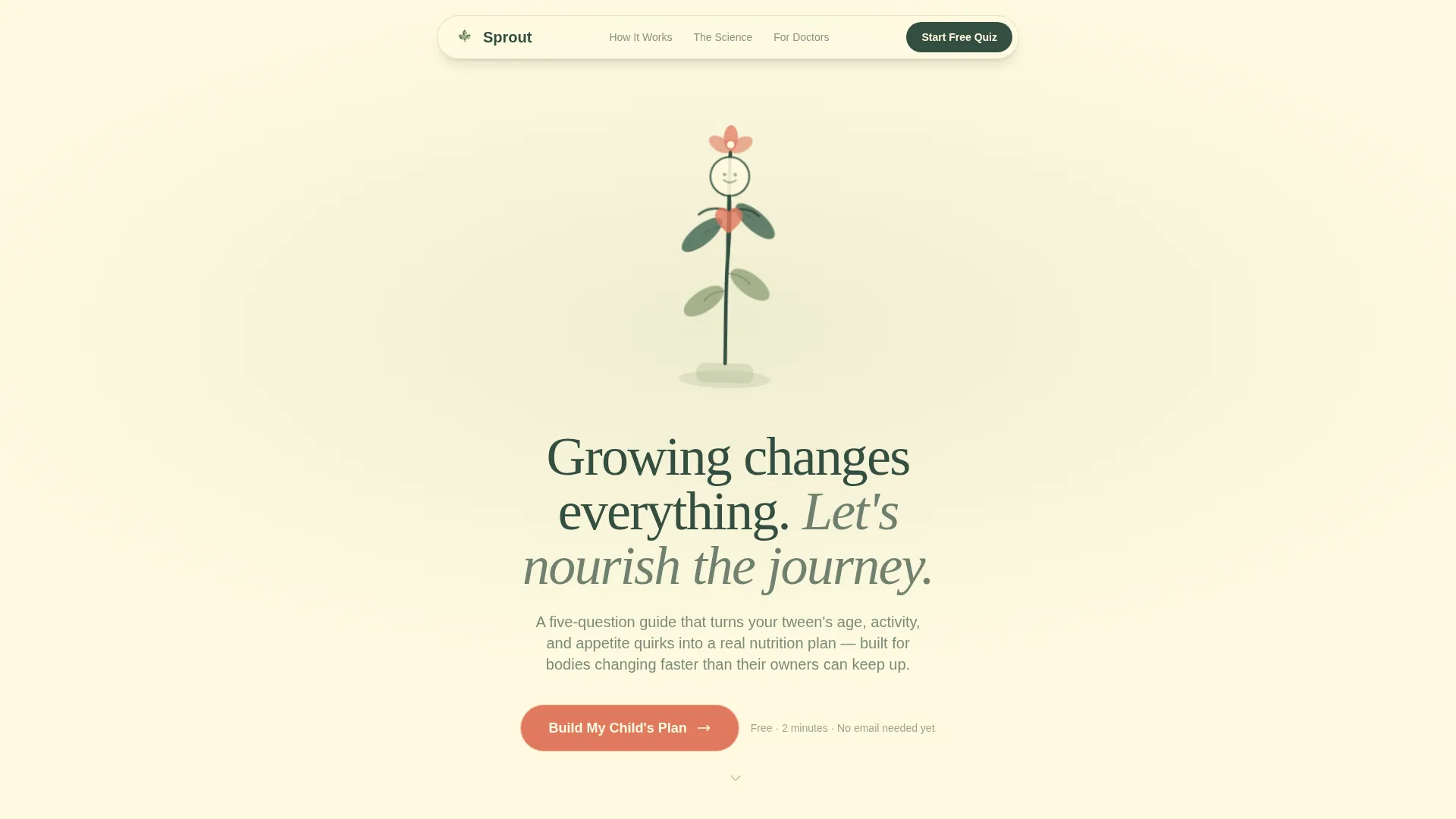
The header fills the full viewport with a looping Lottie animation. A stylized tween silhouette grows upward like a seedling, limbs stretching into leaves, with a small pulsing heart at the center. The motion is slow and organic. Nothing bounces or blinks. Soft sage, deep fern, and peach accents render the scene in a way that immediately sets a calm, trustworthy tone.
Five-Question Inline Quiz Flow
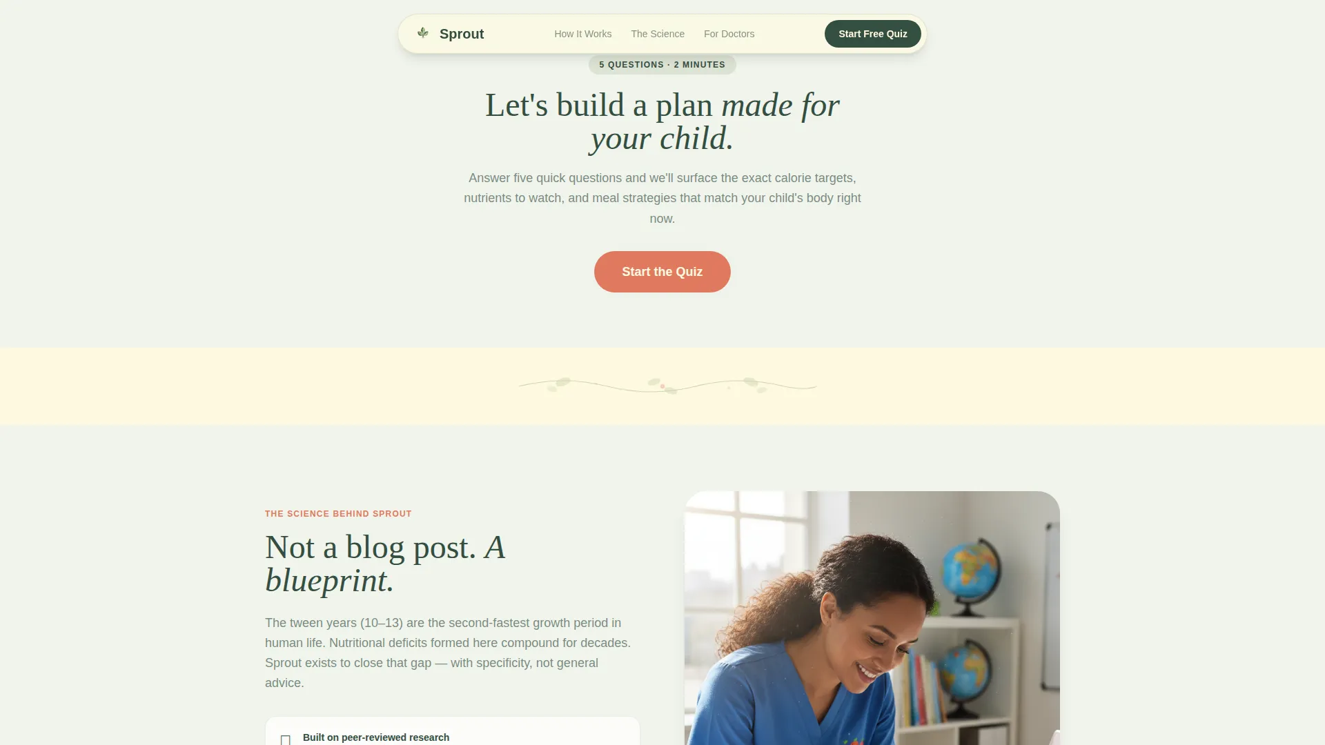
The quiz is embedded directly in the page rather than a separate modal or external link. Five questions cover age, activity level, biggest mealtime challenge, dietary restrictions, and energy or mood concerns. Each answer dynamically reveals the next alternating section, so the scroll feels like a guided conversation rather than a form.
Zigzag Alternating Section Layout
Left-side blocks display illustrated scenarios such as a tween at soccer practice or a child faced with vegetables they are not sure about. Right-side blocks surface personalized insights tied to the quiz answers. The alternating rhythm keeps reading natural and prevents visual fatigue across the full page.
Personalized Results Card
After the quiz resolves, a results card appears with the child's recommended nutrition profile and a sample weekly meal plan thumbnail. The card is the payoff moment. It gives real, specific output before asking for anything, making the primary call to action feel like a logical next step rather than a sales push.
Dual Call-to-Action Capture
The primary button reads "See Their Full Plan" and links through to the product or subscription page. A secondary link beneath it reads "Email This Summary" and captures the parent's email address without friction. Both actions live on the same results card, keeping the conversion flow tight and intentional.
Trust and Credibility Section
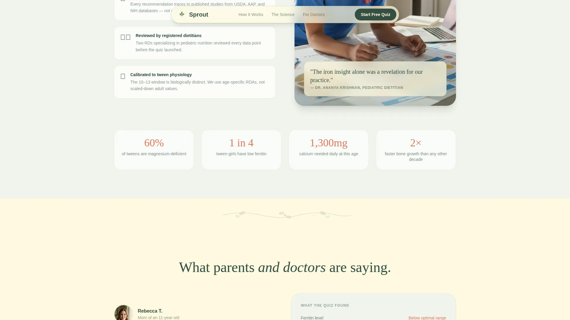
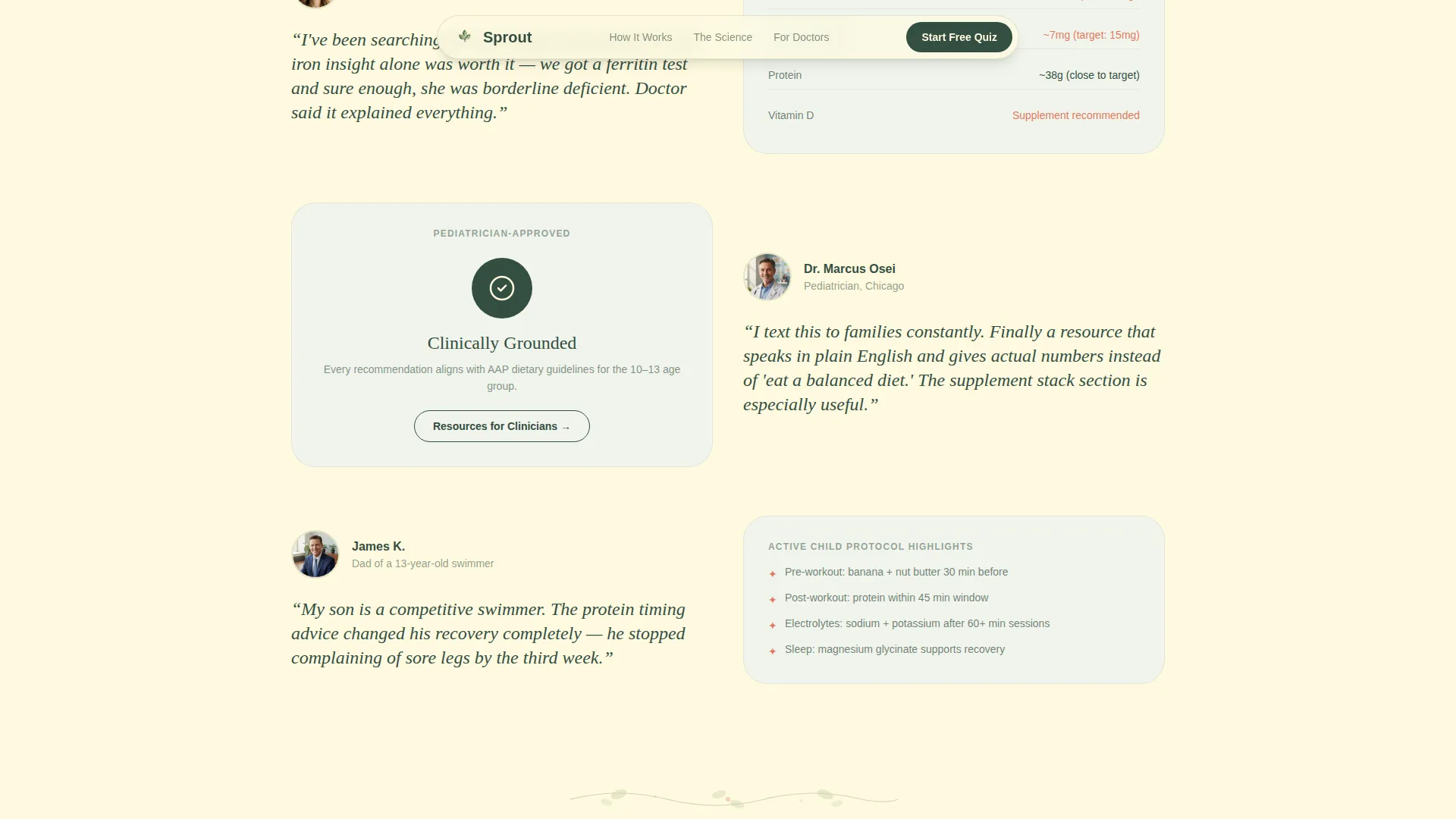
A dedicated trust section supports the quiz results with science citations and pediatrician endorsements. Parent testimonials include specific outcomes rather than vague praise. This section reinforces the value already delivered by the quiz, so visitors arrive at the call to action already confident in the guidance they have received.
Page sections overview
| Section | Purpose |
|---|---|
| Hero Animation Block | Introduce brand and launch quiz entry |
| Quiz Question One | Capture tween age |
| Quiz Question Two | Capture activity level |
| Quiz Question Three | Capture mealtime challenges |
| Quiz Questions Four and Five | Capture dietary restrictions and mood concerns |
| Personalized Results Card | Deliver nutrition profile and meal plan thumbnail |
| Trust and Credibility | Reinforce science backing and pediatrician endorsements |
| Final Call to Action | Drive click-through and email capture |
| Footer | Minimal horizontal navigation and brand close |
Design & branding system
The visual identity follows a Nurture and Care theme built on a botanical color system. Every color choice references the natural world, and every typographic decision supports an unhurried, editorial reading pace.
- Color palette: soft sage (#A3B18A), deep fern (#344E41), warm oat milk (#FEFAE0), and ripe peach (#E07A5F) reserved for buttons, badges, and interactive highlights
- Typography: Fraunces serif for headlines to create warmth and authority, DM Sans for body text to keep reading effortless
- Section dividers use hand-drawn botanical line art that breathes rather than decorates, with backgrounds alternating between oat milk and a pale sage wash
Mobile & speed optimization
Sprout is built mobile-first because the primary user is a parent searching for nutrition answers late at night on a phone. Every layout decision starts with the smallest screen and scales up.
- Quiz flow and scroll-linked reveals are designed to work smoothly on touch screens with single-thumb navigation in mind
- Static sections use server-side rendering while quiz state is managed through client components, keeping the interactive experience responsive without slowing the initial page load
- The results card and dual call-to-action buttons are sized and spaced for comfortable mobile tapping, not just desktop clicking
How this template helps you convert
Sprout earns the conversion before the call to action appears. By delivering real, specific nutritional numbers for a parent's individual child, it builds the kind of trust that makes clicking through feel natural.
- The quiz collects five data points and immediately returns a personalized nutrition profile, giving the visitor something genuinely useful before any ask is made
- The results card pairs the nutrition profile with a sample weekly meal plan thumbnail, making the full product feel concrete and worth exploring
- The "Email This Summary" secondary link captures parent email addresses as a low-friction alternative for visitors not yet ready to click through, creating a retargeting opportunity without a disruptive popup
Other information about this template
Sprout is built for a specific niche where trust and specificity matter more than visual flash. A few additional details worth knowing before you customize and launch.
- The template is designed for English-language, United States context with pricing and dietary references aligned to US standards
- Footer layout follows a minimal horizontal pattern suited to single-page flows where a heavy footer would interrupt the editorial rhythm
- Social proof components include slots for pediatrician quotes, parent testimonials with specific outcomes, and science citation callouts
- The page type is a single-page landing page, not a multi-page website, so all sections live in one scrollable flow
- The template style is zigzag and alternating throughout, meaning illustrated and insight blocks are never stacked on the same side twice in a row
Theme
Nurture & Care
Creative direction
Quiz & Personalize
Color system
Botanical
Style
Zigzag/Alternating
Direction
Click-Through
Page Sections
Botanical Lottie Hero Animation
Five-question Inline Quiz
Zigzag Alternating Layout
Personalized Results Card
Dual Call-to-action System
Trust and Credibility Section
Related questions
What kind of brand is Sprout designed for?
Does the quiz actually personalize the content shown on the page?
Can a pediatrician or family health practitioner use this template?
What does the visitor see after finishing the quiz?
Is this a single-page template or a multi-page website?