Pediatric Dentist Booking Website Template
Sprout is a pediatric dentist landing page built around layered social proof. It turns parent anxiety into booked appointments through a live review counter, a fear-versus-reality comparison table, a video testimonial mosaic, category star ratings, and a warm booking form with a "nervous child" checkbox that shows families this practice already understands them.
by Rocket studio
Quick summary
Sprout is a single-page lead generation template for pediatric dental practices. It organizes parent reviews into emotional, rational, and social proof layers so every parental worry finds a direct answer. The design is warm, rounded, and nature-inspired, nothing clinical. The page ends with a low-friction booking form that meets anxious families exactly where they are.
Who this template is for
This template is built for pediatric dental practices that rely on parent trust and word-of-mouth to fill their appointment books. It works especially well for neighborhood clinics that already have strong patient satisfaction but struggle to show that proof online in a way that converts.
- Pediatric dentists launching or refreshing their practice website presence
- Practice managers running targeted local campaigns for first-visit bookings
- Dental marketing teams who need a ready-made, conversion-focused social proof page
What problem this template solves
Parents searching for a kids dentist late at night are not looking for a list of services. They are looking for reassurance. A generic clinic page with a phone number and office hours does nothing to calm a parent picturing their child in tears. Sprout solves that trust gap directly.
- Raw review counts don't address specific fears like needles, wait times, or billing surprises
- Most dental pages bury testimonials in a single slider instead of organizing them by concern
- First-time parents need both emotional and factual proof before they will pick up the phone
What you get with this template
Sprout delivers a fully structured, single-page layout with every section planned and purposeful. From the animated hero counter to the floating booking button, every element is designed to reduce hesitation and prompt a decision.
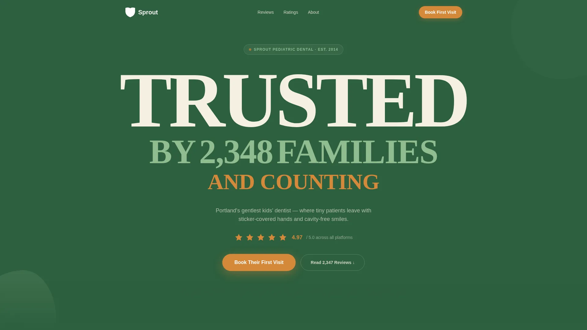
- A hero section with a live-ticking review counter and bold stacked typography on deep woodland green
- A fear-versus-reality comparison table, a video testimonial mosaic, a category ratings breakdown, and an Instagram-style photo wall
- A warm lead generation form with a child's first name, age, parent phone number, and a "My child is nervous" checkbox
Feature list
This section describes the key built-in components that make Sprout work as a conversion tool for a pediatric dental practice.
Live Animated Review Counter
The hero section displays a number that ticks up by one every few seconds, making the social proof feel active rather than static. Parents land on the page and immediately see momentum, a practice that real families keep choosing.
Fear versus. Reality Comparison Table
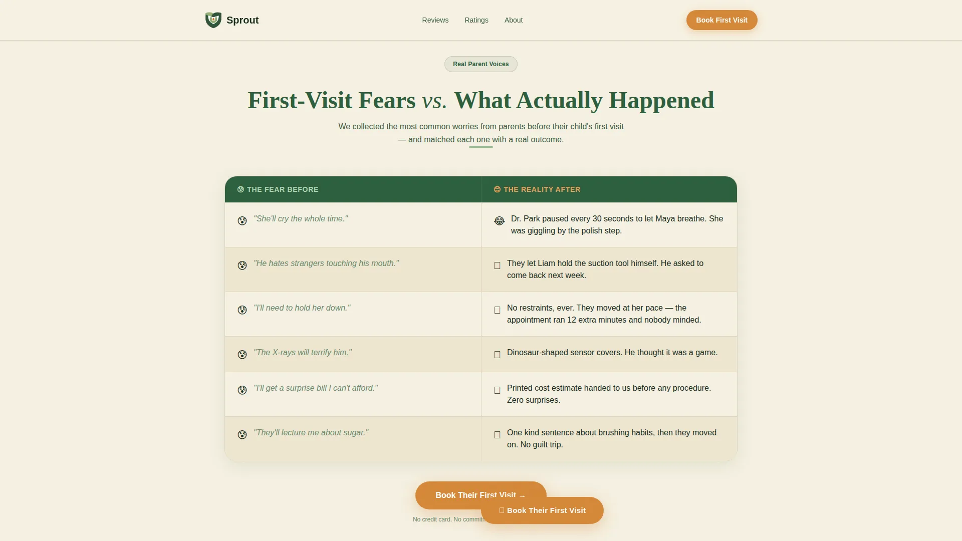
A structured side-by-side table pairs common first-visit fears with actual patient experiences. This format is the emotional core of the page. It acknowledges parental anxiety directly and answers each worry with a matching real-world outcome.
Video Testimonial Mosaic Grid
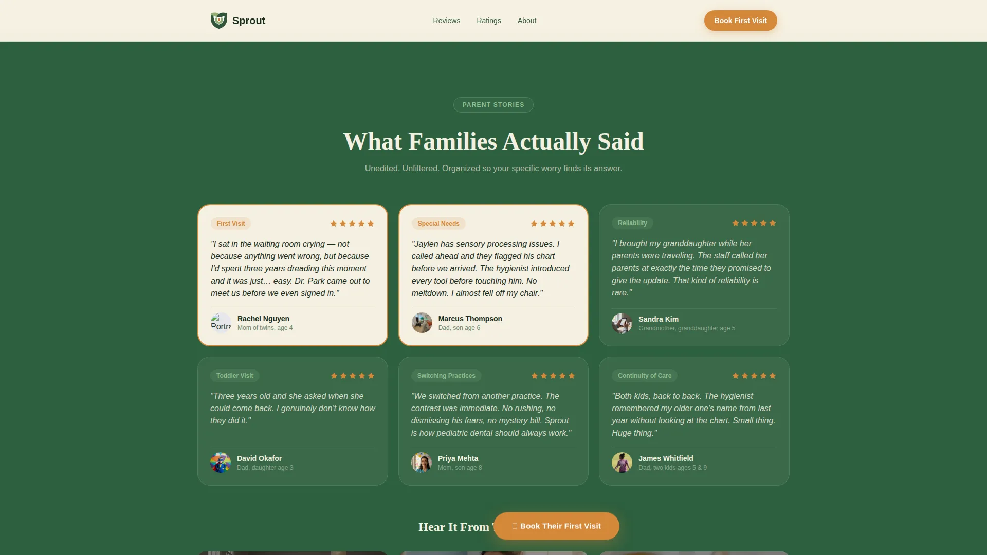
Real parent video thumbnails are arranged in a staggered mosaic grid. Each clip covers a specific experience: the waiting room, the dentist's chair-side manner, and the follow-up call. The visual variety keeps scroll momentum going.
Category Star Ratings Breakdown
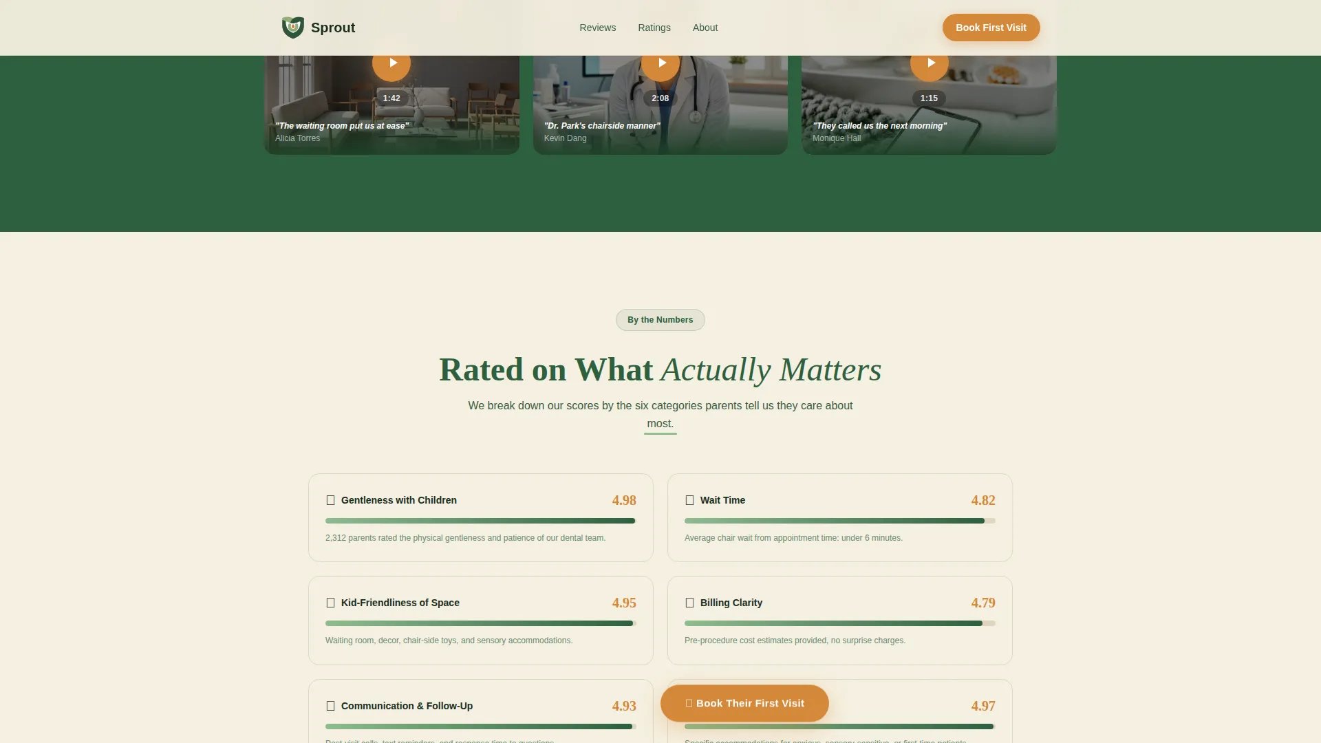
Ratings are broken into four specific categories: gentleness, wait time, kid-friendliness, and billing clarity. Interactive rating bars let visitors scan the data quickly. This moves the proof from emotional to rational without feeling cold.
Floating "Book Their First Visit" Button
An acorn orange call-to-action button appears after the first testimonial cluster and then floats at the bottom of every subsequent section. It stays visible without interrupting reading flow, so the decision to book is always one tap away.
Nervous Child Checkbox Form
The booking form includes a single optional checkbox: "My child is nervous, please call us first." This one field does more conversion work than a paragraph of reassurance copy because it shows the practice already anticipates the concern.
Page sections overview
| Section | Purpose |
|---|---|
| Hero Stacked Tower | Establishes trust instantly with bold live-counter typography on deep woodland green |
| Fear versus. Reality | Side-by-side comparison table converting first-visit anxiety into specific reassurance |
| Testimonial Mosaic | Video thumbnail grid organizing parent stories by waiting room, chair manner, and follow-up |
| Ratings Breakdown | Category star ratings for gentleness, wait time, kid-friendliness, and billing clarity |
| Social Photo Wall | Instagram-style grid of post-visit selfies building social and visual proof |
| Lead Gen Form | Booking form with nervous-child checkbox and SMS PDF opt-in for mobile visitors |
| Footer | Linear single-row footer with practice contact and navigation essentials |
Design & branding system
Sprout uses an Organic Flow visual style built around the Forest Trust color system. Every design choice reinforces warmth, safety, and growth, the emotional language parents need before they trust a stranger with their child's care.
- Colors: deep woodland green (#2D5F3E) anchors headers and trust badges; soft fern (#8FBC8F) supports accents; birch cream (#F5F0E1) fills all backgrounds; acorn orange (#D4883A) is reserved strictly for buttons, star ratings, and interactive highlights
- Typography: Fraunces serif display for headings gives the page a warm, editorial feel; DM Sans body text keeps reading effortless at every size
- All shapes are rounded and soft; no hard edges, no clinical grid layouts; the visual rhythm feels like a Saturday morning nature walk
Mobile & speed optimization
This template is built with mobile-first parents in mind. The audience searches on their phones late at night, so the layout prioritizes thumb-friendly spacing, fast-loading CSS animations, and a form that is easy to complete on a small screen.
- CSS-powered animations handle the live counter, scroll reveals, floating call-to-action, and staggered card entries without heavy script overhead
- The booking form is short by design: four fields and one checkbox keep friction minimal on mobile
- All interactive elements including rating bars and hover states are sized and spaced for touch use
How this template helps you convert
Sprout is structured as a conversion funnel disguised as a social proof page. Each scroll section moves the visitor one step closer to booking by addressing a different type of parental doubt.
- The hero live counter creates immediate social momentum, so the visitor's first question, "do other parents trust this place?", is answered before they read a single word of body copy.
- The fear-versus-reality table and video mosaic work together to replace emotional doubt with specific, recognizable stories, moving the visitor from anxious browser to confident decision-maker.
- The floating "Book Their First Visit" button and the secondary SMS PDF path give visitors two low-pressure ways to act, meeting both ready-to-book parents and those who need one more nudge before committing.
Other information about this template
Sprout is part of a growing library of niche-specific healthcare landing page templates designed for local service providers who need trust-first design. A few additional details worth knowing before you start building:
- The secondary conversion path lets mobile visitors text a number to receive a "What to Expect at Your Child's First Visit" PDF, capturing leads who are not yet ready to book
- The footer follows a Pattern 1 Linear Single-Row layout, keeping the bottom of the page clean and uncluttered
- The template is localized for English-speaking United States audiences, with USD formatting and standard US date display
- Animation intensity is set to high by default, with a live counter, scroll-triggered reveals, floating call-to-action behavior, and staggered card entrance effects all included in the build
Theme
Organic Flow
Creative direction
Testimonial Mosaic
Color system
Forest Trust
Style
Comparison Table
Direction
Lead Generation
Page Sections
Live Animated Review Counter
Fear Versus. Reality Comparison Table
Video Testimonial Mosaic Grid
Category Star Ratings Breakdown
Floating Book First Visit Button
Nervous Child Checkbox Form
Related questions
Can I change the review count displayed in the hero section?
Does the nervous child checkbox send a different notification to the practice?
Is this template suitable for a practice just starting to collect reviews?
Can I use this page as a standalone campaign page rather than a full website?
Can the Instagram-style photo wall be filled with my own images?



