Squeegee - Reliable Windowcleaning Landing Page Template
Squeegee is a single-column landing page template built for Boston window cleaning professionals who serve property managers, condo boards, and commercial office clients. It uses a Case Study Narrative structure to build trust through real job stories, a Plum Executive color palette for quiet authority, and a click-through layout that pushes visitors toward a dedicated scheduling page.
by Rocket studio
Quick summary
Squeegee is a click-through landing page template designed for a Boston window cleaning service. It uses a single-column scrolling flow, a Case Study Narrative creative direction, and the Plum Executive color system. The page earns trust through accumulated job stories rather than a form, then drives visitors to a dedicated scheduling intake page.
Who this template is for
This template is built for window cleaning crews that work commercial and residential buildings in urban markets. It speaks directly to the decision-makers those crews need to reach, and it presents professionalism without overcomplicating the layout.
- Property managers overseeing multi-unit residential buildings in neighborhoods like Comm Ave or the Seaport
- Condo board members preparing for seasonal walkthroughs or building inspections
- Office managers in commercial districts who need a reliable, recurring window cleaning vendor
What problem this template solves
Most window cleaning businesses rely on generic service pages that list prices and phone numbers. That approach fails with property managers and facility buyers, who need proof of capability before they commit. This template replaces the generic pitch with a story-driven page that compounds credibility with every scroll.
- Visitors arrive skeptical and leave convinced, because every section adds a completed job to the record
- The page removes the friction of an on-page form, replacing it with a clean click that leads to a dedicated intake page
- Client quotes focused on reliability and timing answer the real objections that property managers carry into any vendor decision
What you get with this template
The template delivers a fully structured single-column landing page ready for a Boston window cleaning brand. Every section has a defined purpose, and the visual hierarchy guides the visitor from curiosity to a confident click.
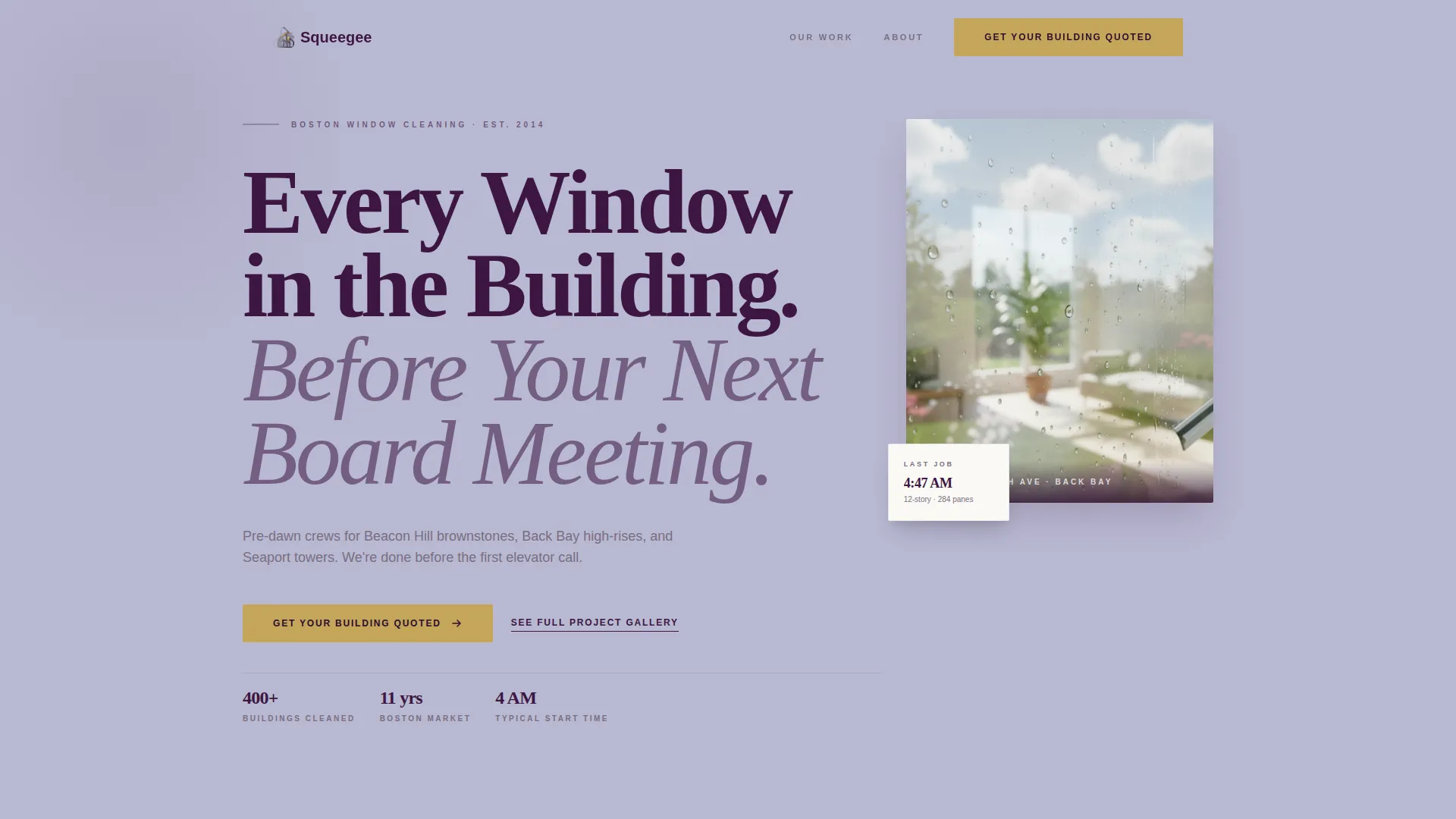
- A Giant Headline Left header with enormous display type and a single supporting photo, no full-bleed hero image
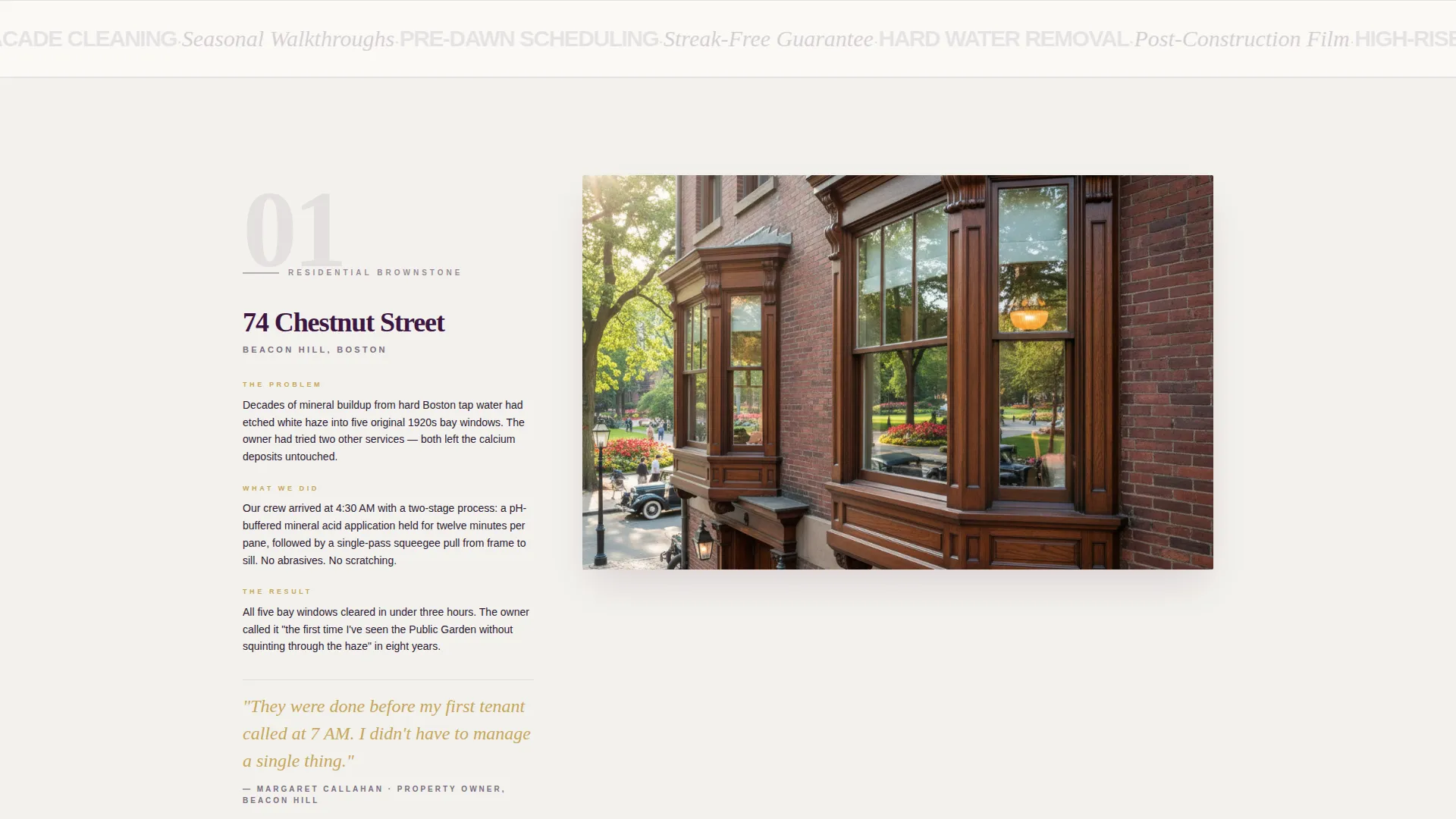
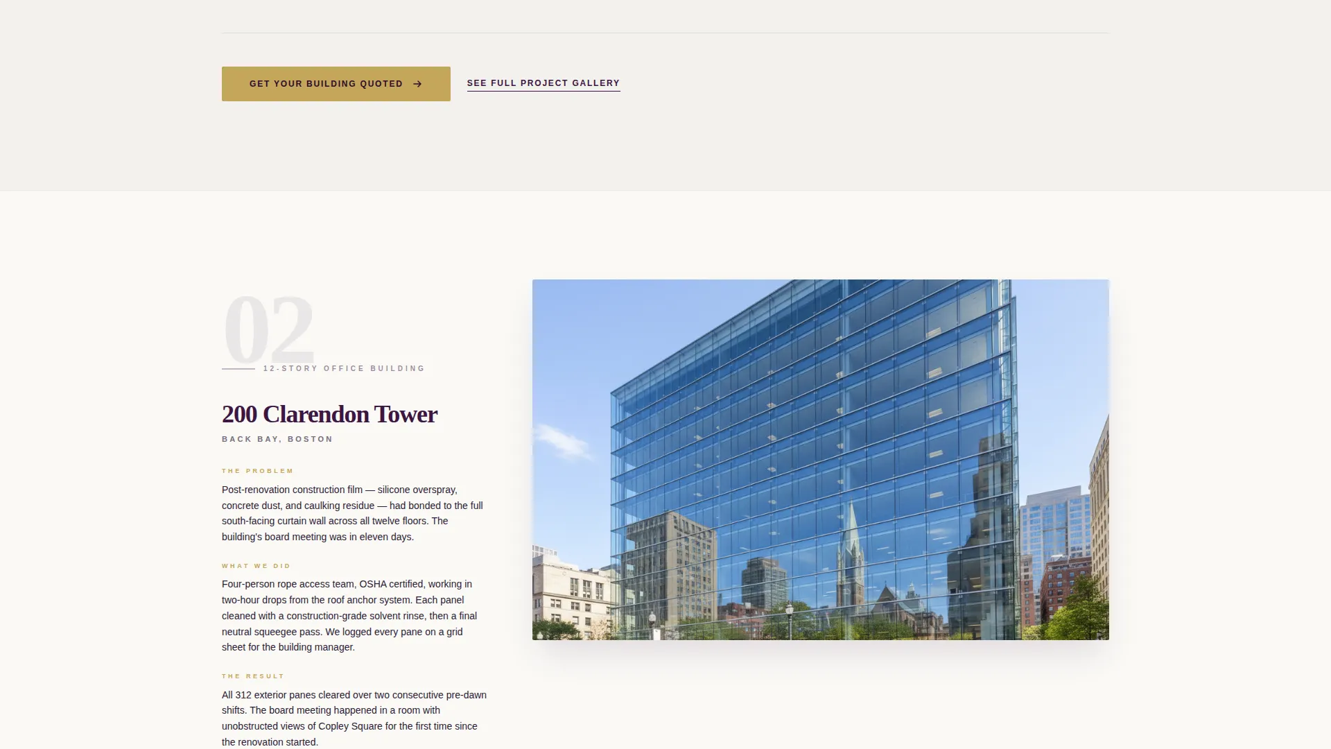
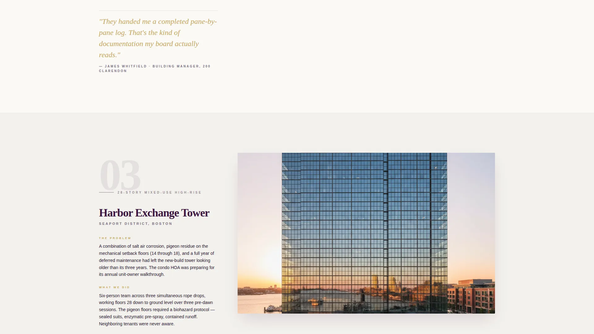
- A sequence of case study scroll sections, each telling a real job story with a wide finished-glass photograph and a client quote in brass-gold italics
- A repeating brass-gold call-to-action button labeled "Get Your Building Quoted" placed after the header and after every second case study, plus a secondary text link to a full project gallery
Feature list
This section covers the core capabilities built into the Squeegee template as described in the source brief.
Giant Headline Left Header
The header uses enormous display type set flush against the left margin in deep aubergine over a silver-lavender field. A single small photo of a gloved hand pulling a squeegee down a floor-to-ceiling pane sits in the right third. Typography carries the authority; no hero image takeover competes with it.
Escalating Case Study Sections
Each scroll section tells a real job as a micro-story: building name, the specific problem, what the crew did, and a wide photograph of the finished glass. Jobs escalate in scale from a single brownstone to a twelve-story commercial facade, building proof that compounds with every scroll.
Brass-Gold Quote Breaks
Between case studies, short client quotes appear in brass-gold italics. These quotes address reliability and timing, not personality, which directly matches the concerns of property managers and facilities buyers.
Repeating Click-Through Call to Action
The primary call-to-action button, "Get Your Building Quoted," appears first beneath the header and repeats after every second case study. There is no form on the page. The button click leads to a dedicated scheduling intake page, keeping the landing page lean and focused.
Secondary Gallery Text Link
A secondary text link labeled "See Full Project Gallery" sits alongside the primary call to action. It catches visitors who need more visual proof before committing, without pulling them away from the conversion path prematurely.
Plum Executive Color System
The palette applies deep aubergine for headers and section dividers, muted silver-lavender as the background wash, crisp linen white for card surfaces, and brass gold exclusively for buttons and interactive cues. Every color choice is purposeful and restrained.
Page sections overview
| Section | Purpose |
|---|---|
| Giant Headline Header | Establish authority with display type and a single supporting photo |
| First Case Study | Introduce proof with a residential brownstone job story |
| Quote Break One | Reinforce reliability with a client quote in brass-gold italics |
| Primary call to action Block | Drive the first "Get Your Building Quoted" click |
| Second Case Study | Escalate complexity with a mid-scale building job |
| Quote Break Two | Add a second voice focused on timing and trust |
| Second call to action Block | Repeat the primary call to action after the second case |
| Third Case Study | Close proof sequence with a twelve-story commercial facade job |
| Final call to action Block | Present the primary button and secondary gallery text link |
Design & branding system
The Plum Executive palette was chosen to feel like the lobby of a well-managed Back Bay building: composed, considered, and quietly serious. No element competes for attention; every color serves a specific role in the hierarchy.
- Deep aubergine (#3C1642) anchors all headers and section dividers, giving the page a grounded, authoritative structure
- Muted silver-lavender (#B8B8D1) covers the primary background wash, and crisp linen white (#FAF9F6) fills card surfaces and breathing space between sections
- Brass gold (#C5A55A) appears exclusively on buttons and interactive cues, making every actionable element unmistakable at a glance
Mobile & speed optimization
The single-column flow structure adapts naturally to smaller screens without requiring major layout shifts. Each scroll section is self-contained, so the reading experience stays coherent on any device.
- The single-column template structure eliminates complex grid reflow on mobile viewports
- Wide case study photographs are contained within their sections and scale proportionally as screen width narrows
- The repeating call-to-action placement means the button is never more than one or two scroll steps away on any screen size
How this template helps you convert
The page is built around a click-through conversion model. Every design and content decision removes doubt and points toward one action: clicking through to the scheduling intake page.
- The Case Study Narrative structure builds trust incrementally. By the third job story, the visitor is not questioning capability; they are thinking about timing and next steps.
- The repeating "Get Your Building Quoted" button in brass gold keeps the conversion path visible throughout the scroll, so the visitor never has to hunt for the next step.
Other information about this template
This template sits within the Professional Services category, targeting the Boston Local Services subcategory with a specific focus on the Boston window cleaning niche. It is built on a Service Utility theme, which prioritizes clear function and quiet confidence over decorative flair.
- The template style is Single Column Flow, making it straightforward to customize section by section without restructuring the entire layout
- The Case Study Narrative creative direction makes this template especially useful for service businesses where proof of past work matters more than a list of features
- The Click-Through landing page direction means no contact form is included by design; the page is intentionally lean and pairs with a separate intake or scheduling page
- The header concept, Giant Headline Left, positions display typography as the dominant trust signal rather than photography, which suits businesses where the crew's track record speaks louder than imagery
Theme
Service Utility
Creative direction
Case Study Narrative
Color system
Plum Executive
Style
Single Column Flow
Direction
Click-Through
Page Sections
Giant Headline Left Header
Escalating Case Study Sections
Brass-gold Client Quote Breaks
Repeating Click-through Call to Action
Secondary Gallery Text Link
Plum Executive Color System
Related questions
Is there a contact form built into this landing page?
How many case study sections does the template include?
Who is the primary audience this page is designed to reach?
Can I adapt the headline and copy to fit a different city or market?
What does the secondary 'See Full Project Gallery' link do?



