Vibrant Franchise Landing Page Template
Squeeze is a vibrant franchise landing page template built for juice and smoothie franchise opportunities. It pairs a Neo-Retro visual identity with a masonry scroll experience, a hero Bundle Deal card, and seasonal lifestyle sections. The page is designed to move prospective franchise owners toward a single click-through action: exploring the Franchise Starter Bundle.
by Rocket studio
Quick summary
Squeeze is a single-page franchise landing page template designed for juice and smoothie brands. It opens with a vintage-styled hero card promoting a Franchise Starter Bundle, then guides visitors through seasonal masonry sections packed with lifestyle photography and owner testimonials. Every design choice drives toward one goal: getting the right prospect to click through to the franchise application.
Who this template is for
This template speaks directly to people ready to invest in a feel-good food and beverage franchise. It works equally well for first-time owners and experienced franchisees who want a polished, high-energy first impression online.
- Fitness instructors and wellness professionals exploring franchise ownership for the first time
- Young couples or partners combining savings to open a brick-and-mortar juice or smoothie location
- Serial franchisees adding a vibrant, health-focused brand to an existing fast-casual portfolio
What problem this template solves
Most franchise landing pages look like corporate PDFs. They lead with legal copy, bury the product appeal, and fail to make a visitor feel anything. A juice and smoothie franchise opportunity deserves a page that creates desire before it asks for a decision.
- Prospects leave before they picture themselves behind the counter because the page never shows them the product experience
- The franchise application feels like a cold call instead of a natural next step
- Research-mode visitors have no low-commitment path to stay engaged, so they bounce without leaving contact details
What you get with this template
You get a complete, ready-to-customize franchise landing page that balances visual energy with clear conversion intent. The layout does the storytelling while the calls to action do the work.
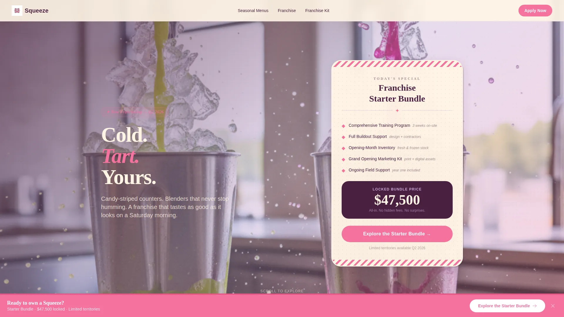
- A hero section built around a Franchise Starter Bundle card with a looping background video, vintage diner menu board styling, and a primary call-to-action button
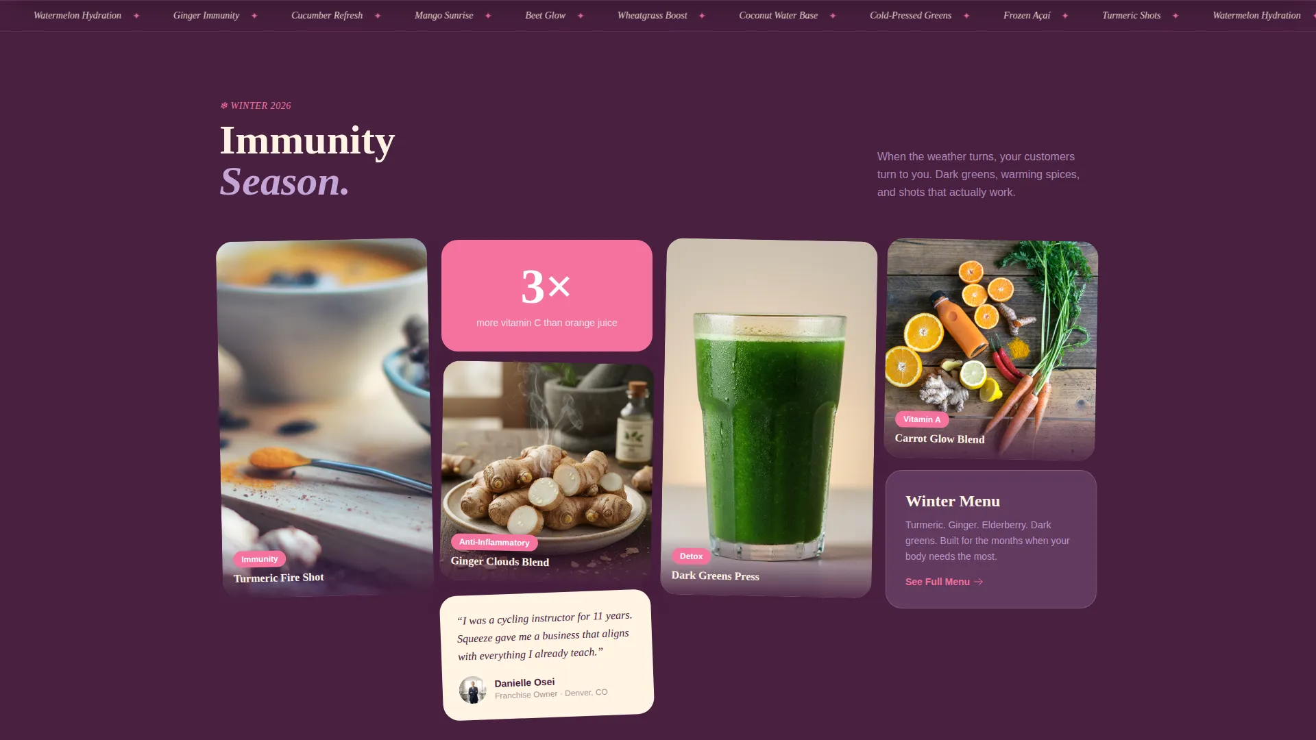
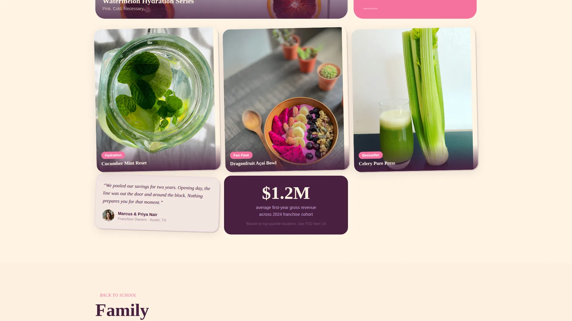
- Four seasonal masonry content clusters tied to winter immunity, summer hydration, back-to-school, and additional product moments, each mixing lifestyle photography, ingredient close-ups, and pinned franchise-owner testimonials
- A sticky guava-pink call-to-action bar that reappears after the second scroll section, plus an inline two-field email capture form embedded inside the winter immunity section
Feature list
This template is built around a set of carefully considered components. Each one earns its place by serving either the visitor experience or the conversion goal.
Vintage Hero Bundle Card
The hero section opens with a menu-board-styled card using rounded corners, halftone dot textures, and hand-lettered pricing. It presents the Franchise Starter Bundle, which covers training, buildout support, and opening-month inventory at a single locked price. A looping half-speed background video of juice taps, blenders, and sliding cups plays behind the card.
Masonry Seasonal Grid Layout
The scroll experience is structured as a Pinterest-style masonry cascade. Sections shift between tight four-column grids and single breathing image moments. Each cluster is tied to a specific season and feeling, keeping the scroll rhythm dynamic and the visitor engaged across the full page.
Sticky Call-to-Action Bar
After the visitor passes the second scroll section, a persistent guava-pink bar appears at the bottom of the viewport. It carries the primary call to action and stays visible as the visitor continues scrolling, keeping the franchise application path always one tap away.
Inline Franchise Kit Capture Form
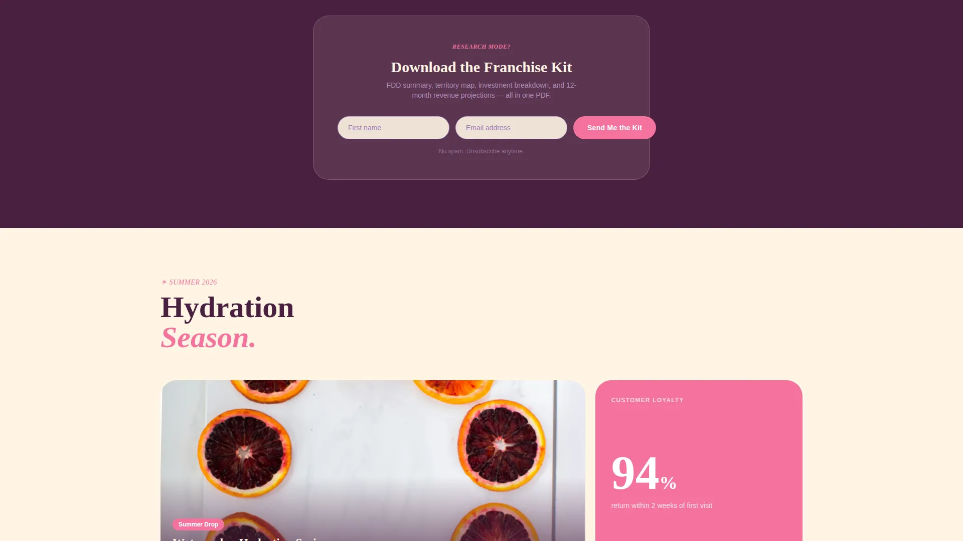
The winter immunity section contains a two-field inline form collecting an email address and first name. This gives research-mode visitors a low-commitment way to engage before they are ready to apply, capturing leads without interrupting the scroll experience.
Seasonal Lifestyle Sections
Each masonry cluster uses a dedicated seasonal color mood. The winter immunity grid uses moody plum tones with turmeric and ginger imagery. The summer hydration section bursts with watermelon pinks and cucumber whites. The back-to-school cluster features kid-sized cups and lunchbox pairings. Together they build product desire across multiple use cases.
Click-Through Conversion Architecture
The page is built as a click-through landing page, not a destination. The primary call-to-action button inside the hero card links directly to the franchise disclosure page with the Starter Bundle pre-selected. The sticky bar reinforces this path. Both calls to action resolve to the same external franchise application platform.
Page sections overview
| Section | Purpose |
|---|---|
| Hero Bundle Card | Introduces the Franchise Starter Bundle with pricing, looping video, and primary call to action |
| Winter Immunity Grid | Showcases turmeric and ginger products in moody plum tones with inline email capture form |
| Summer Hydration Cluster | Displays watermelon and cucumber products in bright seasonal photography |
| Back-to-School Section | Features kid-sized cups and lunchbox pairings for family-oriented product appeal |
| Sticky call to action Bar | Persists after second scroll section to maintain application click-through visibility |
Design & branding system
The visual identity follows a Neo-Retro direction that feels like a 1960s soda fountain reimagined through a modern, digitally saturated lens. Every color has a specific role and the palette holds together across all scroll sections.
- Soft digital lilac (#C3A6D8) across section backgrounds, creamy vanilla malt (#FFF5E4) as the primary canvas, deep plum (#4A2040) for headlines and navigation, and punchy guava pink (#F4729E) on buttons, badges, and price callouts
- Halftone dot textures, rounded card corners, and hand-lettered type details give the hero section its vintage diner personality
- Plum anchors typography with authority while guava pink makes every clickable element feel immediately visible and inviting
Mobile & speed optimization
The masonry layout is designed to shift naturally across screen sizes. Seasonal grid density adjusts so the scroll experience remains engaging on smaller viewports without losing visual hierarchy.
- Four-column masonry grids can collapse to single-column or two-column arrangements on mobile screens
- The sticky call-to-action bar is sized and positioned for thumb-friendly tapping on touch devices
- The looping hero video is set to half speed, keeping visual interest without competing with page load priority
How this template helps you convert
This template earns the click rather than demanding it. By the time a visitor reaches the sticky bar, they have already experienced four seasons of product beauty and read real owner testimonials.
- The hero bundle card establishes value immediately, pairing a locked price with a looping video that makes the product feel real and desirable before a single word is read
- The inline email capture form inside the winter immunity section creates a secondary conversion path for visitors still in research mode, so no interested prospect leaves empty-handed
- The sticky call-to-action bar keeps the franchise application one tap away at all times after the second section, removing any friction between interest and action
Other information about this template
This template is built for the franchise food and beverage space and carries enough visual personality to stand apart from generic retail templates. A few additional details worth noting:
- The page is classified as a click-through landing page, meaning its primary role is to hand off the visitor to a separate franchise application platform rather than complete the conversion itself
- The Retail and E-Commerce category and Franchise Business subcategory positioning means this template suits any juice bar, smoothie chain, or wellness beverage concept seeking franchise growth
- The masonry layout approach draws inspiration from social content browsing habits, making the page feel more like an editorial lookbook than a traditional sales page
- Template customization can extend the seasonal clusters to reflect additional product lines or regional menu variations without disrupting the core scroll structure
Theme
Neo-Retro
Creative direction
Comparison Journey
Color system
Ink & Paper
Style
Overlap/Layered
Direction
Click-Through
Page Sections
Vintage Hero Bundle Card
Masonry Seasonal Grid Layout
Sticky Click-through Call to Action Bar
Inline Franchise Kit Form
Seasonal Lifestyle Sections
Related questions
What type of business is this landing page template built for?
Can I customize the seasonal sections for my own product menu?
How does the inline email capture form work?
Does the primary call-to-action button link to an external platform?
Is this template suitable for first-time franchise owners?



