Equestrian Community Platform Landing Page Template
Canter is a single-column horse community landing page template built for riders, barn owners, and horse enthusiasts ready to leave cluttered Facebook groups behind. It pairs a warm Soft Mist color palette with playful geometric design, a scroll-driven origin story, a marketplace preview, and a low-friction signup form to welcome every member of the herd.
by Rocket studio
Quick summary
Canter is a horse community landing page template designed to bring riding enthusiasts together in one warm, welcoming space. It replaces the chaos of juggling multiple group chats and marketplace apps with a single, beautifully flowing page. The template uses a Playful Geometric visual style, a scroll-driven origin story, and a coral-accented color system to turn first-time visitors into active community members.
Who this template is for
This template is built for anyone who lives and breathes horses and wants to connect that passion with a real digital community. Whether you are launching a new facility, growing an existing herd of followers, or simply tired of fragmented online spaces, Canter gives you a professional horse landing page right from the beginning.
- Teenage eventers and adult amateur riders who want to share videos, swap saddle recommendations, and find a riding partner within trailering distance
- Barn managers and horse owners who need a calm, organized space to post hay delivery updates, session schedules, and facility services without the noise of a Facebook group
- Equestrian entrepreneurs and community builders launching a horse social network, marketplace, or equine assisted services platform who want a polished first impression
What problem this template solves
Horse people are scattered across apps that were never built for them. The result is a painful process of juggling six groups, three marketplace apps, and a notes-app list of farrier contacts. No single space lets riders walk from community posts into a saddle listing and back again without friction. A niche horse community deserves better than a generic template that treats every visitor the same. Canter was built to solve exactly this.
- Eliminates the fragmented, multi-app process of connecting with other horses owners, riders, and barn managers across platforms not built for equestrian life
- Reduces signup friction to three fields and a single role selector, so a person arriving on a phone after a night ride can join the herd in seconds
- Gives community builders a credible, conversion-ready horse landing page that prioritizes belonging and authentic connection over transactional sales pressure
What you get with this template
You get a fully designed, single-column flow landing page with every section mapped to a specific purpose. The template covers the full visitor journey from first impression to completed signup, with a warm tone that feels like leaning on a fence rail at golden hour. High-quality visuals, animated scroll chapters, and a marketplace preview are all included as part of the design system.
- A five-section page layout including a mascot hero, a three-chapter origin story with GSAP scroll animations, a marketplace preview, a community mosaic, and a low-friction signup form
- A complete Soft Mist color system with morning fog lavender, warm oat, paddock mist white, and bridle-snap coral reserved for interactive elements and calls to action
- A geometric low-poly horse mascot character that reappears in multiple poses throughout the scroll, stitching the story together visually and creating a consistent sense of herd identity
Feature list
This template packs a practical set of design features that work together to build trust, communicate value, and move visitors toward joining.
Scroll-Driven Origin Story with Mascot Poses
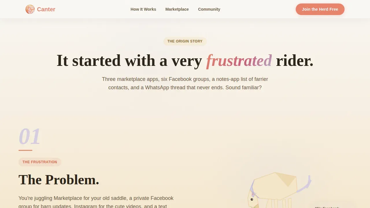
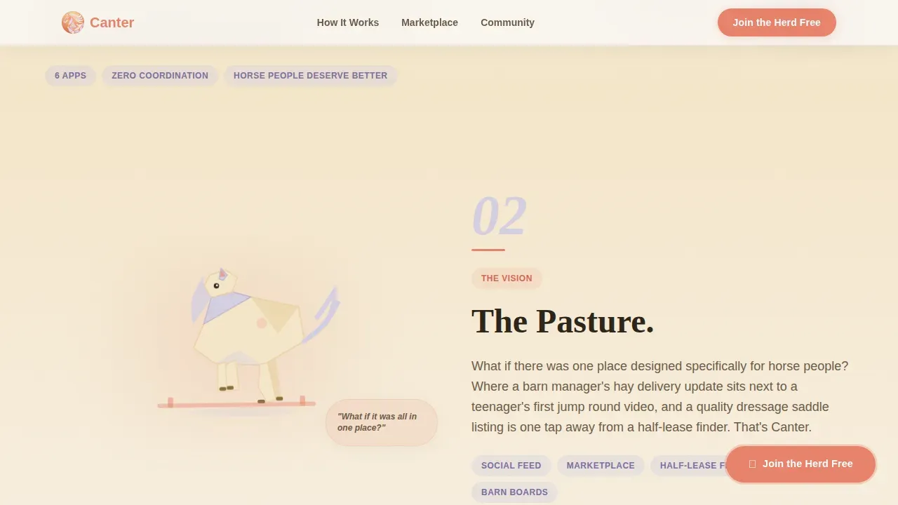
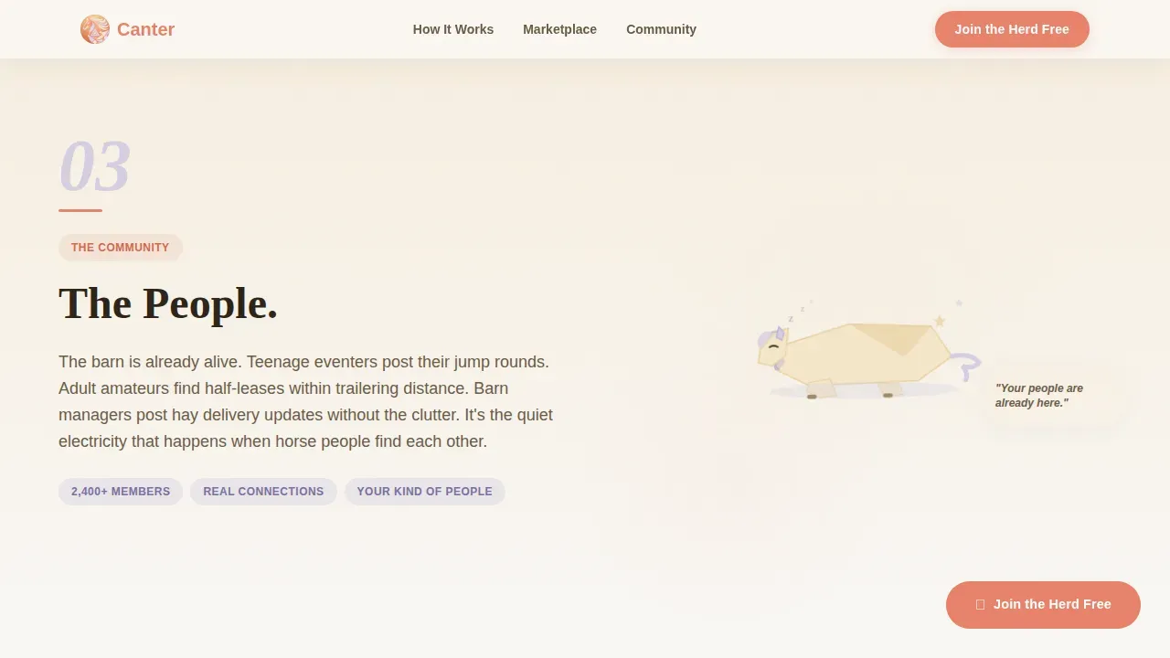
The origin story section unfolds across three scroll chapters titled "The Problem," "The Pasture," and "The People." Each chapter features the geometric horse mascot in a new pose: grazing, jumping, or napping. GSAP-powered animations and staggered reveals guide the visitor through a founder's voice narrating the frustration of fragmented horse community spaces, building from commiseration to genuine excitement. This approach mirrors the way horses process their environment collectively as a herd, making the community feel alive before a visitor even fills out a form.
Geometric Low-Poly Horse Mascot
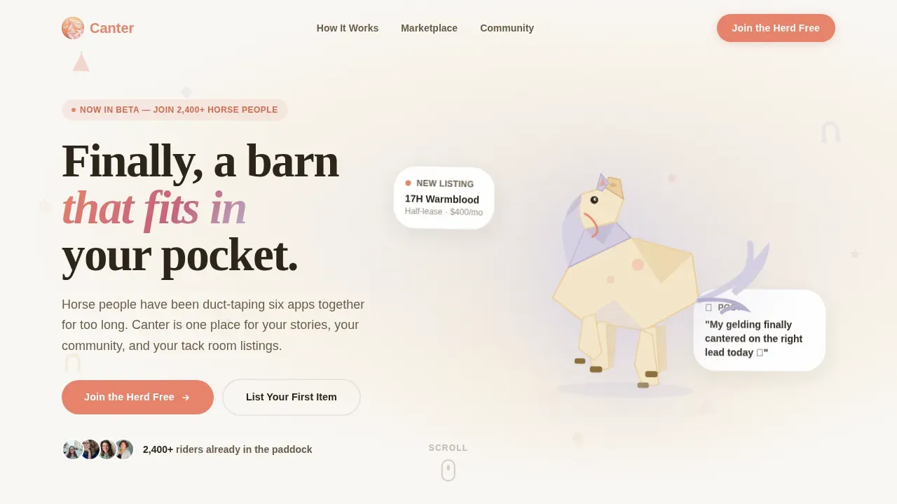
The header introduces a hand-drawn geometric mascot assembled from soft triangles and rounded polygons in lavender and oat tones. The character is shown mid-canter with one ear pricked forward and tail streaming behind, occupying the right two-thirds of the viewport. Tiny floating shapes including carrots, horseshoes, and stars drift slowly in the background. The mascot is a visual partner that reappears across the page, giving the brand a personality that feels warm, active, and distinctly equestrian.
Marketplace Preview with Dual Conversion Paths
The marketplace section displays a mini-preview of active listings, including a used dressage saddle and a lesson horse listing. Two calls to action run side by side: the primary "Join the Herd Free" button and the secondary "List Your First Item" path. This dual-path structure respects that some visitors are here to connect with the community while others arrive ready to trot straight into buying or selling. Both paths are present without one overshadowing the other.
Low-Friction Three-Field Signup Form
The signup section asks only for a first name, email address, and a single-select role preference: rider, barn owner, or horse-curious. Keeping the form this light removes the wrong kind of friction that causes visitors to walk away before they ever feel safe enough to commit. The role selector also helps the platform understand each participant from the beginning, supporting a more relevant experience from the first session onward.
Community Mosaic with Member Quotes
The community mosaic section closes the storytelling arc with real-feeling social proof. Member quotes and community screenshot layouts are built into the design, making it easy to showcase the voices of people already active in the herd. Testimonials in this position help visitors evaluate whether this space is right for them, reinforcing that the barn is already alive and welcoming before they click "Join."
Sticky Coral Call-to-Action Button
After the second scroll chapter, the "Join the Herd Free" button becomes a sticky element that follows the visitor down the page. It uses the bridle-snap coral color reserved specifically for interactive elements, ensuring it is always visible without feeling aggressive. A magnetic button interaction adds a tactile quality that rewards a person who is browsing carefully and not yet ready to commit.
Page sections overview
| Section | Purpose |
|---|---|
| Hero with Mascot | Introduce the brand, showcase the geometric horse character, and deliver the headline "Finally, a barn that fits in your pocket" |
| Origin Story Chapters | Walk visitors through three scroll segments that build emotional connection before asking for anything |
| Marketplace Preview | Show active listings and present two conversion paths side by side |
| Community Mosaic | Provide member quotes and social proof screenshots to reinforce trust |
| Signup Form | Capture name, email, and role with minimal friction to complete the join process |
| Footer | Close the page with a horizontal flow pattern and supporting navigation |
Design & branding system
The visual identity follows a Playful Geometric theme that feels like a watercolor wash left on a tack trunk overnight. Every color and typeface choice reinforces the golden hour mood the template is built around, warm and approachable without ever feeling sterile.
- Color system uses morning fog lavender (#D5CFE1), warm oat (#F5E6CA), and paddock mist white (#F9F7F4) as the base palette, with bridle-snap coral (#E8836B) reserved for buttons, badges, and interactive highlights
- Typography pairs Plus Jakarta Sans for body text with Fraunces for display headings, giving the page a hand-lettered warmth balanced by clean readability
- Geometric shapes, soft polygon constructions, and drifting background elements reinforce the Playful Geometric theme at every scroll position without overwhelming the content
Mobile & speed optimization
The template is built mobile-first because the primary audience is teen riders filming jump rounds on their phones and adult amateurs searching for a half-lease between barn chores. Every section is designed to feel as natural on a small screen as it does on a desktop, making it easy for any visitor to access the full experience regardless of device.
- Single-column flow layout adapts cleanly across screen sizes, keeping the mascot, story chapters, and signup form readable and tappable on mobile without horizontal scrolling
- CSS smooth scroll and IntersectionObserver-powered reveals keep animations feeling fluid and present without relying on heavy resources that slow the experience for visitors on a mobile connection
- Sticky call-to-action button remains accessible and visible throughout the scroll session on both mobile and desktop, reducing the distance a visitor has to travel to convert
How this template helps you convert
Conversion on this page is not about pressure. It is about feeling safe enough to take the next step. The template is structured to build willingness at every stage of the scroll before asking for a commitment.
- The origin story earns trust first by validating the visitor's frustration with existing spaces, creating a sense that this community understands what they have been suffering through before presenting a solution
- The marketplace preview and dual call-to-action structure give visitors two entry points based on their preferences, so whether a person wants to connect socially or list a saddle, they find a path that feels right without feeling pushed in the wrong direction
- The three-field signup form and role selector reduce the barrier to entry to its lowest possible point, so joining the herd feels as easy as walking through a paddock gate rather than filling out a boarding contract
Other information about this template
Canter is designed specifically for the horse community niche, but the design system and section structure can support a wider range of equestrian services. The following notes cover additional context that may be valuable as you evaluate this template for your project.
- Horse community websites that include therapy horses, equine assisted services programs, or adoption initiatives can use the community mosaic and story chapters to present those services in a warm, human context without feeling clinical
- The template's facility-focused language and layout make it well suited for a new facility launch, where early visitors need to feel welcomed, informed about available space, and confident that the operation is responsible and well organized
- Racehorses, thoroughbred ex-racehorse rehabilitation programs, and herd-based adoption networks can use the origin story format to explain a transition narrative, helping visitors understand the journey from past circumstances to a future in a caring community setting
- The page structure supports equine services that go beyond riding, including training programs, donation campaigns for horse welfare organizations, supplements suppliers, and property listings for boarding facilities
- Designers and builders working with tools such as the Canter find your herd horse community landing page template will find that the Playful Geometric theme and Soft Mist color system are fully documented and customizable, making it straightforward to reflect the unique identity of any horse community
- The template's approach aligns with the understanding that horses are social animals that come into the world to form a network with other horses, creating a herd that helps them process their environment and regulate stress collectively. Digital communities for horse people mirror this dynamic, and Canter is built to reflect that truth
- Two horses listed side by side in the marketplace preview illustrate the kind of connection the platform facilitates, whether that is two horses available for a half-lease or two horses whose owners are looking for a riding partner in the same country region
- The design supports programs that serve participants at every experience level, from someone at the very beginning of their riding journey to a seasoned eventing competitor who has been involved in the sport for years
- Contact information, session schedules, and facility details can be added to the footer or signup section to give visitors a direct path to reach out, appreciated especially by barn managers who want to reduce back-and-forth messages
- Safety, protection, and responsible horse care values can be woven into the community mosaic copy, reinforcing that the space is built for people who treat horses and fellow riders with care
Theme
Playful Geometric
Creative direction
Origin Story
Color system
Soft Mist
Style
Single Column Flow
Direction
Marketplace/Multi
Page Sections
Scroll-driven Three-chapter Origin Story
Geometric Low-poly Horse Mascot
Dual-path Marketplace Preview
Low-friction Three-field Signup Form
Community Mosaic with Social Proof
Sticky Coral Call-to-action Button
Related questions
What type of project is this template best suited for?
Can I customize the color palette and mascot to match my brand?
Is the template suitable for mobile users?
Does the template support multiple conversion goals?
Can this template work for equine therapy or adoption programs?