SaaS Consulting FAQ Website Template
Stackaudit is a single-page landing page template built for SaaS operations consultants. It uses a zigzag FAQ-driven layout to walk visitors through real ops anxieties, pairing each question with a process breakdown and mini case study. A press mentions bar, a primary checklist offer, and a secondary download path work together to build trust and earn the contact.
by Rocket studio
Quick summary
Stackaudit is a SaaS consulting landing page template designed for ops-focused consultants. It opens with a press mentions bar, moves through alternating FAQ-anchored sections, and drives two content offers: a primary checklist and a secondary stack comparison download. The charcoal and amber palette signals calm authority. Every section resolves a real buyer anxiety before asking for anything in return.
Who this template is for
This template is built for independent consultants and fractional operators who help growing companies clean up their software stacks. It speaks directly to the person who gets called in after things have already gotten complicated.
- SaaS operations consultants and fractional COOs taking on new client engagements
- Workflow and automation specialists who audit and rebuild broken tool stacks
- Independent advisors serving Series A companies drowning in unused subscriptions
What problem this template solves
Most consulting landing pages lead with credentials. This template leads with the problem. Visitors recognize their own situation before a single sales claim is made, which builds trust faster than any biography could.
- Prospects arrive with vague anxiety about overspending on tools they barely use
- Ops managers and founders need proof of fluency, not just a list of services
- Generic consulting pages fail to convert because they never name the specific pain
What you get with this template
You get a fully structured single-page layout that handles the entire visitor journey from credibility signal to content offer. Every section has a clear role and nothing is decorative without purpose.
- A press mentions scroll bar that borrows authority from media logos and pull-quotes
- Alternating zigzag sections pairing real ops questions with process answers and case study snapshots
- Two conversion paths: a primary email-gated checklist and a no-gate stack comparison download
Feature list
This template includes a focused set of layout and conversion components drawn directly from the brief.
Press Mentions Scroll Bar
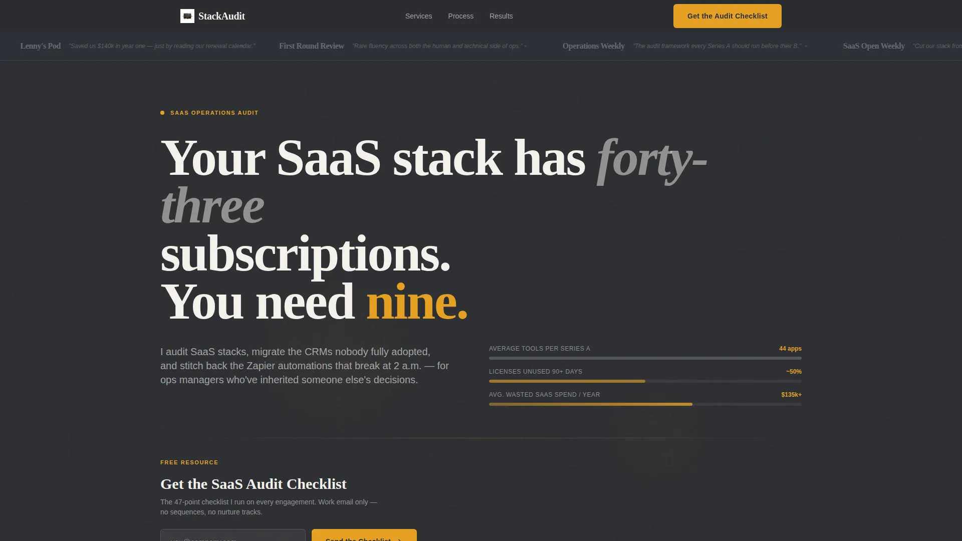
A horizontal scroll rail displays media logos and pull-quotes against the charcoal background. Each logo renders in tool-steel gray at rest and flares to warm amber on hover, giving the header immediate third-party authority without a hero image or portrait.
FAQ-Driven Zigzag Layout
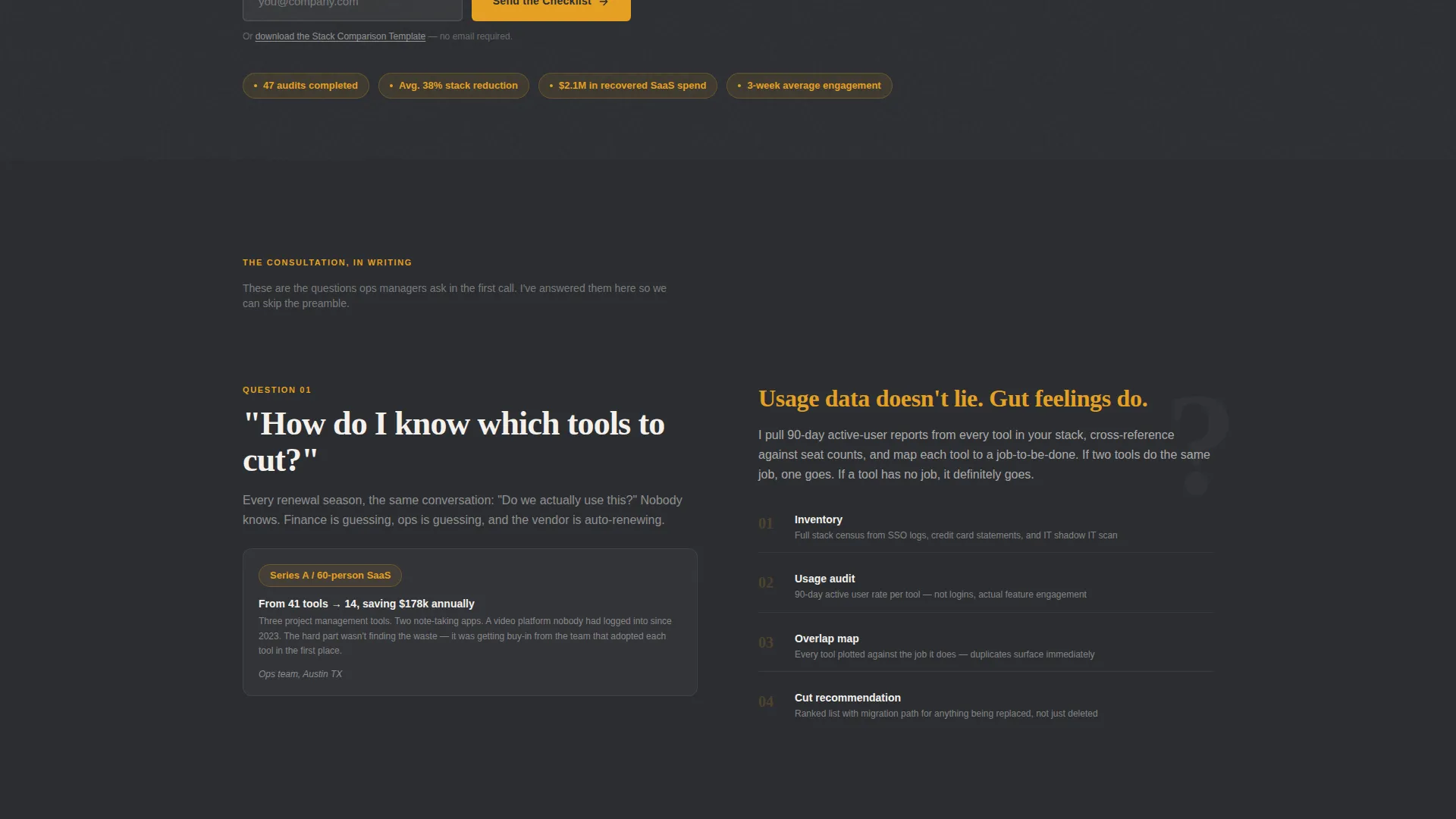
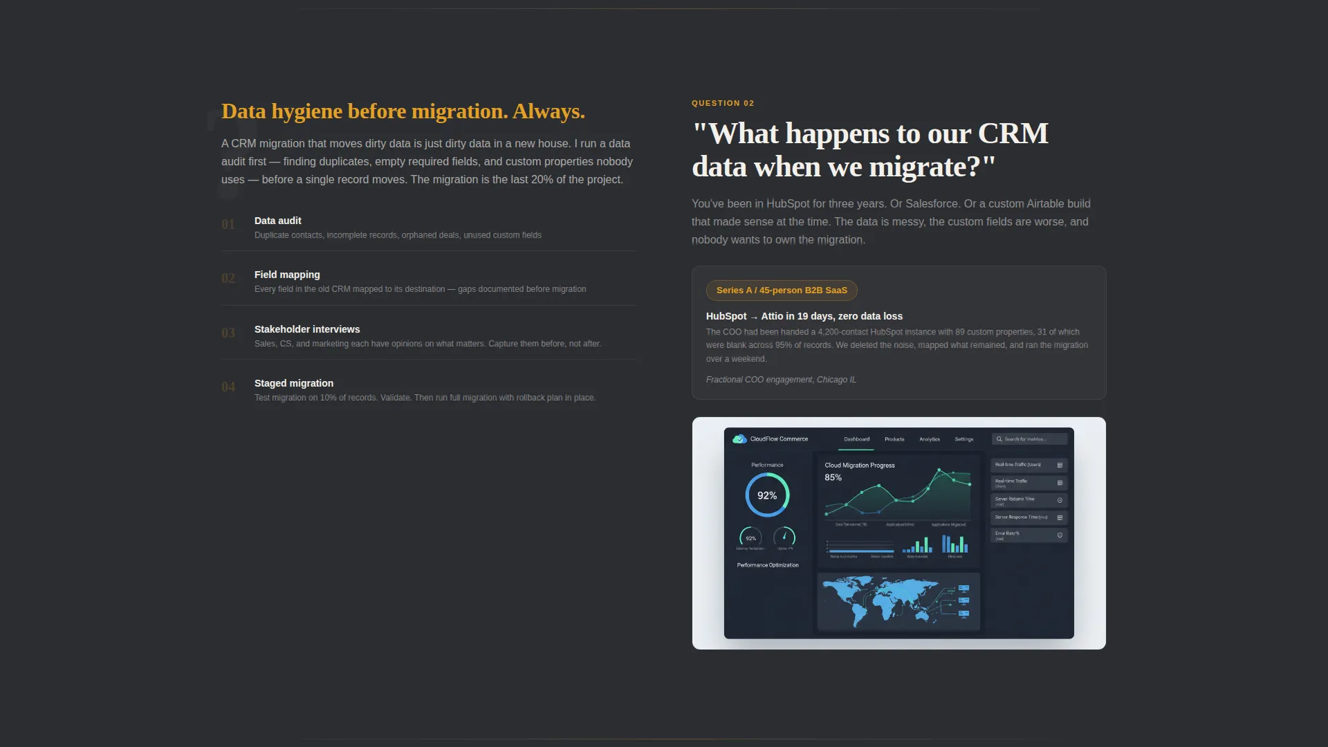
Each content section is anchored by a question ops teams actually ask. The answer appears on the alternating side, paired with a process breakdown and a mini case study. The layout mimics the rhythm of a real consultation, question then answer, concern then proof.
Dual Content Offer System
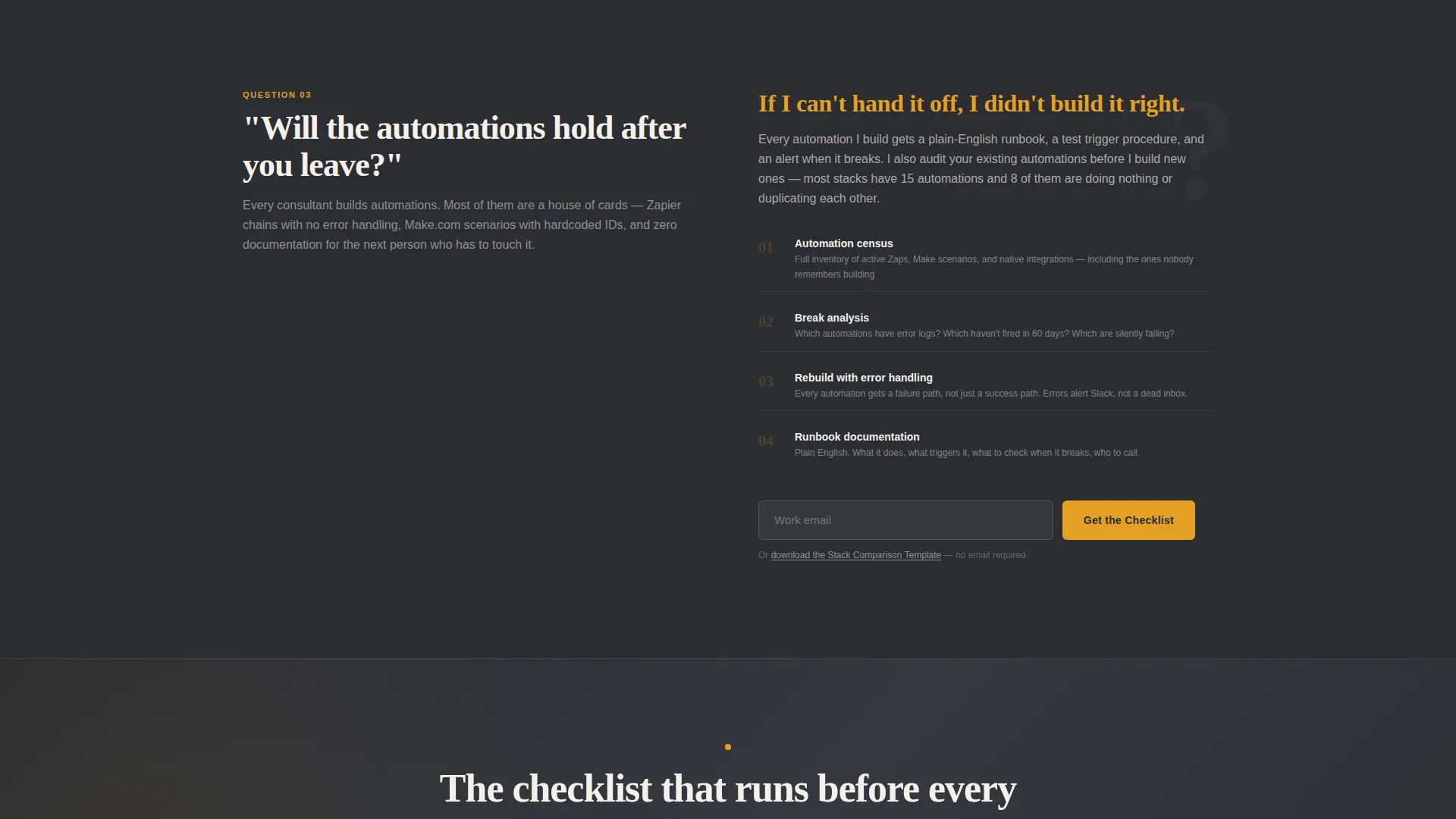
The primary call to action is "Get the SaaS Audit Checklist," placed at the fold break and repeated after every third FAQ section. A secondary path offers "Download the Stack Comparison Template" for visitors who are not yet ready to share their work email.
Single-Field Lead Form
The email capture form asks for work email only. Keeping the form to one field reduces friction and makes the checklist offer feel like a fair exchange rather than a commitment.
Charcoal and Amber Visual System
The color system uses deep workshop charcoal for primary backgrounds, tool-steel gray for secondary surfaces, warm signal amber on every actionable element, and clean utility white for body text. The result is a palette that feels organized and authoritative, like a well-kept machinist's bench.
No-Portrait Authority Header
The header skips the typical consultant headshot. Instead, authority is established through the press mentions bar and a single sharp headline: "Your SaaS stack has forty-three subscriptions. You need nine." The specificity of the claim does more work than any photo could.
Page sections overview
| Section | Purpose |
|---|---|
| Press Mentions Bar | Establishes credibility through media logos and pull-quotes at the top of the page |
| Headline Block | Delivers the core value claim with no image, relying on specificity and copy alone |
| Fold Break call to action | Places the primary checklist offer at the first natural pause in the scroll |
| FAQ Zigzag Sections | Alternates real ops questions with process answers and mini case studies |
| Repeated call to action Block | Reinserts the checklist offer after every third FAQ section to recapture intent |
| Secondary Download Path | Offers the stack comparison template as a no-email alternative for cautious visitors |
Design & branding system
The visual identity follows a Service Utility theme. Every color choice and layout decision reinforces the idea of calm, organized expertise rather than polished sales energy.
- Deep workshop charcoal (#2B2D31) anchors primary backgrounds; tool-steel gray (#6B6E73) fills secondary surfaces
- Warm signal amber (#E4A024) marks every actionable element, from buttons to hover states on media logos
- Clean utility white (#F4F1EC) handles body text and provides breathing room across the dark layout
Mobile & speed optimization
The single-column structure of the zigzag layout adapts naturally to narrower screens. Each FAQ section remains readable and scannable without horizontal scrolling or layout collapse.
- Alternating sections restack vertically on smaller viewports, keeping the question-and-answer rhythm intact
- The single-field email form stays prominent and easy to tap on mobile without needing a redesigned layout
How this template helps you convert
This template earns conversions by answering real questions before making any ask. Visitors who scroll through the FAQ sections arrive at the call to action already partially convinced, because the page has already demonstrated expertise in plain language.
- The press mentions bar handles the credibility question immediately, so visitors do not leave to verify who you are
- The dual offer system captures two visitor types: those ready to share an email and those who need one more step of trust before committing
Other information about this template
This template is suited for consultants working with early-stage and growth-stage companies in the SaaS operations space. It is designed as a standalone landing page, not a multi-page site, so it focuses all visitor attention on a single decision.
- The template is built around content-led conversion, meaning the page earns the click by delivering value freely before gating anything
- The layout works well for consultants positioning around tool rationalization, automation cleanup, and SaaS spend reduction
- It fits naturally into a broader content marketing workflow, where the checklist and stack comparison template serve as entry points to a longer engagement
- The charcoal and amber palette is distinct enough to stand apart from the typical blue-and-white SaaS aesthetic without feeling unconventional
Theme
Legal Shield
Creative direction
Case Study Narrative
Color system
Plum Executive
Style
Split Screen (50/50)
Direction
Booking/Scheduling
Page Sections
Press Mentions Scroll Bar
Faq-driven Zigzag Layout
Dual Content Offer System
Single-field Lead Form
No-portrait Authority Header
Charcoal and Amber Visual System
Related questions
Does this template include the checklist and stack comparison download files?
Can I edit the FAQ questions and headline to match my consulting niche?
How does the press mentions bar work if I have no media coverage yet?
Does the template work for a consultant who focuses on areas beyond SaaS operations?
What happens after a visitor submits the email form?



