Digital Library Portal Landing Page Template
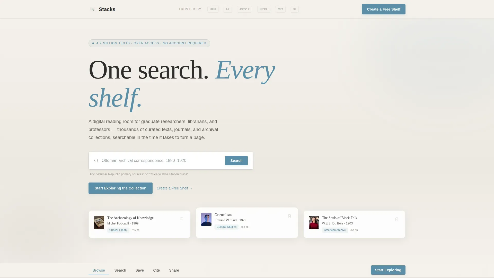
Stacks is a hub-and-spoke landing page template built for digital library portals. It combines an authoritative institutional design with a guided, step-by-step scroll experience. Graduate researchers, public librarians, and adjunct professors can browse curated collections, run live searches, format citations, and build reading lists, all before signing up for anything.
by Rocket studio
Quick summary
Stacks is a single-page digital library portal template built around a hub-and-spoke anchor navigation structure. It guides visitors through five clearly labeled actions: Browse, Search, Save, Cite, and Share. The design feels like a well-ordered reading room, calm, authoritative, and immediately useful. No registration is required to explore the collection.
Who this template is for
This template is designed for teams and institutions that need to present a searchable digital collection to a serious, task-driven audience. It works equally well for public-facing portals and academic resource hubs.
- Graduate researchers who need fast, precise access to texts and archival citations
- Public librarians building community reading lists or showcasing curated collections
- Adjunct professors assembling course reserves under tight deadlines
What problem this template solves
Digital library portals often overwhelm visitors with complexity before delivering any value. Registration walls, unclear navigation, and cluttered interfaces push researchers away exactly when they need help most. This template solves that by leading with immediate access and building trust through demonstration.
- Visitors can run a live search and see sample results before any sign-up prompt appears
- The anchor navigation breaks a complex resource into five simple, scannable steps
- Citation tools and reading list exports are shown in action, not just described
What you get with this template
You get a fully structured, single-page landing page that walks visitors from first impression to confident sign-up. Every section serves a specific purpose and flows naturally into the next.
- A hero section with a prominent search field and institutional partner logo bar
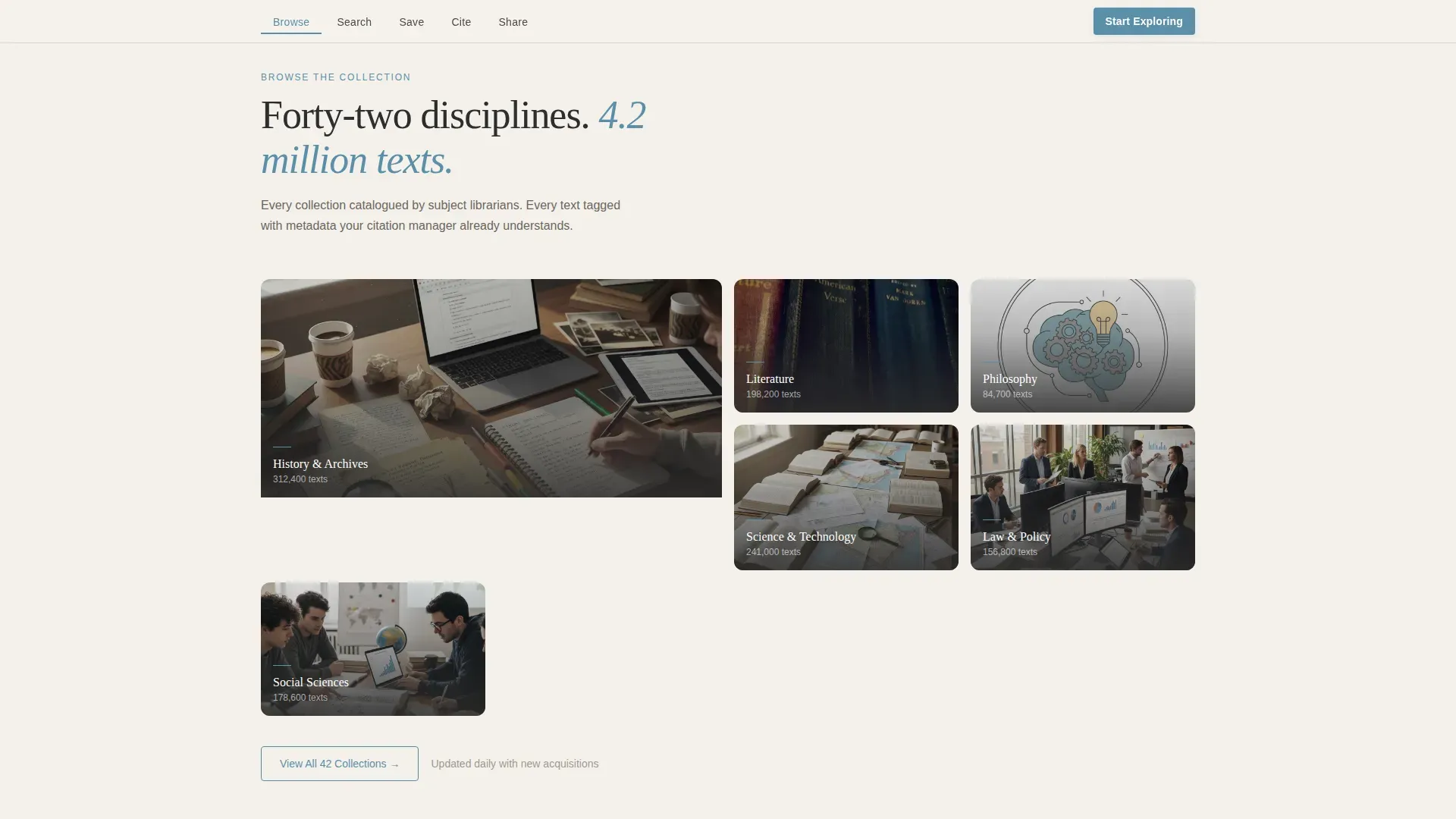
- Five anchor-linked spoke sections covering Browse, Search, Save, Cite, and Share
- A secondary conversion path inviting users to create a free shelf with minimal friction
Feature list
This template is built with a specific set of interactive and visual components that make a research portal feel trustworthy and easy to use.
Anchor Navigation with Active States
A sticky anchor navigation bar pins to the top of the page as the visitor scrolls. Each spoke label, Browse, Search, Save, Cite, Share, updates its active state to reflect the visitor's current position, so orientation is never lost.
Live Search Narrowing Demo
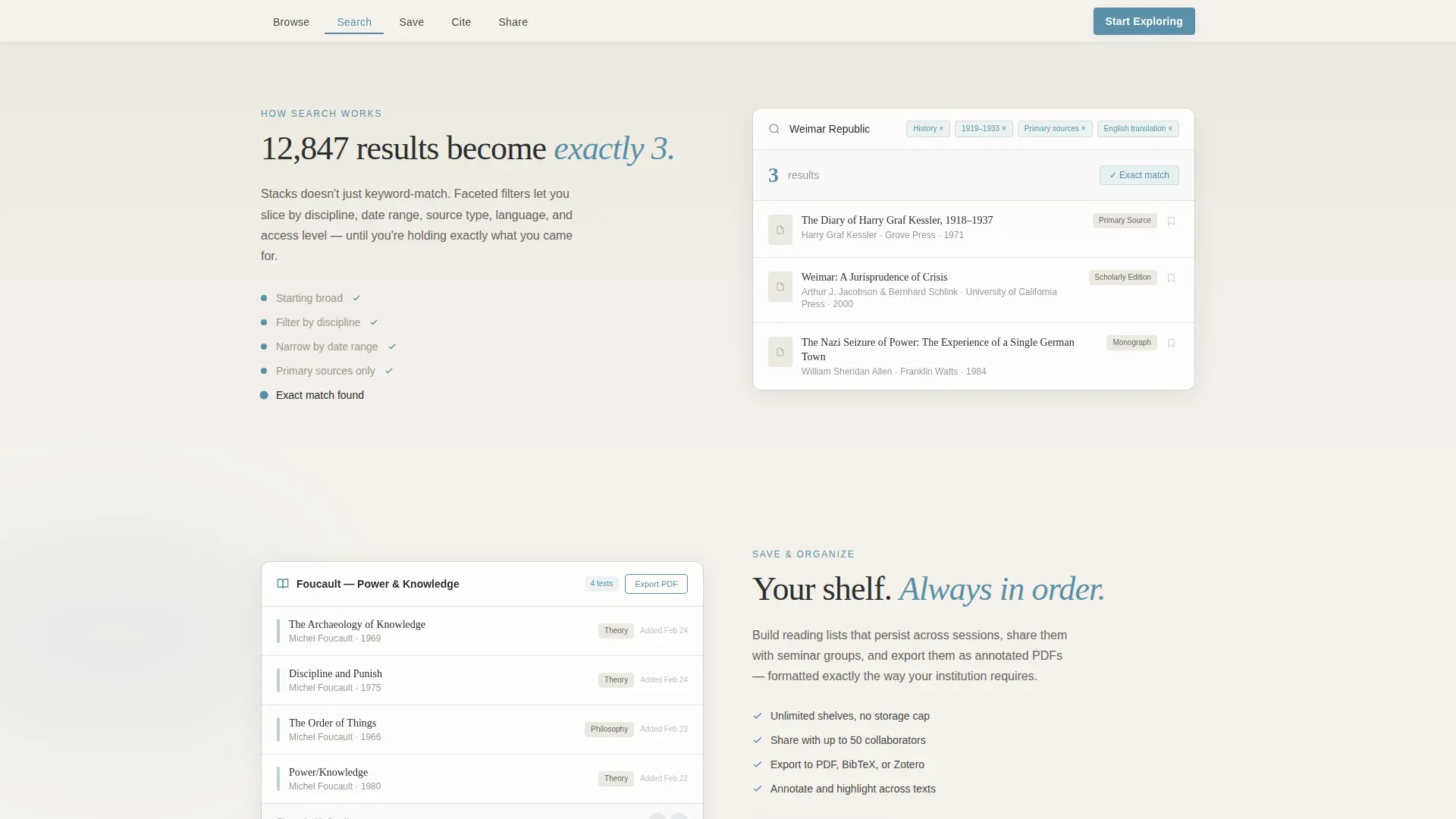
An animated search interface shows results filtering from 12,000 down to 3, complete with a live counter and filter animation. This demonstrates the power of the search tool without asking the visitor to trust a written claim.
Citation Auto-Format Demo
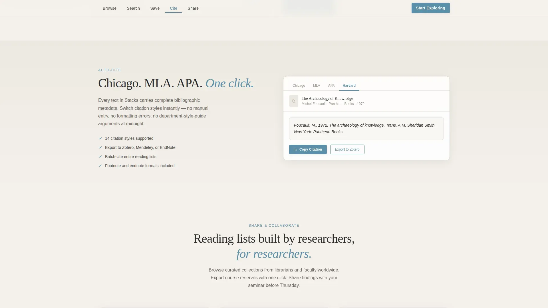
A built-in interactive demo shows a citation automatically switching between Chicago and MLA style formats. Researchers see the tool working before they ever create an account.
Reading List Builder
Visitors can view a working reading list builder and see how items are saved and organized. The export-to-PDF flow is shown as part of the Save and Share spokes, making the workflow tangible.
Institutional Logo Bar Header
The header features the portal wordmark alongside institutional partner logos, university presses, archive foundations, and public library systems, arranged in a clean single row. It establishes authority without visual noise.
Dual Conversion Path Design
The primary call to action, "Start Exploring the Collection," appears both beneath the hero search bar and as a persistent button in the anchor navigation. A softer secondary path invites visitors to create a free shelf using only an email and institutional affiliation.
Page sections overview
| Section | Purpose |
|---|---|
| Hero Search Bar | Introduce the portal and invite the first query immediately |
| Institutional Logo Bar | Establish credibility through partner and affiliation logos |
| Browse Category Grid | Show collection breadth with staggered animated reveals |
| Live Search Demo | Demonstrate result filtering from broad to precise |
| Save and Cite | Show reading list builder and citation format switching |
| Share and Export | Display collaboration and PDF export with secondary call to action |
| Footer | Provide single-row links and supporting portal information |
Design & branding system
The visual identity follows an Institutional Authority theme. Every color and type choice reinforces a sense of quiet scholarly permanence, like diffused January light falling across pale oak reading tables.
- Color palette: archival parchment (#F4F1EB) background, cataloging charcoal (#2D2D2D) for text, soft overcast gray (#D6D2CB) for neutral surfaces, and muted cerulean (#5B8FA8) reserved for navigation links, active states, and call-to-action elements
- Typography: Fraunces serif for display headings, DM Sans for body text and interface labels, creating a contrast between scholarly weight and clean usability
- Animation level is medium-high, including a blinking cursor in the search field, staggered category grid reveals, a live result counter, and a citation format swap
Mobile & speed optimization
The template is built desktop-first to serve graduate researchers working on laptops at odd hours. Mobile support is solid and consistent with the same interaction model.
- Static sections use server-side rendering approaches, keeping initial load lean for content-heavy pages
- Interactive demos for search, citation, and export are scoped to client-side components so they do not slow down the rest of the page
- The anchor navigation collapses cleanly on smaller screens without losing the step-by-step guidance structure
How this template helps you convert
Every design and content decision in this template is aimed at reducing friction and building confidence before asking for anything in return.
- Value is delivered before any form appears, live search results, sample collections, and a featured reading list are all accessible without an account, making the portal feel generous rather than gated.
- The persistent "Start Exploring the Collection" call-to-action button stays visible throughout the scroll, so a motivated visitor never has to hunt for the next step.
- The secondary "Create a Free Shelf" path asks for only an email and institutional affiliation, lowering the commitment threshold for users who are ready to save and organize their finds.
Other information about this template
This template is a strong fit for any organization that needs to present a large digital collection to a discerning, research-oriented audience. It is built for the public library and academic resource space, where trust and clarity matter more than visual spectacle.
- The template style is Hub and Spoke with Anchor Navigation, meaning each section is reachable directly from the top navigation bar without full-page reloads
- The creative direction follows a Step-by-Step Guide structure, so each scroll step teaches the visitor one action and builds their confidence progressively
- The header concept is a Logo Bar, which is particularly effective for portals that derive authority from institutional partnerships
- The landing page direction is Content and Resource, meaning the page earns engagement by demonstrating real value before asking for a sign-up commitment
- The color system is Cloud Canvas, combining parchment, charcoal, gray, and cerulean into a palette that reads as scholarly, calm, and immediately trustworthy
Theme
Institutional Authority
Creative direction
Step-by-Step Guide
Color system
Cloud Canvas
Style
Hub & Spoke (Anchor Nav)
Direction
Content/Resource
Page Sections
Anchor Navigation with Active States
Live Search Narrowing Demo
Citation Auto-format Demo
Reading List Builder and Export
Institutional Logo Bar Header
Dual Conversion Path Design
Related questions
Does a visitor need to register before searching the collection?
What actions does the anchor navigation cover?
Can the citation tool display more than one format?
What information is required to create a free shelf?
Is this template suitable for a public library portal as well as an academic one?