Education Facility Design Booking Website Template
Stacks is a landing page template for a bespoke library design studio. It uses an asymmetric 60/40 grid, an editorial dark-luxury aesthetic, and a Creator Spotlight scroll structure to guide university provosts, municipal directors, and private collectors toward a consultation booking. Each section reads like a chapter, building spatial narrative until curiosity demands a click.
by Rocket studio
Quick summary
Stacks is a single-page, click-through landing page template built for a high-end library design studio. It uses an asymmetric 60/40 grid, a rich Void and Violet color palette, and a Creator Spotlight scroll format. The page routes visitors to a detailed project portfolio and consultation booking page through contextually shifting calls to action.
Who this template is for
This template is designed for architecture and interior design studios that work on commissioned library spaces. It speaks directly to the kind of practice that needs to communicate craft, spatial philosophy, and a discerning client record before anyone picks up a phone.
- Library design studios targeting institutional and private clients
- Architecture firms presenting bespoke reading room commissions
- Design practices serving university provosts, municipal directors, or private collectors
What problem this template solves
Most architecture studio pages present projects as a static portfolio grid. That format fails to communicate the philosophy behind a space or the expertise behind a decision. Potential clients in this niche need to feel the weight of the work before they reach out.
- A flat gallery cannot convey scale, material thinking, or designer intent
- High-value clients need narrative context, not just photographs
- Standard layouts dilute the studio's curatorial identity and make it hard to stand apart
What you get with this template
You get a fully structured, single-page landing page that tells a spatial story from an intimate residential library to a vast civic reading hall. Every section is built to earn a click rather than demand one.
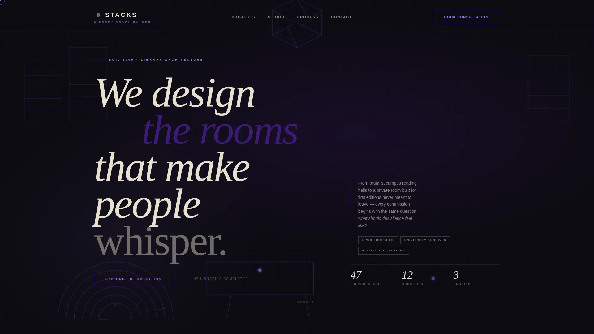
- A cursor-reactive hero with an axonometric wireframe parallax effect and a ghost call-to-action button
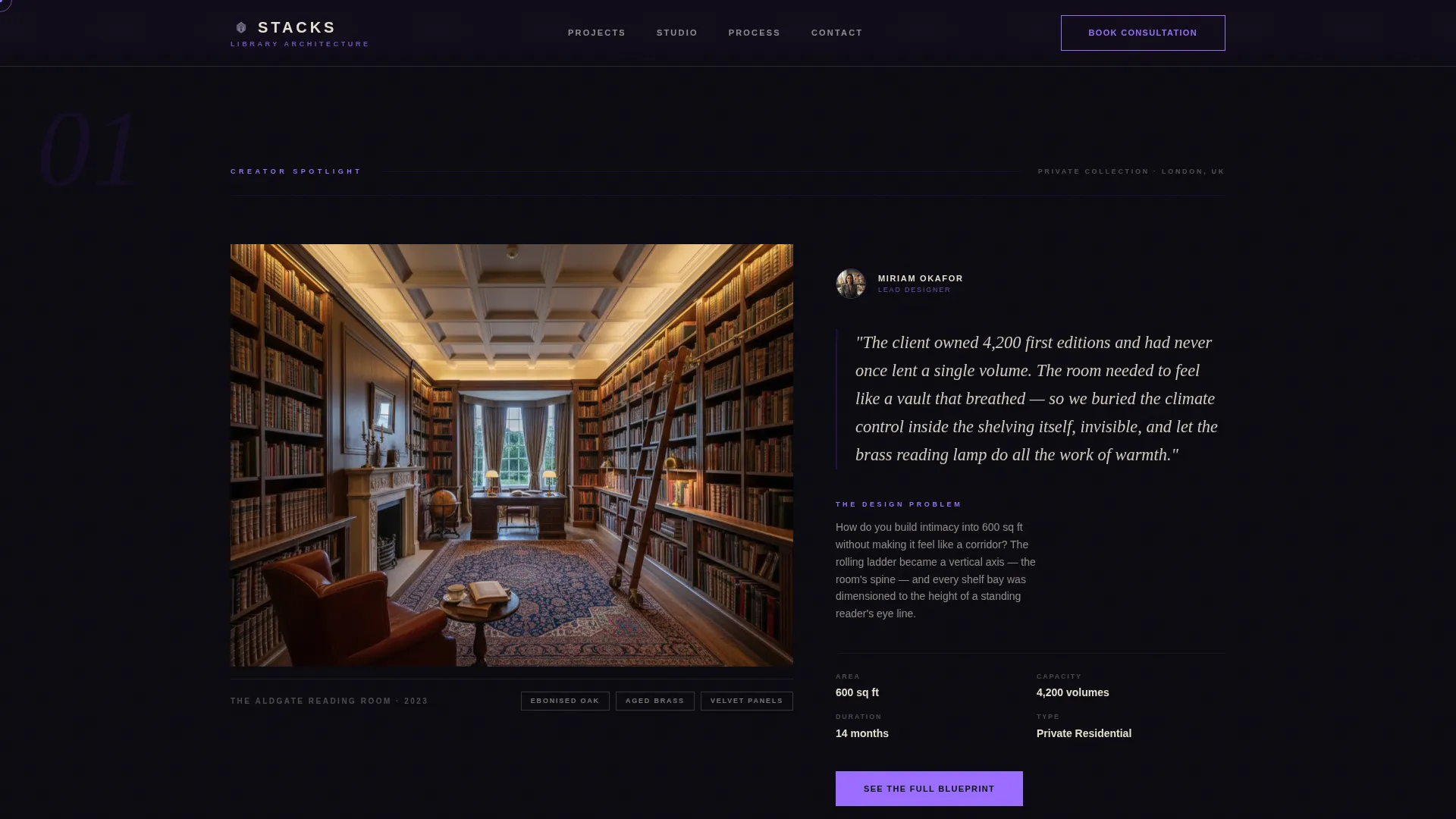
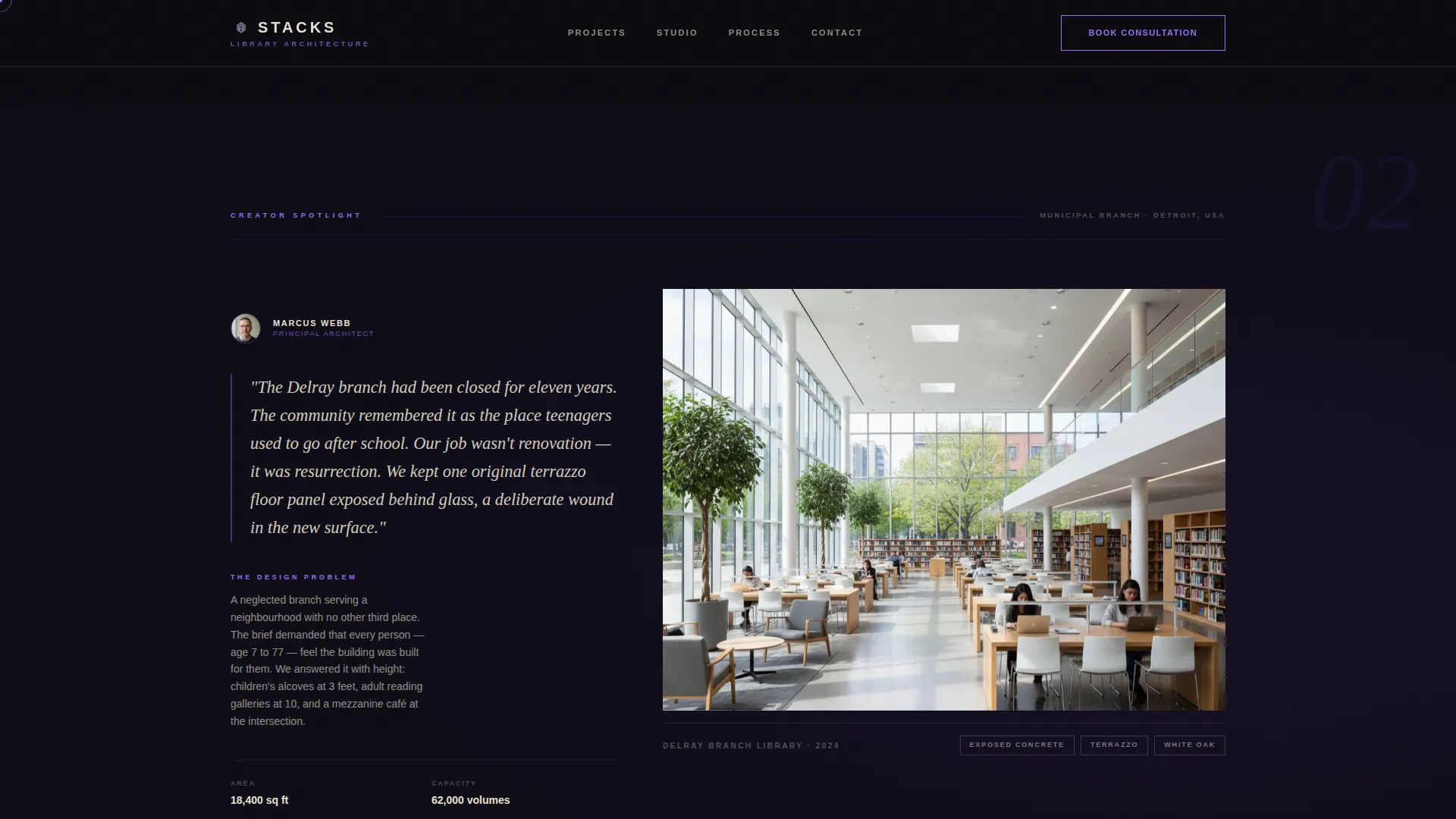
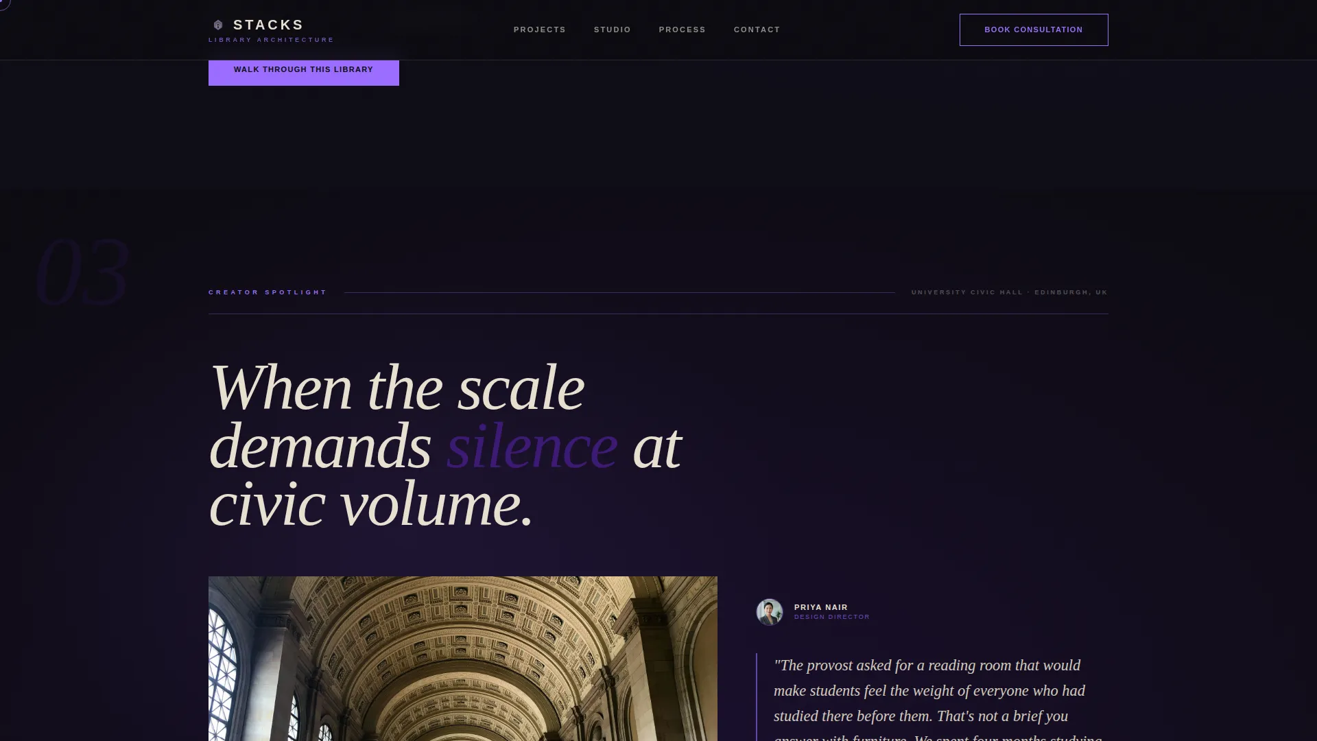
- Three Creator Spotlight sections with alternating 60/40 and 40/60 grid layouts, immersive photography columns, and designer narrative panels
- An under-construction teaser section with a final "Start Your Library" call to action, plus a linear single-row footer
Feature list
The template delivers a tightly connected set of visual and structural features drawn directly from the studio brief.
Asymmetric 60/40 Grid Layout
The page uses a two-column asymmetric grid that alternates weight between sections. Photography and designer notes swap sides across each spotlight, so the scroll feels like turning chapters rather than repeating a pattern.
Cursor-Reactive Parallax Hero
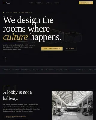
The header features overlapping polygons that resolve into an axonometric wireframe of a reading room. The composition shifts with cursor movement, creating a breathing blueprint effect that draws visitors into the studio's spatial thinking immediately.
Creator Spotlight Scroll Structure
Each project is profiled through the lens of its lead designer. The wider column holds immersive project photography while the narrower column carries handwritten-style designer notes, material callouts, and a short first-person narrative built around a single defining design problem.
Contextual Call-to-Action System
The primary call to action appears first as a ghost button labeled "Explore the Collection." It resurfaces as a solid button after each spotlight with a shifting label: "See the Full Blueprint," "Walk Through This Library," and "Start Your Library." Labels change exactly where curiosity peaks.
Void and Violet Color Execution
Void black dominates negative space. Aged vellum carries body text. Deep archival violet anchors headlines and section dividers. The ink-bloom accent appears only on hover and interactive states, rewarding engagement without cluttering the resting palette.
GSAP Scroll Reveal Animations
Staggered text reveals, image scale hover effects, and GPU-accelerated transforms are built into the scroll experience. Native CSS smooth scroll ties the motion system together across the full page.
Page sections overview
| Section | Purpose |
|---|---|
| Hero with Wireframe | Opens the page with a parallax axonometric composition and ghost call to action |
| Creator Spotlight One | Residential private library profiled with left photo and right designer notes |
| Creator Spotlight Two | Municipal branch library with grid flipped to right photo and left designer notes |
| Creator Spotlight Three | University civic hall with deeper violet intensity and left photo layout |
| Under Construction Teaser | Final invitation section with "Start Your Library" call to action |
| Linear Footer | Single-row footer closing the page |
Design & branding system
The template's visual identity is built on an Ink and Paper theme executed through the Void and Violet color system. Every palette decision has a structural role, and no color is decorative without purpose.
- Void black (#0B0A10) fills negative space between grid cells, giving the page its editorial depth
- Aged vellum (#E8E0D0) carries body text and content panels; deep archival violet (#3C1874) anchors headlines and dividers; ink-bloom (#9B6DFF) is reserved strictly for hover and interactive moments
- Typography pairs DM Serif Display in italic for headlines with Plus Jakarta Sans for body copy, creating a contrast between institutional gravitas and modern legibility
Mobile & speed optimization
The template is built desktop-first to match the browsing habits of its high-value target audience. The motion system relies on GPU-accelerated transforms and lazy image loading to keep the experience fluid on capable hardware.
- GPU-accelerated CSS transforms handle parallax and reveal animations without layout repaints
- Lazy image loading defers off-screen photography until the visitor scrolls toward it
- Native CSS smooth scroll removes dependency on heavy scroll-hijacking libraries for basic navigation
How this template helps you convert
This template converts by earning trust before asking for action. The click-through structure is deliberate: every spotlight section gives visitors just enough spatial detail and designer philosophy to make them want more, then places a button exactly where that curiosity peaks.
- The hero ghost button introduces the call to action without pressure, allowing the studio's spatial narrative to do the persuasion work first.
- Each Creator Spotlight ends with a solid contextual button whose label matches the emotional register of that project, so the click feels like a natural next step rather than an interruption.
- The under-construction teaser reframes an incomplete project as an open invitation, making "Start Your Library" feel like joining something rather than buying something.
Other information about this template
This template is a strong fit for architecture and interior design studios that operate in the library design space and serve clients with long decision cycles and high commissioning value. A few additional details worth noting:
- The page is English-language and does not include explicit pricing, reflecting the studio's direct consultation model
- Social proof is embedded structurally through first-person designer narratives and project-specific material callouts rather than testimonial blocks
- The footer follows a linear single-row pattern, keeping the close of the page clean and unfussy
- The template is designed as a click-through landing page, meaning no contact form lives on this page; conversion happens by routing visitors to a separate portfolio and booking page
- Desktop is the primary device target; the immersive parallax and grid system are optimized for larger viewport experiences
Theme
Ink & Paper
Creative direction
Creator Spotlight
Color system
Void & Violet
Style
Asymmetric Grid (60/40)
Direction
Click-Through
Page Sections
Asymmetric 60/40 Grid Layout
Cursor-reactive Parallax Hero
Creator Spotlight Scroll Structure
Contextual Call-to-action System
Void and Violet Color Execution
GSAP Scroll Reveal Animations
Related questions
Is this template suitable for a single architect or a full studio?
Does this template include a contact form?
Can the color palette be adjusted to match a different brand identity?
What types of library projects does this template's structure support?