Public Library Pricing Website Template
Stacks is a single-column click-through landing page template built for mobile library programs. It combines documentary-style imagery, a Monochrome Steel color system, and a Transparent Process creative direction to convert municipal directors, school superintendents, and corporate CSR managers into qualified pricing-page visitors. Every section earns trust through verifiable data before asking for a click.
by Rocket studio
Quick summary
Stacks is a focused, single-purpose landing page template designed for mobile library services. It leads with a bold headline, real circulation statistics, and a documentary photograph. Five content sections reveal the deployment timeline, route coverage, impact metrics, and cost-per-reader data that budget-holders need. One strong call to action closes every scroll. No form. Just the click.
Who this template is for
This template speaks directly to decision-makers who control literacy program budgets and community engagement portfolios. It is not built for casual browsers. It is built for professionals who need proof before they proceed.
- Municipal program directors and school district superintendents who must justify spending to budget committees
- Corporate social responsibility managers who need community impact data and named partner credibility
- Nonprofit program leads and grant writers building the case for a mobile library service launch
What problem this template solves
Getting a mobile library program funded is rarely about the idea. It is about the evidence. Decision-makers navigate procurement processes that demand numbers, timelines, and cost breakdowns before any conversation about commitment. Generic landing pages with mission statements and stock images do not survive a budget review. This template solves that credibility gap.
- It replaces vague mission language with a numbered deployment timeline, named route coverage, and a cost-per-reader breakdown that program directors can copy directly into proposals
- It removes friction by putting all verifiable data on a single scroll path, so visitors never have to navigate away to find what they need
- It eliminates premature asks by building trust through data first, then delivering a single clear call to action at exactly the right moment
What you get with this template
You get a complete single-column landing page layout structured around five conversion-focused content sections. Every element in this template exists to move a qualified visitor one step closer to the pricing page. The structure is intentional and the content hierarchy is strict.
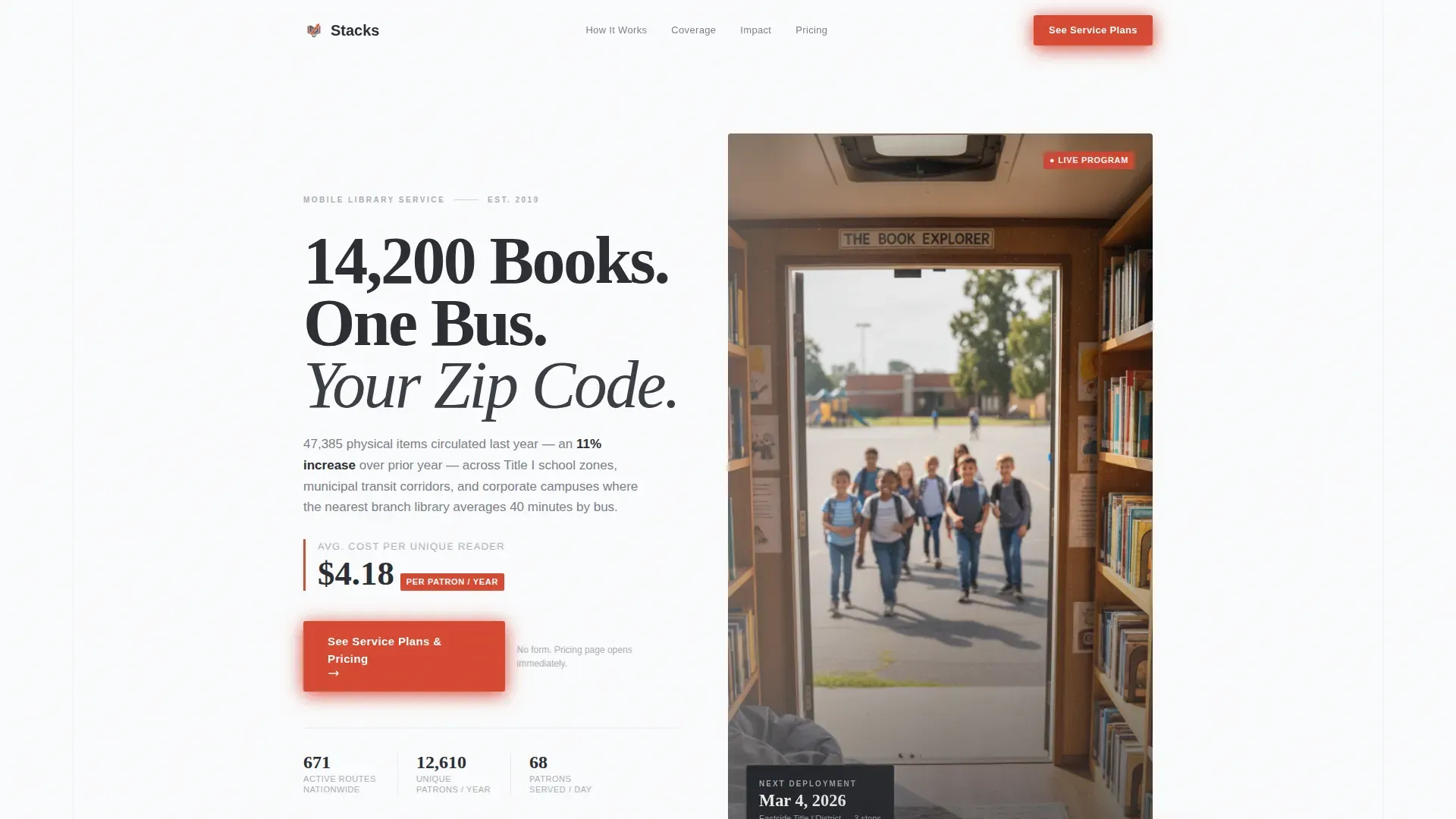
- A half-page hero with a left-aligned headline stack, a live circulation subhead, and a documentary photograph on the right side showing the vehicle interior looking outward
- Five body sections: a six-step deployment timeline, a named route coverage map, four key performance indicator (KPI) metric blocks, a cost transparency table, and a minimal single-row footer
- A primary vermillion call-to-action button beneath the hero stats and a fixed bottom bar that becomes visible after the cost breakdown section
Feature list
This template is built around a clear set of purposeful components. Each one does a specific job inside the landing page flow.
Documentary Hero Section
The hero occupies half the page width on desktop. The left column carries a bold, tight headline set in a high-contrast display serif, stacked above a single-line subhead showing a circulation stat. The right side holds a documentary-style photograph shot from inside the vehicle. The image is not staged. It reads as evidence. The hero section features a clear, benefit-oriented headline and high-quality imagery that loads fast and commands attention immediately.
Six-Step Deployment Timeline
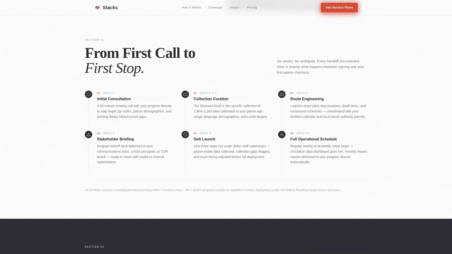
Section one of the body lays out the full service process from initial consultation to first scheduled stop. Each of the six steps is a single sentence beside a small monochrome icon. The numbered layout lets visitors scan the entire deployment process in under thirty seconds. This transparent approach is what makes the landing page trustworthy to procurement-minded users.
Named Route Coverage Map
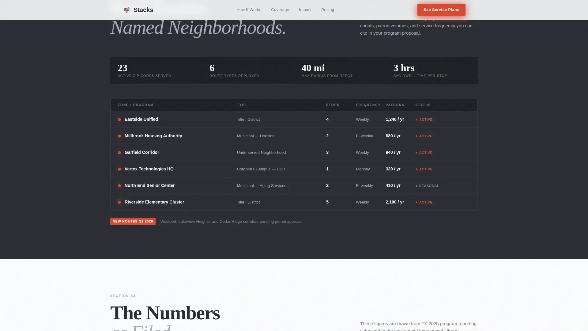
Section two shows an actual route map with real neighborhood names, coverage radius data, and stop frequency information. There are no generic placeholder pins. Named locations make the service feel real and operational rather than hypothetical. This section answers the first geographic question every program director asks before they will consider moving forward.
Impact Metrics Display
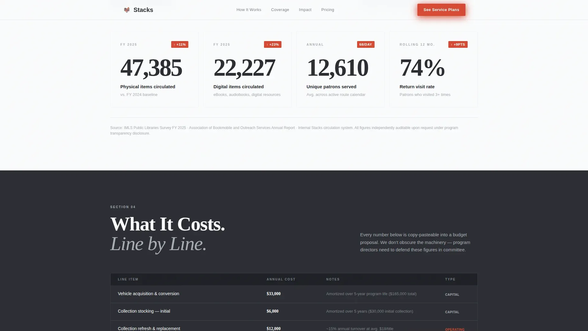
Section three renders four key performance indicators as large steel-gray numerals with vermillion percentage-change badges. Metrics include books circulated, unique readers, and return visit rates. High-impact figures like these build the kind of trust that a paragraph of copy never could. The count-up animation triggered on scroll makes each number land with weight.
Cost Transparency Table
Section four presents a per-reader cost breakdown with program tiers and budget-ready numbers. Program directors and grant writers can read the table and copy figures directly into a budget proposal without requesting additional materials. This is the section that converts hesitation into a confident click toward the pricing page. No vague pricing ranges, no contact-us-for-a-quote deflection.
Fixed Bottom Call-to-Action Bar
After the cost breakdown, a persistent bottom bar becomes visible on every device. It carries the primary call to action in vermillion on charcoal. It does not obstruct content during the data sections. It appears at the exact moment a qualified visitor has seen enough to act. The bar ensures the next step is always within reach without demanding attention before trust is earned.
Page sections overview
| Section | Purpose |
|---|---|
| Hero Split Layout | Headline, stat subhead, and documentary photo establish credibility immediately |
| Deployment Timeline | Six numbered steps show exactly how the service launches from consultation to first stop |
| Route Coverage Map | Named neighborhoods and stop frequency data answer the geographic question upfront |
| Impact Metrics Block | Four KPI numerals with percentage badges show real program outcomes |
| Cost Transparency Table | Per-reader breakdown lets budget holders copy numbers into proposals |
| Fixed call to action Bar | Persistent bottom bar keeps the pricing-page click visible after cost section |
| Minimal Footer | Single-row linear footer with essential links and partner logo strip |
Design & branding system
The visual identity follows a Corporate Precision theme built on the Monochrome Steel color system. The palette is authoritative and data-forward. It feels like a freshly printed annual report on a stainless steel table. Every color choice is intentional and every element earns its place on the page.
- Structural charcoal (#2B2D33) anchors section backgrounds; brushed aluminum (#A8ADB5) carries secondary text and divider lines; bright paper white (#FAFBFC) opens breathing room between content blocks
- Library-stamp vermillion (#D64933) is reserved exclusively for calls to action and data callouts, landing like an ink stamp on every element that demands action
- Typography pairs a Fraunces display serif for headlines with DM Sans for body text and interface elements, creating a visually appealing contrast between editorial weight and clean utility
Mobile & speed optimization
The template is desktop-first by design, reflecting the reality that budget decision-makers typically review procurement materials at a desk. However, the layout is fully mobile responsive and built to deliver a clear, usable experience on any screen size. Creating an effective landing page for a mobile library service requires a mobile-first, secure, and user-friendly approach, and this template meets that standard across all breakpoints.
- The single-column flow adjusts naturally to any device width, with ample white space preserved on smaller screens so content remains scannable rather than cramped
- Images are structured for compressed delivery and scripts are organized to keep load times tight, so the page performs well whether a visitor opens it in a desktop browser window or on a phone
- Buttons are sized to meet thumb-friendly interaction standards, keeping the primary call-to-action accessible and easy to tap without precision on any screen
How this template helps you convert
This template is built around one conversion goal: move a qualified decision-maker from first scroll to the pricing page. Every section earns trust before the call to action asks for anything. The result is a landing page that does not need a form to create commitment.
- The hero leads with a verifiable headline stat and a documentary photograph, so the first five seconds of the visit establish credibility rather than making a pitch. Visitors who trust what they see are far more likely to scroll and eventually convert.
- The data-forward body sections, including the timeline, route map, metrics, and cost table, guide visitors through a structured proof sequence. Each section removes a specific objection that a budget committee would raise, so by the time the fixed call-to-action bar is visible, the decision to click feels logical rather than pressured.
Other information about this template
This section covers additional context that helps you understand how this template fits into a broader landing page workflow and what to keep in mind as you customize and launch it.
This template is part of a curated stack of high performance landing page designs built for specific service niches. It sits at the intersection of government and public services, making it one of the more specialized app landing page layouts in the library. The landing pages tile format used here, with a clear single-column flow, is one of the most effective structures for directing users toward a single goal without distraction. The same structural logic that makes a great saas landing page work applies here: one message, one action, real results.
No-code tools allow users to build landing pages without writing a single line of code. This template is designed to work within those environments. Non-technical team members can create and launch pages using drag-and-drop functionality without needing developer support. You can modify color schemes, swap images, and adjust headline copy directly in the editor window. No-code platforms enable teams to build fast, iterate based on feedback, and manage multiple versions without touching the underlying code.
Landing page templates save time by providing a proven structure you can customize. This template is a practical example of how a well designed landing page can serve a very specific audience. You can browse the section components, drop in your own content, and adapt each layout box to your program's data. The ability to manage content type by section, navigate between blocks in the dashboard, and sign off on a final design without developer involvement makes the process faster for the whole team.
Additional features you can explore when adapting this template include:
- Adding videos of the vehicle in operation to the impact metrics section for richer storytelling content
- Displaying named partner logos and community endorsements directly below the hero to build trust early in the scroll
- Including a dynamic schedule or interactive stop map so users can see the exact next visit time for their neighborhood
- Using the icon set in the timeline section to create additional visual structure across other content blocks
- Adapting the cost table columns to reflect your own program tiers and budget message
- Reviewing the landing pages tile layout as an example for how to structure other pages in your site
The template is a stacks trusted mobile library service landing page template, purpose-built for the public library niche. A well-crafted landing page shows off your brand, builds trust, and strengthens your program's credibility with exactly the potential customers and institutional partners you need to reach. The best app landing pages load quickly, are mobile responsive, and give happy users a clear path forward. This template meets those standards and gives you a strong foundation to start building your program's digital presence today.
Theme
Corporate Precision
Creative direction
Transparent Process
Color system
Monochrome Steel
Style
Single Column Flow
Direction
Click-Through
Page Sections
Documentary Hero with Headline Stack
Six-step Deployment Timeline
Named Route Coverage Map
Impact Metrics with Count-up Animation
Cost Transparency Breakdown Table
Fixed Bottom Call-to-action Bar
Related questions
Does this template include a contact form?
Can I customize the colors and typography to match my program's branding?
How do I update the impact metrics with my own program data?
Is this template suitable for a school district or municipal department?
Can I add more sections to the page after customizing the template?