Sports Branding Agency Landing Page Template
Stadiummark is a sports branding agency landing page template built on an asymmetric 60/40 grid with a Tech Glass aesthetic. It opens with a full-screen video header, guides visitors through a gallery-style project showcase, and converts them with a gated PDF download. The iridescent color system and dark obsidian base make every section feel charged and arena-ready.
by Rocket studio
Quick summary
Stadiummark is a single-page template designed for sports branding studios. It pairs a cinematic full-screen video header with a gallery-walk project layout on an asymmetric 60/40 grid. The iridescent color system keeps the visual tone electric without feeling chaotic. A sticky lead-capture banner and a closing download section work together to convert curious visitors into qualified contacts.
Who this template is for
This template is built for creative studios and agencies whose work lives in the sports, athletics, and esports world. If your clients judge identity systems by how they hold up on a helmet, a jersey, and a jumbotron at the same time, this page speaks their language.
- Sports branding agencies presenting identity, type, and motion work to franchise owners or athletic directors
- Esports organizations and sportswear startups looking to position their visual identity credentials to prospective clients
- Independent brand designers specializing in athletic marks who want a portfolio page that matches the energy of their work
What problem this template solves
Most portfolio templates are built for general creative studios. They present work as a flat image grid, offer no narrative flow, and give visitors no reason to stay beyond a first scroll. For a sports branding agency, that gap is costly.
- Clients evaluating a rebrand need to see process artifacts alongside hero applications, not just finished logos
- Generic layouts fail to communicate the voltage and precision that athletic identity work demands
- Without a clear lead-capture path, traffic leaves without converting, and the agency has no way to follow up
What you get with this template
You get a fully structured, single-page layout that moves visitors from first impression through case study exploration to a concrete conversion action. Every section has a defined role and a defined visual register.
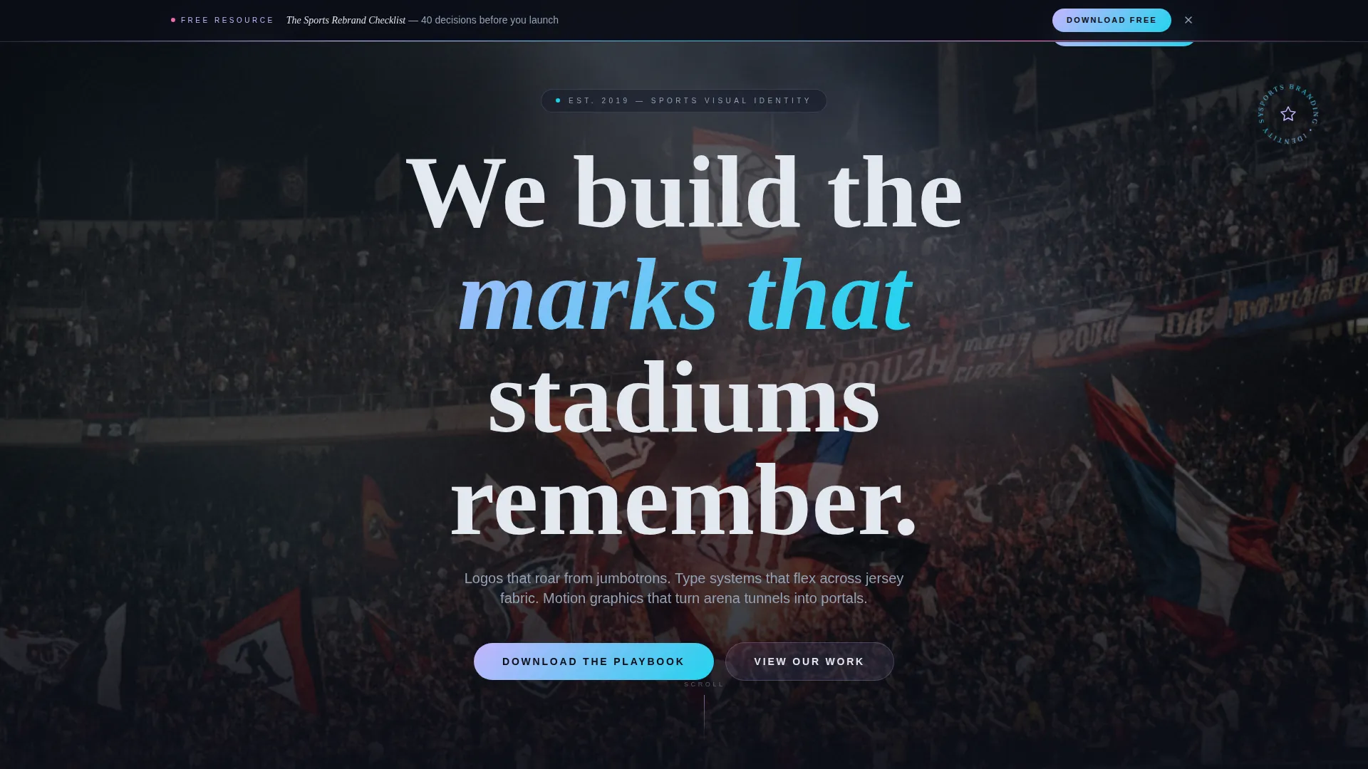
- A full-screen video header with centered knockout type and iridescent accent compositing
- An alternating 60/40 asymmetric project gallery with scroll-triggered fade and slide animations
- A sticky post-scroll lead-capture banner and a full-width closing download section with a three-field form
Feature list
This template is built from six core features, each drawn directly from the brief.
Full-Screen Video Header
The header occupies the entire viewport with a slow-motion video reel. The footage follows a continuous camera push: from logo sketch on a tablet, through vector construction lines, across a jersey on a mannequin, and into a stadium tunnel where the mark is projected sixty feet tall. The video is desaturated except for iridescent accents that pulse on each brand reveal. Centered knockout white type reads: "We build the marks that stadiums remember."
Asymmetric 60/40 Project Gallery
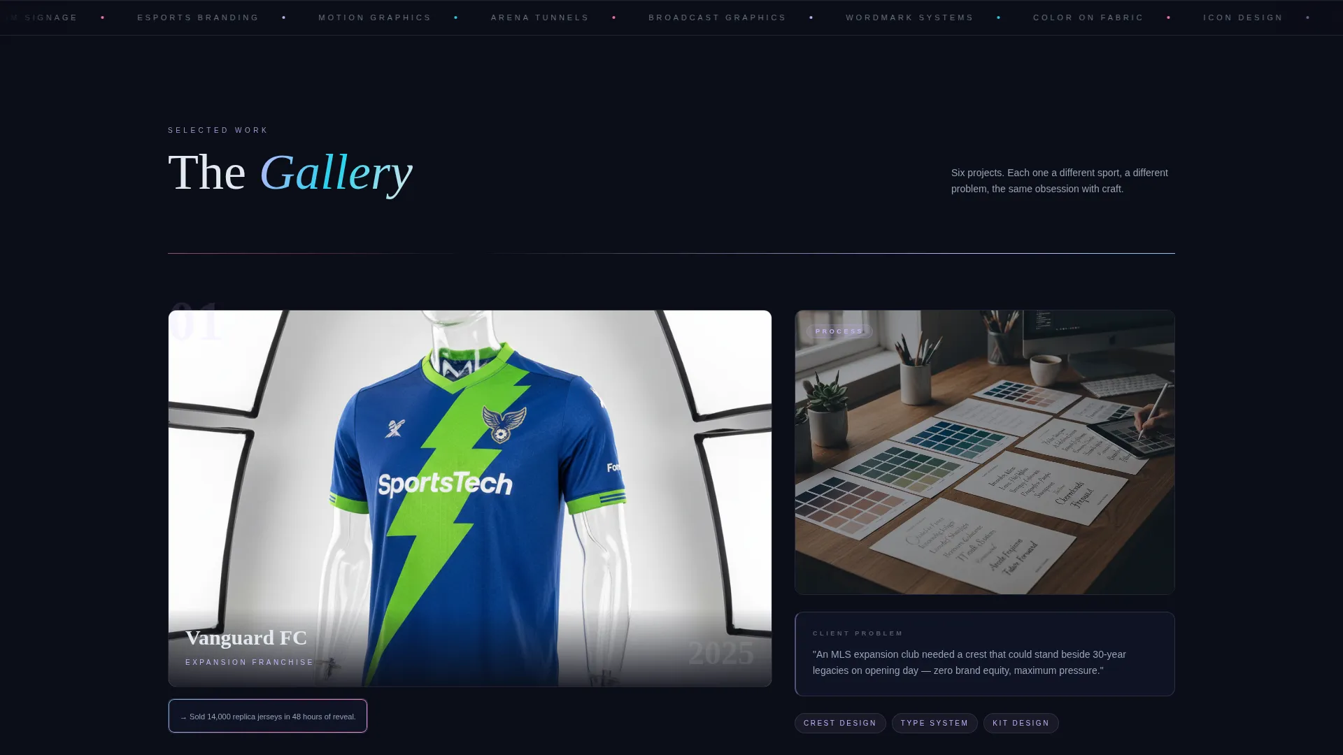
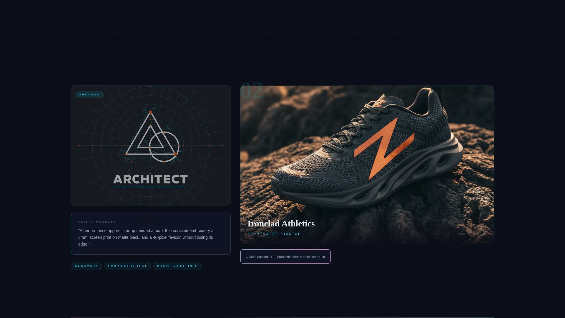
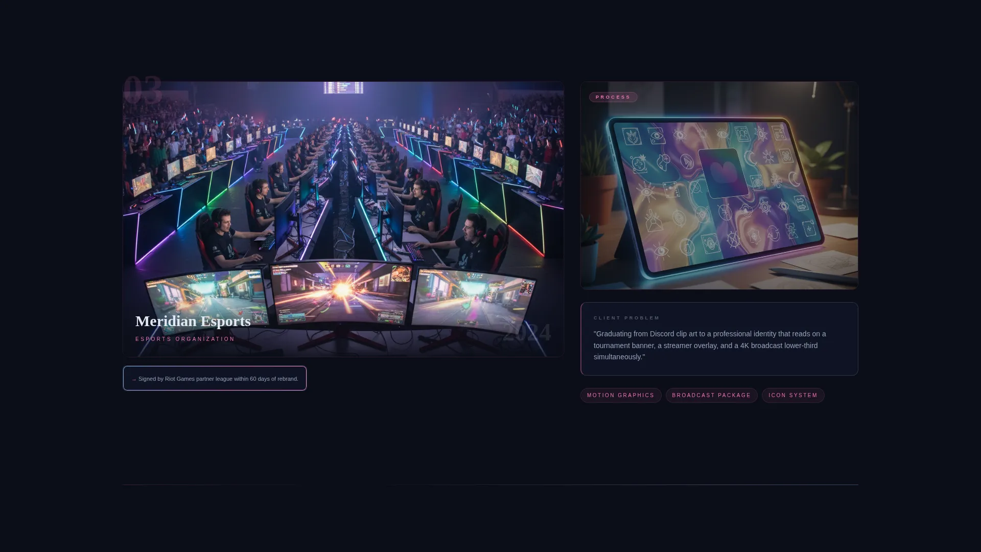
Each project cell uses an asymmetric split. The larger 60-percent panel displays a hero application such as a helmet, a court floor, or a broadcast lower-third. The 40-percent column holds process artifacts: mood boards, type specimens, color-on-fabric swatches, and a one-sentence client problem statement. The hero side alternates left and right between projects, creating a zigzag rhythm that keeps the eye moving through the page.
Scroll-Triggered Gallery Animations
Projects do not load all at once. Each cell fades and slides into view as the visitor scrolls, mimicking the experience of moving from room to room in a gallery. Each project carries its own micro-palette drawn from the iridescent color system, so the page shimmers with variety while staying visually unified.
Sticky Lead-Capture Banner
After the visitor passes the third project cell, a sticky banner appears offering the free PDF download: "The Sports Rebrand Checklist: 40 Decisions Before You Launch." The form asks for three fields only: first name, team or organization name, and email address. Nothing else.
Filterable Case-Study Archive
A secondary browsing path lets visitors explore the full case-study archive without gating. This ungated access builds trust and increases time on the page, so the download offer feels earned rather than demanded when it appears.
Full-Width Closing Download Section
The page closes with a full-width section that repeats the download offer. It presents the PDF as a concrete, useful resource and reiterates the three-field form. This gives visitors who scrolled past the sticky banner a clear second opportunity to convert.
Page sections overview
| Section | Purpose |
|---|---|
| Full-Screen Video Header | Sets cinematic tone and introduces the agency's core positioning line |
| Knockout Hero Type | Anchors the brand promise in a single, readable statement |
| Project Gallery Grid | Showcases hero applications alongside process artifacts in an alternating 60/40 layout |
| Sticky Download Banner | Captures leads after the third project cell with a minimal three-field form |
| Filterable Case Studies | Provides ungated archive browsing to build trust and extend visit time |
| Closing Download Section | Repeats the PDF offer as a full-width conversion section at page end |
Design & branding system
The visual system is built on a Tech Glass theme using an iridescent color palette. Obsidian dominates backgrounds, chrome carries body text, and the iridescent accent tones appear as gradients on card borders, project thumbnails, and section dividers.
- Color tokens: obsidian base (#0B0D17), holographic lilac (#C4B5FD), shifting cyan (#22D3EE), molten chrome (#E2E8F0), and hot signature pink (#F472B6) reserved for hover states and active call-to-action elements
- Gradients appear at oblique angles across card borders and section dividers, creating a light-refracting effect that shifts as the cursor moves
- The overall atmosphere is intentionally dark and electric, referencing the charged air of a stadium corridor before a match begins
Mobile & speed optimization
The template layout is designed to adapt from a wide-screen asymmetric grid to a clean single-column flow on smaller screens. The visual hierarchy stays intact at every breakpoint.
- The 60/40 grid stacks vertically on mobile so hero images and process artifacts read in clear sequence
- Scroll-triggered animations are scoped to individual project cells, so each section enters cleanly without competing with others
- The sticky lead-capture banner repositions for smaller viewports so it remains visible without covering critical content
How this template helps you convert
The conversion strategy works in layers, moving visitors from passive viewing to active engagement before asking for their contact details.
- The ungated filterable case-study archive invites visitors to explore freely, building trust and extending the time they spend with the agency's work before any form appears.
- The sticky banner introduces the download offer at a natural mid-scroll moment, after the visitor has already seen three complete project stories and is primed to want more depth.
- The full-width closing section gives a second, unhurried opportunity to claim the checklist, so visitors who ignored the banner still encounter a clear and low-friction conversion path.
Other information about this template
This template is a strong fit for agencies competing in a crowded sports marketing landscape where visual positioning is the primary differentiator. A few additional details worth knowing:
- The template style is classified as an Asymmetric Grid (60/40), a layout format that naturally communicates editorial confidence and creative authority
- The creative direction follows a Gallery Walk approach, which suits portfolio-heavy agencies that need visitors to slow down and absorb process thinking, not just final marks
- The header concept is a Full-Screen Video Background, which requires the agency to supply its own video reel; the template provides the compositing structure and text overlay layer
- The lead-capture resource is a free PDF titled "The Sports Rebrand Checklist: 40 Decisions Before You Launch," positioned as a practical guide for expansion franchise owners, athletic directors, esports orgs, and sportswear startups
- The color system is labeled AI Iridescent and uses five named tokens; all iridescent tones are applied as gradients, never as flat fills, to maintain the shifting Tech Glass atmosphere
Theme
Tech Glass
Creative direction
Gallery Walk
Color system
AI Iridescent
Style
Asymmetric Grid (60/40)
Direction
Content/Resource
Page Sections
Full-screen Video Header with Overlay Type
Asymmetric 60/40 Project Gallery
Scroll-triggered Gallery Animations
Sticky Lead-capture Banner
Ungated Filterable Case-study Archive
Full-width Closing Download Section
Related questions
What kind of agency is this template built for?
Do I need to supply my own video for the header?
How does the lead-capture form work?
Can visitors browse case studies without submitting the form?
Can I add more projects to the gallery?



