Log Cabin Staging Studio Landing Page Template
Stagea is a split-screen landing page template built for log cabin staging studios. It guides visitors through a sequence of dramatic before-and-after room reveals, each one deepening the case for professional staging. The design uses a warm, editorial palette and a click-through structure that moves potential clients toward a booking and pricing page without friction.
by Rocket studio
Quick summary
Stagea is a single-page template designed for cabin staging professionals. It opens with a full-viewport before-and-after slider, then walks visitors through four sequential room reveals. Each section widens the transformation gap until the value is undeniable. The page closes with a clear call to action pointing toward a staging packages page.
Who this template is for
This template is built for staging and design professionals who work with rustic, timber-framed properties. It speaks directly to the clients those professionals serve and positions the studio's work in a way that earns trust before a word of copy is read.
- Cabin staging studios serving Airbnb superhosts and short-term rental owners
- Vacation rental management companies preparing new property listings
- Real estate agents marketing second homes to buyers who want refined rustic interiors
What problem this template solves
Raw cabin interiors rarely photograph well. Mismatched furniture, bare bulbs, and cluttered surfaces hide a property's potential and cost owners real money in nightly rate and booking volume. Staging professionals need a page that makes the transformation undeniable at a glance.
- Visitors struggle to grasp the value of staging from text alone; visual proof closes that gap
- Potential clients need to see the gap between an unstyled room and a magazine-ready space before they commit
- A poorly structured page buries the call to action and loses buyers who are already convinced
What you get with this template
You get a fully structured, single-page layout built around visual storytelling. Every section serves one purpose: make the staged result so compelling that the visitor reaches for the booking button on their own.
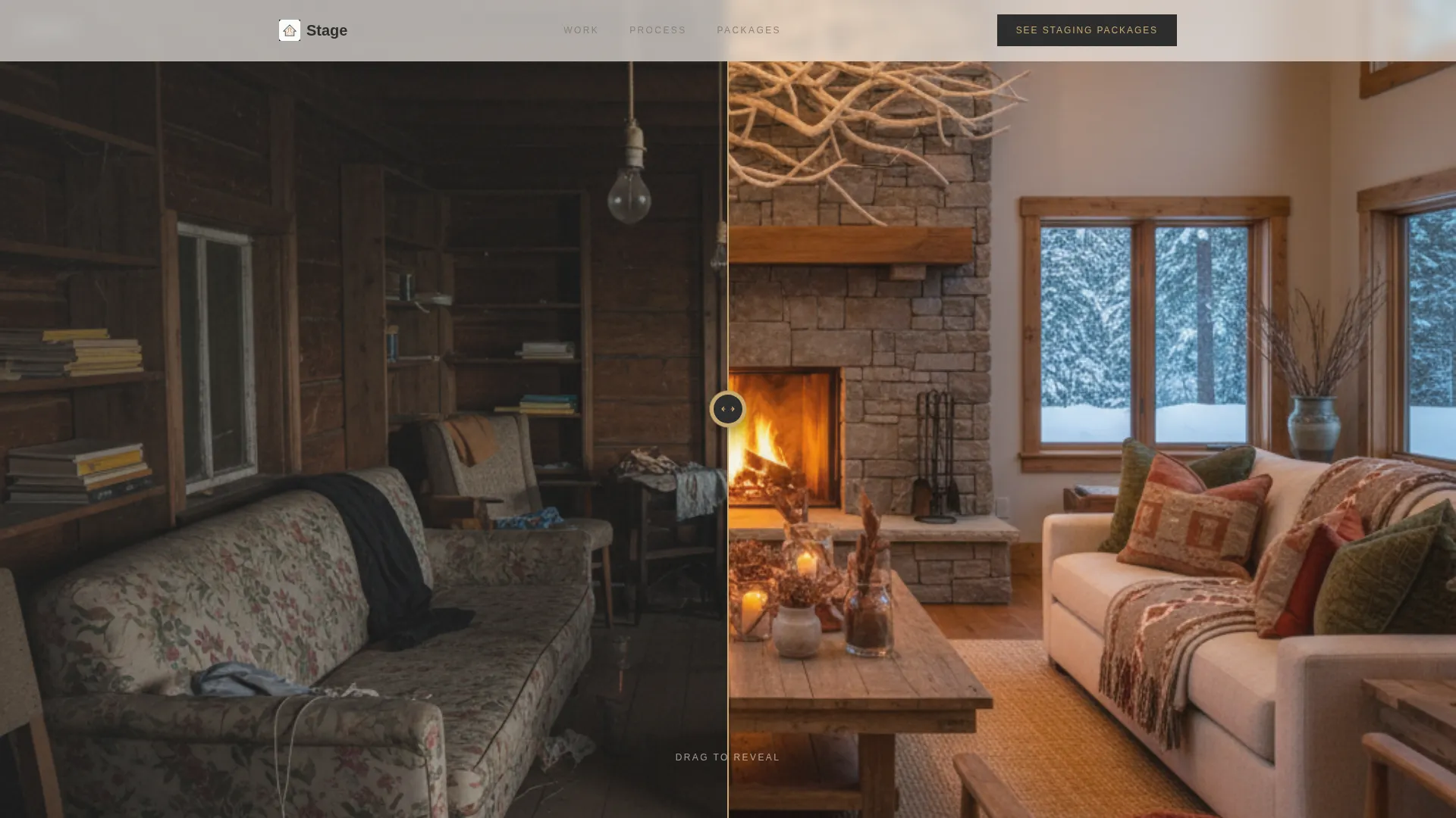
- A full-viewport before-and-after header slider with a brass handle and a type-on headline reveal
- Four sequential room-reveal sections covering the great room, kitchen, bedroom, and porch
- Two placed calls to action and secondary portfolio links beneath each room section
Feature list
This template is organized around a single, disciplined creative idea: the transformation sells itself when the reveal is choreographed correctly. Every feature listed below exists to support that idea.
Full-Viewport Before/After Header Slider
The header splits the screen down the center. The left side shows a dim, cluttered cabin interior. The right side reveals the same room fully staged. The visitor drags a thin brass handle to expose the difference. A serif headline types itself onto the screen only after the slider is moved at least once.
Sequential Room Walkthrough Structure
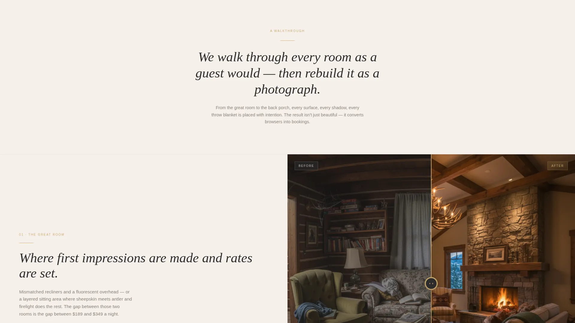
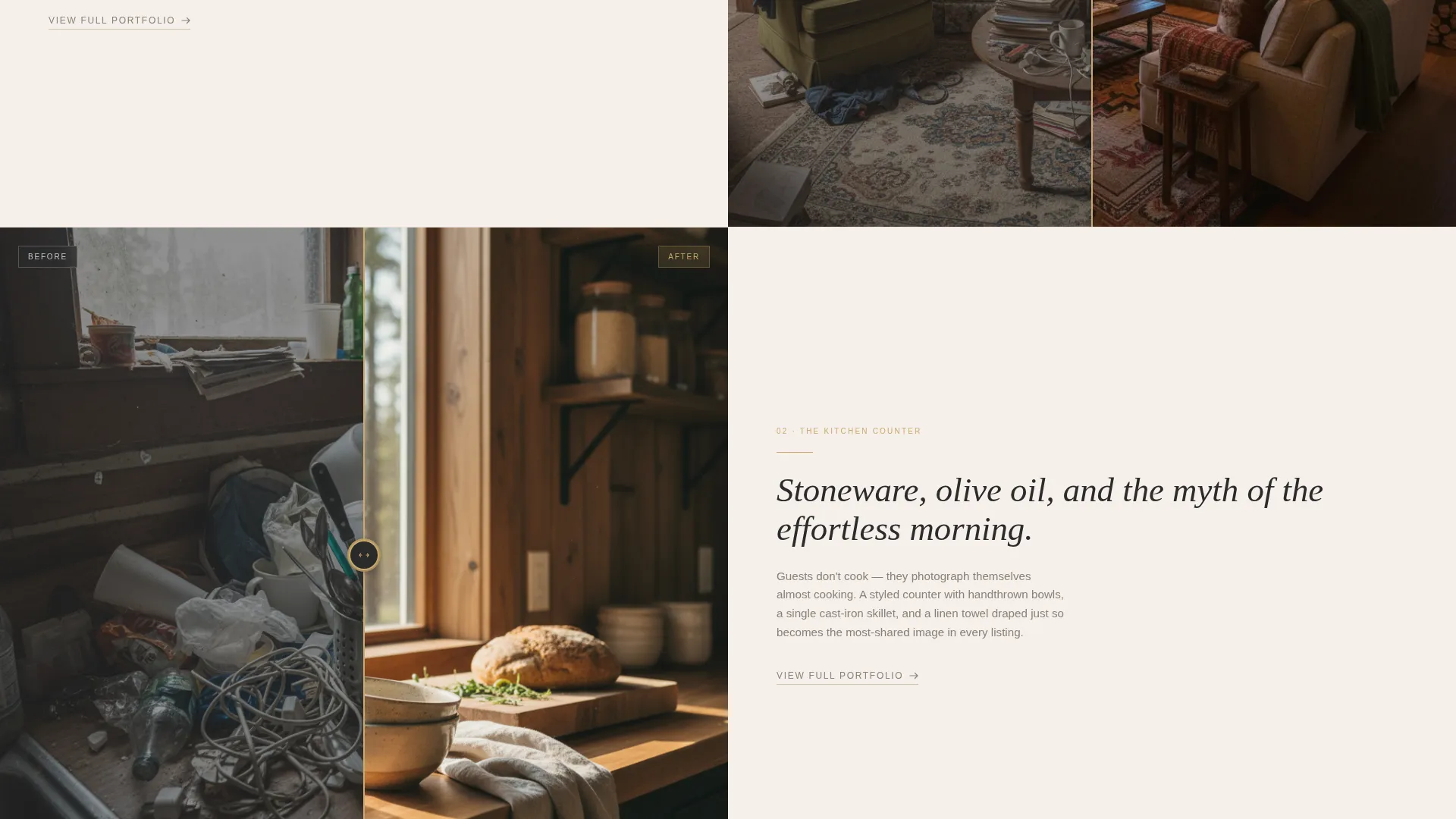
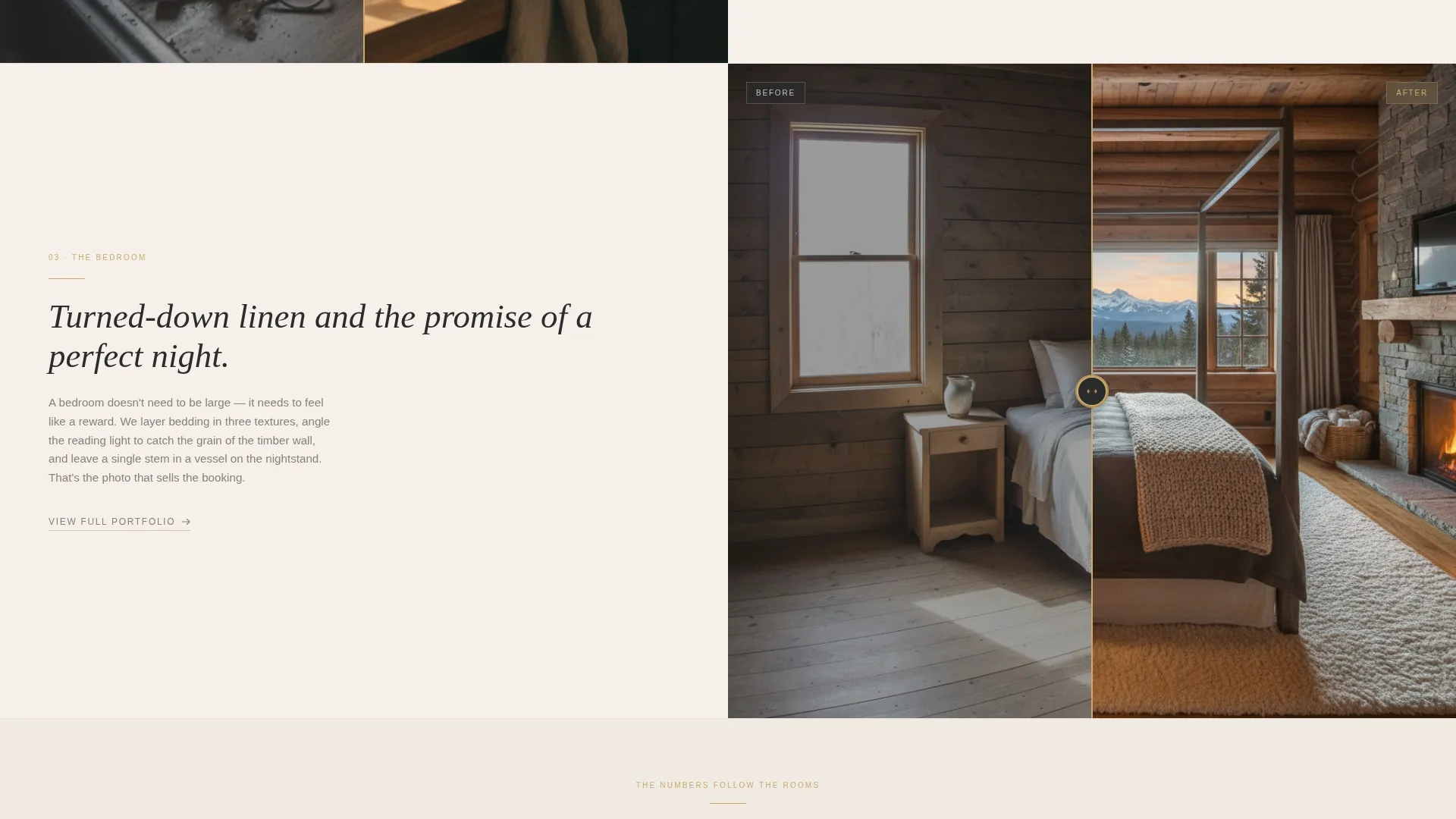
The page scrolls like a walkthrough deeper into the cabin. Each new section introduces a different room: the great room, a kitchen counter, a turned-down bedroom, and a porch at golden hour. The before-and-after contrast grows stronger with each section, building a cumulative case for the studio's work.
Click-Through Call-to-Action Placement
There is no form on this page. The primary call to action, "See Staging Packages," appears in warm brass text on a charcoal background. It is placed once after the third room reveal and once anchored at the bottom of the page after a final full-bleed after image.
Secondary Portfolio Links
A text link labeled "View Full Portfolio" sits beneath each room section. This gives visitors who need more visual proof a clear path forward without disrupting the main conversion flow.
Luxe Minimal Visual Identity
The design uses a Cloud Canvas color system: soft gallery white, warm birch, deep hearth charcoal, and a muted brass accent. The brass is reserved for buttons, divider lines, and hover states. Typography is clean serif. Nothing competes visually; the photography carries the page.
Whitespace-Driven Rhythm
Sections alternate between silence and reveal. Generous whitespace separates each room section, giving the photography room to land. The pacing is intentional: the quiet moments make the staged rooms feel more dramatic when they appear.
Page sections overview
| Section | Purpose |
|---|---|
| Before/After Header | Opens with the slider reveal and delayed headline |
| Great Room Reveal | First room transformation, sets the editorial tone |
| Kitchen Counter Reveal | Styled stoneware scene widens the contrast |
| Bedroom Linen Reveal | Turned-down bedding section deepens desire |
| Porch Golden Hour | Final outdoor reveal before the primary call to action |
| Primary Call to Action | "See Staging Packages" button in brass on charcoal |
| Full-Bleed After Image | Final visual statement before the anchor call to action |
| Anchor Call to Action | Closing "See Staging Packages" button at page bottom |
Design & branding system
The visual identity is built on restraint. Every color, spacing decision, and typographic choice is made to let the photography speak. The result feels like a high-end interiors magazine rendered as a webpage.
- Color palette: soft gallery white (#F5F0EB), warm birch (#D4C5B2), deep hearth charcoal (#2B2B2B), and muted brass (#C9A96E) for accents only
- Typography uses clean serif faces that feel editorial without being decorative
- Brass accent color is strictly reserved for buttons, divider lines, and hover states to maintain visual hierarchy
Mobile & speed optimization
The split-screen layout and slider interactions are designed with touch navigation in mind. Visitors on mobile can drag the before-and-after handle with a finger, and the sequential scroll structure translates naturally to a vertical mobile experience.
- The 50/50 split-screen layout adapts to single-column stacking on smaller screens
- Before-and-after sliders support touch-drag interaction for mobile visitors
- Full-bleed photography sections are sized and positioned to remain impactful at phone-screen dimensions
How this template helps you convert
This template removes every obstacle between a curious visitor and a confident inquiry. The page does not ask for a decision too early. It builds desire room by room, then presents the call to action at the exact moment the visitor is most convinced.
- The interactive header slider creates immediate engagement and emotional investment before a single line of copy is read
- The sequential room walkthrough builds a cumulative visual argument, so by the third reveal the value of staging feels self-evident
- Two strategically placed calls to action catch visitors at peak conviction, and secondary portfolio links retain those who need one more reason to act
Other information about this template
This template is designed for professionals working in the log cabin real estate and short-term rental staging space. It suits studios that serve the Smokies, Blue Ridge, and similar mountain rental markets where visual presentation directly influences nightly rates and booking velocity.
- The page structure is click-through only; there is no contact form or embedded lead-capture element
- The template is built as a single landing page and is intended to connect outbound to a separate staging packages or pricing page
- The Luxe Minimal theme and Cloud Canvas palette make the template adaptable to other high-end rustic or cabin property niches beyond staging
- The before-and-after slider concept works well for any property-focused service where visual transformation is the primary selling point
Theme
Atelier Studio
Creative direction
Calculator/Tool First
Color system
Dark Emerald
Style
Split Screen (50/50)
Direction
Direct Sales
Page Sections
Full-viewport Before/after Header Slider
Sequential Room Walkthrough Layout
Click-through Call-to-action Structure
Secondary Portfolio Text Links
Luxe Minimal Visual Identity
Whitespace-driven Pacing
Related questions
Does this template include a contact form?
Can I use this template for staging services beyond log cabins?
How many before-and-after sections are included?
Where exactly are the calls to action placed?
What triggers the headline to appear on the header?



