Immersive Mixed-Use Development Staging Landing Page
Stagecraft is a full-width immersive landing page template built for mixed-use development staging services. It pairs a dramatic before/after drag slider with a scroll-driven gallery walk, editorial typography, and a warm mineral color system. The result is a page that proves taste before asking for trust, guiding developers and leasing agents toward a single, confident click.
by Rocket studio
Quick summary
Stagecraft is a single-page, long-scroll landing page template designed for premium interior staging services in the mixed-use development market. It opens with a full-viewport before/after drag slider, moves through three photographic project sequences, and closes with a hard case study and two clear calls to action. Every section is built to create a lasting impression and earn a click rather than fill a form.
Who this template is for
This template speaks directly to staging professionals who work at the intersection of architecture, real estate sales, and editorial photography. If your clients are developers, leasing agents, or architects, this page was shaped around your workflow and your audience.
- Mixed-use developers managing ground-floor retail and twenty to one hundred residential units who need vacant space to feel lived-in before buyers arrive for a site visit
- Leasing agents working against tight photography timelines who need a production-ready stage that communicates design intent, not generic rental furniture
- Interior staging teams who want a web presence that reflects the perceived quality of their work and converts developer inquiries into consultations
What problem this template solves
Empty units sit on the market longer than staged ones. The problem is not always the space itself but how it is presented before a buyer ever sets foot in the venue. A staging service needs to prove its eye before a developer picks up the phone, and most template options cannot carry that weight.
- Generic portfolio pages bury the work under navigation clutter, slow the audience down, and increase bounce rate before the photography even loads
- Developers reviewing options on large screens need a presentation that matches the scale and ambition of their project, not a card grid with small thumbnails
- Without a cohesive event stage design logic applied to the scroll experience, even great staging photography fails to build anticipation or move a prospect toward action
What you get with this template
You get a fully structured, dark immersive landing page with every section mapped to a specific moment in the buyer journey. The page is visually appealing, editorially paced, and built to let photography do the convincing.
- A full-viewport before/after drag slider hero, three sequential gallery walk project sections, a ghost call-to-action interlude, a case study section with hard numbers, and a final solid call-to-action block
- A Warm Stone color system using deep charcoal plaster, travertine cream, smoked walnut, and oxidized brass, paired with DM Sans for body text and Fraunces for editorial headlines
- Scroll-linked parallax fades, GSAP ScrollTrigger animation sequencing, GPU-accelerated transforms, and lazy-loaded images baked into the production build
Feature list
This section describes the key functional and design features built into the Stagecraft template. Each one is grounded in the source brief and reflects what a staging service actually needs from a premium landing page.
Before/After Drag Slider Hero
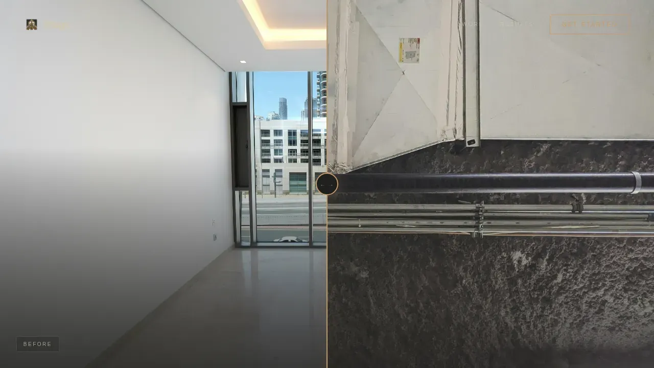
The hero fills the full viewport with a single interactive stage. The left side shows a raw unit with exposed ductwork and poured concrete floors. The right side shows the same unit staged to editorial perfection. A thin brass handle sits between them. The visitor drags it, and a fade-in headline appears: they do not buy the unit, they buy the life inside it. First impressions are set before a single word of body copy is read.
Scroll-Driven Gallery Walk
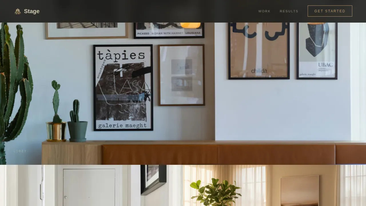
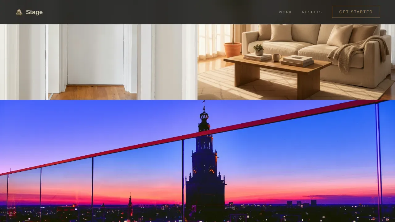
Three project sequences create the sense of a private after-hours showing. Each section presents three to four full-bleed images that move through the space the way a buyer would walk it: lobby, corridor, living room, balcony view. Slow parallax fades dissolve one space into the next. The pacing becomes more deliberate as the page deepens, reducing words per section and letting the stage designs speak.
Ghost and Solid Call-to-Action System
The primary call to action, "See What We'd Do With Your Units," appears first as a ghost button in oxidized brass after the third project. It returns as a solid button anchoring the final section. A secondary link, "Download Our Developer Lookbook," sits alongside it. No form appears on this page. The click leads to a tailored intake page, keeping conversion rates focused on a single intent signal.
Hard Case Study Block
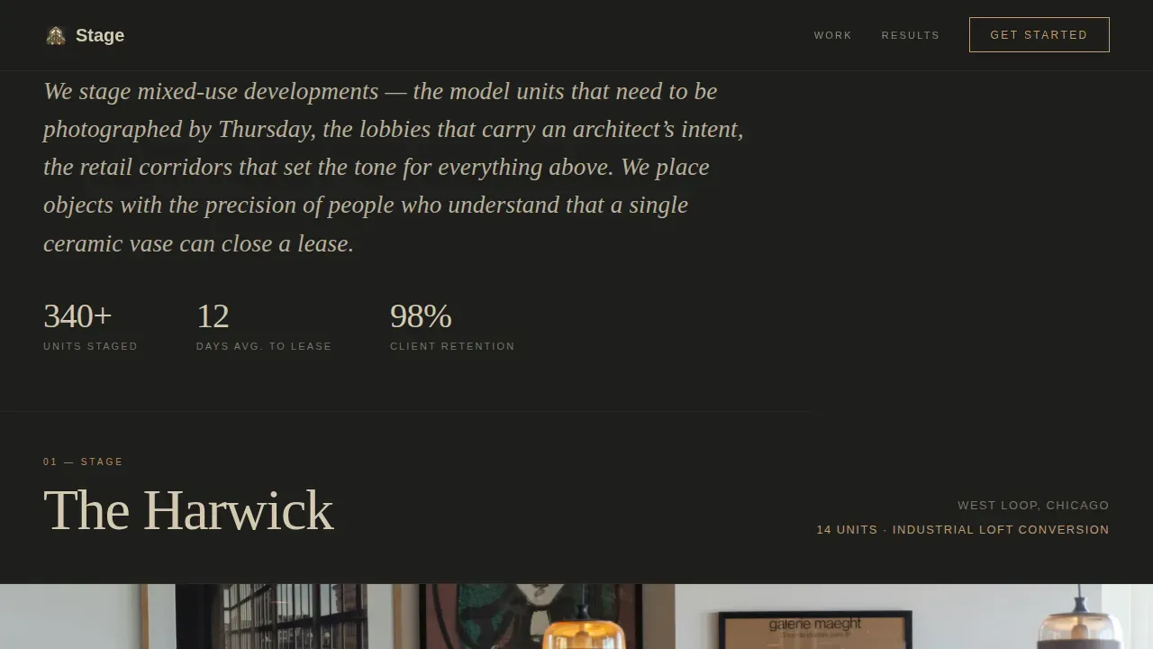
The final gallery section breaks the visual silence with a short, specific case study. It displays unit count, days on market before staging, and days on market after. These numbers do the work that testimonials cannot. The audience does not need to imagine the return; it is stated plainly.
Warm Stone Editorial Branding
The color system uses deep charcoal plaster (#1E1E1C) as the base, travertine cream (#D4C9B0) for body text, smoked walnut (#5C4033) for depth layers, and oxidized brass (#C49A6C) reserved for hover states and calls to action. Fraunces handles editorial headlines. The palette and type pairing create a brand identity rooted in material warmth, not digital flatness.
Parallax Animation and Interaction System
GSAP ScrollTrigger drives all scroll-linked parallax fades and section transitions. The before/after slider uses drag interaction. Images are lazy-loaded and transforms are GPU-accelerated. The animation system is calibrated for desktop-first presentation while maintaining mobile parity, so the immersive show holds across screen sizes.
Page sections overview
| Section | Purpose |
|---|---|
| Before/After Hero | Drag slider reveals the staging transformation and fades in the brand headline |
| Harwick Gallery Walk | Four-image loft conversion sequence guides the audience through the staged space |
| Meridian Gallery Walk | Three-image high-rise residential sequence shows lighting and material detail |
| Ghost call to action Interlude | Brass ghost button prompts early action after the first two projects |
| Caldwell Mixed-Use Walk | Ground-floor retail and 28-unit residential sequence demonstrates full project scale |
| Case Study Block | Hard numbers on unit count, pre-staging days on market, and post-staging days on market |
| Final call to action Section | Solid brass button and lookbook download anchor the page close |
| Minimal Footer | Centered superhuman-style footer closes the page without visual noise |
Design & branding system
The visual identity is built around a Dark Immersive theme that treats every surface as a warm mineral rather than a digital element. The palette absorbs light rather than reflecting it, which keeps the photography dominant and the interface receding.
- Colors: deep charcoal platter (#1E1E1C) base, travertine cream (#D4C9B0) text, smoked walnut (#5C4033) depth layers, oxidized brass (#C49A6C) for hover states and calls to action only
- Typography: DM Sans for body copy across all paragraphs and labels, Fraunces for editorial stage headlines and section titles, with sizing and weight calibrated to feel like a printed editorial spread rather than a website
Mobile & speed optimization
The template is built desktop-first because developers and architects reviewing project options typically work on large screens. That said, the immersive elements are structured to maintain full function on smaller viewports so the experience does not degrade for a prospect checking the page on a phone before a site visit.
- Images are lazy-loaded across all gallery sections to reduce initial load time and keep bounce rate low on content-heavy scroll sequences
- All animation transforms are GPU-accelerated so parallax fades and slider drag interactions remain smooth without taxing the device, and the long-scroll production layout holds its pacing on both desktop and mobile
How this template helps you convert
The page is built around a single conversion goal: earn the click to the intake page. It does not ask for trust before it proves taste. Every section is ordered to accumulate evidence before presenting an ask, making the call to action feel like a natural next step rather than an interruption.
- The before/after hero creates immediate interactive engagement, giving the audience a hands-on sense of the staging team's transformation ability before any copy makes a claim, which is a critical role for first impressions in a visually led service
- The gallery walk sequences and case study build a layered production argument, showing three distinct project types at scale so developers can self-identify their own event type or project profile in the work before the final call to action appears
Other information about this template
This template sits at the intersection of real estate staging and immersive event production design principles. Many of the structural decisions borrow from how a well-designed stage is used as the centerpiece of a production and the visual representation of a brand. That logic applies directly to how a staging service presents its portfolio online.
- The single-page, long-scroll format maintains narrative flow across all sections, which is the same approach used in effective event stage design where audience flow is managed through space sequencing rather than navigation menus
- The template supports unique stage designs for each project section, meaning each gallery walk can carry a distinct visual event theme without breaking the overall system, whether the project is an industrial loft conversion, a high-rise residential building, or a ground-floor retail and residential mix
- Stage designs presented through the gallery walk borrow from the logic of multi-level stage designs that add depth and drama: lobby to corridor to living room to balcony view mirrors the way attendees move through a physical event stage
- The template is well-suited for staging teams who also serve adjacent markets such as corporate events, private events, or product launch presentations where the same editorial photography and before/after staging logic applies
- For teams working across live events and virtual events simultaneously, the page structure can support live streaming links or additional sections for hybrid events without breaking the base layout
- The case study block mirrors the measurable objectives that effective immersive environments should trace back to, including days on market reduction, which is the staging equivalent of audience engagement and conversion rates in live event production
- The stagecraft immersive mixed use development staging landing page template is designed as a digital showroom that simulates the experience of a yet-to-be-completed development, functioning the same way an immersive show does for a live audience
- Projection mapping, LED walls, and LED screens are not part of this template's feature set, as it is a web template rather than a physical event production tool; however, staging professionals who also manage corporate events, live events, or brand activations involving projection mapping, LED walls, LED screens, motion sensors, or rigging points will find the page's visual language and presentation logic consistent with how those event stage design disciplines communicate value to clients
- Teams managing venue constraints such as low ceilings or unusual rigging points in physical staging work will recognize the same planning discipline reflected in the way this page's event space is structured: every section accounts for what the content displayed needs to achieve before the next section begins
- Pre production planning is baked into the template's section order; each stage of the scroll corresponds to a pre production decision about what the audience sees and when, including camera angles used in photography, lighting effects captured on film, and the pacing of immersive visuals across the scroll
- The template supports social proof placement for partner and media logos, which provides instant authority for new projects, and the case study section acts as the equivalent of a product launch proof point for staging services entering new development markets
- Key points such as unit count, square footage, and days-on-market delta are surfaced in the case study block, giving developers the detailed information they need to justify a staging budget before the next event or upcoming event in their development pipeline
- Brand messaging and brand identity are carried entirely through the visual system and editorial typography rather than through copy-heavy sections, which keeps the page visually led and the set design of the page itself coherent
Theme
Dark Immersive
Creative direction
Gallery Walk
Color system
Warm Stone
Style
Full-Width Immersive
Direction
Click-Through
Page Sections
Full-viewport Before/after Drag Slider
Scroll-driven Gallery Walk Sequences
Ghost and Solid Call to Action Architecture
Hard Case Study Numbers Block
Warm Stone Dark Immersive Color System
GSAP Scrolltrigger Animation System
Related questions
Who is this landing page template designed for?
Can I customize the project sections for my own staging portfolio?
Does this template include a contact form?
Is the before/after drag slider included in the template?
What makes this template different from a standard portfolio page?



