Fractional Real Estate Investment Landing Page Template
The Stake landing page template is a split-screen, gallery-style page built for fractional real estate investment platforms. It combines a Ken Burns aerial hero, scrolling case study narratives, and a five-question inline assessment to match investors with deals. The design uses an Atelier Studio palette of gallery white, soft graphite, misted lavender, and matte gold to create a curated, private-gallery feel that builds instant trust.
by Rocket studio
Quick summary
Stake is a single-page landing page template designed for fractional real estate investment platforms. It pairs cinematic visuals with a structured deal-narrative layout and an inline quiz that captures emails by serving personalized deal matches. The result is a real estate landing experience that feels editorial, moves purposefully, and guides every visitor toward one primary action: signing up for a matched portfolio.
Who this template is for
This landing page template speaks directly to founders and product teams building real estate crowdfunding platforms. It is equally well suited to marketing managers who need a high-performing page ready to deploy without rebuilding from scratch.
- Fintech and property investment platforms targeting salaried professionals aged 35 to 45
- Real estate business operators who want to present commercial properties and fractional ownership deals in a polished, credible format
- Growth teams running ad campaigns who need a landing page that converts visitors efficiently and aligns with campaign messaging
What problem this template solves
Most real estate landing pages fail financially literate investors. They lead with generic stock imagery, bury key metrics, and offer no path that feels personalized. The result is high bounce rates and low sign up completions, even when the underlying investment is strong.
This template solves that problem with three structural choices:
- It tells the story of real deals from sourcing through exit, giving potential buyers and investors detailed information rather than vague promises
- It replaces a static call to action with a five-question assessment, so every visitor receives a result matched to their budget, risk tolerance, and preferred property type
- It gates a deal memo PDF behind a quiet text link, creating a secondary conversion path that catches analytical investors who skip the quiz but cannot resist the data
What you get with this template
This template ships as a complete, single-page layout with every section pre-designed and ready to populate with your platform's real content. No section is a placeholder and no component is speculative.
- A panoramic split-screen hero with a frosted-glass panel, Ken Burns CSS drift animation, and a single editorial headline that sets tone before any call to action appears
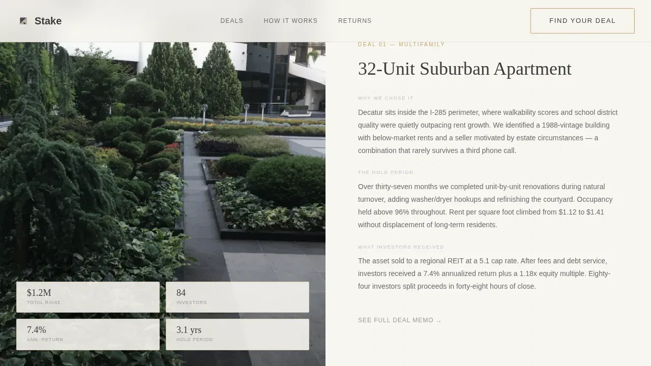
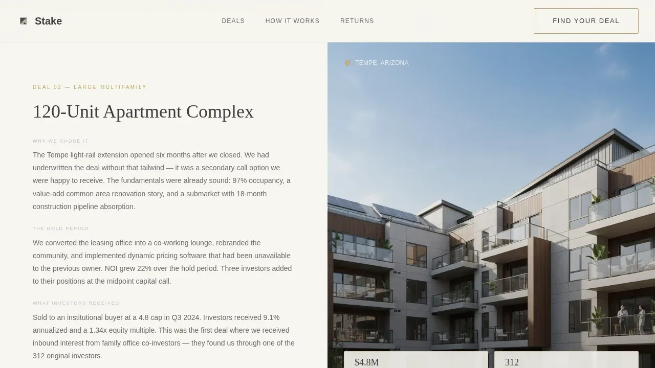
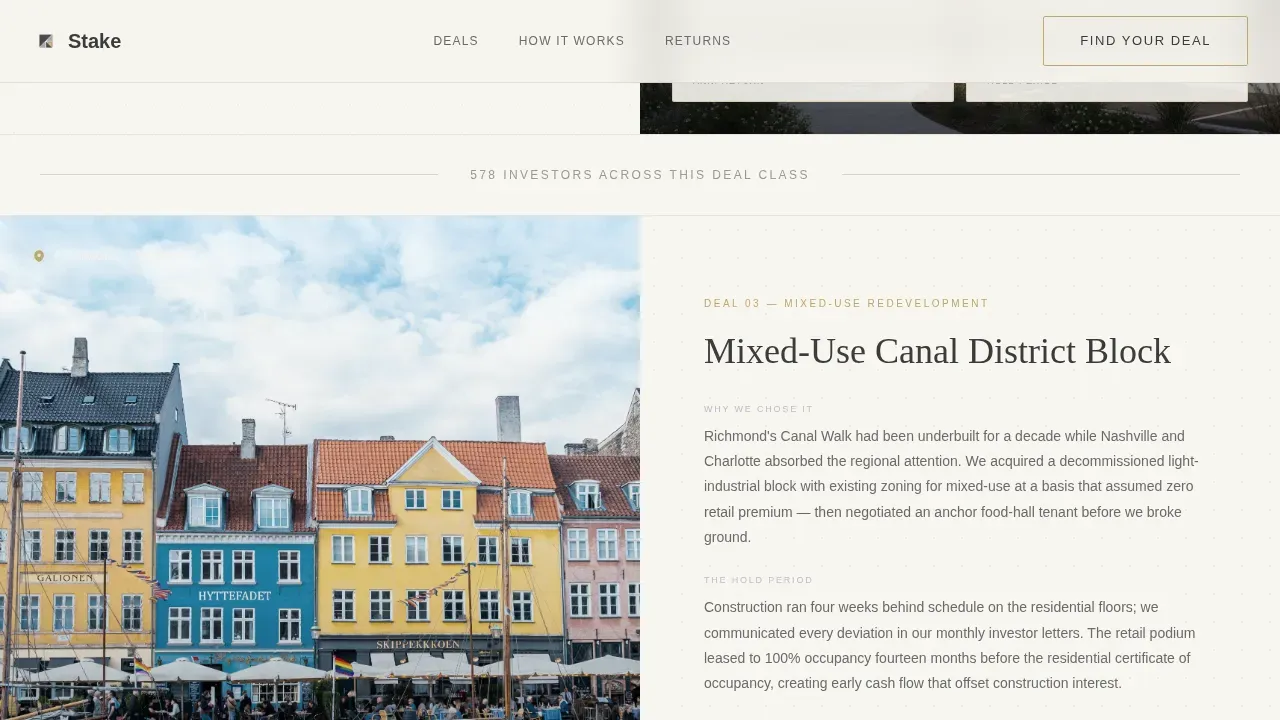
- Three escalating case study sections, each pairing a property photo, location pin, and key metrics panel on the left with a three-paragraph deal narrative on the right, moving from suburban multifamily through 120-unit apartment complex to mixed-use redevelopment
- A five-question inline assessment labeled "Find Your First Deal" that swaps the left panel's imagery dynamically as visitors answer, ending with a personalized deal-match summary and an email capture field
Feature list
This landing page template includes the following built-in features, each prompt-defined and ready for use.
Ken Burns Aerial Hero with Frosted-Glass Panel
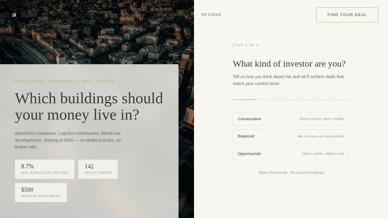
The hero section fills the full viewport with a panoramic city skyline photograph at golden hour. A CSS Ken Burns drift animates the image edge to edge. A frosted-glass panel on the left half carries a single line of graphite type. No call to action appears yet. The skyline does the selling first, giving visitors five patient seconds before the right half resolves into the assessment's opening question.
Escalating Case Study Narrative Layout
Three case study sections scroll in sequence, each more complex than the last. The Maple Grove deal introduces suburban multifamily ownership. The Meridian Portfolio steps up to a 120-unit apartment complex. The Canal District closes with a mixed-use redevelopment. Each left panel displays the property photo, location pin, total raise, investor count, and annualized return. Each right panel narrates the deal in three short paragraphs. Between case studies, a thin lavender rule and a single stat keep the reading rhythm steady.
Five-Question Inline Assessment with Image Swapping
The "Find Your First Deal" assessment is the page's main conversion engine. Visitors answer a few questions covering investment comfort level, preferred property type, target hold period, starting capital range, and accreditation status. Selecting a property type, such as logistics warehouse, swaps the left panel's photograph in real time. At the end, the visitor receives a personalized deal-match summary alongside an email capture field labeled "Send My Portfolio Match."
Secondary PDF Gate via Text Link
Below each case study section, a quiet text link reads "See full deal memo." Clicking it gates a PDF behind an email capture. This path is designed for the analytical investor who reads cap rates the way others read sports scores and who skipped the quiz but cannot ignore detailed property data.
Cloud Canvas Color System with Matte Gold Interactivity
The entire page uses four colors with strict rules. Gallery white (#F7F5F0) covers backgrounds. Soft graphite (#3B3B3B) handles all body type. Misted lavender (#C4B8CC) appears as section dividers and hover states. Matte gold (#C2A66B) fires only on interactive elements: call to action borders, progress indicators inside the quiz, and clickable states. This discipline makes the gold feel earned every time it appears.
DM Sans and Fraunces Typography Pairing
Body copy uses DM Sans for clean, modern readability. Display headlines use Fraunces, a serif with editorial weight. The combination creates the visual impression of type set by letterpress on warm off-white paper. This pairing gives the page authority without formality and warmth without casualness.
Page sections overview
| Section | Purpose |
|---|---|
| Panoramic Hero | Aerial split-screen intro, frosted-glass headline, Ken Burns animation |
| Maple Grove Case | Suburban multifamily deal narrative with left-panel metrics |
| Lavender Stat Rule | Breathing pause between case studies with a single hold-period stat |
| Meridian Portfolio Case | 120-unit apartment deal narrative with investor and return data |
| Lavender Stat Rule | Second rhythm break with a curated market stat |
| Canal District Case | Mixed-use redevelopment narrative, most complex deal in the sequence |
| Find Your First Deal | Five-question inline assessment with dynamic image swapping |
| Deal Match Summary | Personalized result panel and email capture field |
| Footer Layout | Horizontal footer with platform links and regulatory disclosures |
Design & branding system
The visual identity follows an Atelier Studio direction, built to feel like stepping into a private gallery where each asset on the wall is a building you could own a piece of. Every design decision reinforces quiet confidence and institutional credibility without corporate coldness.
- Color system uses gallery white for all backgrounds, soft graphite for body text and headlines, misted lavender for dividers and hover transitions, and matte gold strictly for interactive and earned states such as call to action borders and quiz progress indicators
- Typography pairs DM Sans for body copy with Fraunces serif for display headlines, creating an editorial warmth that reads like a well-produced investment memorandum rather than a typical fintech website
- The color schemes are purposefully restrained, so when matte gold appears, it carries visual weight and signals to visitors that something clickable or meaningful has arrived on the page
Mobile & speed optimization
This template is built desktop-first to suit the financially literate professional audience who will engage with detailed property metrics and multi-paragraph deal narratives on a larger screen. The layout is fully mobile responsive for visitors arriving via mobile social media or text links.
- CSS animations use native scroll-behavior and Intersection Observer to keep the page light; transitions fire only when sections enter the viewport, reducing unnecessary rendering work
- The split-screen layout stacks gracefully on smaller screens, with the left-panel property images, listing metrics, and deal narratives reordering into a single-column flow that preserves readability at any screen width
- Load times are kept lean by design: professional photos load progressively, quiz panel image swaps use preloaded assets, and no external video embeds or heavy third-party scripts add latency to the initial page load
How this template helps you convert
A well-designed landing page can transform casual visitors into serious leads. This template concentrates every design and structural choice on a single conversion goal: email capture through a deal-match quiz or a PDF gate. High-converting landing pages keep visitors focused, and this page does exactly that by removing distractions and building confidence section by section.
- The case study narrative structure delivers social proof in the form of real deal metrics, total raise figures, investor counts, and annualized returns, giving potential clients the detailed information they need before they feel ready to sign up
- The five-question assessment creates a personalized moment that motivates action: visitors who see a deal matched to their budget, risk preference, and property type are far more likely to enter their email than visitors who land on a generic listings page
- The secondary PDF gate below each case study catches the segment of investors who need more data before committing, turning a potential exit into a second email capture opportunity and keeping the entire process inside the page
Other information about this template
This section covers additional context about how the template fits into a broader platform strategy and what users can expect when deploying it.
- The stake curated fractional real estate investment landing page template is designed with a specific audience in mind: salaried professionals in the real estate market who want access to institutional-grade deals without becoming landlords or navigating complex property management responsibilities
- The page is built to serve as a trusted resource for first time buyers entering real estate investing, as well as experienced investors who already track market trends and want a platform that matches their analytical expectations
- Regulatory information, risk disclosures, and compliance text are accommodated in the footer section, placed to remain visible without disrupting the visual flow of the deal narrative above, so the site stays credible without feeling like a legal document
- The template supports popular searches and landing page structures common to real estate crowdfunding platforms, including deal-specific listings, property details panels, and investment metric displays that align with what financially literate visitors expect to find
- For teams running ad campaigns, the landing page is structured so that clear messaging in the hero and case study sections aligns directly with campaign copy, reducing the message gap that lowers conversion rates between an ad and its destination page
- The page is ready to connect with tools like Google Analytics for traffic and conversion tracking, giving marketing teams the data they need to measure sign up rates, quiz completions, and PDF gate clicks across different audience segments and ad campaigns
- Virtual tours and additional property videos can be embedded within the case study panels to further showcase properties and give potential buyers a richer sense of location, square footage, and asset character before they reach the assessment
- First time buyers and seasoned investors alike benefit from the escalating complexity of the case study sequence: it builds confidence that the platform can sell investments across scales, from entry-level ownership stakes to large commercial properties
- The template can serve as a high-quality starting point for teams who want to create landing pages for multiple property types, adapting each case study section for different assets such as logistics warehouses, apartment complexes, or mixed-use developments
- Sellers and platform operators who want to drive traffic from both organic search and paid ad campaigns will find the page's structure and color schemes compatible with a wide range of brand directions, since the Cloud Canvas palette is neutral enough to adapt while the Atelier Studio layout remains distinctive
- The page is built around one primary action per visit, keeping visitors focused rather than overwhelmed, which directly supports stronger conversion rates and cleaner data for teams optimizing their real estate business over time
Theme
Atelier Studio
Creative direction
Case Study Narrative
Color system
Cloud Canvas
Style
Split Screen (50/50)
Direction
Quiz/Assessment
Page Sections
Ken Burns Hero with Frosted-glass Panel
Escalating Case Study Narrative Sections
Five-question Deal-match Assessment
Secondary PDF Gate Text Link
Cloud Canvas Color System
Atelier Studio Editorial Typography
Related questions
Can I adapt this template for different property types beyond the three case studies?
Does the five-question assessment require a backend or third-party integration to function?
Is this landing page suitable for first time buyers who are new to fractional real estate investing?
How does the PDF gate work as a secondary conversion path?
Can the color scheme and typography be customized to match an existing brand?


