Paid Product Managers Community Landing Page Template
Standup is a single-column landing page template built for a paid product managers community. It follows a Hero's Journey narrative scroll, guiding visitors from PM isolation to transformation through unedited member stories and real social proof. The warm Slate and Sky color system, Fraunces serif headlines, and a single click-through call to action make this template feel honest, human, and ready to convert.
by Rocket studio
Quick summary
Standup is a single-column flow landing page template for a paid product managers community and membership. It narrates transformation through five emotionally grounded sections, from PM isolation to earned clarity. The design uses a warm editorial palette and a single primary call to action that leads visitors to a membership breakdown page.
Who this template is for
This template is built for community founders, membership operators, and product leaders who want to launch a paid peer community for product managers. It speaks directly to the PM experience without softening it.
- Founders building a paid community or membership for mid-career product managers at Series B startups
- Community operators targeting senior product leads at enterprise companies who want honest peer conversation
- Coaches or operators serving solo product managers at early-stage teams who have never had a PM mentor
What problem this template solves
Most community landing pages list features and pricing tiers. They sell the room before the visitor believes the room exists. This template solves the trust problem first by letting the story do the convincing.
- Product managers do not respond to framework-heavy copy; this template leads with emotional honesty and real member language
- Visitors need to feel the community before they click; the Hero's Journey scroll builds that feeling section by section
- A single, focused call to action prevents decision fatigue and moves qualified visitors toward the membership breakdown page
What you get with this template
You get a fully structured, single-column landing page layout built around five narrative sections. Every block has a defined emotional job, and the copy direction is grounded in the product managers community brief.
- A cinematic full-bleed photo header with a fade-in headline and one sky-blue call-to-action button
- Four body sections covering the ordinary world of PM isolation, inside the community room, a member transformation story, and a return-with-clarity close
- A linear single-row footer and a secondary text link that offers additional social proof for hesitant visitors
Feature list
This template ships with a clear set of design and layout capabilities grounded in the source brief.
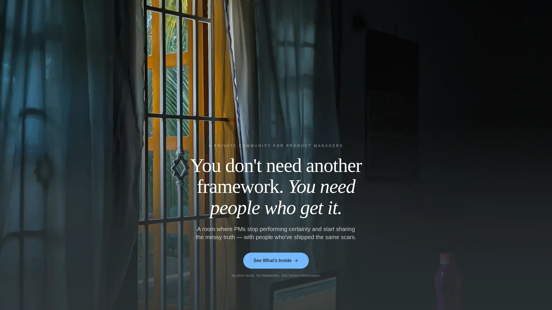
Full-Bleed Cinematic Header
The header uses a real, unposed, slightly overexposed photograph at full canvas width. A headline fades in over the image on load. There is no navigation bar or logo cluster, only the photo, the words, and a single call-to-action button below.
Hero's Journey Scroll Narrative
The page is structured as a five-act emotional arc. It opens in the ordinary world of PM isolation, crosses into what the community looks like inside, moves through a vulnerability and transformation section, and closes with a confidence-and-clarity return. Each section deepens the emotional stakes before asking for a click.
Scroll-Reveal and Fade-In Animations
Section transitions use fade-in reveals and scroll-linked word animations. Staggered card appearances and hover states on member quotes create a sense of live, breathing content without feeling flashy or distracting.
Dual Call-to-Action Placement
The primary call to action, "See What's Inside," appears twice: once beneath the header and once after the member transformation section. A secondary text link, "Read member stories," anchors below the community screenshot section for visitors who need more proof before committing.
Unedited Social Proof Blocks
The template includes layout blocks designed for real member quotes, thread screenshots, voice-note callouts, and small-group calendar previews. These elements are placed deliberately to build trust before each call-to-action moment.
Warm Editorial Typography System
Headlines use Fraunces, a serif typeface with warmth and editorial authority. Body copy uses DM Sans for clean, readable paragraphs. The combination gives the page the feeling of a considered, well-edited publication rather than a generic SaaS sign-up page.
Page sections overview
| Section | Purpose |
|---|---|
| Hero Header | Set emotional tone, deliver headline, present first call to action |
| Ordinary World | Show PM isolation proof through solo Slack and misunderstood reviews |
| Inside the Room | Display community screenshot, voice note, and small-group call calendar |
| Member Transformation | Present vulnerability quote and failure-to-trajectory story |
| Return and Close | Deliver clarity, confidence, and final call-to-action button |
| Footer | Linear single-row footer with minimal supporting links |
Design & branding system
The visual identity follows a Family First theme built around a Slate and Sky color system. The palette is designed to feel like a Saturday morning on the back porch, coffee still warm, sky just clearing.
- Cloud white (#FAF9F6) dominates the canvas as the background; slate (#2D3436) anchors every headline; heather gray (#636E72) softens body paragraphs; sky blue (#74B9FF) appears only on buttons and interactive highlights
- Fraunces serif headlines carry editorial warmth, while DM Sans body text keeps long-form paragraphs clean and readable
- Animation is set to medium intensity using scroll-reveal word transitions, fade-in sections, and staggered card appearances to keep the scroll feeling alive without overwhelming
Mobile & speed optimization
The template is built desktop-first to match the primary audience of product managers on laptops in the evening, with strong mobile responsiveness for on-the-go access.
- Desktop-first layout with a responsive single-column flow that adapts cleanly to smaller screens
- Static sections use server component patterns and CSS scroll-behavior for smooth, performant transitions without heavy JavaScript overhead
How this template helps you convert
The page earns the click rather than demanding it. Every design and copy decision is in service of one outcome: getting a qualified product manager to tap "See What's Inside."
- The Hero's Journey structure means visitors experience the story of transformation before they see any pricing, which builds emotional investment and reduces resistance at the click point
- Dual placement of the primary call to action catches both early-decision visitors and those who need the full story before committing
- Unedited member quotes and real thread screenshots give the community an existing, warm feeling, so the visitor's mental shift is from "should I join?" to "how do I get in?"
Other information about this template
This template is designed for a specific niche: the paid product managers community and membership space. A few additional details are worth knowing before you build.
- The template is categorized under Community and Nonprofit with a subcategory focus on product managers communities
- It is localized for English-language audiences using USD pricing and US date formats
- The footer follows a Pattern 1 linear single-row layout, keeping the close of the page clean and uncluttered
- The template style is a single-column flow, meaning all content scrolls vertically in one continuous narrative thread


Theme
Family First
Creative direction
Hero's Journey
Color system
Slate & Sky
Style
Single Column Flow
Direction
Click-Through
Page Sections
Full-bleed Cinematic Header
Hero's Journey Scroll Narrative
Scroll-reveal and Fade-in Animations
Dual Call-to-action Placement
Unedited Social Proof Layout Blocks
Warm Editorial Typography System
Related questions
Who is this landing page template designed for?
Does this template include pricing or enrollment sections?
Can I use my own member quotes and screenshots?
What animations are included in this template?
How many calls to action does this template include?


