Student Finance Professional Website Template
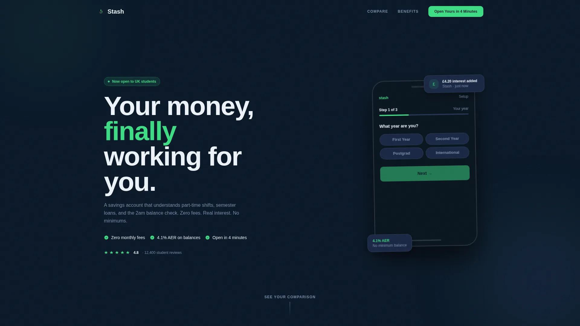
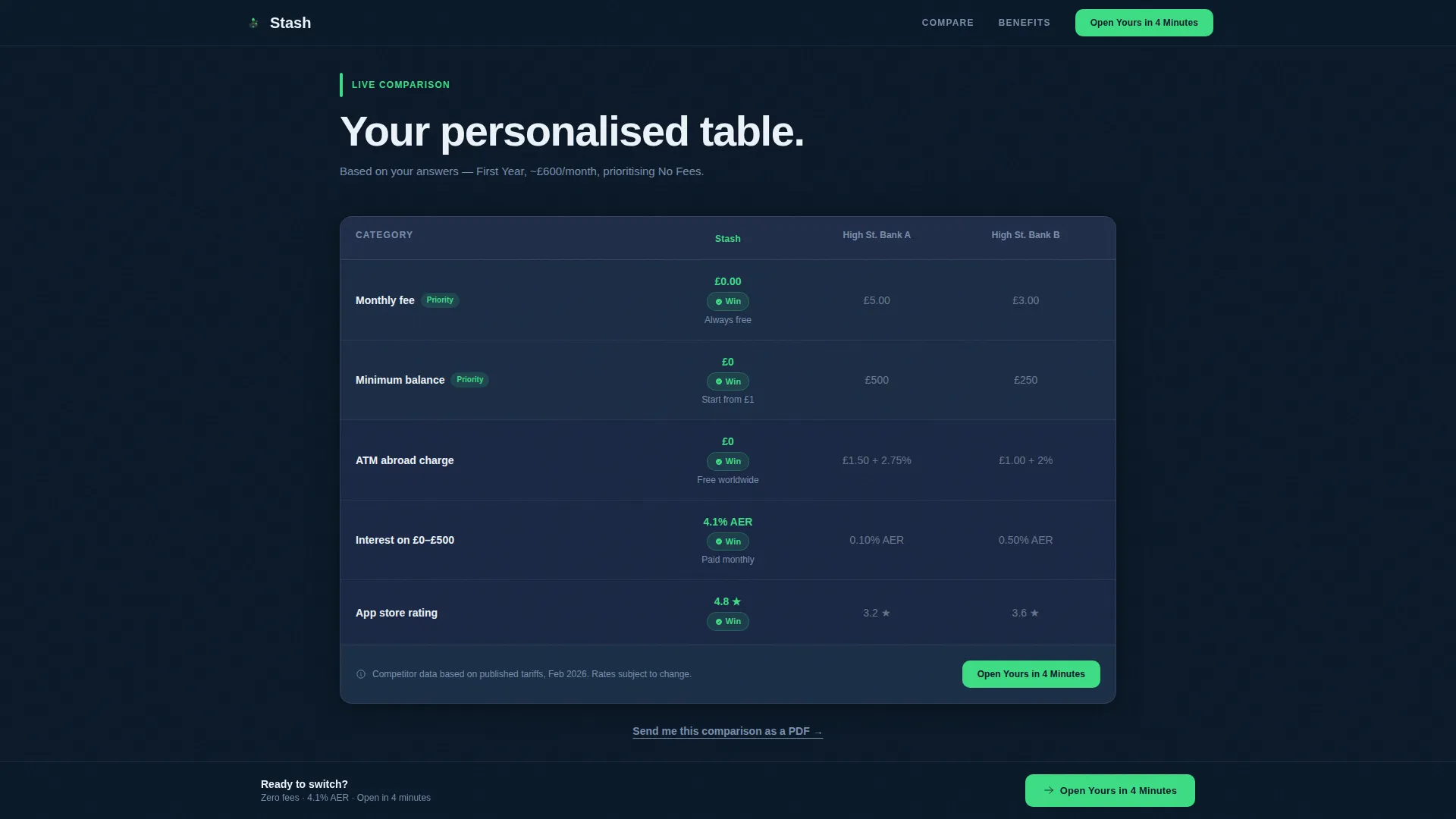
Stash is a dark-mode student savings account landing page built around a personalised comparison journey. A three-step onboarding form generates a live table pitting Stash against two anonymised high-street banks. Signal-green win chips highlight every advantage row by row, and a short lead-gen form captures applicants once the numbers have done the convincing.
by Rocket studio
Quick summary
Stash is a single-page fintech landing page designed for UK student savers. Visitors answer three quick questions, then watch a personalised comparison table build in real time. Every section from the floating phone mockup header to the sticky call-to-action bar is engineered to turn curiosity about student savings into a confident account application.
Who this template is for
This template suits fintech teams, student banking products, and early-stage financial services brands that need to convert student visitors before asking for personal data. It works best when the product genuinely competes on fees, interest rates, or ease of access.
- First-year undergrads opening their first independent savings account
- International students navigating unfamiliar fee structures and foreign charges
- Postgraduate students managing stipends or irregular research income over long study windows
What problem this template solves
Most students distrust financial marketing because it leads with jargon and asks for personal details before proving any value. This template flips that sequence. It lets the visitor interact with real comparison data first, so trust is earned through evidence before a single form field is filled in.
- Students struggle to compare savings accounts without a clear side-by-side view of fees and interest
- Standard landing pages ask for signup before showing the student why the product is better
- Generic financial pages feel corporate and intimidating at the moment students need calm clarity
What you get with this template
You get a fully structured, single-page lead-generation layout built specifically for a student savings account. The page moves visitors through personalisation, comparison, and conversion in a single confident scroll.
- A three-step onboarding form embedded in a floating phone device mockup
- A live five-row comparison table that populates from the visitor's form answers
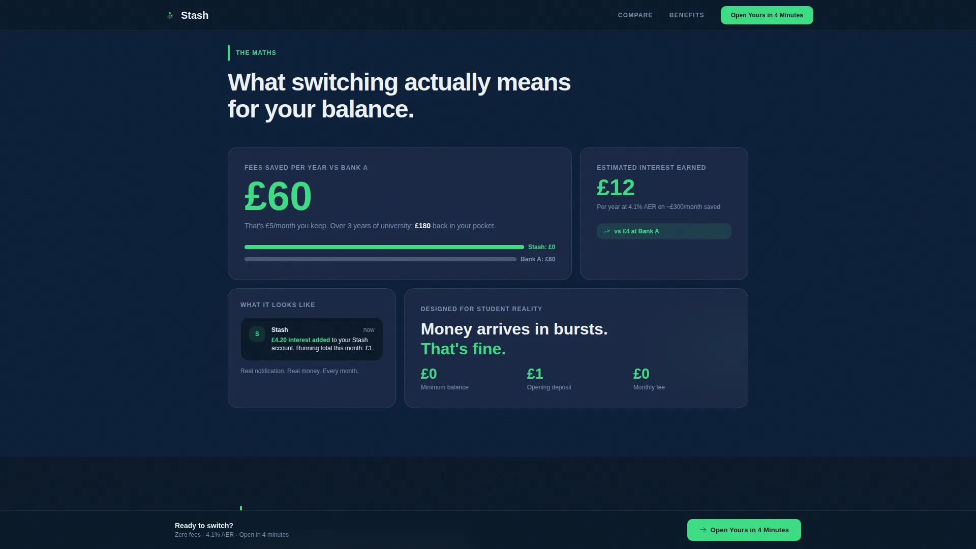
- Dashboard-style cards including a mini interest calculator, an animated fee-saved counter, and a notification mockup
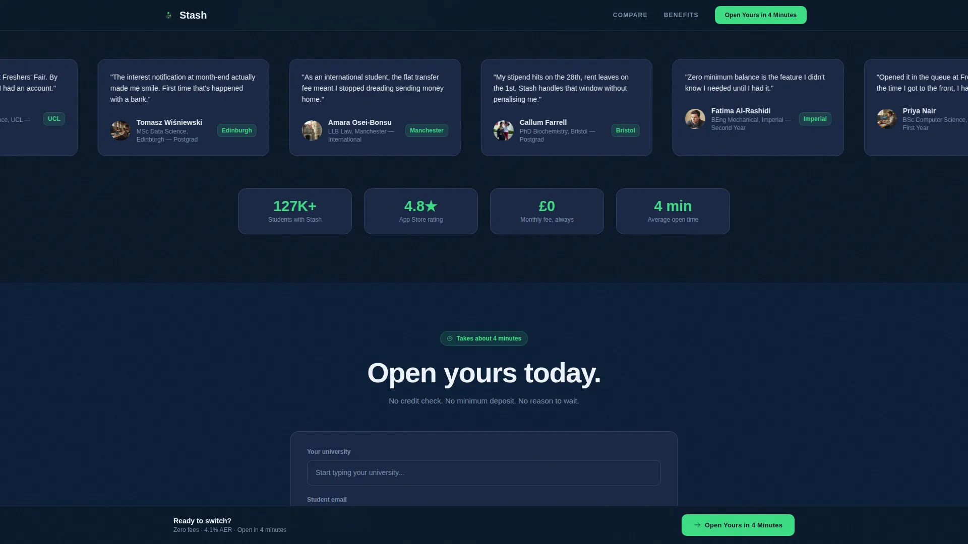
- A social proof strip with student testimonial quotes and university name badges
- A dual-path lead capture form with a primary signup flow and a secondary email-only path
Feature list
This template combines high interactivity with a focused conversion flow. Each component is built to reduce drop-off and move the visitor one step closer to opening an account.
Three-Step Personalisation Form
The header form guides visitors through year of study, estimated monthly income via a slider from £0 to £2,000, and priority preferences across three toggleable chips: No Fees, High Interest, and Instant Transfers. A progress bar glows signal-green as each step completes, making the visitor feel already inside the product.
Live Personalised Comparison Table
Immediately below the header, a five-row table materialises using the visitor's answers. It benchmarks the student savings account against two anonymised high-street bank alternatives across monthly fees, minimum balance penalties, ATM charges abroad, interest on balances under £500, and app rating. Green highlight chips mark every category won.
Animated Dashboard Cards
Three dashboard-style cards unpack the comparison advantages in concrete terms. A mini interest calculator shows projected earnings. An animated fee-saved-per-year counter ticks upward on scroll. A real notification mockup displays a sample credit message, making abstract savings feel tangible.
Dual-Path Lead Capture Form
The primary call-to-action invites visitors to open an account in four minutes using a short form with university autocomplete, email, and mobile number fields. A secondary path captures just an email address for students not yet ready to commit, delivering a personalised PDF of their comparison results.
Sticky Bottom Call-to-Action Bar
The primary call-to-action repeats in a persistent sticky bar at the bottom of the viewport. It ensures the signup prompt stays visible throughout the entire scroll without interrupting the comparison journey.
Social Proof Strip
A testimonial section features short student quotes alongside university name badges and an app store rating chip. This section builds peer credibility at the moment visitors are evaluating whether to trust the product.
Page sections overview
| Section | Purpose |
|---|---|
| Hero Form Header | Collects year, income, and priorities via three-step form inside a phone mockup |
| Live Comparison Table | Displays personalised five-row bank comparison with green win chips |
| Dashboard Advantage Cards | Animates interest calculator, fee-saved counter, and notification mockup |
| Social Proof Strip | Reinforces trust with student quotes, university badges, and app rating |
| Lead Generation Form | Captures university, email, and mobile for primary signup or email-only path |
| Footer | Single linear row with essential links and brand details |
Design & branding system
The visual identity follows a dark-mode fintech aesthetic that feels like a banking app running at a library desk after midnight. The palette is calm, data-dense, and specifically chosen to reduce financial anxiety rather than amplify it.
- Midnight navy (#0B1929) dominates all backgrounds, giving the page depth and focus
- Panel-surface charcoal (#1A2744) lifts card components off the background for a layered dashboard feel
- Interface white (#EDF2F8) carries all readable body text and label copy
- Signal-green (#3DDC84) appears exclusively where the student wins: lower fees, higher interest, zero minimums, and all active call-to-action states
- Typography uses Plus Jakarta Sans across all weights for a clean, modern, screen-optimised reading experience
Mobile & speed optimization
The page is designed mobile-first, reflecting the core scenario of a student checking their finances late at night on a phone. Every interactive element is sized and sequenced for a small touchscreen before scaling up.
- CSS smooth scroll and GPU-accelerated transforms keep animation fluid without draining battery
- GSAP ScrollTrigger powers the reveal animations, counter increments, and form step transitions
- The comparison table, form steps, and dashboard cards are all laid out to read comfortably on a single-column mobile viewport
How this template helps you convert
The conversion strategy is built on a single principle: show the student the math before asking for anything personal. By the time the call-to-action appears, the visitor has already interacted with their own data.
- The three-step form creates personalised investment in the page before any commitment is required, increasing the likelihood the visitor stays to see the comparison results.
- The live comparison table and animated dashboard cards replace persuasion copy with evidence, so the decision to open an account feels rational rather than pressured.
- The dual-path lead form captures both ready applicants and undecided visitors, maximising the value of every visit without forcing a binary choice.
Other information about this template
This template is built in the Dashboard Pro theme using the Midnight Blue colour system. The full colour set, typography stack, and interaction patterns are consistent with the Dashboard Pro design language, making it straightforward to extend or adapt the page within the same system.
- Localisation is set for the UK market with GBP currency formatting, DD/MM/YYYY date format, and English UK copy throughout
- The footer uses Pattern 1, a linear single-row layout that keeps the page closure minimal and on-brand
- Animation intensity is set to high, with GSAP ScrollTrigger reveals, pulsing green accents, and animated counters working together to create a live product feel
- The template targets the student savings account niche within the broader student finance and finance and insurance categories
Theme
Dashboard Pro
Creative direction
Comparison Journey
Color system
Midnight Blue
Style
Comparison Table
Direction
Lead Generation
Page Sections
Three-step Personalisation Form
Live Personalised Comparison Table
Animated Dashboard Advantage Cards
Dual-path Lead Capture Form
Sticky Bottom Call-to-action Bar
Social Proof Strip
Related questions
Can I change the comparison table rows to match my product's actual features?
Does the three-step form connect to a backend or database out of the box?
Is this template suitable for markets outside the United Kingdom?
Can the secondary email-only capture path be removed or replaced?
What level of front-end knowledge is needed to customise this template?



