Multiple Sclerosis Care Professional Website Template
Steady is a split-screen landing page template built for a peer-led multiple sclerosis support group. It pairs a warm portrait-centered hero with scroll-through checklist sections that walk visitors from diagnosis basics to daily management. The design feels like a linen notebook left open on a kitchen table, never clinical, always human. Two clear conversion paths invite visitors to join the circle or download a practical guide.
by Rocket studio
Quick summary
Steady is a split-screen (50/50) landing page template for a weekly peer support circle focused on multiple sclerosis. It blends an editorial warm-tone design with a checklist-and-audit scroll structure. Every section gives real, usable guidance before asking for anything in return. Visitors can save a seat at a meeting or download a new diagnosis checklist.
Who this template is for
This template is built for people running a peer-support community around multiple sclerosis care. It speaks equally well to small volunteer-led groups and organized non-profit circles. The tone is warm and grounded, not institutional.
- Organizers welcoming newly diagnosed MS patients in their thirties who are still processing early MRI results
- Long-term community leads supporting members navigating disability paperwork and workplace advocacy
- Caregiving spouses or partners who need a space where exhaustion is understood without explanation
What problem this template solves
People newly diagnosed with multiple sclerosis often spend hours searching online and still feel alone with the practical questions: how to rotate injection sites, how to explain brain fog to a manager, or which symptoms qualify for a workplace accommodation. A plain website does not answer those questions with the warmth they deserve. This template solves that gap.
- It builds trust before asking for a name or email, delivering real guidance in every scroll section
- It removes the clinical distance that standard health-page designs create, using softened color and editorial typography instead
- It gives visitors two low-friction paths to take action, so no one leaves without a clear next step
What you get with this template
The template delivers a complete single-page layout that moves a visitor from first impression through education and into conversion. Nothing feels rushed or transactional.
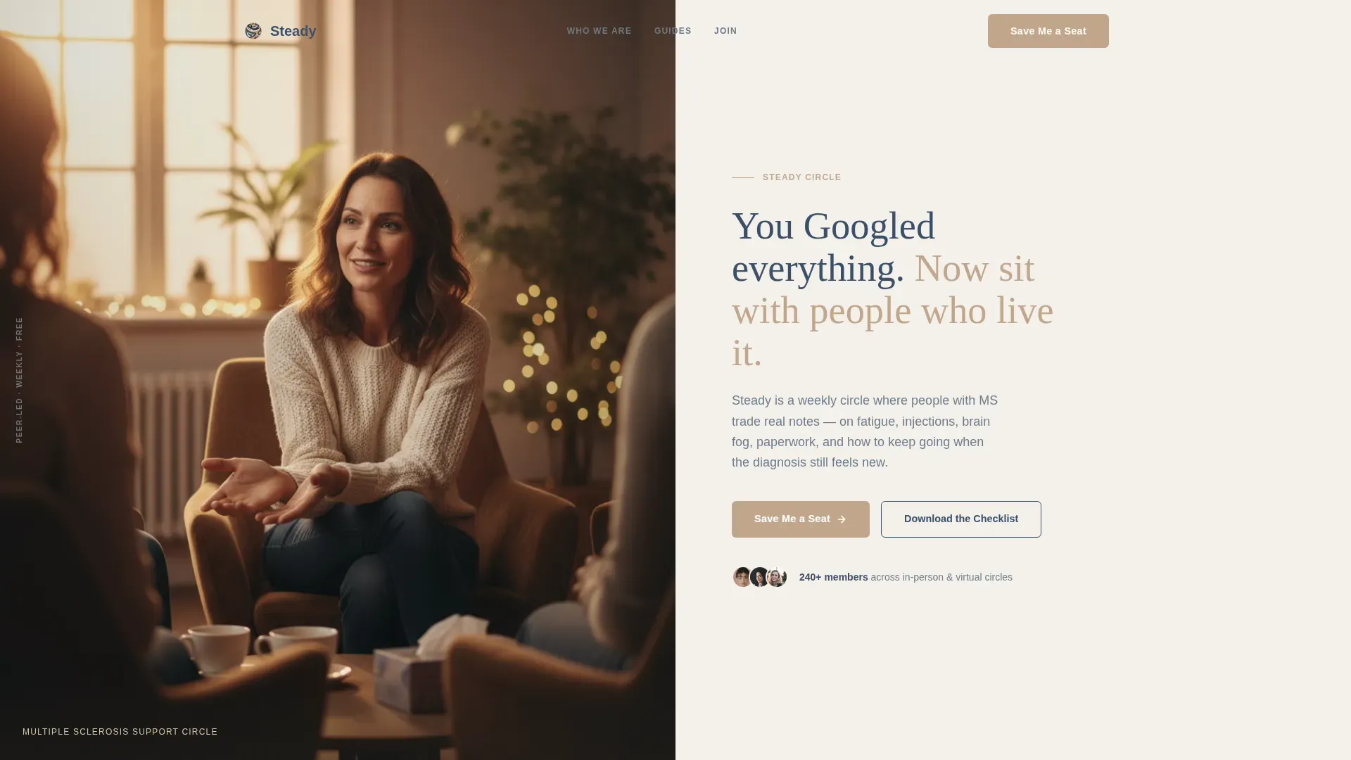
- A portrait-centered hero split with a headline and warm ambient photograph that sets tone immediately
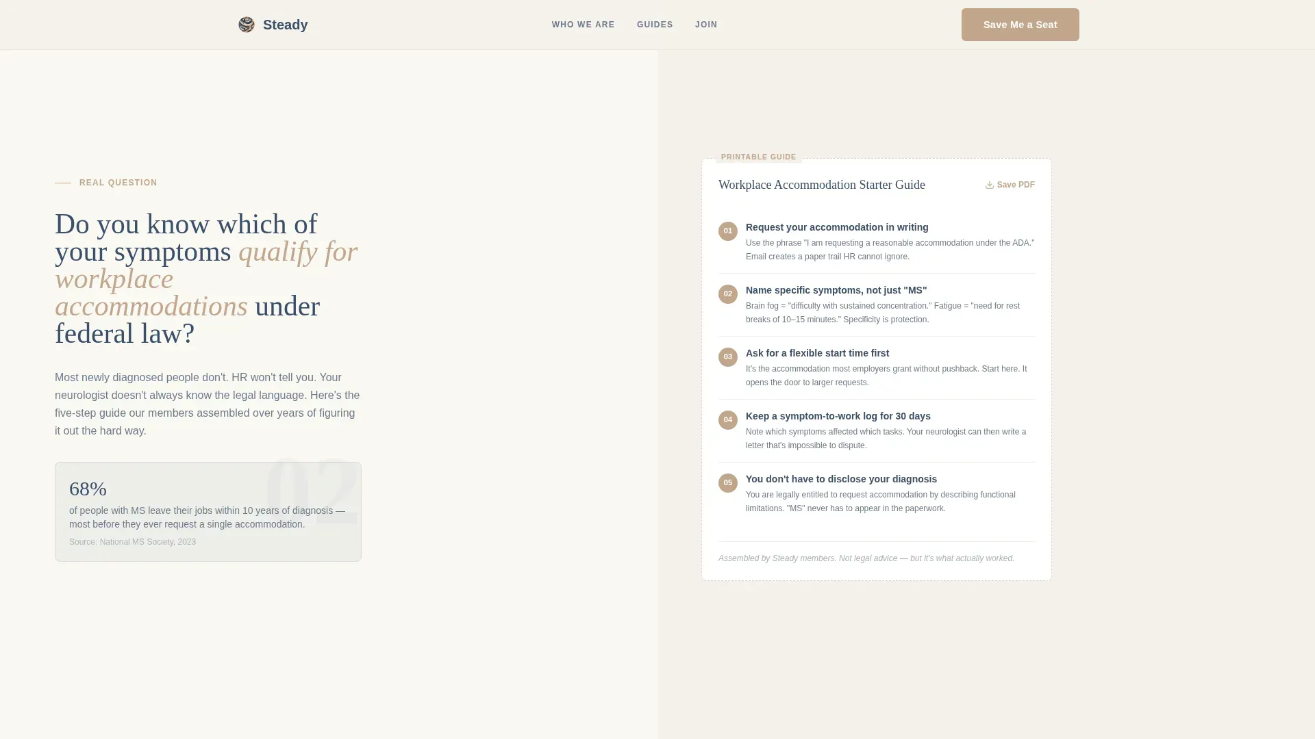
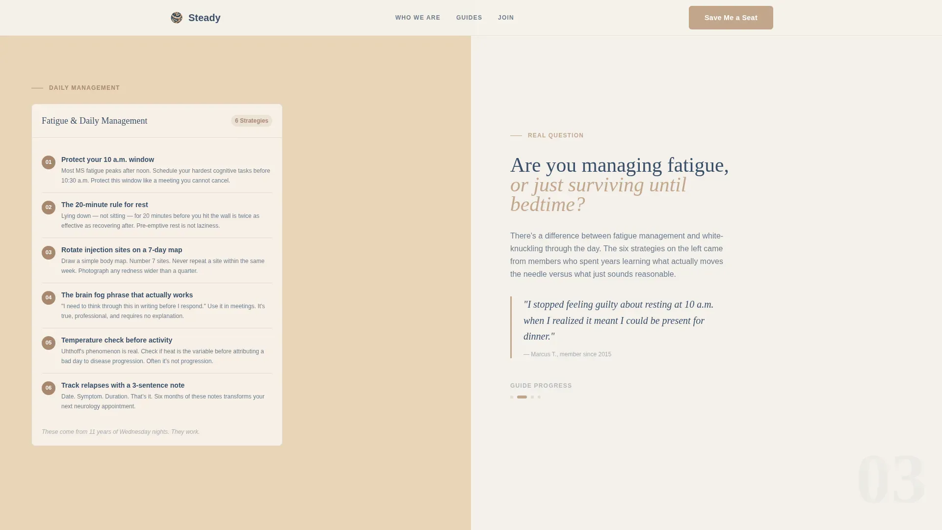
- Two checklist scroll sections covering diagnosis basics and daily management, each formatted as a numbered micro-guide beside a grounding question
- A dual conversion section with a short meeting sign-up form ("Save Me a Seat") and a gated checklist download requiring only an email address
Feature list
The Steady template is built around five core design and content features grounded in the source brief.
Split-Screen (50/50) Layout
Every major section divides the viewport into two equal halves. One side poses a real, specific question or presents a member story. The other delivers a numbered micro-guide, checklist visual, or form. The layout creates a sense of quiet dialogue rather than a broadcast.
Portrait-Centered Hero Section
The hero uses a softly lit, close-cropped photograph of a person mid-conversation. Depth of field keeps only the face and hands sharp while the background dissolves into warm amber tones. The effect feels candid and personal, like a photo a friend took, not a polished brand shoot.
Checklist and Audit Scroll Structure
Each scroll section builds on the last, moving from diagnosis basics to daily symptom management to longer-term advocacy. The structure creates a sense of progress that feels earned. Numbered micro-guides sit beside real questions, giving visitors something useful before any call to action appears.
Dual Conversion Paths
The primary call to action is a short form collecting first name, optional diagnosis year, and preferred meeting format (in-person, virtual, or both). The secondary path offers a downloadable new diagnosis checklist gated behind an email address only. Both paths are low-friction and low-commitment.
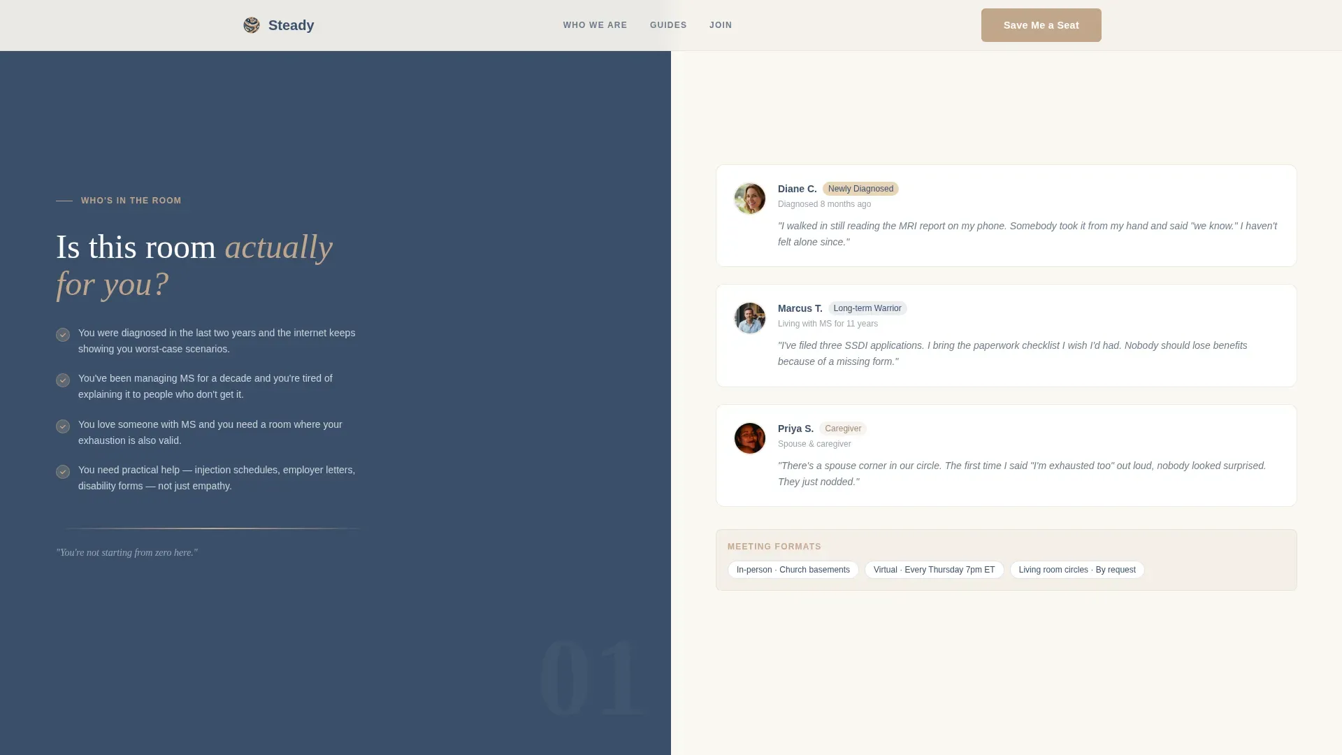
Who Is In The Room Section
This section introduces three member profiles with real-feeling micro-stories representing newly diagnosed patients, long-term members, and caregiving partners. It answers the unspoken visitor question "is this group actually for me?" before they reach the form.
Member Social Proof Layer
Community tenure, meeting count, and brief member quotes are woven into the layout as supporting evidence. This reinforces that the group has genuine history and that the room is already full of people who understand.
Page sections overview
| Section | Purpose |
|---|---|
| Hero Portrait Split | Headline and warm portrait introduce the group's tone and promise |
| Who's In The Room | Member profiles answer "is this for me?" with real stories |
| Diagnosis Basics Checklist | Numbered micro-guide covers workplace accommodation questions |
| Daily Management Checklist | Practical checklist for fatigue and injection-site management |
| Save a Seat Form | Short lead-gen form collects name, diagnosis year, and format preference |
| Checklist Download Path | Email-gated PDF offer for the new diagnosis checklist |
| Minimal Footer | Horizontal flow footer with essential links and quiet branding |
Design & branding system
The visual identity follows an Educational Guide theme using a Cloud Canvas color palette. The overall feel is a linen-bound notebook left open beside a cup of tea: unhurried, approachable, and quietly organized.
- Colors: fog white (#F4F1EB) for backgrounds, muted slate (#6B7B8D) for body text, warm clay (#C2A68C) for buttons and dividers, and deep dusk blue (#3A4F6A) for headlines and interactive elements
- Typography: Fraunces serif for headlines to add warmth and editorial character, paired with DM Sans for body text to keep reading easy and clean
- Animation approach: low-to-medium intensity with gentle fade-ins and scroll reveals throughout, no jarring or distracting motion
Mobile & speed optimization
The template is built mobile-first, which matters because many MS support seekers are searching on a phone during a difficult moment, not at a desk. The layout adapts the 50/50 split into a stacked single-column flow on smaller screens without losing the editorial warmth.
- Optimized images and minimal JavaScript keep the page light and quick to load on mobile connections
- The split-screen sections restack gracefully so checklist guides and questions read in the correct logical order on narrow viewports
- Form interactions and checklist hover states are touch-friendly and respond clearly on mobile devices
How this template helps you convert
The page is designed to earn trust first and ask second. By the time a visitor reaches the form, they have already received real, usable information in at least two scroll sections.
- Every checklist section gives concrete guidance before any call to action appears, so visitors already feel helped rather than sold to when the form comes into view
- The dual-path conversion design means a visitor who is not ready to commit to a meeting can still take a smaller step by downloading the checklist, keeping them connected to the community
- Member stories and group tenure visible throughout the page reduce hesitation by showing that real people with shared experience are already in the room
Other information about this template
This template suits any peer-support group, community health circle, or patient advocacy organization that wants a warm, editorial landing page without clinical distance. It is equally useful for a newly formed group building its first web presence and an established circle refreshing its outreach.
- The footer uses a Vercel Horizontal Flow pattern kept intentionally minimal so attention stays on the conversion sections
- Meeting format options (in-person, virtual, or both) are built into the sign-up form, making it practical for groups that run hybrid schedules
- The page localization is English (US) with no currency elements, keeping the experience clean for non-commercial health communities
Theme
Educational Guide
Creative direction
Checklist & Audit
Color system
Cloud Canvas
Style
Split Screen (50/50)
Direction
Lead Generation
Page Sections
Split-screen 50/50 Layout
Portrait-centered Hero
Checklist and Audit Scroll Sections
Dual Conversion Paths
Member Story Profiles
Social Proof Layer
Related questions
Can I customize the checklist content for my specific MS support group?
Does the template support both in-person and virtual meeting groups?
What does the gated checklist download require from the visitor?
Is the template suitable for caregivers, not just people with MS?
Can someone with no design experience use this template?



