Anxiety Support Group Landing Page Template
Steady is a hub and spoke landing page template built for anxiety support groups that lead with clinical credibility. It opens with credential badges and a bold outcome stat, then guides visitors through evidence, methods, sessions, stories, and resources via a sticky anchor nav. The design is clean, controlled, and built to earn trust before asking for anything.
by Rocket studio
Quick summary
Steady is a single-page landing page template designed for evidence-based anxiety support groups. It combines clinical social proof with structured content spokes, guiding mid-career professionals, new parents, and college seniors from skepticism to action. The restrained Alpine Fresh palette and Stats-First layout signal credibility without overwhelming a visitor who is already carrying a full load.
Who this template is for
This template is built for anxiety support groups and mental health practitioners who need to establish clinical trust before asking visitors to engage. It suits facilitators, therapists, and wellness organizations running structured weekly group sessions.
- Mid-career professionals running or promoting evidence-based anxiety circles
- Mental health practitioners who need a content and resource destination page
- Wellness organizations targeting adults who need proof before they commit
What problem this template solves
People arriving at an anxiety support group page are often mid-panic, mid-doubt, or mid-Google-search at midnight. A generic wellness page with stock photography and soft language fails them. This template replaces that softness with structure, data, and earned warmth.
- Visitors need clinical credibility before they trust a group setting with their anxiety
- Professionals hiding panic attacks will not engage with pages that feel vague or emotionally performative
- There is no clear path from "I found this page" to "I downloaded the toolkit" on most wellness templates
What you get with this template
You get a fully structured, single-page hub and spoke layout with a sticky anchor navigation rail linking five content spokes. Every section is pre-built with the correct content hierarchy for an anxiety support group that leads with evidence.
- A credential badge header with oversized stat display and a five-spoke sticky anchor nav (Evidence, Methods, Sessions, Stories, Resources)
- A gated toolkit download section with an email field and a purpose dropdown, plus an ungated session archive browse path
- Scroll-reveal animations, number count-up effects, horizontal scroll for session cards, and hover states throughout
Feature list
This section covers the core built-in capabilities that make Steady a purpose-built template for clinical anxiety support groups.
Stats-First Scroll Architecture
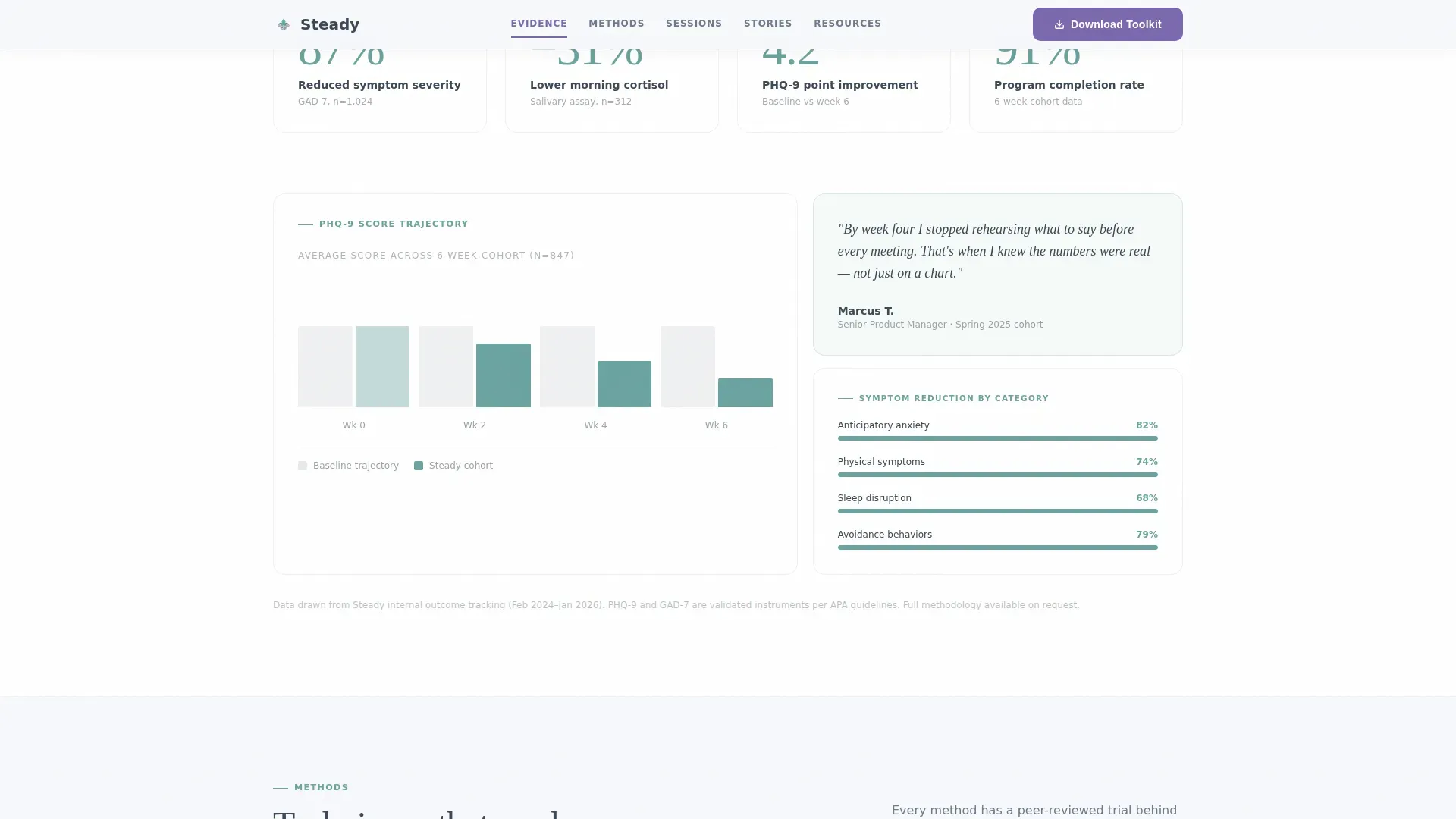
Every scroll transition opens with a peer-reviewed data point before softening into a human story. The layout is pre-structured to show cortisol reduction percentages, PHQ-9 score improvements, and session attendance data before a member narrative follows. This order is intentional and cannot be accidentally reversed.
Sticky Anchor Navigation Rail
A five-spoke anchor nav pins to the top of the page and stays visible as the visitor scrolls. The five spokes, Evidence, Methods, Sessions, Stories, and Resources, each link directly to their corresponding section. This gives visitors who arrive with a specific question an immediate path.
Credential Badge Header
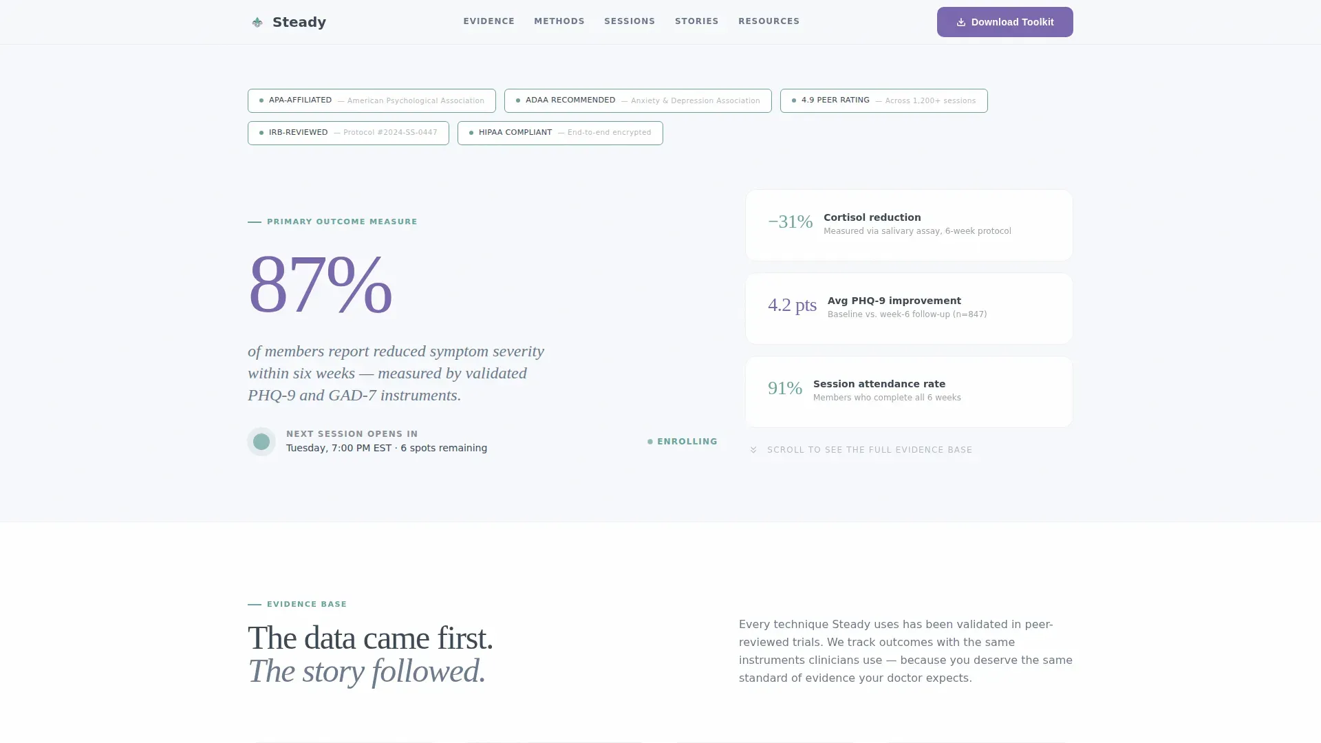
The header opens with a horizontal row of credential shields and clinical recognition badges rendered in granite slate with glacial teal borders. No hero image is included. The design leads with proof: affiliation recognition, peer rating, and session count, before any narrative begins.
Gated Toolkit Download with Purpose Dropdown
The primary call to action is a downloadable anxiety toolkit gated behind a single email field. A dropdown menu labeled "What brings you here?" includes options such as workplace stress, health anxiety, and social avoidance. This qualification step adds relevance without adding friction.
Session Archive Browse Path
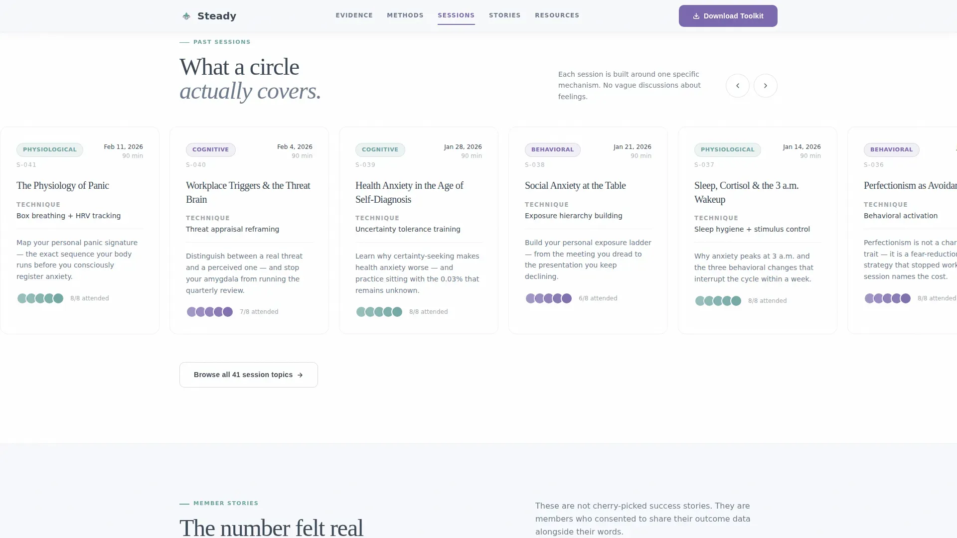
A secondary, ungated path lets visitors browse a searchable archive of past group session topics. This lowers the barrier for first-time visitors who are not yet ready to share their email. It builds familiarity with the group's methods before any commitment is asked.
Bento Grid Methods Section
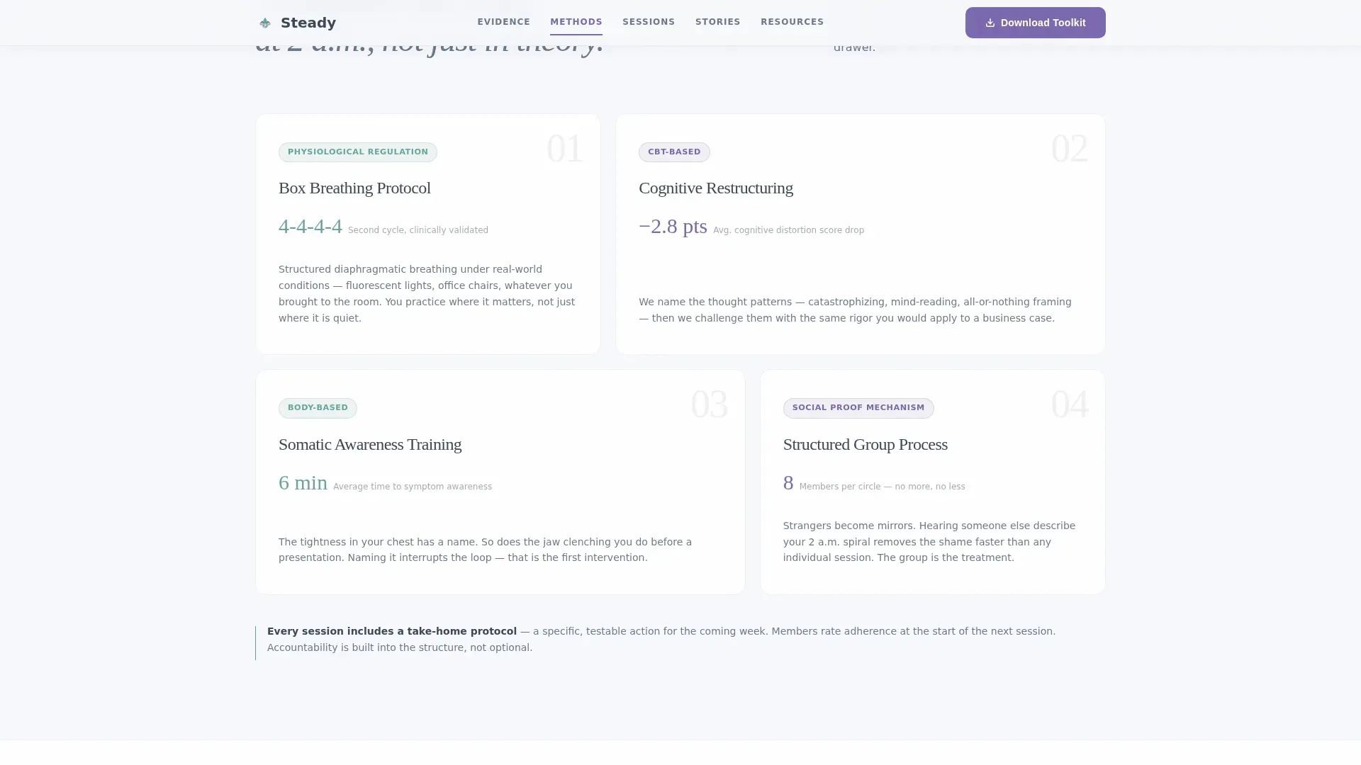
The Methods spoke uses a bento grid layout to display session techniques including box breathing, cognitive behavioral approaches, and group format details. Each technique is presented as a distinct card, making it easy to scan without reading a wall of text.
Page sections overview
| Section | Purpose |
|---|---|
| Credential Badge Header | Opens with clinical proof and key outcome stat |
| Sticky Anchor Nav | Links five content spokes for quick navigation |
| Evidence Spoke | Presents peer-reviewed data on symptom outcomes |
| Methods Spoke | Bento grid of session techniques and formats |
| Sessions Spoke | Horizontal scroll showing weekly circle structure |
| Stories Spoke | Named member testimonials with roles and specifics |
| Resources and Call to Action | Toolkit download form and session archive browse |
| Footer | Arc Browser Split pattern footer layout |
Design & branding system
The visual identity follows a Corporate Precision theme built on the Alpine Fresh color system. The palette is designed to feel like a clinic built into a mountain: sterile enough to signal credibility, with just enough living color to signal warmth exists on the other side.
- Colors: snowfield white (#F7F9FC) background, granite slate (#3B4856) primary text, glacial teal (#6BA3A0) borders and accents, mountain-aster violet (#7B68AE) reserved for interactive states and key data highlights
- Typography: Fraunces display serif for headings, DM Sans for body text, creating a contrast between clinical weight and readable clarity
- The oversized violet stat in the header ("87% of members report reduced symptom severity within six weeks") is the single most visually dominant element on the page
Mobile & speed optimization
The template is designed desktop-first to match the primary use case: a professional opening the page on a work computer, often behind a closed office door. All layouts are fully responsive and adapt to smaller screens without losing structural clarity.
- Horizontal scroll in the Sessions spoke converts to a standard vertical stack on mobile viewports
- Scroll-reveal animations and number count-up effects use minimal JavaScript, keeping the interactive layer light
- Server components handle static sections, reducing the amount of JavaScript the browser needs to process on load
How this template helps you convert
The page is structured to earn trust before it asks for anything, moving visitors through a deliberate progression from clinical proof to personal relevance to action.
- The credential badge header and oversized outcome stat establish authority in the first visible screen, before the visitor has scrolled even once.
- The five evidence-led spokes build a cumulative case through data, method explanation, session detail, and member stories, so that by the time a visitor reaches the Resources section, the toolkit download feels like a logical next step rather than a cold ask.
Other information about this template
This template is a strong fit for groups or practitioners who want a content and resource destination rather than a direct booking or sign-up flow. The ungated session archive browse path is a deliberate second conversion lane for visitors who are not yet ready to share their email.
- The footer uses the Arc Browser Split pattern, a structured two-column layout that separates navigation links from contact or legal information
- The page includes no hero imagery or stock photography by design; the restraint is a core part of the clinical tone
- Animation intensity is set to medium: scroll reveals and count-up numbers add life without distracting from the evidence-first message
- The template is built for English (United States) audiences with no currency display or localization layer required
Theme
Corporate Precision
Creative direction
Stats-First Impact
Color system
Alpine Fresh
Style
Hub & Spoke (Anchor Nav)
Direction
Content/Resource
Page Sections
Stats-first Scroll Architecture
Sticky Five-spoke Anchor Nav
Credential Badge Header
Gated Toolkit Download Form
Ungated Session Archive Browse
Bento Grid Methods Section
Related questions
Who is this landing page template designed for?
What does the gated toolkit download section include?
Can visitors access content without submitting their email?
What interactive elements are included in this template?
Does this template include pre-written content or clinical data?



