Parkinson's Disease Support Group Landing Page Template
Steady is a hub-and-spoke landing page built for Parkinson's disease support groups. It guides newly diagnosed adults and their caregivers from confusion to commitment through a structured Problem-to-Solution scroll. Four anchor-nav spokes, Understand, Connect, Move, and Plan, address real fears and introduce specific programs, with a single "Reserve Your First Chair" call to action that earns the click before it asks for it.
by Rocket studio
Quick summary
Steady is a single-page, anchor-navigated landing page template designed for Parkinson's disease support groups. It moves visitors through a deliberate emotional arc, from the disorientation of a new diagnosis to the clarity of a structured first step. Every section gives something useful before asking for anything in return.
Who this template is for
This template is built for community-based Parkinson's disease support organizations that need to convert anxious visitors into registered session attendees. It works equally well for clinically guided peer groups, hospital-affiliated patient programs, and independent caregiver support networks.
- Parkinson's disease support groups running weekly in-person sessions
- Patient advocacy organizations offering clinical education and care planning
- Healthcare providers or social workers who refer newly diagnosed patients to community resources
What problem this template solves
Finding a Parkinson's support group at 2 a.m. on a phone is a disorienting experience. Most pages confront visitors with clinical language, long registration forms, or generic inspiration that does nothing to reduce the fear already sitting in the room. Steady solves the trust gap before asking for commitment.
- Newly diagnosed adults need plain language and a clear first step, not a wall of medical text
- Remote caregivers need to quickly confirm that the group is credible and worth bringing to a parent
- Healthcare professionals referring patients need a page that feels clinical enough to share confidently
What you get with this template
Steady delivers a complete, scroll-guided landing page with four content spokes anchored in a sticky navigation bar. Each spoke addresses one specific fear and resolves it with a matching program. The page is built mobile-first, reflecting how most people in distress search, on a phone, at night.
- A portrait-centered hero section with headline, subhead, and primary call-to-action placement
- Four spoke sections (Understand, Connect, Move, Plan) with program descriptions, testimonials, and individual calls to action
- A three-field modal registration form and a secondary PDF download gate for visitors not yet ready to commit
Feature list
This template covers the key structural and functional components described in the brief. Each feature is directly grounded in the template's design and content scope.
Portrait-Centered Hero Section
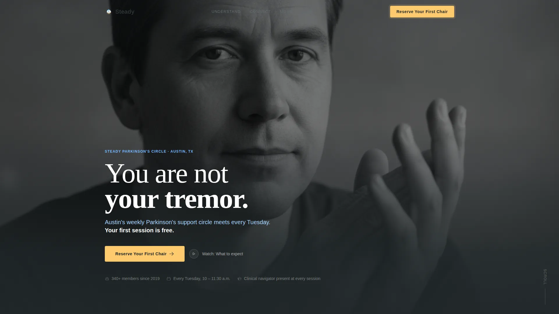
The hero fills the full viewport with a single black-and-white portrait. A bold headline in clean white type reads "You are not your tremor." A sky-blue subhead names the city, the meeting day, and the fact that the first session is free. The primary call-to-action button in warm gold appears directly below.
Anchor Navigation Bar
A sticky hub navigation links to four named spokes, Understand, Connect, Move, and Plan. Sky blue marks active states and interactive waypoints. The nav keeps visitors oriented as they scroll and lets them jump directly to the section most relevant to their situation.
Four Program Spoke Sections
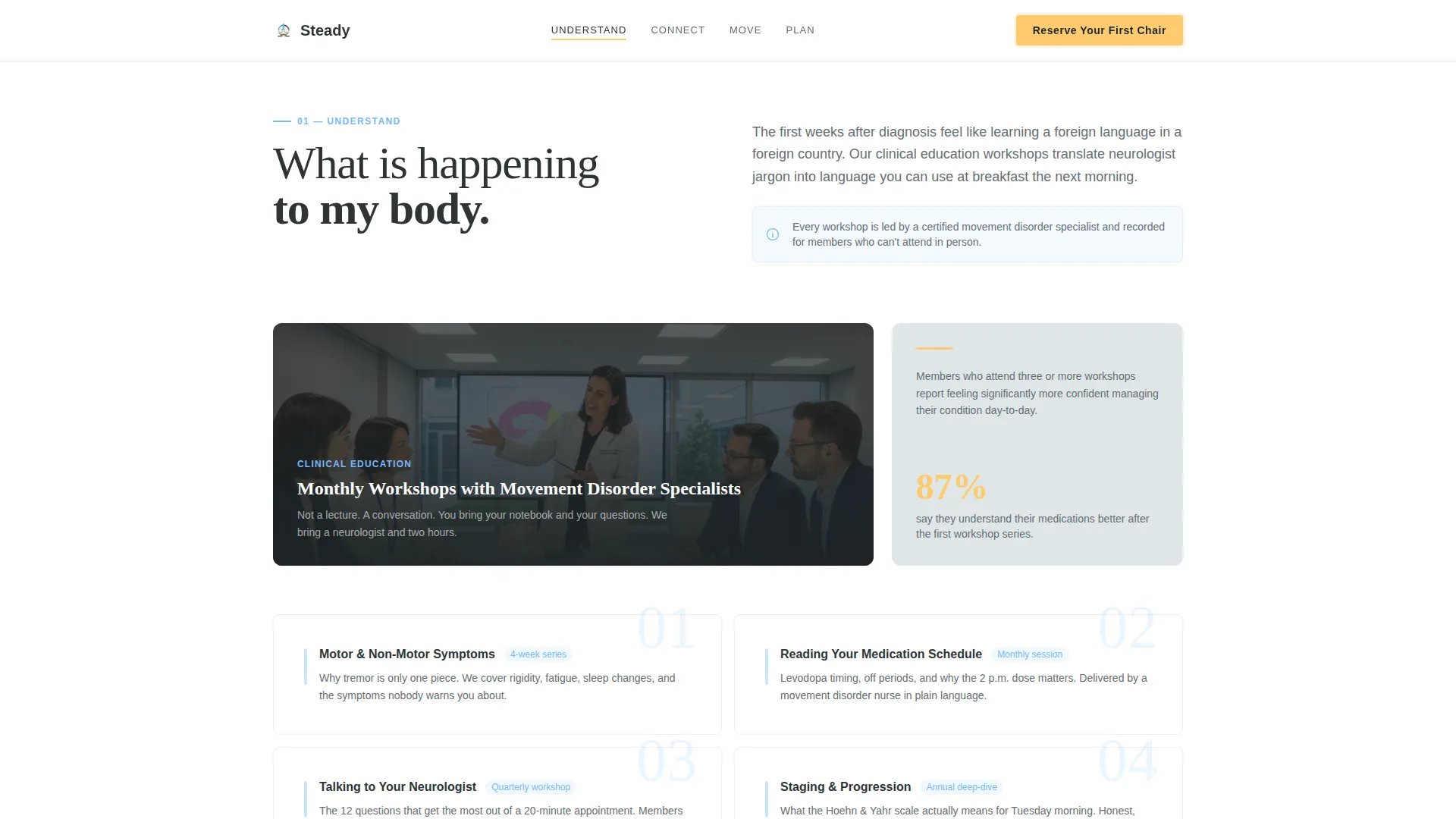
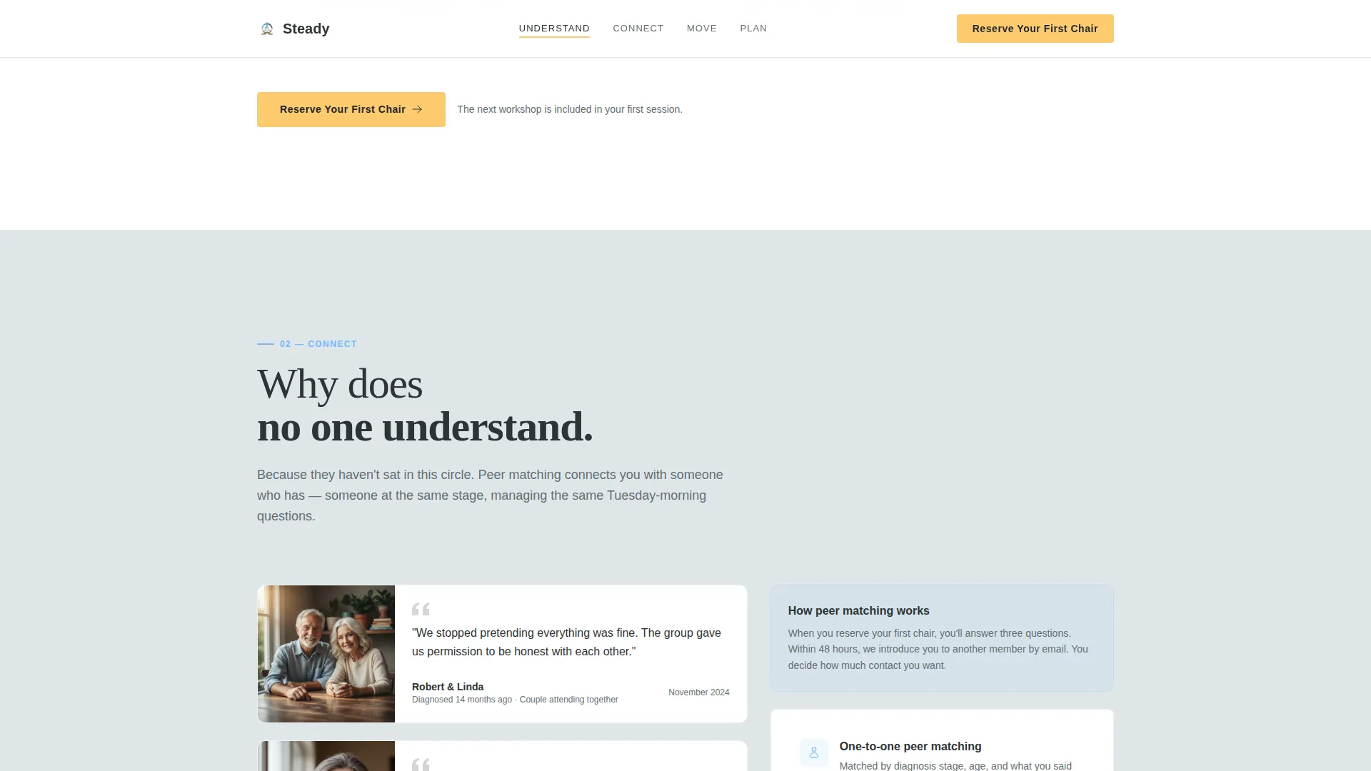
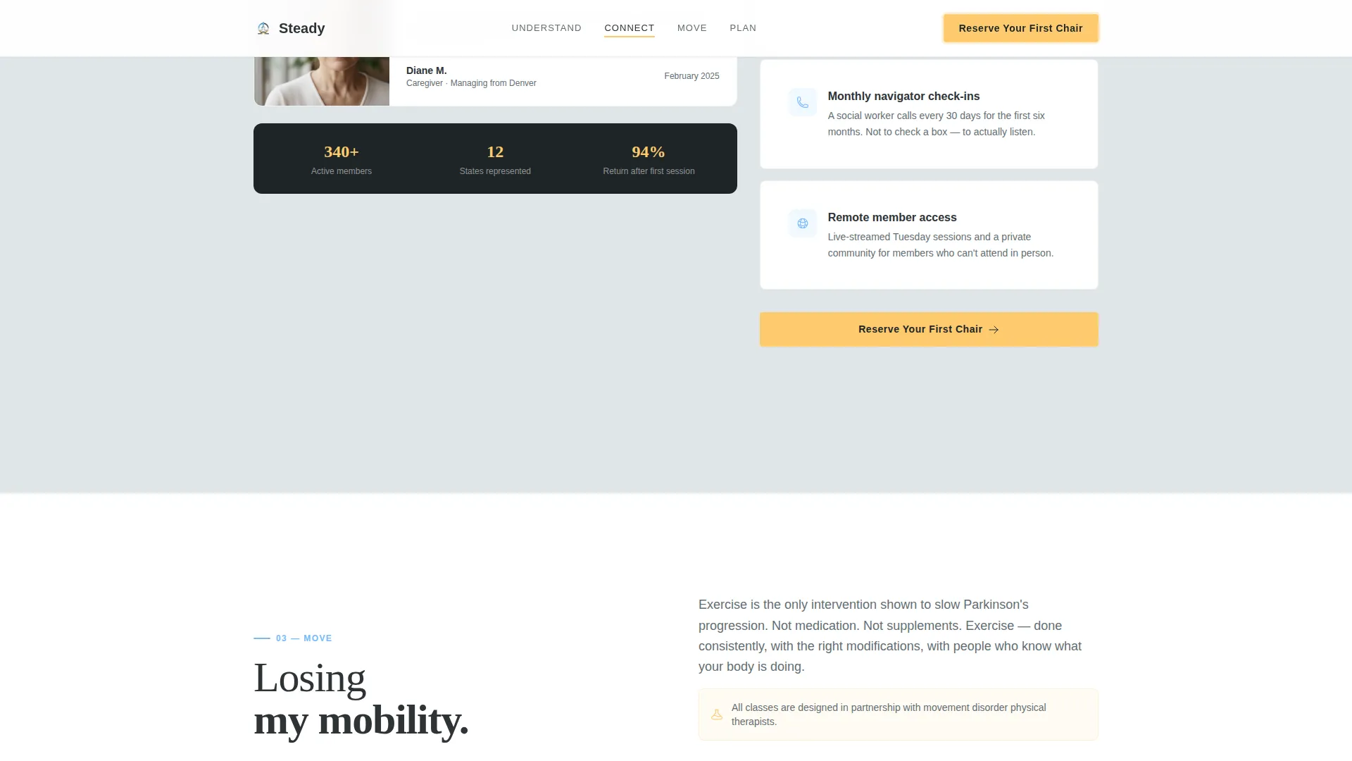
Each spoke section targets a specific fear and introduces the program that addresses it. Understand covers clinical education workshops. Connect introduces the peer-matching program. Move presents Parkinson's-adapted exercise classes. Plan describes care-planning sessions with social workers. Every spoke closes with a "Reserve Your First Chair" call to action.
Dated Testimonials and Marquee Social Proof
Testimonials are specific and dated in month-and-year format rather than generic quotes. An example entry reads: "I joined in March. By June my wife came too. We sleep better now." A marquee scroll displays this social proof between sections to maintain credibility without breaking flow.
Three-Field Modal Registration Form
The primary lead-capture form opens in a modal and asks only three fields in sequence: first name, email address, and a single dropdown. The dropdown options are "I am: newly diagnosed / caring for someone / a healthcare provider referring a patient." Reducing friction at the point of commitment is central to the page's conversion design.
PDF Download Gate
A secondary path offers a downloadable guide titled "Your First 90 Days After Diagnosis," gated behind email only. This path is built for visitors not yet ready to attend a session. It captures contact information while delivering immediate value.
Page sections overview
| Section | Purpose |
|---|---|
| Hero portrait header | Establish emotional trust and present the primary call to action |
| Anchor navigation bar | Let visitors jump to the spoke most relevant to their situation |
| Understand spoke section | Address the fear of not knowing what is happening to the body |
| Connect spoke section | Address the isolation of early-stage diagnosis through peer matching |
| Move spoke section | Address fear of losing mobility with Parkinson's-adapted exercise classes |
| Plan spoke section | Address fear of the future through care-planning sessions with social workers |
| Testimonials marquee | Reinforce credibility with dated, specific peer stories between spokes |
| PDF download gate | Offer a lower-commitment path for visitors not ready to register |
| Linear footer row | Close with contact details and group logistics in a single clean row |
Design & branding system
The visual identity follows a Corporate Precision theme that feels like a teaching hospital's private consultation room. It is serious enough to hold a diagnosis and open enough to suggest that recovery has a structure. Typography pairs DM Sans for body text with Fraunces for display headlines.
- Slate (#2D3436) anchors all body text and section backgrounds; silver (#DFE6E9) creates generous breathing space between content blocks
- Sky blue (#74B9FF) marks all interactive elements, anchor nav states, and progress indicators
- Warm signal gold (#FDCB6E) appears exclusively on call-to-action buttons and active navigation states, reserving its visual weight for moments of decision
Mobile & speed optimization
Steady is built mobile-first to match how its target audience actually searches. A person newly diagnosed, or a daughter calling from three states away, is most likely on a phone. The layout and form fields are designed for that context.
- Scroll-linked reveals and staggered fade animations are set to medium intensity, keeping the experience smooth without demanding heavy processing
- The three-field modal form is sequenced for thumb-friendly input on small screens
- Image optimization is a stated performance priority, with the portrait hero processed to load quickly without sacrificing visual weight
How this template helps you convert
Steady earns the click by retiring fear before requesting commitment. The conversion path is deliberate: give first, ask second. Every section delivers a useful idea before presenting a call to action.
- The Problem-to-Solution arc moves visitors from emotional disorientation at the hero through increasing clarity across four spokes, so the "Reserve Your First Chair" button at the hub center arrives after trust is already established
- The three-field modal and PDF download gate offer two commitment levels, capturing both the visitor ready to attend and the one who needs more time before walking through the door
Other information about this template
Steady is part of a template library designed to match specific niche and intersection contexts. A few additional details are worth noting for teams evaluating this template for their organization.
- The footer follows Pattern 1 (Linear Single-Row), keeping the close of the page clean and logistically useful without adding visual weight
- Scroll-linked reveals and a marquee testimonial component are included as interactive elements alongside the anchor nav, modal form, and PDF gate
- The template is localized for English, United States date format, and United States dollar currency where pricing references apply
- The page type is a single-page landing structure, not a multi-page website, so all content lives within one scrollable flow organized by anchor navigation
Theme
Corporate Precision
Creative direction
Problem→Solution Arc
Color system
Slate & Sky
Style
Hub & Spoke (Anchor Nav)
Direction
Lead Generation
Page Sections
Portrait-centered Hero with Primary Call to Action
Sticky Anchor Navigation Bar
Four Spoke Program Sections
Three-field Modal Registration Form
PDF Download Gate
Dated Testimonials with Marquee Scroll
Related questions
Who is this landing page template designed for?
What are the four spoke sections included in this template?
How does lead capture work in this template?
Can a healthcare provider use this page to refer patients?
Does the template include social proof components?



