Occupational Therapist Review Landing Page Template
The Steadyhands trusted patient review occupational therapist landing page template is a split-screen, frequently asked question-driven design built for clinics that convert anxious visitors into booked consultations. It pairs real patient questions with testimonial answers, a persistent "Book a Free Screen" call to action, and an animated line-art hero, all styled in a calming Alpine Fresh palette of evergreen, glacial blue, and snowfield white.
by Rocket studio
Quick summary
This template gives occupational therapy clinics a single-page lead generation tool built entirely around trust. Patient fears become frequently asked question scroll sections. Real testimonials become the answers. A persistent booking bar and a three-field intake form sit at the end of every visitor's journey, ready to convert curiosity into a confirmed free screening session.
Who this template is for
This template is designed for occupational therapy practices that serve emotionally invested clients. It speaks directly to visitors carrying real worry, not just curiosity.
- Parents seeking help with a child's handwriting, sensory processing, or fine motor activities
- Adults recovering from workplace injuries or post-surgical rehabilitation sessions
- Families of elderly patients working to preserve daily independence and quality of life
What problem this template solves
Most healthcare landing pages list services. This one answers fears. Visitors arrive with specific doubts, and generic copy does nothing to move them forward. The top section of the landing page is critical for a good first impression, and this template uses that space to show proof immediately.
- Visitors leave before booking because they find clinical language, not human reassurance
- Parents and caregivers need examples from people who lived the same situation, not bullet points about therapy modalities
- Anxiety around cost, process, and outcomes stays unaddressed when a page lacks clear, transparent documentation of real results
What you get with this template
You get a fully structured single-page layout that guides each visitor from doubt to decision. Every section has a deliberate purpose, and the design does the emotional work so your copy does not have to carry it alone.
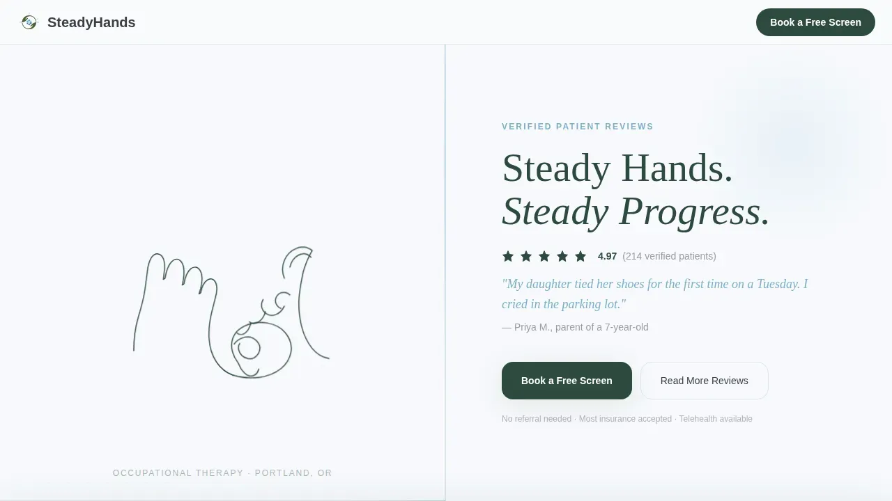
- A full-viewport animated hero with a continuous line-art drawing, headline, and verified five-star patient proof
- Four frequently asked question scroll sections pairing real patient questions with testimonial excerpts that describe specific outcomes
- A lead capture form with a three-field intake sequence and a persistent "Book a Free Screen" viewport bar
Feature list
This template focuses on high-trust, conversion-oriented design. Each built-in component serves a specific role in moving visitors toward booking.
Animated Line Art Hero
The header opens with a single continuous-line SVG illustration drawing in real time over four seconds. It depicts hands guiding hands around a jar lid, rendered in evergreen on snowfield white with no fill. The headline and a verified star rating appear beside it on the opposite split, ensuring the top section makes a strong first impression.
frequently asked question-Driven Scroll Sections
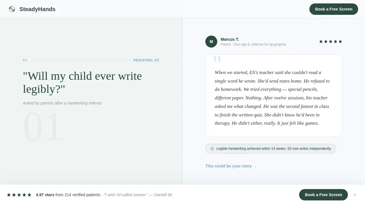
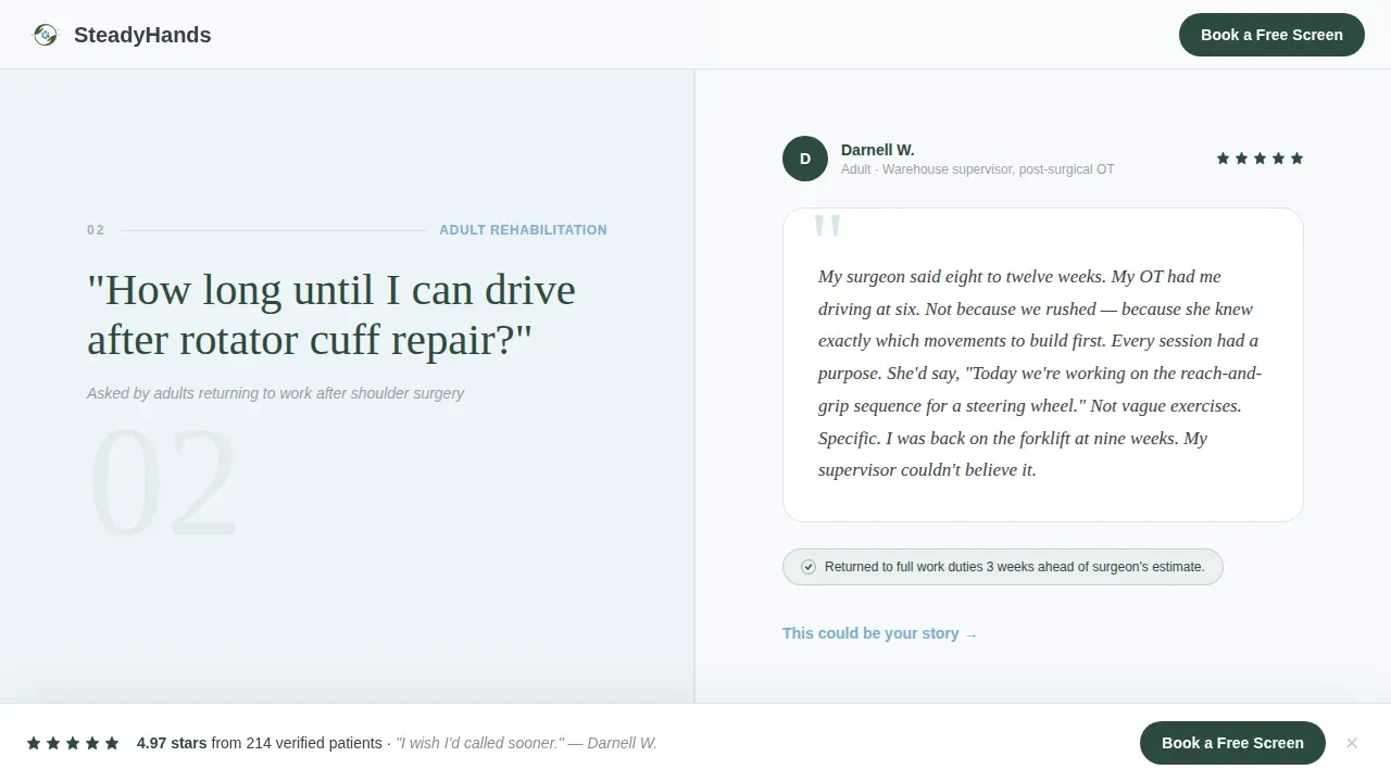
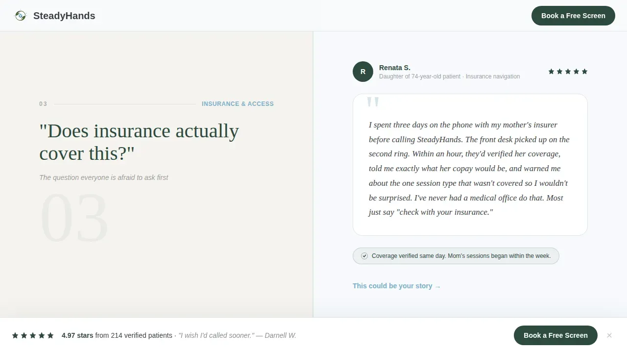
Four full-width split-screen sections each present one patient question on the left and a testimonial answer on the right. The questions walk visitors through the emotional journey from clinical doubts ("Will my child ever write legibly?") to logistical ones ("Does insurance cover this?"). Each answer is framed as proof from a patient who carried that same fear, not as clinical notes or generic advice.
Persistent Booking Bar
A "Book a Free Screen" call-to-action bar stays locked to the bottom of the viewport throughout the entire scroll. This means the primary action is always visible without interrupting the reading flow. One clear call to action reduces decision fatigue and keeps focus on the booking goal.
Three-Field Intake Form
The final split-screen section houses the lead capture form. It uses three deliberate fields: a visual toggle for patient type (child, adult, or senior), a short free-text concern field with placeholder examples, and a preferred contact method selector. No insurance field appears upfront, keeping friction low at the point of first contact.
Social Proof Architecture
The template is structured to provide layered trust signals. The hero carries a five-star rating and a real first-name quote. Each frequently asked question section layers a named patient testimonial beneath it. A secondary call to action links to an expanded review grid for visitors who need more proof before committing.
Secondary Review Path
A "Read More Reviews" link runs alongside the primary booking call to action. It catches visitors who are not ready to book but are still building trust. This secondary path ensures the page serves two types of visitors simultaneously without splitting the primary conversion focus.
Page sections overview
| Section | Purpose |
|---|---|
| Animated hero split | Establish trust with line-art animation, headline, and star proof |
| frequently asked question Section 1 | Answer child handwriting and developmental fears with parent testimonial |
| frequently asked question Section 2 | Address return-to-work timelines with adult injury recovery testimonial |
| frequently asked question Section 3 | Handle insurance and logistics concerns with real patient context |
| frequently asked question Section 4 | Describe the first session experience with a first-visit testimonial |
| Booking form split | Capture leads with three-field form and primary call-to-action placement |
| Footer row | Provide visible contact information in a single linear row |
Design & branding system
The visual identity follows a Corporate Precision theme with an Alpine Fresh color system. Calming blues and greens dominate, which research notes are seen as relaxing and well-suited for healthcare environments. The palette stays clean and uncluttered to reduce anxiety for visitors arriving in a worried state.
- Snowfield white (#F7F9FC) as the dominant background, with evergreen (#2D4A3E) for primary text and section anchors
- Glacial stream blue (#7AAFCB) on interactive elements and hover states, granite charcoal (#3B3F45) for secondary type
- DM Sans for body and interface language, Fraunces serif for display headlines to balance clinical precision with warmth
Mobile & speed optimization
The template is built desktop-first with graceful mobile stacking for every split-screen section. Because many users search on mobile devices, the layout ensures all information remains readable and accessible at smaller viewports without losing its structural logic.
- Split-screen panels stack vertically on mobile, keeping frequently asked question question and answer pairs intact and in order
- The persistent booking bar remains visible on all screen sizes, ensuring the call to action is never buried
- Server components handle static content, while client components manage animations and interactive elements like the patient-type toggle
How this template helps you convert
Every design and copy decision in this template serves one goal: turning a worried visitor into a booked patient. The page earns trust through accumulation, not assertion.
- The animated hero and five-star proof establish credibility in the first seconds of the visit, ensuring the page conveys safety, professionalism, and empathy before a visitor reads a single word of copy.
- The frequently asked question scroll mirrors the visitor's mental journey, answering clinical fears first and logistical ones second, so by the time they reach the form, their objections have already been addressed by someone who lived them.
- The low-friction three-field form and persistent booking bar work together to result in higher completion rates, because the ask is simple, the timing is right, and the path to action is always clear.
Other information about this template
This template is also a useful reference for clinics thinking about their broader documentation practices and digital tools. Occupational therapy notes are vital records that serve crucial functions across patient care, billing, and compliance with healthcare regulations. Progress Notes in occupational therapy document the continuity of care and offer a comprehensive view of the patient's progress over time, while SOAP Notes provide a systematic way to record a patient's status using subjective, objective, assessment, and plan sections.
Templates in occupational therapy notes provide a structured approach to documentation, offering real advantages for busy clinics. A standard Progress Notes template includes patient information, date and time of session, therapy goals, interventions used, patient response, and any adjustments to the plan. Utilizing structured templates like these enhances the efficiency of documentation and helps ensure records stay consistent across all sessions.
Effective note-taking is a cornerstone of successful occupational therapy. Digital tools play a meaningful role here. TextExpander, for example, allows therapists to create custom keyboard shortcuts for frequently used phrases, sentences, or even paragraphs, significantly reducing the time spent typing repetitive content and maintaining accuracy across documents.
For clinics involved in research, resources like Ulrichs, InCites Journal Citation Reports, and Scimago Journal and Country Rank help evaluate and locate trustworthy journals. Researchers should also use the Think. Check. Submit. checklist when assessing publications. Tools like Jane help find suitable journals by comparing documents to PubMed entries, though predatory journals can still appear in those results.
This page template is a strong fit for therapists working with students, pediatric clients, and older adults alike. It can support practices developing their first digital presence or those refreshing an existing site. All public reviews featured on any live site must have express written patient permission to comply with healthcare regulations, including HIPAA requirements. Secure, encrypted contact forms and active SSL certificates ensure patients feel their sensitive data is protected from their first click.
- The Steadyhands trusted patient review occupational therapist landing page template is available as a ready-to-use starting point for any occupational therapy practice
- Video testimonials can be added to the review grid section to provide authenticity that text alone cannot replicate
- Clinicians should prominently display certifications, licenses, and professional memberships on any live version of this template to establish authority and reinforce trust
Theme
Corporate Precision
Creative direction
FAQ-Driven
Color system
Alpine Fresh
Style
Split Screen (50/50)
Direction
Lead Generation
Page Sections
Animated Line Art Hero Section
Faq-driven Testimonial Scroll
Persistent Booking Call-to-action Bar
Three-field Low-friction Intake Form
Layered Social Proof Architecture
Alpine Fresh Visual Identity System
Related questions
Can I adapt this template for a pediatric-only occupational therapy practice?
Does the template include documentation tools or note-taking features?
How does the booking form work on mobile devices?
Can I add more frequently asked question sections to address additional patient concerns?
What should I know about using patient reviews on this template?



