Advanced Robotics & Automation Professional Website Template
Steelflow is a modular card-grid landing page built for conveyor system manufacturers. It opens with a metrics wall showing four live-counter statistics, then walks visitors through every production phase via expandable process cards. A gated specification guide and ungated case study downloads give engineers multiple ways to self-qualify before committing to a conversation.
by Rocket studio
Quick summary
Steelflow is a single-page template designed for industrial conveyor manufacturers who need to earn engineer-level trust fast. The layout pairs a command-center aesthetic with a transparent process flow, letting distribution and plant buyers absorb real project data, explore phase-by-phase production cards, and download specification resources without friction.
Who this template is for
This template is built for industrial manufacturers and automation suppliers whose buyers are technical decision-makers, not passive browsers. If your sales cycle depends on proving engineering depth before a prospect ever picks up the phone, this layout matches that reality.
- Distribution center directors evaluating new fulfillment line specifications
- Plant engineers replacing aging belt systems and building a shortlist of vendors
- Logistics vice presidents assembling the business case for automation before peak season
What problem this template solves
Most industrial manufacturer pages look like brochures. They describe capabilities in vague terms and ask for a call before proving any depth. Technical buyers stop reading and move on. Steelflow flips that pattern by leading with hard data and showing the full production process before any ask is made.
- Engineers distrust vendors who hide process details behind a sales call
- Decision-makers need to self-qualify against real project benchmarks before engaging
- Generic hero images and lifestyle photography fail to communicate manufacturing rigor
What you get with this template
You get a fully structured landing page that opens with quantified credibility and then systematically educates the visitor through every phase of how a conveyor system actually gets built. The page earns each conversion step rather than demanding it.
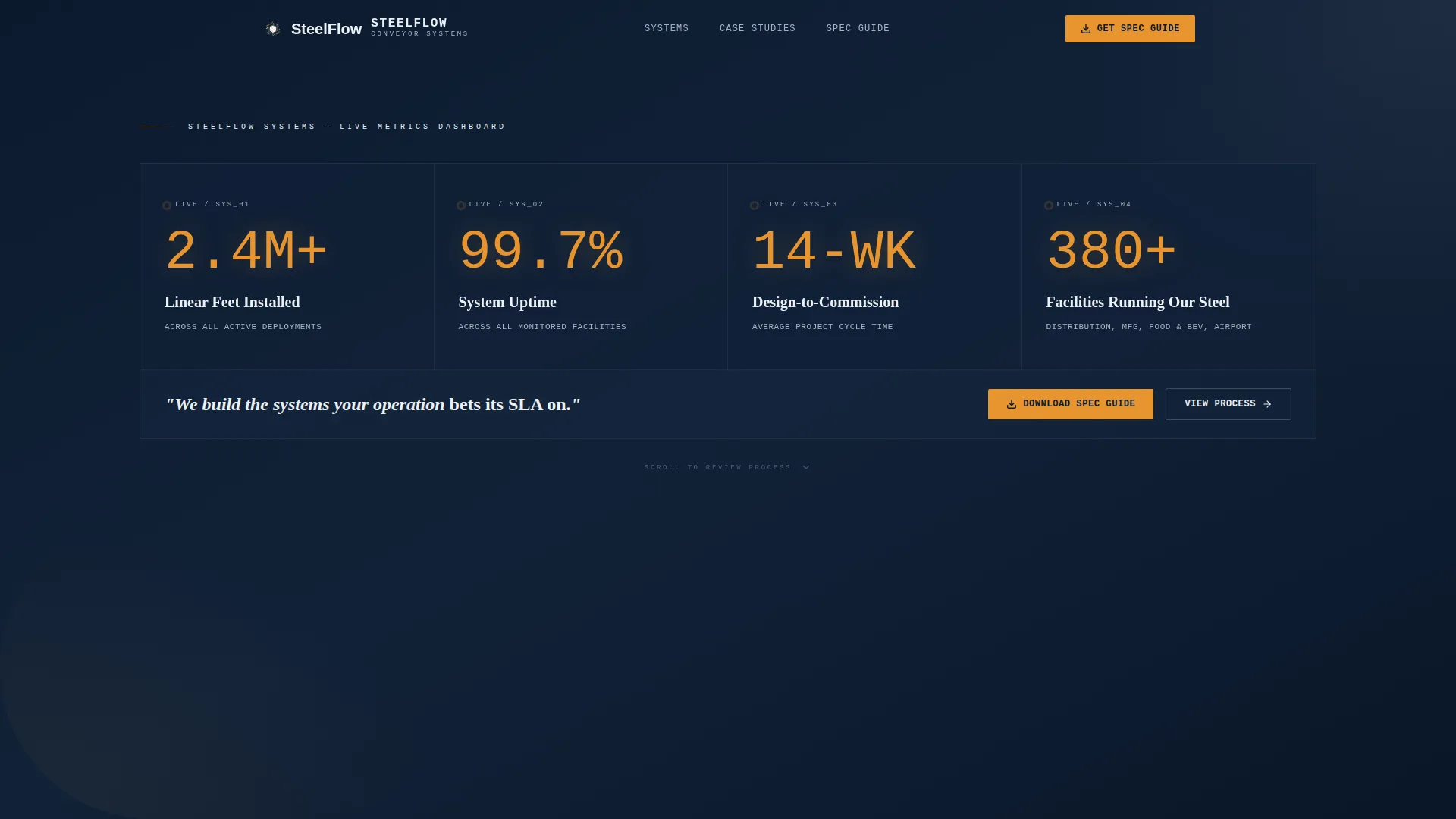
- A Stats/Metrics header displaying four animated data counters on a command-center navy background
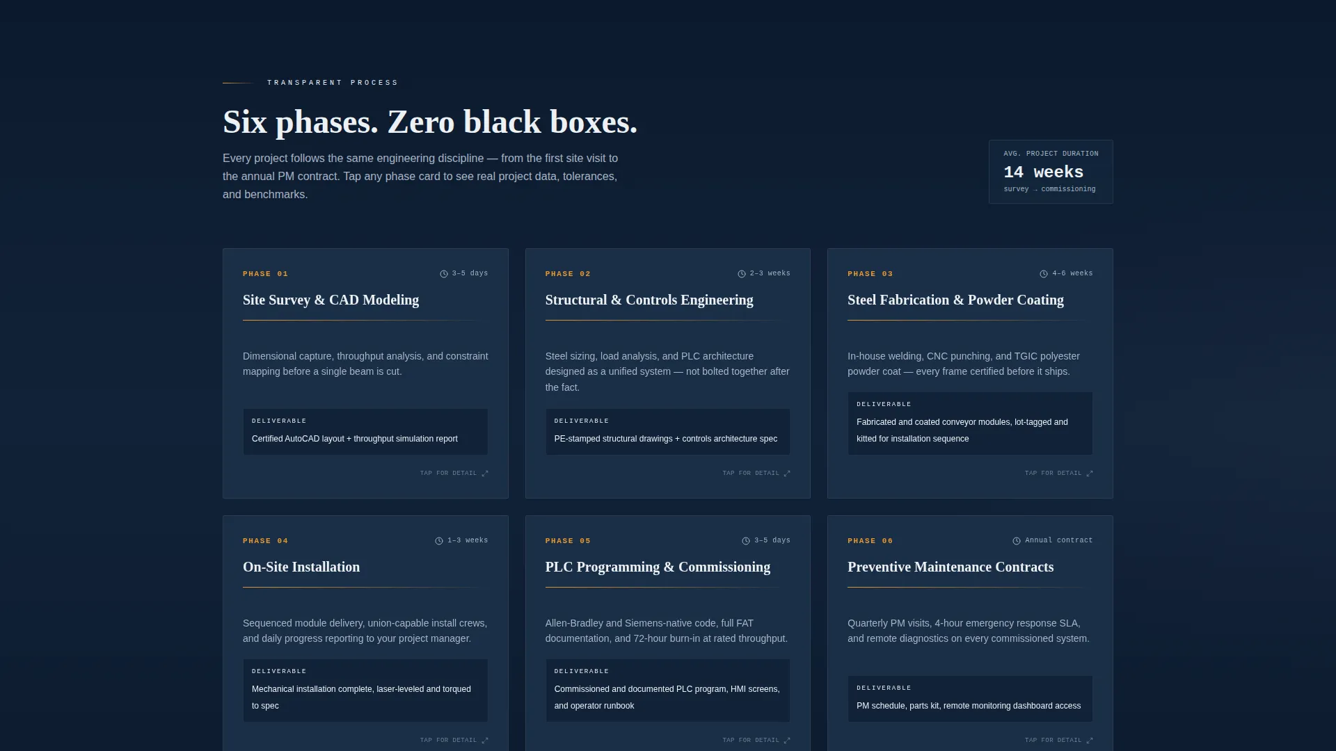
- A modular card grid covering six production phases, each expandable to reveal photography, tolerances, and timelines
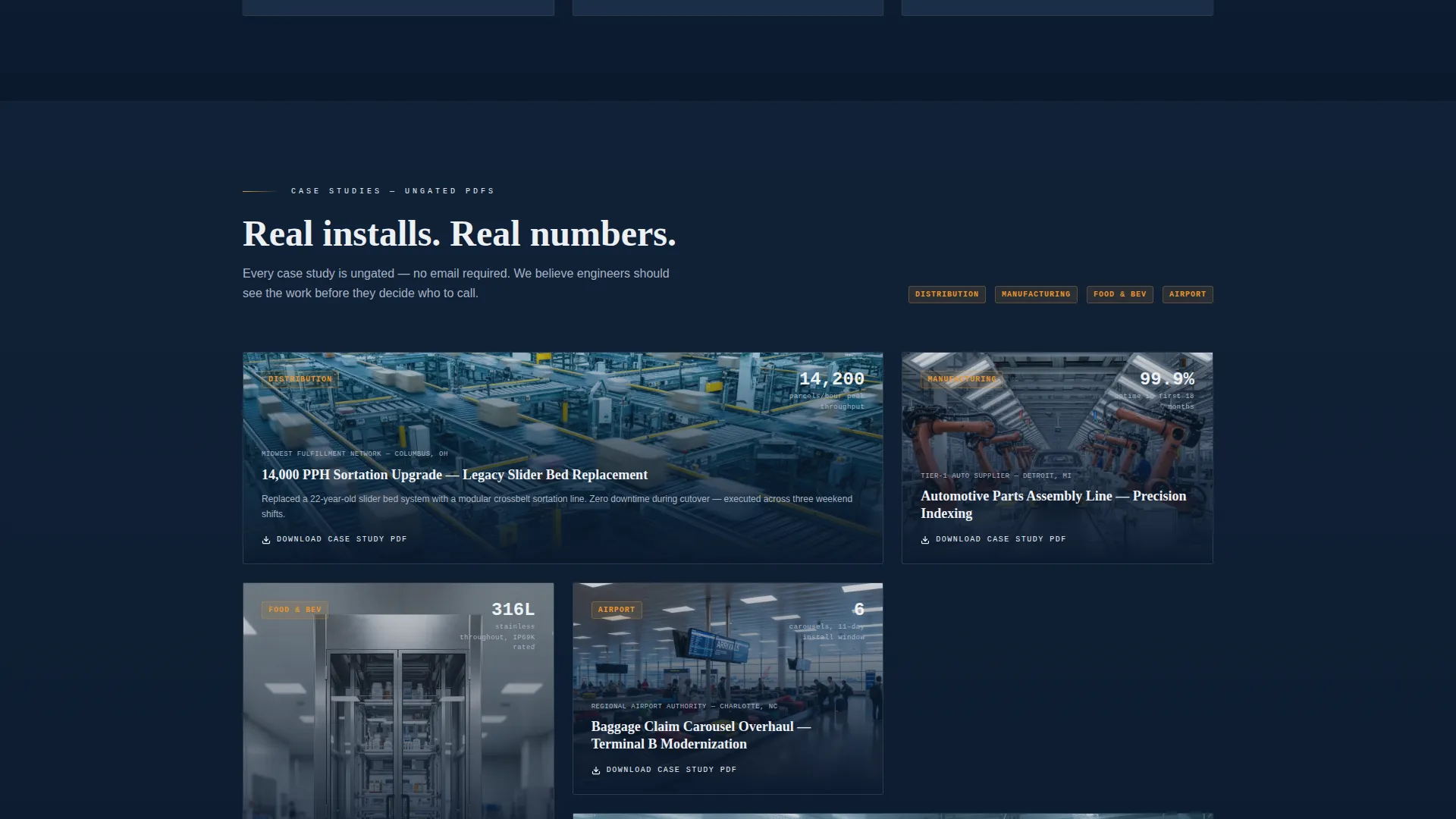
- A gated three-field download form for the Conveyor Specification Guide and ungated case study cards tagged by industry vertical
Feature list
This section walks through the specific built-in components that make Steelflow work for industrial buyers.
Animated Metrics Header
Four oversized data points render in a monospaced industrial typeface on a dark navy background. Each figure animates up from zero on page load, mimicking a live throughput counter. The statistics shown are: 2.4 million-plus linear feet installed, 99.7 percent uptime across active systems, 14-week average design-to-commission, and 380-plus facilities running the system. A single authority line sits below: "We build the systems your operation bets its SLA on."
Expandable Process Card Grid
Six modular cards map the full production journey from site survey through preventive maintenance contracts. Each card flips or expands on click to surface real project photography, engineering tolerances, and timeline benchmarks. The layout educates without persuading, letting the process speak before any call to action appears.
Gated Specification Guide Download
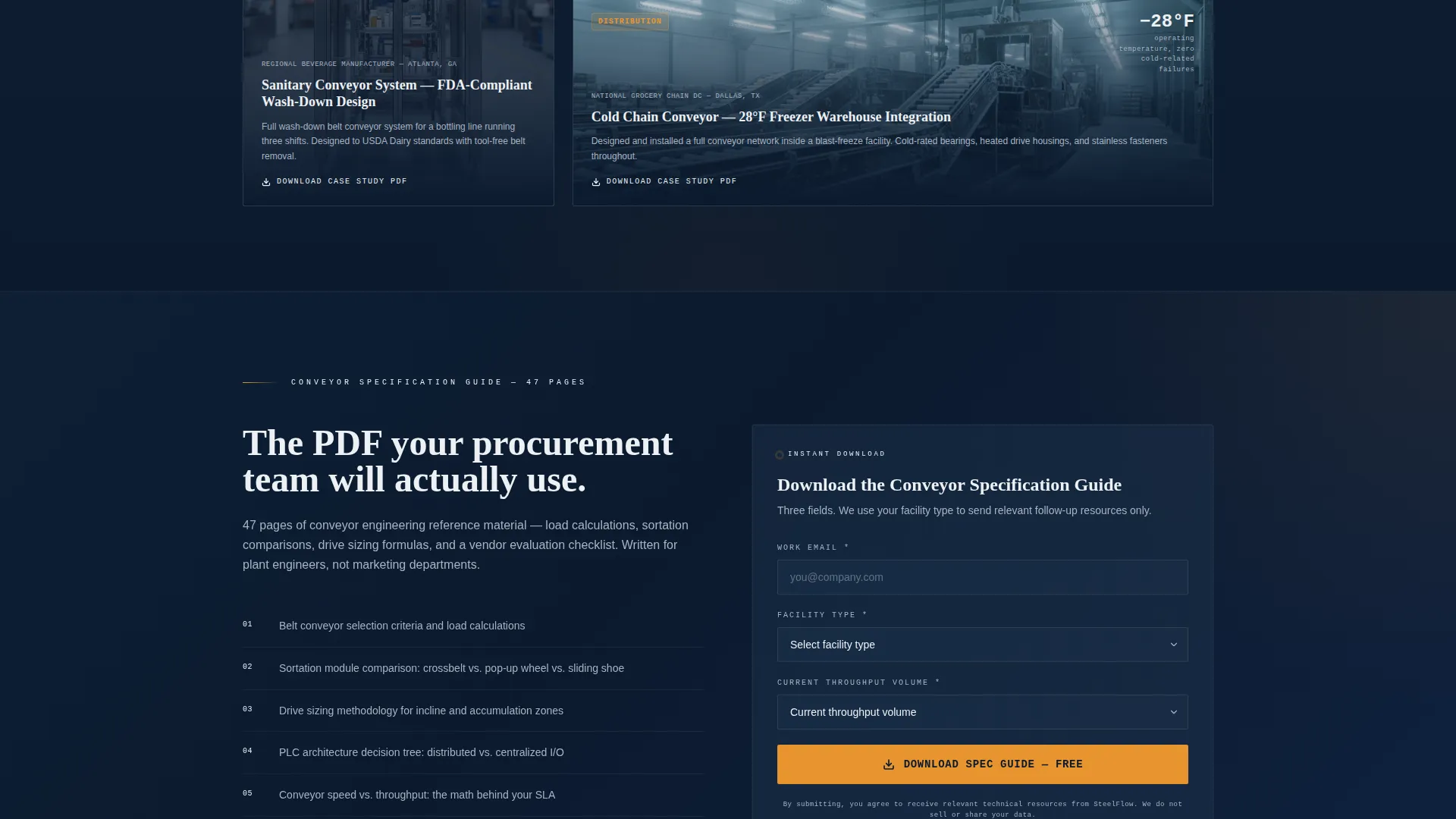
A three-field form gates the primary Conveyor Specification Guide download. Visitors enter a work email, select a facility type from a defined list (distribution, manufacturing, food and beverage, or airport), and provide their current throughput volume. The gate appears after the visitor has already absorbed the process content, making the trade feel fair.
Ungated Case Study Cards
Individual case study cards sit throughout the card grid and are available without a form. Each card is tagged by industry vertical, letting engineers self-qualify by finding peers in their own sector. This secondary path removes friction for buyers who are not yet ready to share contact details.
Data Command Color System
Operational amber is reserved exclusively for calls to action, live data callouts, and hover states. The remaining palette uses command-center navy, gunmetal housing, and signal white to create a high-contrast, information-dense environment that reads like a supervisory control panel rather than a marketing site.
Transparent Process Architecture
The scroll sequence is structured to peel back production detail progressively. Each phase card represents a real stage: site survey and CAD modeling, structural and controls engineering, steel fabrication and powder coating, on-site installation, PLC (Programmable Logic Controller) programming and commissioning, and preventive maintenance. Nothing is skipped or softened.
Page sections overview
| Section | Purpose |
|---|---|
| Stats/Metrics Header | Establishes quantified credibility with four animated data counters |
| Authority Tagline | Anchors the value proposition below the metrics wall |
| Process Card Grid | Educates visitors on each production phase via expandable cards |
| Case Study Cards | Provides ungated, vertical-tagged proof for self-qualifying engineers |
| Specification Guide Gate | Converts engaged visitors through a lightweight three-field form |
| Facility Type Selector | Qualifies leads by distribution, manufacturing, food and beverage, or airport context |
| Throughput Volume Field | Captures current capacity data to segment inbound leads |
Design & branding system
The visual identity uses a Data Command theme built entirely around the Navy Authority color system. Every color choice has a functional role, matching the logic of an industrial human-machine interface (HMI) screen rather than a marketing website.
- Command-center navy (#0B1A2E) forms the dominant background, giving the page a control-room weight
- Gunmetal housing (#3A4553) defines card surfaces and structural dividers, while signal white (#EDF0F4) keeps text and card faces legible
- Operational amber (#E8952F) appears only on calls to action, live data callouts, and interactive hover states, preserving its urgency value
Mobile & speed optimization
The modular card grid is structured to reflow cleanly across screen sizes. Engineers reviewing specifications during a facility walk-through need content that holds up on a tablet or phone without losing the data density the desktop version delivers.
- Card columns collapse to a single-column stack on smaller viewports without breaking the phase-order logic
- The metrics header scales type proportionally so animated counters remain readable on mobile screens
- Form fields in the gated download section are sized for touch input, reducing friction on non-desktop devices
How this template helps you convert
Steelflow does not ask for trust before it has been earned. The conversion architecture is sequenced so that every engagement step follows demonstrated depth.
- The animated metrics header creates immediate quantified authority, giving first-time visitors a reason to keep scrolling before reading a single marketing claim
- The expandable process cards build progressive trust across six production phases, so that by the time a visitor reaches the specification guide gate, the three-field form feels like a reasonable trade for genuine engineering value
- Ungated case study cards provide a low-commitment secondary conversion path, capturing engineer attention even when they are not ready to share contact details
Other information about this template
Steelflow is categorized under Manufacturing and Industrial, within the Robotics and Automation subcategory. It is specifically designed for the conveyor system manufacturer niche and carries an intersection match score of 13, indicating strong alignment between the template style and the target market.
- The template style is Card Grid (Modular), built to support non-linear browsing across multiple process phases
- The creative direction is Transparent Process, meaning the layout prioritizes showing real production detail over promotional language
- The landing page direction is Content/Resource, structured to earn a download conversion through depth rather than pressure
- The header concept is Stats/Metrics, replacing lifestyle photography with data points that speak directly to operations and engineering buyers
Theme
Data Command
Creative direction
Transparent Process
Color system
Navy Authority
Style
Card Grid (Modular)
Direction
Content/Resource
Page Sections
Animated Metrics Header
Expandable Process Card Grid
Gated Specification Guide Download
Ungated Case Study Cards
Data Command Color System
Transparent Process Architecture
Related questions
Who is the primary audience for this template?
What does the gated download form collect?
Do visitors have to fill out a form to access any content?
Can I customize the process phase cards?
Is this template suitable for food and beverage or airport facility clients?