Coffee Roaster & Specialty Coffee Pricing Website Template
Roast is a Neo-Retro coffee subscription landing page built for direct sales. It uses a full-screen video hero, a modular card grid with before-and-after origin sliders, and an interactive box-builder quiz. The Desert Rose color system and warm analog typography help specialty coffee brands prove provenance and earn the subscription before asking for a purchase.
by Rocket studio
Quick summary
Roast is a single-page coffee subscription template designed for direct-to-consumer specialty roasters. It leads visitors from a dramatic video hero through origin story cards, a freshness timeline, and a guided quiz that builds a personalized box. Every section earns trust before the checkout drawer ever opens.
Who this template is for
This template is built for specialty coffee businesses that sell single-origin subscriptions directly to consumers. It works best when the brand story centers on farm traceability, roast freshness, and a curated product range.
- Specialty roasters launching or refreshing a direct-to-consumer subscription offer
- Coffee brands targeting home baristas who care about origin, roast date, and brew method
- Gift-focused coffee retailers who need a clean gifting path alongside the main subscription flow
What problem this template solves
Most coffee subscription pages lead with pricing before they build desire. Visitors arrive curious but leave unconvinced because they never feel the story behind the beans. This template flips that sequence entirely.
- It proves provenance card by card before presenting a price, so visitors feel informed rather than sold to
- It removes friction from subscription customization by using a guided quiz instead of a product grid
- It gives gift-buyers a clear separate path so they never have to navigate the main subscription funnel
What you get with this template
You get a fully structured, single-page layout with six distinct sections and a persistent side drawer. Every component is purposeful and tied directly to the conversion sequence described in the brief.
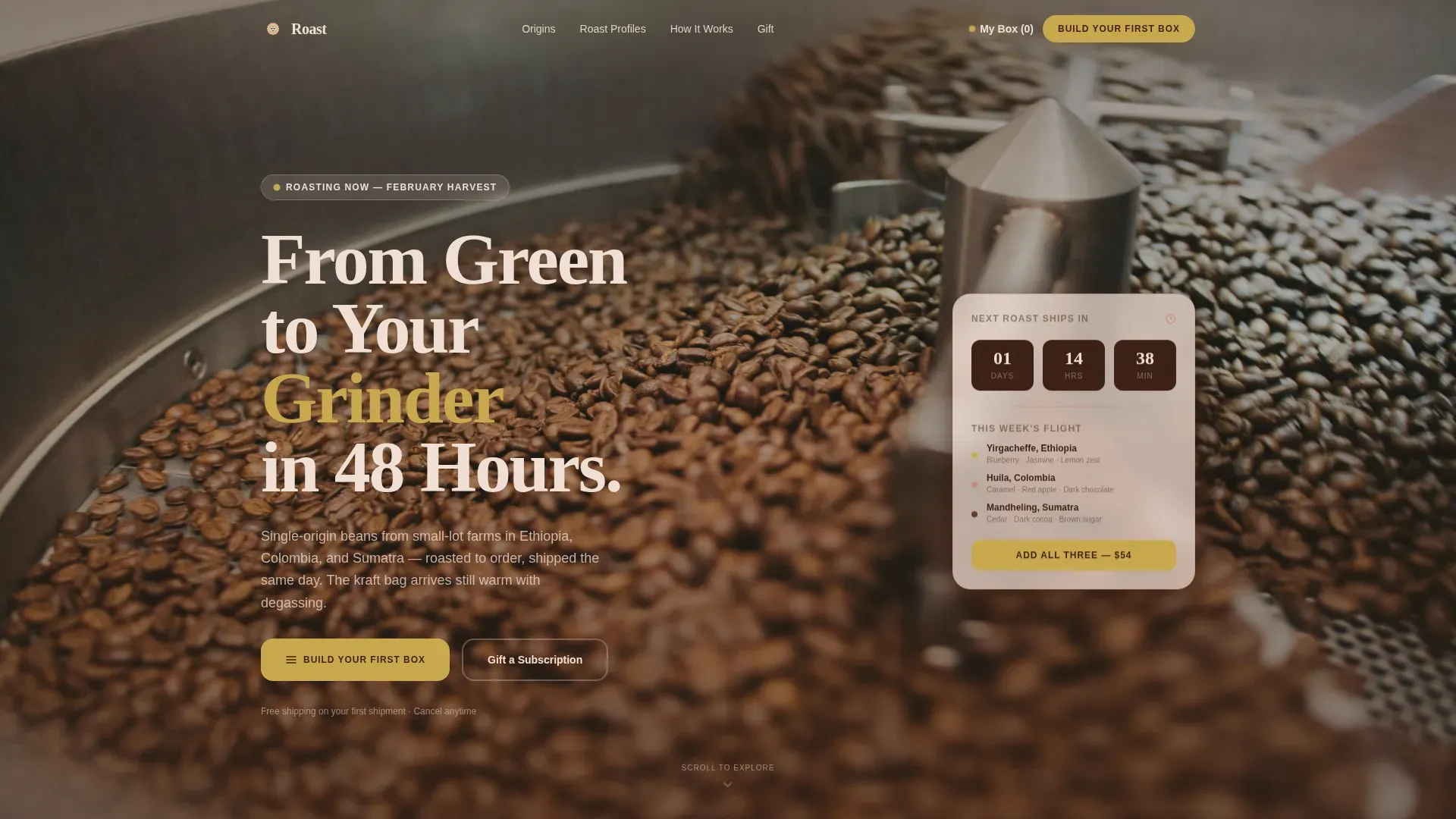
- A full-screen video hero with a floating call-to-action card and a headline anchored to freshness
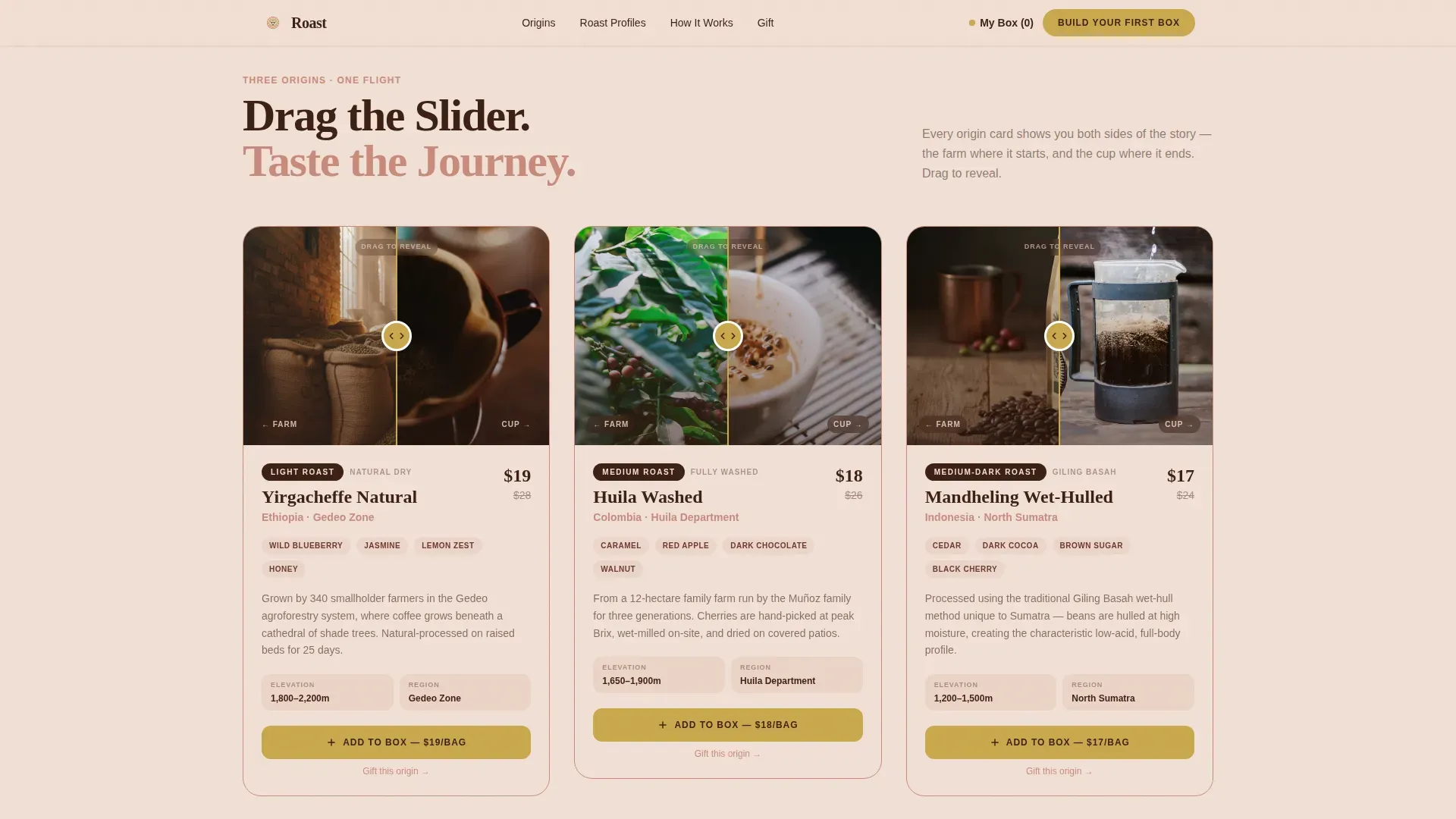
- A modular card grid featuring before-and-after farm-to-cup sliders for each coffee origin
- An interactive brew quiz that auto-recommends a three-bag selection with visible per-bag pricing and a crossed-out retail comparison
Feature list
This template is built around high-interactivity components that guide visitors through a sensory story before presenting a subscription offer.
Full-Screen Video Hero
The header plays a slow macro-speed film of green coffee beans tumbling into a drum roaster. The camera stays close enough to show chaff lifting off at first crack. A floating glass card carries the headline and the primary call to action, keeping the entry point clear without interrupting the visual.
Before-and-After Origin Sliders
Each origin card in the bento grid pairs a raw farm scene on one side with a finished cup on the other. Visitors drag the slider to move between the drying bed and the pour-over bloom. Cards cover Ethiopia, Colombia, and Sumatra, giving the brand three distinct story moments.
Interactive Box-Builder Quiz
The quiz asks three short questions: brew method, flavor preference, and delivery frequency. It then auto-generates a three-bag recommendation with per-bag pricing, a crossed-out retail price for comparison, and a note about free shipping on the first order. The result lands in a persistent side drawer ready for checkout.
Persistent Subscription Drawer
Every origin card carries a brass-styled button that adds a bag to a side drawer without leaving the page. The drawer stays visible as visitors scroll, so their selection is never lost. This keeps the purchase path open at all times without forcing a hard redirect.
Gift Subscription Path
A secondary call to action in terracotta text sits beneath every primary button. It links to a prepaid three-month or six-month gifting option that includes a printable card. The gifting flow is separate and clear, designed for visitors who are buying for someone else.
Scroll-Triggered Grid Rhythm
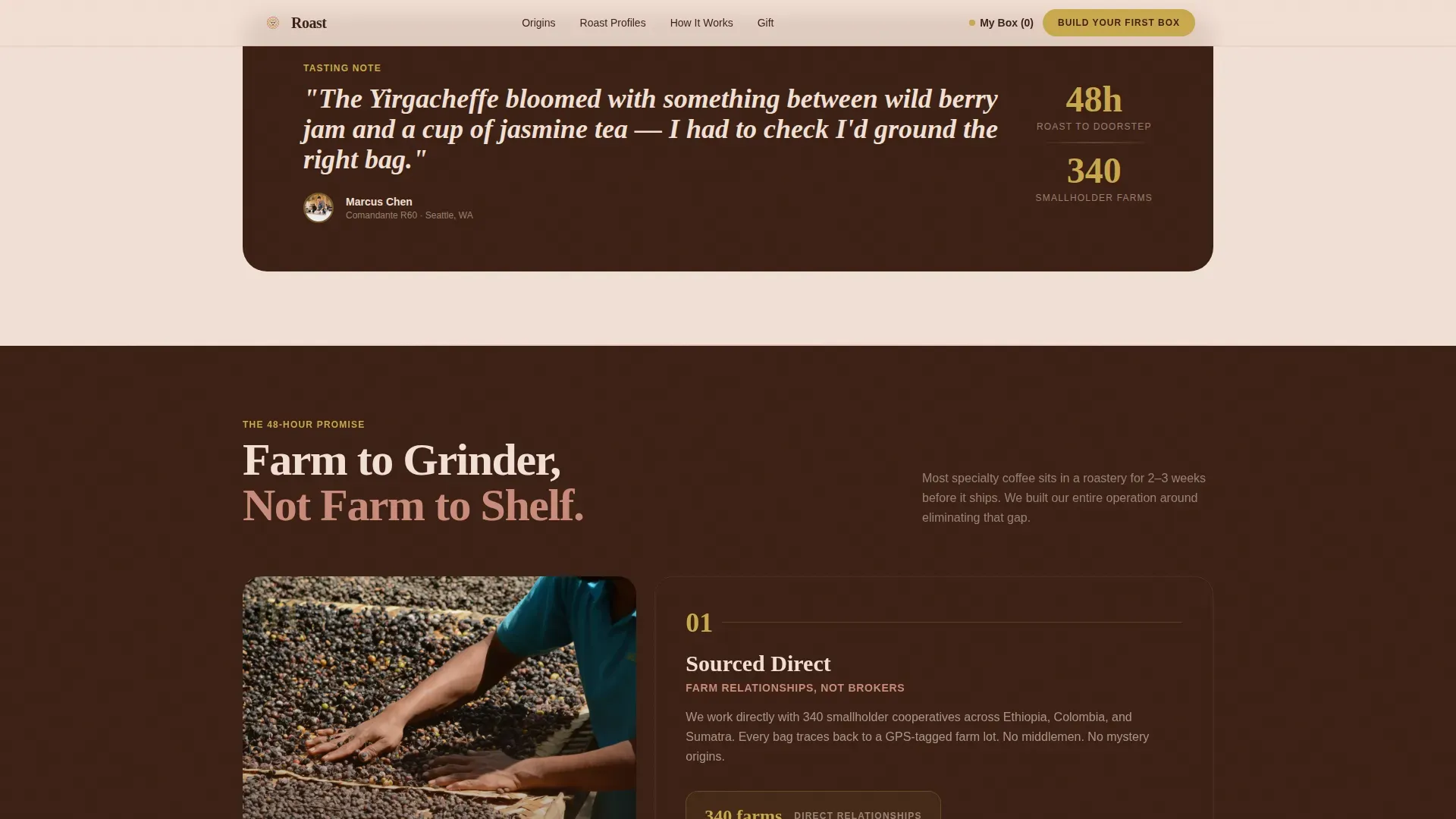
The card grid shifts column count as visitors scroll deeper. It moves from three columns to two, then opens into a single full-width tasting note before the next card flight appears. This breathing rhythm paces the scroll and keeps visual interest high across the entire page.
Page sections overview
| Section | Purpose |
|---|---|
| Video Hero | Establishes freshness story and primary call to action |
| Origin Card Grid | Proves provenance with farm-to-cup slider cards |
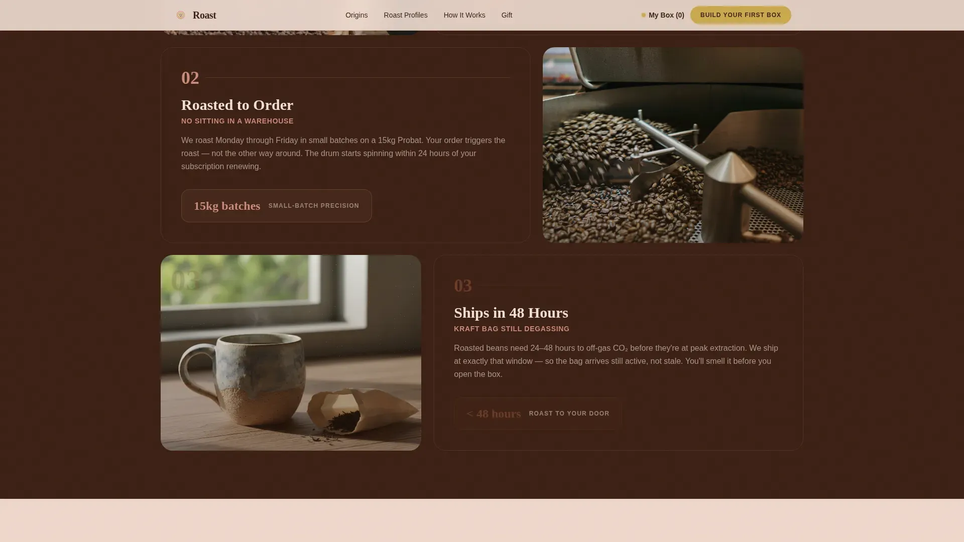
| How It Works | Shows the 48-hour journey from farm to doorstep |
| Build Your Box | Quiz-driven subscription configurator with auto-recommendation |
| Testimonials | Home barista social proof with specific brew details |
| Footer | Splits brand links from gifting path in Arc Browser style |
Design & branding system
The visual identity follows a Neo-Retro aesthetic inspired by a 1970s desert kitchen. The palette feels warm, faded, and analog, anchored by a cream background that makes the content feel open and unhurried.
- Cream (#F2E0D6) fills the background, mahogany (#3B1F13) carries all body text, and terracotta (#C98A7A) marks card borders and section dividers
- Vintage brass (#C9A84C) is reserved for every clickable surface: buttons, price tags, and hover states
- Headlines use a rounded, slightly condensed serif with a vintage grocery-label quality, while body text uses a clean humanist sans-serif for readability
Mobile & speed optimization
The template is built desktop-first to serve home baristas at their kitchen counter, with a strong mobile experience designed specifically for the gifting flow.
- The video hero includes a poster image fallback so the page loads a meaningful visual on slower connections before the video stream begins
- Card images use lazy loading so off-screen assets do not slow down the initial paint
- Scroll animations and grid transitions use CSS-based triggers to keep motion smooth without heavy JavaScript dependencies
How this template helps you convert
The page is structured as a trust sequence. Visitors move from sensory storytelling through provenance proof to a personalized recommendation before they ever see a checkout prompt.
- The video hero and origin sliders build desire by letting visitors experience the product visually, so by the time they reach the quiz they already want the coffee
- The quiz removes decision paralysis by translating personal preferences into a specific three-bag recommendation with transparent pricing, making the add-to-cart step feel like a natural conclusion rather than a sales push
Other information about this template
This template is part of the Card Grid (Modular) template style and is categorized under Food and Beverage, specifically the Coffee Roaster and Specialty Coffee subcategory. It is designed for the coffee subscription service niche and uses the Before-and-After Reveal creative direction paired with the Desert Rose color system.
- The page references a social proof metric of 2,400 or more subscribers, which can be updated with real brand data
- Testimonials are structured to include specific grinder and brew method details, adding authenticity for a technically minded audience
- The layout uses Fraunces for serif headlines and DM Sans for body text, both of which are Google Fonts available at no additional cost
- The footer uses an Arc Browser Split pattern that separates primary brand navigation from the gifting path visually
Theme
Neo-Retro
Creative direction
Before/After Reveal
Color system
Desert Rose
Style
Card Grid (Modular)
Direction
Direct Sales
Page Sections
Full-screen Video Hero with Call to Action Card
Before-and-after Origin Sliders
Interactive Subscription Quiz
Persistent Side Drawer
Gift Subscription Path
Scroll-triggered Grid Layout
Related questions
Can I change the coffee origins shown in the card grid?
Does the quiz connect to a live subscription platform?
Is the gifting flow a separate page?
Can I adapt this template if my roastery only offers one origin?
What does the before-and-after reveal interaction look like for visitors?



